An article discovered whilst flicking through a collected edition of Cassell’s Magazine for the months June to November 1903. Cassell’s ran light fiction, often in serial form, and articles of general interest to the Victorian and Edwardian reader, of which this is an example. The discussion of art produced in insane asylums is presented in the usual terms of the period with “the lunatics” almost being regarded as a race apart. What’s striking looking at this now is how none of the art seems particularly “mad” after a century of avant garde boundary-breaking. The “Pink rocks, red trees with black leaves, lilac ground, and purple vegetation” described in such tones of disapproval would be a commonplace thing once Expressionism came along a decade later. Attitudes towards the mentally ill have changed since 1903 but the art world still prefers to divide itself into fine artists and those it terms “outsiders”—the naive, the unschooled, or the mentally unstable. In other words, people creating art for their own reasons, rather than for the money or approval of others.
* * *
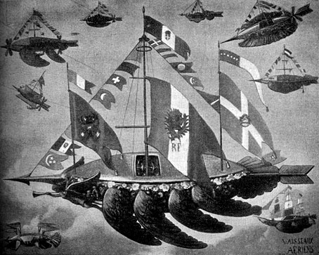
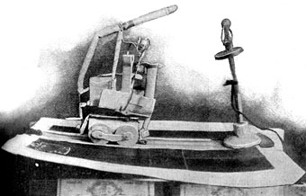
“Designs for air-ships.”
A MADMEN’S MUSEUM by G.A. Raper
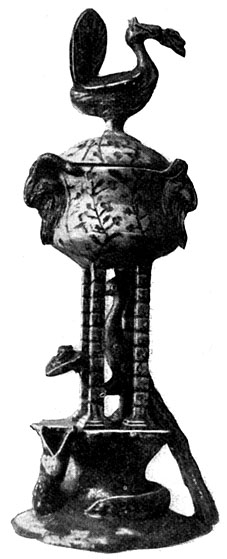
MOST people, who have no special knowledge of the insane, are apt to consider them mere cyphers as far as the practical side of life is concerned. The cunning of the madman is proverbial, but one is hardly disposed to credit him with inventiveness and constructive skill. That lunatics do nevertheless possess these faculties is conclusively shown by a very curious collection of articles, all made by victims of various forms of insanity, which has been accumulated during the last ten years by Dr. Marie, medical superintendent at Villejuif, one of the four large asylums belonging to the city of Paris. Dr. Marie, who is one of the leading experts in France I and a strong advocate of liberal and humane ideas in the treatment of the insane, has long made a practice of encouraging his patients to pursue any harmless occupation for which they show a liking, and the results of this system, as evidenced by the collection in question, are certainly surprising.
Perhaps the most remarkable, though not the best preserved, specimen in Dr. Marie’s museum is a miniature bread-making machine, the work of a patient who had been a chemist. With two or three bottles, some copper tubing, to which he fitted tiny taps of his own manufacture, a strip of wood, and some chemicals for making carbonic acid gas in place of yeast, he got his model into working order, and produced some deliciously light, crusty rolls, no bigger than the palm of one’s hand. Unluckily, an attempt was made to photograph the apparatus, and the inventor, in a sudden fit of fury, smashed it to pieces. He imagined, poor fellow, that his process was being stolen from him, and, though the parts of the little machine were preserved, he could never be induced to put them together again. Another patient constructed a model weaving machine, and, when he had got it to work, took a dislike to it, and allowed it to fall to pieces. The hackneyed lines—
“Great wits are sure to madness near allied,
And thin partitions do their bounds divide”
could hardly be more applicable than in these two cases.
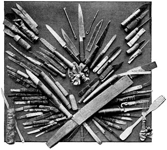
“Knives, daggers and forks made by lunatics.”
Lunatics often show great ingenuity in making implements or weapons, either for daily use or to help them in carrying out some scheme of vengeance or escape. The illustration above shows a variety of articles—chiefly knives and daggers—fabricated “out of nothing,” as the saying is—truss springs, corset busks, broken penknife blades, scraps of slate or glass picked up in the courtyard and surreptitiously sharpened by rubbing on stone steps. The handles are made out of bits of firewood, bandages stolen from the infirmary, or strips torn off the patient’s own shirt. The topmost knife, in the right-hand corner, was patiently fashioned, without the knowledge of the warders, by an inmate of the Évreux Asylum, who nourished a deadly enmity against the cook. Awaiting his opportunity, the madman suddenly attacked the unsuspecting functionary and stabbed him in the stomach. Fortunately, the point of the knife struck the steel spring of a truss worn by the cook, and bent upwards without doing any harm, while the lunatic rolled on the floor in a paroxysm of amazement, exclaiming, “It’s a miracle!”
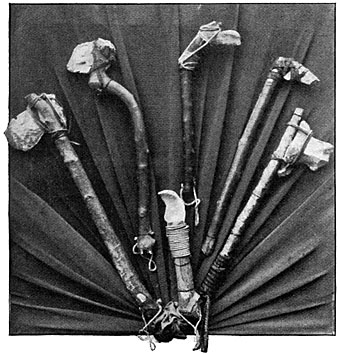
“Weapons of the Stone Age.”
Another photograph shows a set of “pre-historic” clubs and hatchets made out of sticks and flints by an insane physician, who fancied himself to have been mysteriously whirled back into the Stone Age. Having no tools, he rubbed his flints against one another until they assumed the required shape, and lashed them securely to their handles with string and swathes of dried grass. His malady being of a harmless he kept his weapons for ornament rather than for use, and did not try them on his fellow “cave-dwellers.”
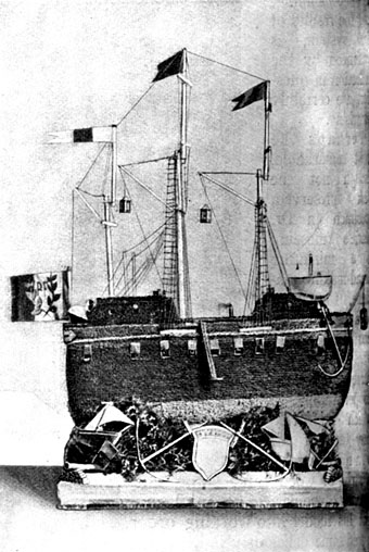
“Ship models made out of rolls of cardboard.”
Dr. Marie has many keys, made out of old sardine tins and pewter spoons, and a large collection pipes, some very skilfully carved, which were nothing but unconsidered trifles of wood and metal before demented hands set to work on them. Some of the pipe bowls were parts of lamps in their previous state of existence. The ship model above, made of little rolls cardboard shaped like cigarettes, was executed, in lucid intervals, by a patient who thinks himself pursued by invisible enemies and hears threatening voices behind him. He has also made a balloon, with all its fittings, and a model of the Panthéon out of his cardboard cylinders. Another item in Dr. Marie’s collection—a relief plan of the asylum—affords further testimony of the patience, perseverance and skill of which the insane are sometimes capable.
“Model of a motor-car.”
“A weird monument (plaster model) intended for the Paris Exhibition.”
It must be confessed, however, that the constructive and inventive talent of the asylum inmate often takes strange and unpractical forms. It carries him up to a certain point and leaves him in the lurch, with no sense of the ridiculous to put him right. There is something pathetically grotesque about the motor-car model on this page, over which one of Dr. Marie’s patients spent many months, and the plaster model of a monument, destined by its inventor for the Paris Exhibition. No one knows what this weird design is intended to represent, its creator obstinately refusing to give any explanation of it, lest someone should steal his idea. For sheer incoherence it would be hard to beat the alleged “Plan of the World” (p. 496), fashioned out of old tin cans and fantastically adorned with heterogeneous scraps of needlework, flags, buttons, and tassels. It will be observed that the designer has ignored every country except France, Russia, and Prussia, and has placed three small circular mirrors near the centre of his “plan.” He used to contemplate his reflection in these three mirrors during the progress of the work, and imagine that it represented the three Persons of the Trinity!
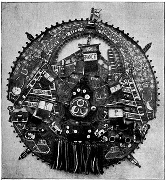
“A madman’s plan of the world.”
Scarcely less fantastic are the airships designed by an artist of considerable talent, who is now an inmate of one of the asylums in the Department of the Seine. He is firmly convinced that he has discovered the ideal flying machine. His airships are all arrow-shaped, in token of the speed he thinks they possess. The largest of these vessels—in the centre of the picture—is apparently propelled by four wings. The figurehead is an archangel with a long trumpet, announcing the news of the great discovery to an attentive universe, and there is an elaborate supply of masts, flags, and ornaments—everything, in fact, but the chief essentials. The artist jealously treasures this design, and can seldom be induced to show it, fearing, like other inventors, sane and insane, to be deprived of the fruit of his ideas.
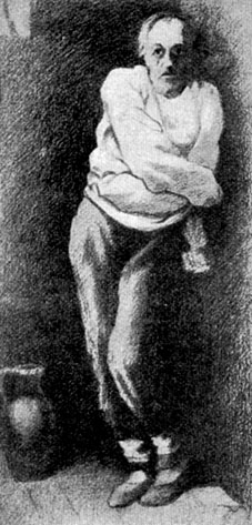
“The caricaturist, André Gill, in Charenton Lunatic Asylum (drawn by himself).”
One of the most interesting features of the Madmen’s Museum is a collection of some 1,500 water-colour sketches and drawings. Nearly all are the work of patients who showed no special bent for art before their minds gave way. It is a curious fact that an artist who has lost his mental balance can rarely be induced to touch a brush or chisel; but it is quite common for other asylum patients to develop a taste—if it may be so called—in this direction. The Villejuif Asylum does, indeed, possess a painter who, though rendered hopelessly insane by disappointment through the rejection of a picture he had sent to the Salon, nevertheless preserved his technical skill, and has executed several admirable oil-paintings, which, however, are only copies, the unfortunate artist’s creative faculty having left him. This survival of artistic talent also occurred in the painter Munkacsy and the famous caricaturist André Gill, who continued to draw first-rate political cartoons while an inmate of an asylum. Gill was quite aware of his own condition, and made a remarkable drawing of himself as he imagined he looked in the padded room. The photograph (left) is taken from a copy, made by one of Dr. Marie’s patients, of André Gill’s drawing, and is thus a type of madness imagined by one madman and reproduced by another. These, however, are quite exceptional cases. The work of an artist overtaken by lunacy almost always gives evidence of his condition. A portrait painter who was confined in an asylum some years ago continued his former occupation, but represented all his sitters without noses. Another spent his time in drawing heads, all pierced with an arrow in the same place. He imagined himself to be pursued by enemies who shot arrows through his head, and he suffered excruciating pain in the part which he thought the darts penetrated. After his death it was found that he had a tumour exactly in this spot.
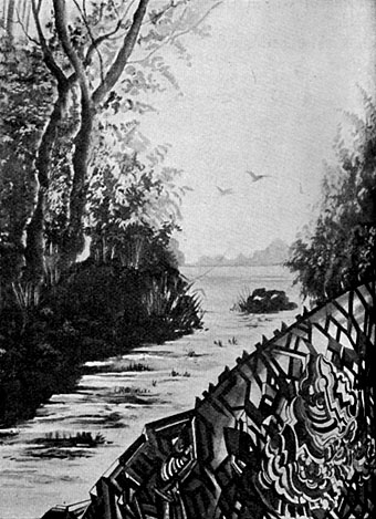
“A lunatic landscape.”
There is a curious naïveté about the productions of the lunatic who has developed a craze for art since the loss of his reason. His drawings have the clumsiness and inexperience of a child’s, combined with a certain maturity of mind. One of the chief contributors to Dr. Marie’s collection is a former porcelain decorator, who spends the whole of his time in concocting landscapes, by no means badly drawn, but always tailing off into weird arabesques at the bottom. His malady also shows itself in the colours he selects. Pink rocks, red trees with black leaves, lilac ground, and purple vegetation constantly recur in his compositions. Similar aberrations, such as yellow leaves, green fruit, and blue poppies, are common in other patients’ landscapes. Imps, devils, and other powers of the nether world seem to exercise a peculiar fascination for the demented draughtsman, sketches of the kind being numerous; and even actualité asserts itself in the sketch of a mounted Boer pursuing an Englishman and English woman, which is not, after all, very much more insane than the views of the South African war held by many thousands of Frenchmen who are not inside asylums. Some of the specimens of sculpture bear a singular resemblance to savages’ idols; others have a tragic intensity of suffering.
As works of art, Dr. Marie’s specimens do not rank high, but they show how much method is to be found in the very worst madness, and that not in vain do science and humanity minister to a mind diseased.
Elsewhere on { feuilleton }
• The fantastic art archive
Previously on { feuilleton }
• The art of Franz Xaver Messerschmidt, 1736–1783