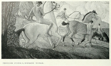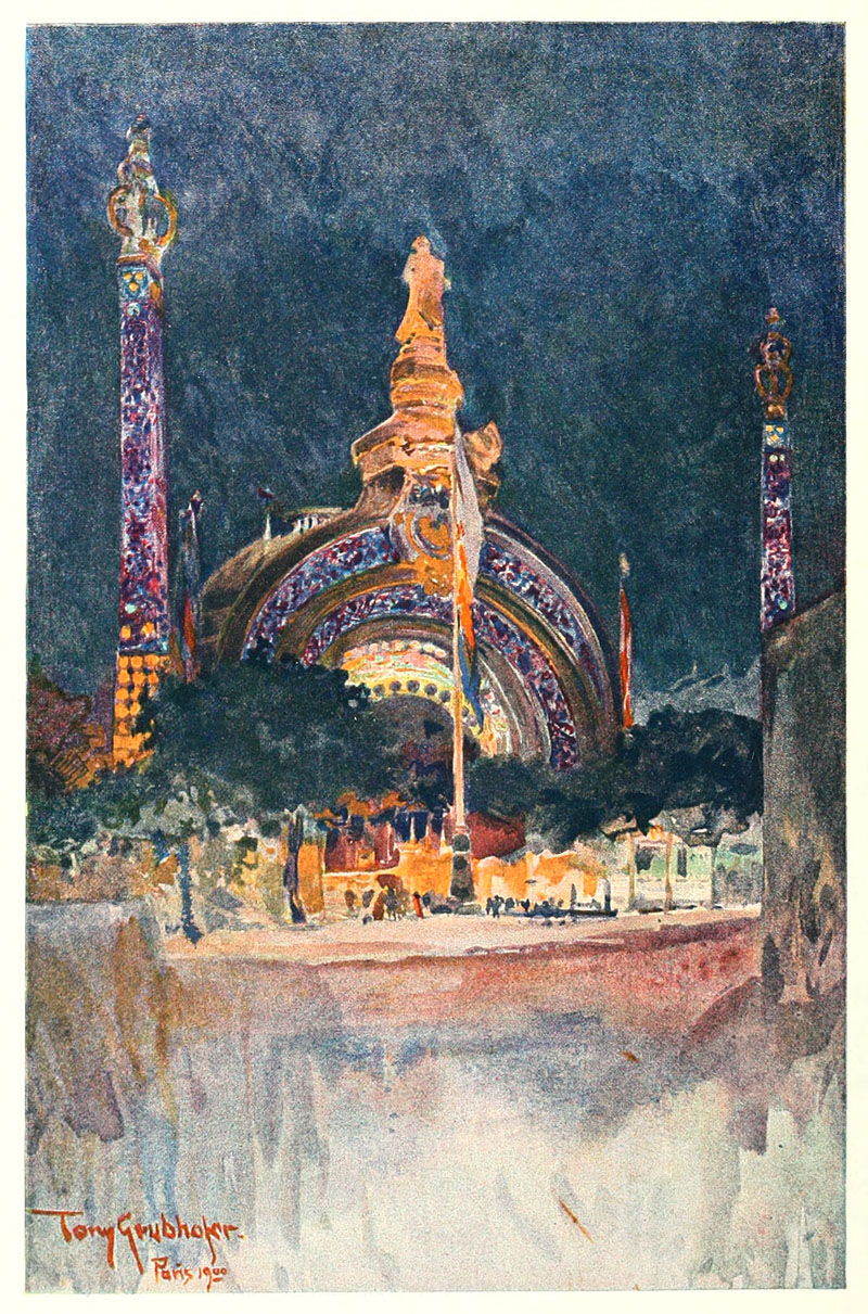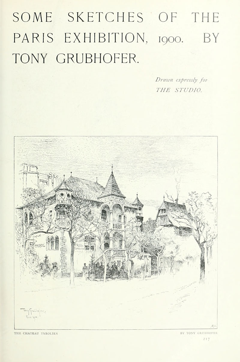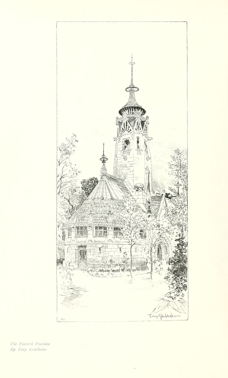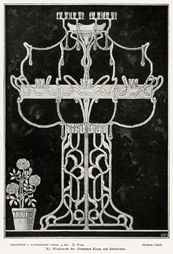
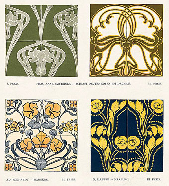
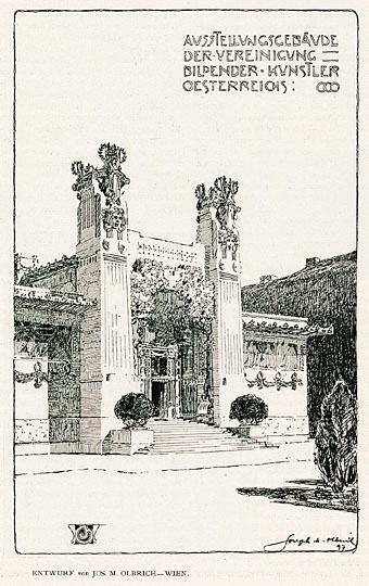
A slight return to Deutsche Kunst und Dekoration, the German periodical of art and decoration. Volume 3, which covers the period from October 1898 to March 1899, was missing from the copies stored at the Internet Archive but has recently been added to the burgeoning collection of books and journals being digitised at the University of Heidelberg. What might have been a frustrating omission turns out to be less interesting than some of the editions which followed but it still features plenty of examples of the German Art Nouveau style.
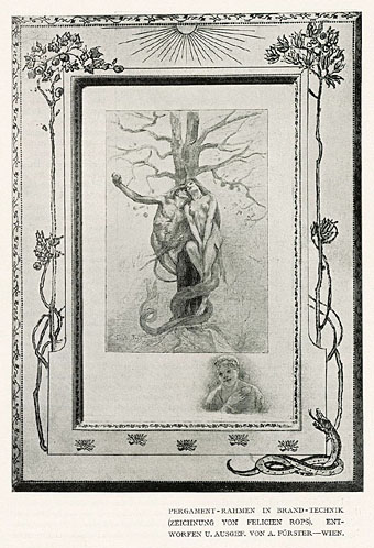
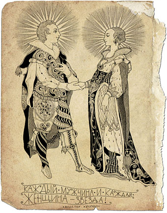
Eritis Similis Deo (They were like God) (1896) by Félicien Rops.
Previously on { feuilleton }
• Deutsche Kunst und Dekoration #25
• Deutsche Kunst und Dekoration #24
• Deutsche Kunst und Dekoration #23
• Deutsche Kunst und Dekoration #22
• Deutsche Kunst und Dekoration #21
• Deutsche Kunst und Dekoration #20
• Deutsche Kunst und Dekoration #19
• Deutsche Kunst und Dekoration #18
• Deutsche Kunst und Dekoration #16
• Deutsche Kunst und Dekoration #15
• Deutsche Kunst und Dekoration #12
• Deutsche Kunst und Dekoration #11
• Deutsche Kunst und Dekoration #10: Turin and Vienna
• Deutsche Kunst und Dekoration #10: Heinrich Vogeler
• Deutsche Kunst und Dekoration #9
• Deutsche Kunst und Dekoration #8
• Deutsche Kunst und Dekoration #7
• Deutsche Kunst und Dekoration #6
• Deutsche Kunst und Dekoration #5
• Deutsche Kunst und Dekoration #4
• Deutsche Kunst und Dekoration #2
• Deutsche Kunst und Dekoration #1
• Deutsche Kunst und Dekoration
• Jugend Magazine revisited