Temples for Future Religions by François Garas

garas1.jpg

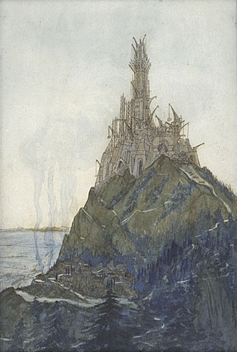
Temple à la Pensée, dédié à Beethoven, vue en cours de construction (1897).

Another artist discovered whilst searching for something quite unrelated. The Musée d’Orsay are custodians of this drawing by François Garas (1866–1925), and they also have the most substantial appraisal of his career.

François Garas remains a mysterious architect, whose artistic pantheon included Baudelaire and Edgar Allan Poe, as well as John Ruskin, Richard Wagner, Jean Carriès and Edouard Manet. He obtained his diploma in 1894, and until 1914 regularly exhibited utopian architectural projects at the Salon de la Société Nationale des Beaux Arts. His career started with the exhibition Architects’ Impressions in 1896 at the Le Barc de Bouteville gallery, alongside his fellow architects Henri Sauvage, Henry Provensal and Gabriel Guillemonat. This exhibition, accompanied by a rebellious booklet by the architect Frantz Jourdain, wanted to get rid of “the mental slavery produced by the exclusive study of Greek and Roman architecture, and by a knowledge of nothing but the Italian Renaissance”. This drawing featured in the exhibition; then it was seen again, the same year, in an exhibition by the Société Nationale des Beaux Arts, as part of a collection entitled Artists’ Interiors.

From 1897, Garas exhibited increasingly oneiric projects at the Salon – “temples for future religions”, dedicated to Beethoven, Wagner, Life, Death and Thought. While his companions from the early days were designing social housing, Garas continued along the same fanciful path, then disappeared from the architectural scene without any of his projects ever having been built.

garas3.jpg

Temple à la Pensée, dédié à Beethoven, vue perspective depuis l’arrière du temple (1897).

garas4.jpg

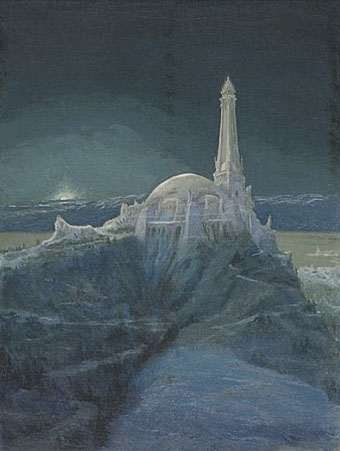
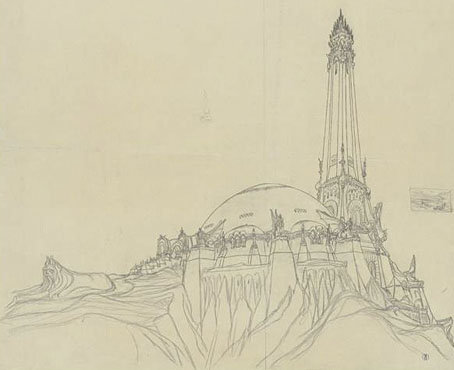
Temple à la Pensée, dédié à Beethoven, visions du temple, clair de lune (1900).

The museum has several pages of various plans and sketches for these Temples for Future Religions, and also some quasi-Gothic designs for “Artist’s interiors” which would benefit from being seen at a larger size. Among his other works are a series of very diffuse pastel studies which look more like Claude Monet drawing the ruins of Angkor than architectural designs.

garas2.jpg

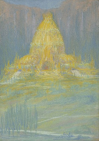
Un temple pour les religions futures (1901).

Previously on { feuilleton }
Exposition Universelle publications
Exposition cornucopia
Return to the Exposition Universelle
The Palais Lumineux
Louis Bonnier’s exposition dreams
Exposition Universelle, 1900
The Palais du Trocadéro
The Evanescent City

Outer Alliance Pride Day

outer.jpgToday is Outer Alliance Pride Day so let’s begin with a statement:

As a member of the Outer Alliance, I advocate for queer speculative fiction and those who create, publish and support it, whatever their sexual orientation and gender identity. I make sure this is reflected in my actions and my work.

Various members of the Outer Alliance are either posting fiction, or reviewing something or otherwise attempting to fill that declaration of intent. For my part I decided today to do a sketch based on my favourite chapter of The Ticket that Exploded by William Burroughs, the sequence entitled the black fruit which Burroughs wrote with Michael Portman. Ticket was the first Burroughs book I read at the age of 16 or so, having discovered a copy in a local library, and it really felt like something exploding in the head. For a start, the text is some of his least accommodating for an average reader, although I was already familiar enough with literary experiment to cope with that. Far more electrifying was seeing familiar scenarios from science fiction and fantasy infused with a raw and relentless gay sexuality of endless erections and spurting cocks. The black fruit begins with a science fiction scene of lost astronauts encountering alien fishboys intent on having sex; it then progresses through a series of descriptions which read like a pornographic rewriting of similar scenes from HP Lovecraft or Clark Ashton Smith. In the opening pages of Ticket, Burroughs describes his book as “science fiction” but this was like no sf I’d read; I started to wish there was more like it. There are flashes of similar stuff in The Soft Machine (including an idea borrowed from Henry Kuttner) and elsewhere, and Cities of the Red Night is pretty much a full-on fantasy in its second half, but I’d still like to read more about the fishboys…

fishboy

Fishboy and Astronaut (detail).

So here’s an explicitly erotic sketch based on the black fruit (click the picture for the full thing). This should have been a lot better but I’m out of practice drawing at the moment and I didn’t give myself enough time. The scene doesn’t really match the book either, and the astronaut figure is pretty crappy. Feeble excuses aside, Burroughs’ rotting swamp gardens with their marble statues of copulating boys deserve better. And where his fiction leads, I’m still hoping that more writers will follow, not by copying his obsessions but by being as fearless and honest in mining their own.

Previously on { feuilleton }
William S Burroughs: A Man Within
The art of NoBeast

The art of Warwick Goble, 1862–1943

goble1.jpg

Moon Maiden (1910).

Goble’s Moon Maiden, an illustration from Green Willow and Other Japanese Fairy Tales, is proof that a peacock train needn’t be the sole preserve of masculine birds, but then Ruth St Denis had already shown us that. Art Passions has a decent selection of Goble’s fairy pictures although if you want to see the full complement of drawings made for these books you need to consult the Internet Archive. As usual with illustrators of this period, I find I prefer many of the black-and-white works over the paintings; Art Passions doesn’t have any of those, unfortunately, while the book scans are too low-res to do them justice. Once again, Bud Plant provides an overview of the artist’s career.

goble2.jpg

Sea-Nymphs – Ding-Dong, Bell (1920).

Elsewhere on { feuilleton }
The illustrators archive

Previously on { feuilleton }
Ruth St Denis

More book design

hotel.jpg

Yes, it’s been a busy year. These are books three and four respectively of the titles I’ve been designing for Tachyon Publications, and there are more on the way.

Kage Baker’s The Hotel Under the Sand is a charming fantasy for children concerning the hotel of the title and its curious inhabitants, which include a ghost bellboy and a pirate captain. The illustrations were by Stephanie Pui-Mun Law and I tried to complement these with the lettering design and graphic elements. I always enjoy working on illustrated books.

fandsf.jpg

The Very Best of Fantasy & Science Fiction is a very different beast, a big (480 pages) selection by Gordon Van Gelder of some of the many first-class stories from the sixty-year history of the fiction magazine. F&SF has published so many classic stories over the years the book could easily have been twice as big. As it is there are pieces by Alfred Bester, Ray Bradbury, Shirley Jackson, Philip K Dick, Harlan Ellison, Stephen King and Neil Gaiman, among others. The design in this case came from studying a copy of the magazine from 1967; I was already thinking of using Bodoni for the story titles and that choice was confirmed when I saw it used for the same purpose in the magazine. The calligraphic titles were also scanned from there, their design going back to the very first issue.

Both these books are on sale now, and Keith Brooke gave a glowing appraisal to the latter in The Guardian at the weekend.

Previously on { feuilleton }
Medicine Road by Charles De Lint
The Best of Michael Moorcock

March of the Penguins

aco_penguin.jpg

top left: David Pelham’s classic design (1972); top right: photography
by Lionel F Williams (Eye) and SOA / Photonica (Cogs) (1996).
bottom left and right: photography by Véronique Rolland (2000 & 2008).

In April this year I wrote about James Pardey’s excellent site devoted to book covers from the Penguin science fiction range. I’m often pointing to various book cover galleries on Flickr and elsewhere but James’s site goes far beyond these, with credits and annotations for every cover on display. He emailed this week to let me know that his site has been considerably expanded, from 160 covers to 250 (!), bringing the timeline closer to the present. In addition the site has improved page layouts which enable you to study the evolution of each title. All design sites should be this good.

And coincidentally, Anne S mentioned in the comments yesterday that she’s been adding some Penguin Classics covers to her Eye Candy for Bibliophiles site. Lots of other worthwhile viewing there, including some of the old Puffin covers for Alan Garner.

Elsewhere on { feuilleton }
The book covers archive

Previously on { feuilleton }
Penguin science fiction
A Clockwork Orange: The Complete Original Score
Penguin Labyrinths and the Thief’s Journal
Penguin Surrealism
Juice from A Clockwork Orange
Penguin book covers
Clockwork Orange bubblegum cards
Alex in the Chelsea Drug Store