Weekend links 557

grygar.jpg

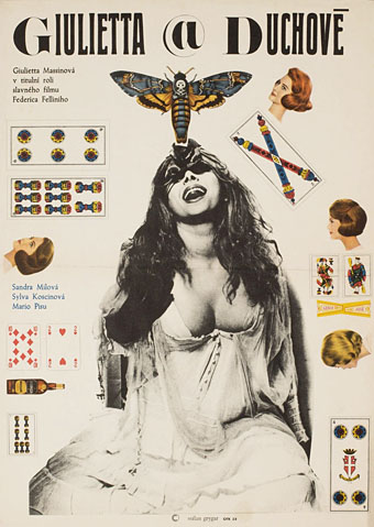
Poster by Milan Grygar for the 1969 Czech release of Fellini’s Juliet of the Spirits.

• “By encouraging composers to engage with sound as something more than just ‘notes on a keyboard’, the result [of the Buchla] was the kind of intricate sound design last heard in musique concrète. Works such as Morton Subotnick’s, Silver Apples of the Moon (1967) show a futurism completely absent on Wendy Carlos’ otherwise highly influential Switched-on Bach (1968), which used the keyboard-controlled Moog modular as if it were merely a glorified organ.” Oli Freke on the evolution of the synthesizer.

• “As humans began settling more consistently in one place to grow and thrive, the penis—or, more specifically, its erect form, the phallus—often came into use as a protector of fields that would prove fertile. In contrast to the comparative prudery of today, the phallus adorned everything from gods to shrines to personal homes and jewellery.” Emily Willingham on penial evolution in the animal kingdom.

• “The Trumpets of Jericho is, in part, so uniquely unsettling because it allows the woman in question to narrate her own horror. She is eager to give birth not to meet her child but so that she can go ahead and kill it.” Reed McConnell on the writings of Unica Zürn and (once again) Leonora Carrington.

At the center of it all, there was one director whom everyone knew, one artist whose name was synonymous with cinema and what it could do. It was a name that instantly evoked a certain style, a certain attitude toward the world. In fact, it became an adjective. Let’s say you wanted to describe the surreal atmosphere at a dinner party, or a wedding, or a funeral, or a political convention, or for that matter, the madness of the entire planet—all you had to do was say the word ‘Felliniesque’ and people knew exactly what you meant.

In the Sixties, Federico Fellini became more than a filmmaker. Like Chaplin and Picasso and the Beatles, he was much bigger than his own art. At a certain point, it was no longer a matter of this or that film but all the films combined as one grand gesture written across the galaxy. Going to see a Fellini film was like going to hear Callas sing or Olivier act or Nureyev dance. His films even started to incorporate his name—Fellini Satyricon, Fellini’s Casanova. The only comparable example in film was Hitchcock, but that was something else: a brand, a genre in and of itself. Fellini was the cinema’s virtuoso.

Martin Scorsese on “Il Maestro”, Federico Fellini

• At Dennis Cooper’s: For Your Crushed Right Eye: The instrumental films of Takahiro Iimura, Tetsuji Takechi, Toshi Matsumoto, Masao Adachi and Takashi Ito.

• “We wanted people to see that we exist.” Joan E. Biren, the photographer who recorded lesbian life in the 70s.

•New music: Alkisah by Senyawa, and Bishintai by Unknown Me.

• Mix of the week: XLR8R Podcast 683 by Laila Sakini.

• Phallus Dei (1969) by Amon Düül II | Sidereal Hands At The Temple Of Omphalos (1996) by Scenic | Starman (feat. Peter Brötzmann) (2017) by Phallus Dei
Squirm: Drew Struzan versus Gustav Klimt

squirm1.jpg

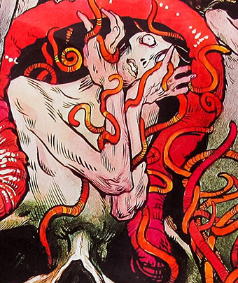
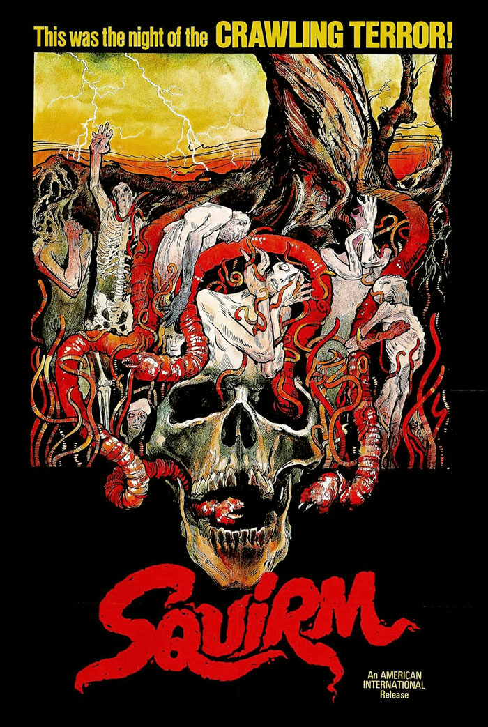
This poster by Drew Struzan turned up in my RSS feed courtesy of 70s Sci-Fi Art. So Struzan did the US poster for Squirm, thought I, …who knew? Wait a minute…are those Klimt figures?! Closer scrutiny confirmed that, yes, Struzan does indeed appear to have swiped a handful of figures from Gustav Klimt as victims for the carnivorous worms. Squirm (1976) for those who haven’t seen it, is described by The Psychotronic Encyclopedia of Film as:

Pretty bad film about electrified earthworms in Georgia that have teeth and make noises like horses. It does have an amazing scene with long worms burrowing through a man’s face. Whole rooms are filled with what looks like thick spaghetti. Don Scardino is the studious young hero. The ads claimed there were “250,000 real worms” in the film. From the director of Blue Sunshine.

Michael Weldon’s book has a very lenient attitude towards this kind of nonsense so for a film to be labelled as bad is always a warning. Having seen Squirm, I agree with Weldon’s appraisal. There were a lot of animals attacking humans in the cinema of the 1970s, thanks in part to the success of Jaws, so a story about worms on the rampage is merely another addition to the trashy pile. (The Japanese poster even managed to emulate the famous Jaws poster.) Squirm is especially ridiculous when the humble earthworm is so resistant to being any kind of menace unless its size is dramatically increased, as in Dune or Tremors, the latter being a much better horror film with its own Jaws-like poster.

klimt1.jpg

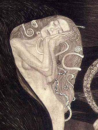
Jurisprudence (1907) by Gustav Klimt.

Struzan’s figures are based on those in Jurisprudence, one of the paintings that Gustav Klimt worked on from 1900 to 1907 for the ceiling of the Great Hall at the University of Vienna. There were three pictures—the others represented Philosophy and Medicine—but all were deemed too pornographic for public display. The paintings were subsequently destroyed in 1945 by retreating Nazi troops after having been seized from their Jewish owners and moved with other loot to the Schloss Immendorf.

klimt2.jpg

squirm2.jpg

Klimt’s Jurisprudence is the strangest of all his works, with three Furies presiding over the cowed figure of a man ensnared by evil, represented here by an octopus. Philippe Jullian in Dreamers of Decadence declares Klimt’s symbolic cephalopod to be “unique in European Art”. I alluded to the Furies, and thereby surreptitiously alluded to those tentacles of evil, when I put a Klimt-like figure into my adaptation The Call of Cthulhu in 1988.

Continue reading “Squirm: Drew Struzan versus Gustav Klimt”

Piranesi record covers

piranesi12.jpg

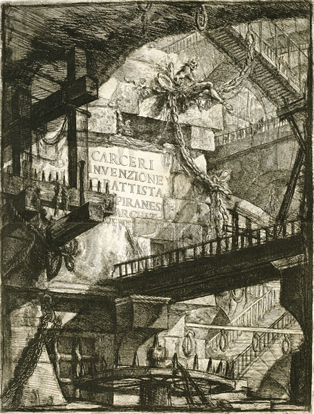
Title page for the Carceri d’Invenzione (second state), 1761.

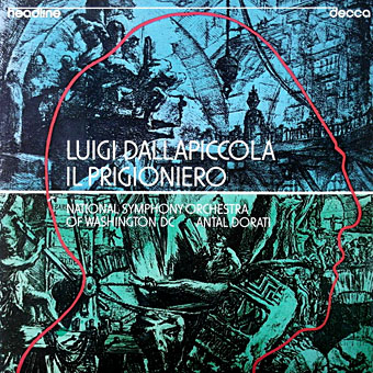
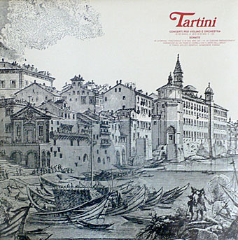
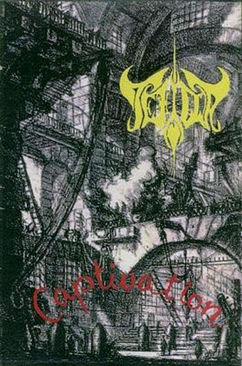
Continuing an occasional series about artists or designers whose work has appeared on record sleeves. Giovanni Battista Piranesi (1720–1778) is a cult figure here so this is an inevitable post even if there isn’t a great deal to look at. Many of the record covers that use Piranesi etchings are for classical releases, which isn’t so surprising. The prints that comprise the Vedute di Roma were Piranesi’s most popular works, and remain so today despite their exaggerations of the true size of Rome’s monuments and ruins. But I thought the Carceri d’Invenzione (aka The Prisons) might be more popular, especially in the metal world where dark and gloomy imagery is de rigueur. There may be more examples, of course, since I’m having to rely on Discogs which doesn’t always note the work of uncredited artists. I suspect that architecture alone isn’t attractive enough for the metal hordes, however vast and tenebrous that architecture might be. The covers I’ve done for metal bands have always had to incorporate figures—human or otherwise—or some kind of occult symbolism. The most prominent musical piece based on Piranesi’s Prisons is also a classical work, one of the Bach cello suites recorded by Yo-Yo Ma in 1998. Ma’s album, Inspired By Bach, was accompanied by six films from different directors; the film for Suite No. 2, The Sound of the Carceri by François Girard, shows Ma playing the piece inside a CGI rendering of Piranesi’s colossal spaces. Copies of Girard’s film come and go on YouTube so this one may not stay around.

piranesi01.jpg

Luigi Dallapiccola: Il Prigioniero (1975); National Symphony Orchestra Of Washington DC, Antal Dorati.

piranesi02.jpg

Palestrina: Missa Aeterna Christi Munera / Oratio Jeremiae Prophetae / Motetti (1976); Pro Cantione Antiqua, London.

piranesi03.jpg

Tartini: Concerti Per Violino E Orchestra / Sonate (1981); P. Toso, I Solisti Veneti, C. Scimone, E. Farina.

piranesi04.jpg

Captivation (1994) by Tefilla.

Continue reading “Piranesi record covers”

A Can pin

pin1.jpg

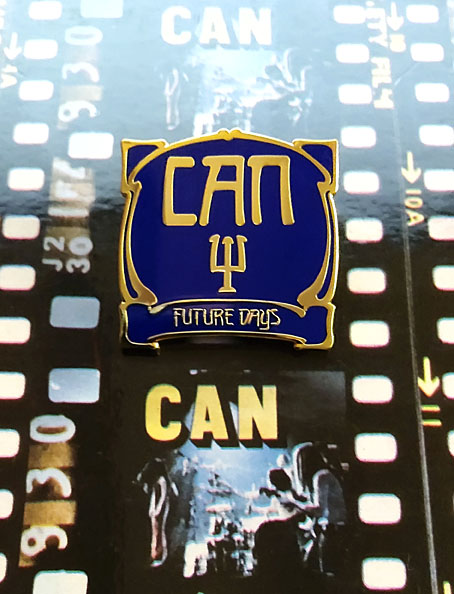
I’ve always liked badges, and I especially like the enamel pin variety even though I tend to buy them then not wear them very much for fear of losing them. This handsome item arrived a couple of days ago from an eBay seller, and is the first Can-related pin I’ve come across. After Kraftwerk, Can were the most popular of the German groups in the Britain of the 1970s but I’ve never seen any Can badges or anything else related to them from that decade aside from the records. The resurgence of interest in German music—Krautrock, if you must—has prompted the badge manufacturers who populate eBay, Etsy and elsewhere to create a number of items based on the record covers of Can, Neu!, Harmonia and others. The quality isn’t always very good but then badges in the 1970s were often crude designs as well. You can’t go wrong with a simple logo but shrinking an album cover down to 25 mm isn’t always a good idea. A couple of years ago I bought three Can badges from another eBay seller; two of them, with logo designs taken from sleeves, were okay but the third, based on the Future Days album cover was poorly printed. This pin equivalent is much better, as well as being one of the few Can sleeves you could transform in this manner. The raised gold lines are a good match for the Art Nouveau-styled design by Ingo Trauer and Richard J. Rudow which was embossed on the original German pressing. The group may have been popular in Britain but UA gave British Can-heads a flat sleeve.

pin2.jpg

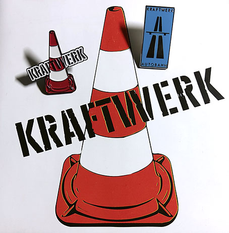
The same eBay seller also makes these Kraftwerk pins which I bought a while ago. I’d still prefer to have the traffic cone without the band name—something that only aficionados would recognise—but it was good to find a pin based on the early years of the group’s career, the period which Kraftwerk themselves have long disowned. The seller recently added a new design with the same traffic cone in green as it is on the Kraftwerk 2 album cover, but the green cone was only a variation on a theme, the orange leitkegel is the ubiquitous and definitive icon of the pre-Autobahn years.

Previously on { feuilleton }
• Holger’s Radio Pictures
• Jaki Liebezeit times ten
• Can esoterics
• Can soundtracks
• The kosmische design of Peter Geitner
• Reworking Kraftwerk (again)
• Leitkegel
• German gear
• Autobahnen
• Ralf and Florian
• Can’s Lost Tapes
• Reworking Kraftwerk
• Autobahn animated
• Sleeve craft
• Who designed Vertigo #6360 620?
• Old music and old technology
• A cluster of Cluster
• Aerodynamik by Kraftwerk

Covering Genet

pelham-genet1.jpg

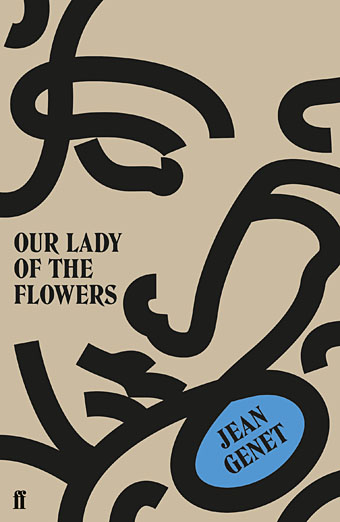
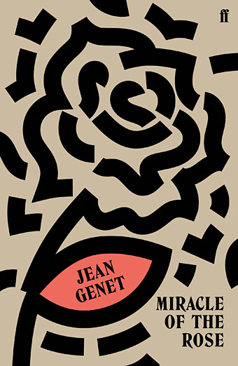
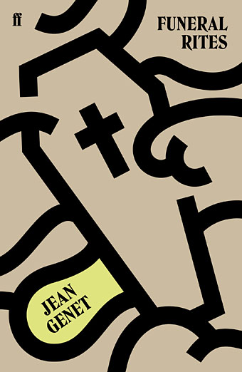
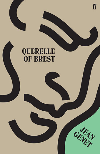
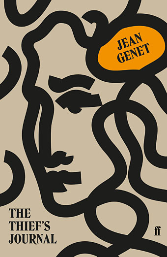
While writing Monday’s post I came across this series of new cover designs for the most recent Faber editions of Genet’s novels. I hadn’t seen these before but I liked the way they look as a set. Jonathan Pelham is the designer. At first glance the covers infringe one of my personal rules for cover design, that you should try and create something that couldn’t easily be used on another book by a different author; this is more of a challenge when a design is minimal or tending towards abstraction as these are. But Genet’s covers from British publishers have veered from the featureless (the Anthony Blond hardbacks of the 1960s) to the bizarrely random (the 1971 Penguin edition of Miracle of the Rose with a detail from Max Ernst’s Europe After the Rain—see below), so anything that looks this smart and consistent is a plus. I still like the series of paperbacks that Panther published in the early 1970s (also below) but they only did three of the books, with the Rubens typeface being a carry over from the Grove Press hardbacks designed by Roy Kuhlman. The new editions from Faber also feature new introductions by Neil Bartlett (Funeral Rites), Terry Hands (Miracle of the Rose), Jon Savage (Querelle of Brest), and Ahdaf Soueif (The Thief’s Journal).

pelham-genet2.jpg

pelham-genet3.jpg

pelham-genet4.jpg

pelham-genet5.jpg

Continue reading “Covering Genet”