Okinami letterforms

okinami4.jpg

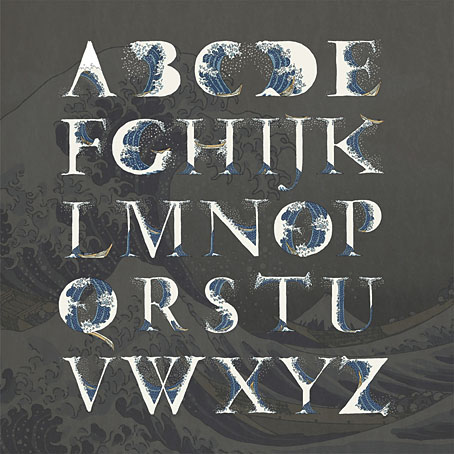
A couple of years ago I posted an incomplete collection of record covers based on Hokusai’s prints, many of which included his most famous work, The Great Wave off Kanagawa. In our age of mechanical reproduction Hokusai’s wave has become as much an emblem for Japan itself as any of the official national symbols, reproduced endlessly in a variety of media while being subject to the usual 21st-century derivations and pastiches. This is a common fate for well-known artworks but Hokusai’s wave is one of the few that are flexible enough to be mutated into a seres of letterforms (you can’t really call this a font) like the ones we have here, a design created by Indonesian designer Aditya Tri which grafts portions of the print onto Garamond serifs. The name of the design, Okinami, is the Japanese word for an offshore wave.

okinami1.jpg

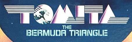
Okinami is an unusual design but this isn’t the first time that Hokusai’s wave has been combined with letterforms. When Tomita’s “Musical Fantasy of Science Fiction”, The Bermuda Triangle, was released in the West it was given new cover art, with a gatefold illustration by Don Punchatz and a title design that added the Great Wave to the modified Sinaloa typeface which by this time had become Tomita’s signature font.

tomita.jpg

Design by Joseph J. Stelmach.

Are there other examples out there? I wouldn’t be surprised. Meanwhile, Hokusai’s print will be even more visible next year when it appears on the back of the new 1000 Yen banknote. A good argument for the retaining of physical currency, and further evidence that Japan gets all the best things.

okinami2.jpg

Previously on { feuilleton }
Hokusai record covers
Waves and clouds
Tomita album covers

Les Maîtres de l’Affiche

affiche09.jpg

Alphonse Mucha.

Les Maîtres de l’Affiche was a multi-volume guide to the state of poster art in the 1890s, published in five volumes from 1896 to 1900. Being a French publication, the contents are mostly by French artists but other nations are represented—Britain, Germany, Italy, the United States—although fewer contributions than you might expect given the quantity of pages to be filled. The chief attraction of these books is the attention they give to each design, all of which are printed in colour on a full page, and the time of publication which coincides with the birth of Art Nouveau. In addition to the great Alphonse Mucha there are designs by Eugène Grasset, Henri Privat-Livemont, Georges de Feure, Will Bradley, Louis Rhead and others. There’s also a lot of cabaret stuff from Montmartre which has never been to my taste (although I like the Steinlen posters) but those designs were the typical ones of the period.

affiche12.jpg

Henri Privat-Livemont.

The first four volumes in this set may be found at Gallica (Volume 1, Volume 2, Volume 3, Volume 4) but not the fifth volume—isn’t a national library supposed to be more thorough than this?—which may be seen at NYPL. For those who prefer paper reproductions, there’s a reprint in Dover Publications’ Pictorial Archive series, The Complete “Masters of the Poster: All 256 Colour Plates from “Les Maîtres de l’Affiche”.

affiche01.jpg

Louis Rhead.

affiche02.jpg

Will Bradley.

affiche04.jpg

Joseph Sattler.

Continue reading “Les Maîtres de l’Affiche”

The Journal of Decorative Art

joda01.jpg

My workload has increased of late to a degree where I’ve not been looking at many websites that aren’t intended to fulfil some research quest or other. To this end, the Getty Research Institute has become a regular port of call, especially when the GRI section of the Internet Archive is updated regularly with many fine books that you won’t easily find elsewhere. For my purposes, the GRI is especially good with books about architecture, design and ornamentation, like this three-volume collection of The Journal of Decorative Art, “An Illustrated Technical Journal for the House Painter, Decorator, and all Art Workmen” published from 1881 to 1883. The illustrated examples are typical late Victoriana of a type I don’t always have much use for but for anyone who does the illustrations are very good, especially the spreads which were obviously intended to be copied by decorators. Some of these include lettering samples for sign-writers that range from simple post-Pugin Gothic to the excessively detailed styles that were de rigueur in the 1880s.

joda02.jpg

joda03.jpg

joda04.jpg

joda05.jpg

Continue reading “The Journal of Decorative Art”

Weekend links 691

kruger.jpg

Arcus (2019) by Markus Matthias Krüger.

• “Listeners can only make an educated guess as to what the experience of working with Slapp Happy might have done for Faust.” Fergal Kinney on the 50th anniversary of Sort Of by Slapp Happy, an eccentric intersection of Anglo-American rock and German experimentalism.

• Now that the summer is over people are making mixes again. Take your pick this week between a mix for The Wire by Shane Woolman at Stihia festival, The Observatory by Jay Keegan, or DreamScenes September 2023 at Ambientblog.

• Quantum poetics: “How Borges and Heisenberg converged on the notion that language both enables and interferes with our grasp of reality.” William Egginton explains, with a little help from Funes the Memorious.

“I feel as if I am entering Jorge Luis Borges’s Library of Babel, a universe of books and records, or maybe a labyrinth of paper and vinyl,” a flabbergasted Szwed relates. “The temptation is to read and listen to every one of them in hopes of at least finding the meaning behind Harry Smith the reader and listener.” He adds, with pointedly Borgesian anxiety, that “maybe my book is in there, already written.”

Ed Halter reviewing Cosmic Scholar: The Life and Times of Harry Smith by John Szwed

• At The Daily Heller: Photographs of lost buildings and American ruins.

• At Dennis Cooper’s: The unknowable presents…Secretly encoded.

• At The Paris Review: Six photos from WG Sebald’s albums.

Winners of the Astronomy Photographer of the Year 2023.

The Art of Cover Art: A Substack by Rachel Cabitt.

• New music: Le jour et la nuit du réel by Colleen.

Familiar Reality (1971) by Dr John | Reality Dub (Virtual Reality Mix) (1993) by Material | Reality Net (1994) by Richard H. Kirk

Ash

ash.jpg

Cover art by Clayton Welham.

I’ve been doing the design duties on albums and singles by Emptyset since their first self-titled release in 2009. The latest album from the electronic duo, Ash, is also the 50th release on the Subtext label for which I’ve once again provided a minimal layout. I’ve no idea how the images by Clayton Welham were created, and I’m quite happy not knowing. Ash is available for pre-order ahead of its release next month.

Work announcements here have been rather scarce of late, in part because I’ve been working on a major project which is nearing completion and will no doubt be announced soon. Watch this space.