Queer Noise in Manchester

queer_noise.jpg

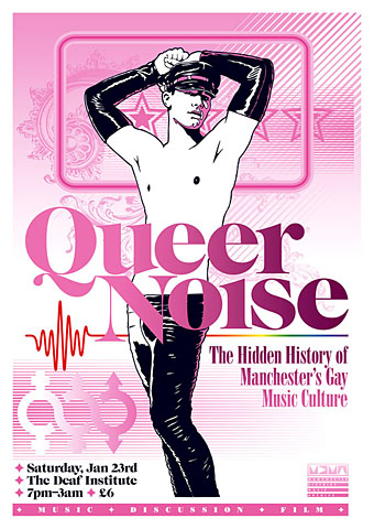
A reminder that the Manchester District Music Archive‘s Queer Noise event (for which I designed posters and flyers) takes place this Saturday.

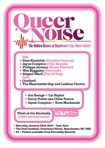
Join us on Saturday 23rd January 2010 at The Deaf Institute for a one-off celebration of gay music in Manchester.

The line-up includes:
DJs: Dave Kendrick (Paradise Factory) • Jayne Compton (Club Brenda) • Philippa Jarman (Aytoun/Homo Electric) • Wes Baggaley (Terrorist)

Live Music: (hooker) • The Manchester Lesbian and Gay Chorus

Discussion: Jon Savage • Dave Kendrick • Liz Naylor • Jayne Compton • Gerry Potter aka Chloe Poems

Tickets are £6 are now available from Piccadilly Records.

ONLINE EXHIBITION
We will follow this event with an online exhibition scheduled for March 2010, curated by Jon Savage. If you have any flyers, posters, photos, footage or info relating to gay music in Manchester from the 1940s onwards, do get in touch at: info@mdmarchive.co.uk

queer2.jpg

Previously on { feuilleton }
Queer Noise and the Wolf Girl

Secession posters

secession1.jpg

Alfred Roller (1901 & 02).

A selection of posters for the Vienna Secession at Lawrence University’s Art of the Poster site. Alfred Roller’s stylised lettering on the poster below was famously adapted by Wes Wilson for his psychedelic designs in the 1960s.

secession2.jpg

left: Koloman Moser (1902); right: Alfred Roller (1903).

Previously on { feuilleton }
The art of Henri Privat-Livemont, 1861–1936
Wilhelm Kåge
Art Nouveau illustration

A profusion of Peake

gormenghast_box.jpg

Bellgrove, young Titus and Barquentine by Mervyn Peake. Case designed by Robert Hollingsworth.

I’d thought about posting the covers of my boxed set of Gormenghast paperbacks a couple of years back when there was a flurry of blogospheric attention being given to Penguin cover designs…thought about it then never got round to it. The reason for doing so now is twofold: firstly I’ve been re-reading the books, and secondly some Gormenghast-related news emerged this week which gives this post an additional relevance.

gormenghast1.jpg

Fuchsia by Mervyn Peake.

The set of Peake paperbacks which Penguin published in 1968 (and their subsequent reprints) were the first editions of Peake’s trilogy which I encountered so I can’t help but regard them as the ones, the only copies I could countenance reading. That may change, however (see below). I’ve no idea how scarce the boxed edition is but the books are reprintings from 1970 so I presume Penguin put out a boxed gift set to make the most of Peake’s posthumous success. I always liked the presentation which is the standard Penguin Modern Classics format of the period, it leaves to you how much you want to regard the books as works of fantasy or simply novels of a rather grotesque and highly imaginative reality. Titus Groan‘s sketch of a glowering and thoroughly unglamorous Fuchsia was a daring choice for a cover intended to lure a newer, younger audience to Peake’s work. The drawing says a great deal about the author’s unsentimental attitude towards his creations; compared to the florid and often delicate covers of the fantasy books being published by Ballantine in the late Sixties (a series which included the Gormenghast trilogy), it seems shockingly unpleasant.

Continue reading “A profusion of Peake”

More science fiction covers

sfcovers.jpg

These science fiction cover galleries are becoming so ubiquitous it hardly seems worth cataloguing a new discovery. However… This pair are from the George Kelley Paperback and Pulp Fiction Collection at the University of Buffalo Libraries:

The UB Libraries’ George Kelley Paperback and Pulp Fiction Collection includes over 30,000 pulp fiction books and magazines. A selection of cover art images, representing more than 500 crime fiction and science fiction volumes found in the Kelley Collection, is featured in UBdigit. Colorful and dynamic, the cover art highlights a variety of artistic themes and imagery, reflecting the social and cultural trends of the period in which these covers were created. (More.)

The documentation is rather scant, unfortunately, but I recognised the Driftglass cover as being by Bob Pepper while the Brian N Ball (who he?) cover is a splendid piece of work by Kelly Freas which can be seen at a larger size and free of type here.

Elsewhere on { feuilleton }
The book covers archive
The illustrators archive

Previously on { feuilleton }
The art of Bob Pepper

The Art of Fontana Modern Masters

fontana1.jpg

Design by John Constable, painting by Oliver Bevan (1971).

James Pardey was in touch again this week with news of his a book cover site which follows his earlier (and justly praised) Art of Penguin Science Fiction. The new site The Art of Fontana Modern Masters presents the abstract cover designs for Fontana’s collection of pocket-sized introductions to notable writers, philosophers and scientists. My own copy of the Joyce volume from the initial run of the series is shown above. A note on the back cover states that Oliver Bevan’s painting is part of a single work arranged across ten books which “can be rearranged to form a variety of patterns”. In a pitch to some presumed “collect-the-set” mentality among intellectuals, this idea was continued on later books in the series and James’s site gives an idea of how the covers might be arranged. Until I saw all these covers together I hadn’t realised how impressive the series looks. As with the Penguin site there’s copious information about the production and evolution of the designs.

fontana2.jpg

If that’s not enough, James has a short essay about the series at Eye magazine and HarperCollins (who bought out Fontana) are producing a fine art print of the entire run of covers as shown above. For more details about that, go here.

Elsewhere on { feuilleton }
The book covers archive

Previously on { feuilleton }
Penguin science fiction