Orphic Egg album covers

orphic12.jpg

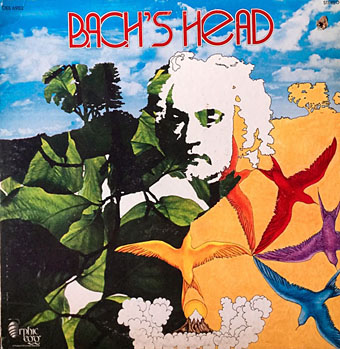
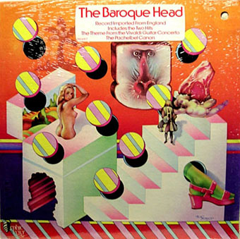
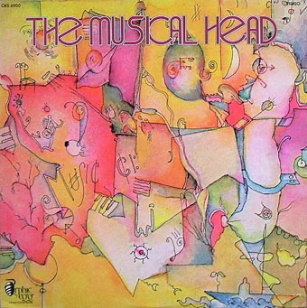
This is a record label I’d not come across before. According to this page Orphic Egg “was a subsidiary label for London Records which was formed in 1972 and lasted about a year. The label was formed to try to capture classical music for the counterculture youth of the time (often called ‘heads’). Liner notes were written by hip rock critics respected by the youth.” According to Discogs the first release, The Baroque Head, was 1971. The covers below follow in chronological order through to 1973. With the exception of the Edgard Varèse album all the releases are compilations of older recordings grouped by composer or theme.

orphic01.jpg

Discogs doesn’t give credits for all the cover art but the series was the work of several different illustrators with George McGinnis being responsible for the design. Jason Roberts’ cover for the Mussorgsky album is a suitably wild piece of late psychedelia for a collection that includes Night On Bald Mountain. There’s a nod there to the Chernobog from Disney’s Fantasia, while the Scriabin cover is an overt swipe from an original piece by Jean Delville. The Mussorgsky album is also notable for the bizarre and unique conjunction of music conducted by Herbert von Karajan and liner notes by Lester Bangs. I have to wonder what the haughty maestro of the Berlin Philharmonic would have made of the sleeve if he ever saw it.

orphic03.jpg

Continue reading “Orphic Egg album covers”

London: Signs and Signifiers

nico01.jpg

By coincidence, two of the projects I was working on in the summer are released this week. First up is London: Signs and Signifiers, a collection of Nico Hogg’s photographs of the streets and architecture of London’s East End. I’ve mentioned Nico’s photography before as his pictures have been used on several of the albums and singles I’ve designed for Keysound Recordings, some of which are featured in the book. This is being published as part of the Keysound catalogue, with a launch event taking place today (the 8th) at the Doomed Gallery, London. See this post for details, and a link to download a free chapter.

nico02.jpg

Nico’s work is notable for the way it avoids the stereotype of the style of urban photography that presents deprived or run-down areas in grim monochrome. Nico doesn’t avoid the decay—there are shots of burned-out flat-blocks, and a chapter devoted to the recent Tottenham riots—but the colour in his pictures shows a different side to these areas of the city.

nico03.jpg

My design for the book follows the minimal approach I’ve used on the Keysound albums, organising the information clearly and giving the photos as much room as possible. The font used for the titles and chapter headings is Transport, the typeface designed by Jock Kinneir and Margaret Calvert used on roads signs throughout the UK.

nico04.jpg

Continue reading “London: Signs and Signifiers”

Weekend links 287

hugo.jpg

Cover by Valentine Hugo for Contes Bizarres (1933) by Achim d’Arnim. See Hugo’s interior illustrations here.

• “In spite of the blood-drinking pursuits of Rollin’s protagonists, there’s very little in the way of body horror to be found. His undead are sensual, romantic creatures that are frequently delicate of mind and body. These movies attempt to evoke nuanced emotional responses with their mixture of romance, loss, eroticism, and tragedy.” Tenebrous Kate on Sex, Death, and the Psychedelic Madness of Jean Rollin.

• “Late at night, [Melville] ‘turned flukes’ down Oxford Street as if he were being followed by a great whale, and thought he saw ‘blubber rooms’ in the butcheries of the Fleet Market.” Philip Hoare on Herman Melville’s time in London.

Haunted by Books, a new collection of writings by Mark Valentine, “explores the more curious byways of literature.” Full details at the home of the esoteric, Tartarus Press.

I am completely an elitist, in the cultural but emphatically not the social sense. I prefer the good to the bad, the articulate to the mumbling, the aesthetically developed to the merely primitive, and full to partial consciousness. I love the spectacle of skill, whether it’s an expert gardener at work, or a good carpenter chopping dovetails, or someone tying a Bimini hitch that won’t slip.

Art critic Robert Hughes quoted in a review by Siri Hustvedt of The Spectacle of Skill: Selected Writings of Robert Hughes

• “Art, art – I couldn’t give a crap about art.” Oscar Wilde’s nephew, Arthur Cravan, puts in another appearance at Strange Flowers.

• “The Tarot is utterly fascinating,” says Evan J. Peterson discussing his Tarot-inspired writing with Tarot Poetry.

Manuel Göttsching: “A lot of crazy music happened at the end of the ’60s, very strange, and very curious…”

• Mixes of the week: Secret Thirteen Mix 169 by Chra, and 28th November 2015 by The Séance.

Czech Artists’ Radical Book Designs of the Early 20th Century

• Ten things you might not know about Yayoi Kusama.

• More megaliths: Francis Pryor on ritual landscapes.

Peaches gets wild in the desert: Rub (uncensored).

Irmin Schmidt‘s favourite records (this week)

Mount Etna erupts

Rituals (1981) by Bush Tetras | Ballet For A Blue Whale (1983) by Adrian Belew | Etna (2006) by Boris & Sunn O)))

Berlin bookplates

bookplate13.jpg

Not all the bookplates here are German, the selection includes examples from Franz von Bayros and Walter Crane. The plates are from the 1907 proceedings of the Ex Libris Association of Berlin. I’d not seen anything by Mathilde Ade before but a quick search reveals her to have been a prolific bookplate illustrator. There’s more of her work here (and that blog is also worth a browse).

bookplate07.jpg

bookplate08.jpg

Continue reading “Berlin bookplates”

Library of Congress bookplates

bookplate03.jpg

Artist: Phil May (1895).

The bookplates housed at the Library of Congress aren’t all available for online viewing which is a shame when their collection includes notable examples such as these. Three of the plates here were designed by the artists whose books they identified; two of the others are for writers—Edgar Rice Burroughs and Jack London—while the sixth one is for Charlie Chaplin. The artists’ plates look like continuations of the work of their creators which makes them less interesting than those of the writers and actor, all three of which say something about the way these men saw themselves reflected in their work: the pantheon of characters from Burroughs’ fiction; Chaplin’s poor boy conquering London; and Jack London’s lone wolf daring you to try to steal his book.

bookplate06.jpg

Artist: Frederic Remington (between 1880? and 1909).

bookplate02.jpg

Artist: Studley Burroughs (between 1914 and 1922).

Continue reading “Library of Congress bookplates”