The art of Willem Arondeus, 1894–1943

arondeus06.jpg

Salomé (1916). “Your eyes are like black holes burned by torches in a Tyrian tapestry.”

This marvellous Salomé design is by a Dutch artist I hadn’t heard of before, Willem Arondeus, who might have had a longer career had his life not been cut short by a Nazi firing squad in 1943. Arondeus helped with the Dutch Resistance during the war, forging papers for fleeing Jews, and bombing the Amsterdam Public Records Office. His work warrants a place in the ever-popular gay artists archive not for any homoerotic qualities but because Arondeus was open about his homosexuality for his entire life, his last message to the world being “Let it be known that homosexuals are not cowards.” The work that can be seen online is in that hybrid style that you see a lot from the 1920s on, a blending of the prevalent Art Deco manner with some hangover from the Art Nouveau period. The Salomé piece is particularly good for the way it entangles Salomé’s figure in writhing foliage and clustered architecture.

arondeus05.jpg

De Elfenzetel (1919).

arondeus04.jpg

Stamp advert (1923).

Continue reading “The art of Willem Arondeus, 1894–1943”

Weekend links 292

splendor.jpg

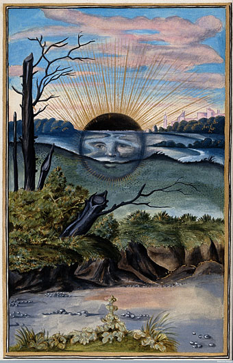
The Black Sun from Splendor Solis (1582) “attributed to the legendary figure Salomon Trismosin”.

Topic B predominates this week. The Black Sun of alchemy was the first thing I thought of when the title of David Bowie’s final album was announced late last year. The Black Sun symbolises the nigredo stage of the alchemical process when putrefaction or decomposition takes place; Carl Jung in Psychology and Alchemy equates the nigredo with the dark night of the soul. At the time I didn’t seriously think that the Bowie of 2015 would have had this in mind as a primary reference even though the Bowie of the early 1970s was immersed in Golden Dawn occultism, the Kabbalah, and a reader of Pauwels & Bergier’s The Morning of the Magicians, a book that informs the lyrics of the Hunky Dory album, and which contains a great deal of discussion about alchemy and other esoteric matters. And yet… Of all the outfits that Bowie might have worn in his final video the one that he chose for Lazarus is a match for the one he wore during the Station To Station Kabbalah-drawing photo session. At Sol Ascendans Alex Sumner and his commenters explored this twilight zone.

Back in the sublunary world, Jonathan Barnbrook’s cut-out sleeve design for the Blackstar album gained additional resonance this week: the black star as the hole that’s left when a more familiar star has been removed from its setting. Hindsight also makes poignant the observation that this was the only album without a picture of the artist on the cover. Elsewhere there were speculations about the title being a reference to Black Star by Elvis Presley (who shared a birthday with Bowie) or a term from oncology, two suggestions that fit so well they’re hard to ignore.

He began to develop a science fiction sensibility, drawing on the New Wave SF movement of Michael Moorcock and JG Ballard, other writers who used the genre such as Anthony Burgess and William S Burroughs, and an older fantasy tradition found in HP Lovecraft and Edward Bulwer-Lytton (whose The Coming Race is name-checked in Oh! You Pretty Things, 1971).

Jake Arnott on David Bowie’s literary influences

• In something-else-also-happened-this-week news, 2016 may see the long-awaited release of Andrei Tarkovsky’s films on Region B Blu-ray. Fingers crossed.

• International posters for The Man Who Fell To Earth. More Nicolas Roeg (and more shiny discs): Eureka (1983) will receive a Blu-ray release in March.

• Cracking the codes of Leena Krohn: Peter Bebergal on the Finnish writer of strange stories.

• Anthems for the Moon: Jason Heller examines David Bowie’s connections to science fiction.

• From 2013: Jon Savage on Bowie’s first meeting with William Burroughs in 1974.

• Mixes of the week: Bowie-esque Vol 1 and Bowie-esque Vol 2 by Abigail Ward.

David Bowie Doing Shit: a Tumblr

“Heroes” (1978) by Blondie & Robert Fripp | “Heroes” (2003) by King Crimson | “Helden” (2007) by Apocalyptica ft. Till Lindemann

Neutron designs

neutron2.jpg

The Bowie overload this week had me thinking again about Derek Jarman’s unmade science-fiction film, Neutron, an apocalyptic work that would have starred David Bowie if the finance had been forthcoming. Jarman’s description in an earlier post about the film remains tantalising:

There are six published manuscripts of Neutron, which zig-zag their anti-heroes Aeon and Topaz across the horizon of a bleak and twilit post-nuclear landscape. ‘Artist’ and ‘activist’ in their respective former lives, they are caught up in the apocalypse, where the PA systems of Oblivion crackle with the revelations of John the Divine. Their duel is fought among the rusting technology and darkened catacombs of the Fallen civilization, until they reach the pink marble bunker of Him. The reel of time is looped—angels descend with flame-throwers and crazed religious sects prowl through the undergrowth. The Book of Revelations is worked as science fiction.

Lee [Drysdale] and I pored over every nuance of this film. We cast it with David Bowie and Steven Berkoff, set it in the huge junked-out power station at Nine Elms and in the wasteland around the Berlin Wall. Christopher Hobbs produced xeroxes of the pink marble halls of the bunker with their Speer lighting—that echo to ‘the muzak of the spheres’ which played even in the cannibal abattoirs, where the vampire orderlies sipped dark blood from crystal goblets.

neutron.jpg

This is one of those great what-if projects along with Jodorowsky’s film of Dune, Nicolas Roeg’s Flash Gordon, and others, so it was a surprise to discover a handful of recent designs for Neutron produced by students at the Wimbledon College of Art. The video here is a short collection of stills by Jonny Blackmore. There’s another of his pieces here, and further designs by Gabrielle Cole here and here. I’m guessing that these were part of a college assignment but if anyone knows otherwise please leave a comment. As to the original Neutron, some version of the script must still exist (Jon Savage was apparently involved in later stages) as must Christopher Hobbs’ designs. Maybe we’ll see them in a book one day.

Previously on { feuilleton }
Derek Jarman’s Neutron

Single sleeves

singles01.jpg

A septet of 7-inch single sleeves from Eastern Bloc Songs, a small but well-selected repository of sleeve art from the record labels of the Eastern Bloc. I’d looked at the album art before but had missed the singles, some of which feature more impressive designs than their 12-inch counterparts. Of special interest are designs that show how the psychedelic styles of the decadent West were transmuted for a Communist audience. The Nautilus sleeve above dates from 1969, and uses the lettering adapted by Wes Wilson from a much earlier design by Alfred Roller. Elsewhere the generic sleeves from venerable Czech label Supraphon stand out for their modish graphics. (Via Record Envelope and Things Magazine.)

singles02.jpg

singles03.jpg

Continue reading “Single sleeves”

Vintage Mishima

vintagemishima01.jpg

Penguin reprinted several volumes of Mishima in their Vintage line in 2010 with covers designed by Anna Crone. Seven of the covers are shown here although there are one or two more, not all of them available as large images. (Not for the first time I wonder why major publishers don’t make their new covers available at a decent size.) I’d have been wary of using Hokusai’s waves on a Mishima cover but colouring the water red makes it readable as a wave of blood.

vintagemishima02.jpg

vintagemishima03.jpg

Continue reading “Vintage Mishima”