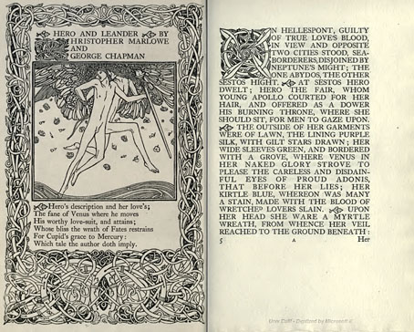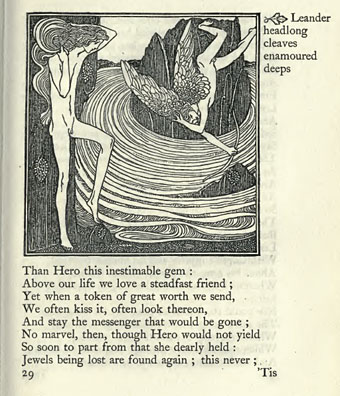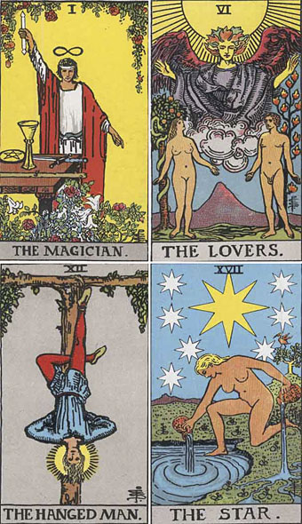
Following yesterday’s post about Frieda Harris’s Tarot designs, it only seems right to acknowledge the other major Tarot artist of the 20th century. Pamela Colman Smith has been overshadowed by her male mentor, Golden Dawn scholar AE Waite, even more than Frieda Harris whose name at least gets mentioned as much as Crowley’s in discussion of her paintings. US Games lists Smith and Waite’s so-called Rider-Waite Tarot of 1909 as “the world’s most popular tarot deck” and uses a silhouette of Smith’s design for The Fool as the company logo, yet it was years before I saw a credit for Smith as artist of this deck, her personal presence being reduced to a tiny monogram in the corner of each picture.
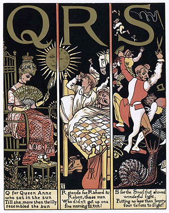
The Absurd ABC by Walter Crane (1874).
I’ve often thought of Smith’s deck as “the Art Nouveau Tarot” which it isn’t really—it’s more late Victorian in style, if anything—but it was created when Art Nouveau was at its height and has some of the character of the poster art of the period. Smith’s designs are incredibly striking in places, with the clarity of drawn archetypes, and her style possibly owes something to the books Walter Crane created for children in the 1870s and 1880s; the clean lines and bright colouring are very similar. In that respect, Smith’s deck might be more fittingly labelled “the Arts and Crafts Tarot.”
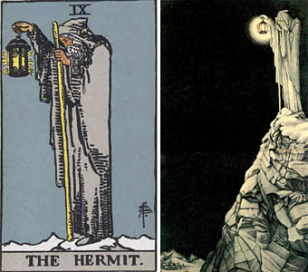
left: Pamela Colman Smith’s Hermit; right: Barrington Colby’s inner sleeve for Led Zeppelin IV.
Pamela Colman Smith also worked as a book illustrator but her other work is overshadowed completely by the popularity of the Rider-Waite cards. Her design for The Hermit was famously borrowed by Crowley obsessive Jimmy Page in 1971 for a gatefold illustration, View in Half or Varying Light by Barrington Colby, on Led Zeppelin IV. This use alone makes it possibly the most famous Tarot card in history (there was even a statue made of it for the now defunct Hard Rock Park Led Zeppelin roller coaster) but I doubt many people familiar with the image could name the original artist.
Happily, Ms Smith’s obscurity is gradually diminishing. US Games recently produced the Pamela Colman Smith Commemorative set for the 100th anniversary of the Rider-Waite deck, a package featuring a book of her artwork (including non-Tarot drawings), prints, postcards and a reprinted set of cards. A long overdue reappraisal but, as is always the case, it’s better late than never.
Mary K Greer’s Tarot blog has some excellent postings devoted to Pamela Colman Smith including this page which gathers links to sites containing further information about the artist’s life and work.
Elsewhere on { feuilleton }
• The illustrators archive
Previously on { feuilleton }
• Layered Orders: Crowley’s Thoth Deck and the Tarot
• William Rimmer’s Evening Swan Song
• The art of Cameron, 1922–1995