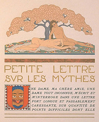
Les Murailles de Samaris by Schuiten & Peeters

map.jpg

The Obscure World.

Les Murailles de Samaris (1983) by François Schuiten and Benoît Peeters is the first of the stories which explores the world of Les Cités Obscures, a “counter-Earth” on the opposite side of our Sun with a continent of separate city-states, each with their own distinct architectural style. Having discovered these stories first in their French editions it wasn’t immediately apparent how much the Obscure World was supposed to be connected to our own; a number of the books contain references to people or places in our world, while the city of Brüsel, subject of the book of that name, is a kind of parallel Brussels. The counter-Earth explanation isn’t given in the early books but seems to have evolved later, as does Schuiten and Peeters’ introduction of portals between the worlds which imply a two-way leakage of influence. Writer and artist encourage readers of the series to suggest or “discover” new portals to the Obscure World.

samaris1.jpg

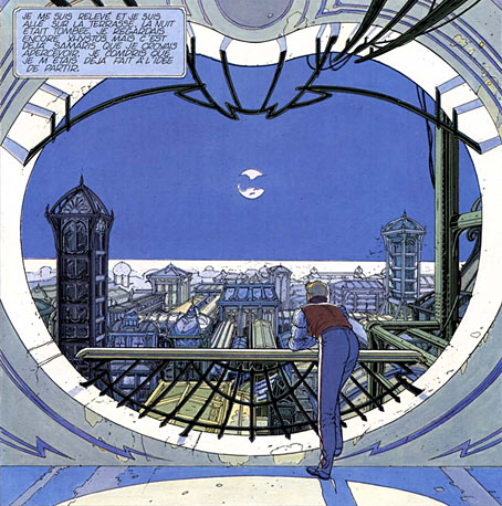
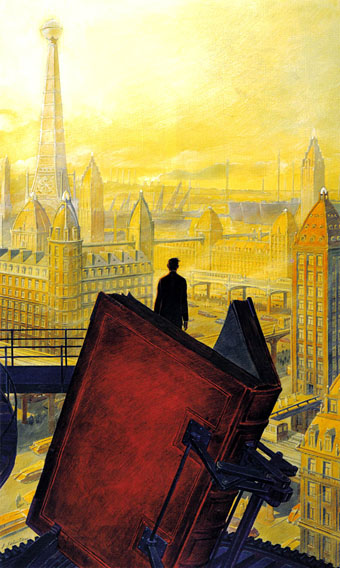
A view over Xhystos.

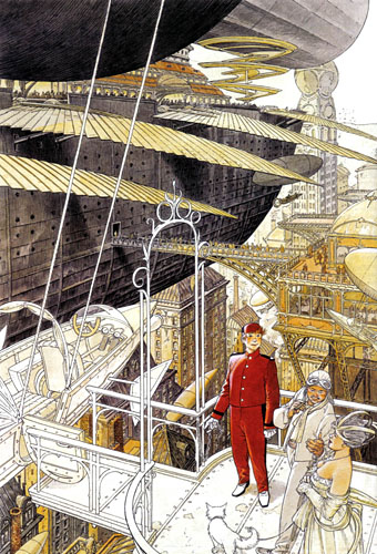
The distant city of Samaris is the mysterious destination of Les Murailles de Samaris (The Walls of Samaris). The story begins in the city of Xhystos whose style is fully Art Nouveau in a manner reminiscent of the celebrated Belgian architect Victor Horta, if Horta had been allowed to design a city where every building is decorated with wrought-iron curves and glass-canopied roofs, and where trams go by on elevated roads several storeys high. The narrator, Franz, is informed by the city authorities that he’s been chosen to go on a perilous mission to discover whether rumours about the nature of Samaris are true or not. Previous explorers have failed to return so Franz’s friends and girlfriend regard his acceptance of the mission as suicidal. What follows is a journey by steam train out of the city into a surrounding zone of lawless ruins, then a journey by “altiplane” and “aerophele”, the latter being a kind of multi-winged sand yacht.

Continue reading “Les Murailles de Samaris by Schuiten & Peeters”

The art of François Schuiten

schuiten1.jpg

Paris au XXieme Siecle by Jules Verne (1994).

Following a comment I made last week in the post about the Temples of Future Religions by François Garas I’ve decided it’s time to give some proper attention to one of my favourite comic artists, François Schuiten, a Belgian whose obsession with imaginary architecture resembles the earlier endeavours of Garas and others. Schuiten’s parents were both architects which perhaps explains his predilection. In addition to a large body of comics work, he’s produced designs for film—notably Taxandria by Raoul Servais—Belgian stamps, and a steampunk makeover for the Arts et Métiers station of the Paris Métro. In 1994 he created cover designs and a series of illustrations for the publication of Jules Verne’s rediscovered manuscript, Paris au XXieme Siecle.

schuiten2.jpg

Cover for Spirou (2000).

I first encountered Schuiten’s work in a 1980 issue of Heavy Metal magazine which was reprinting translated stories from the French Métal Hurlant along with original work. Schuiten’s story, The Cutter of the Fog, was an erotic and futuristic tale of a small community and the obsession of the local “fog-cutter”. François’s brother Luc wrote the piece and it bears some similarity with JG Ballard’s Vermilion Sands story, The Cloud Sculptors of Coral D. Unusually for Schuiten, the architecture was downplayed in this one although the small homes with their geodesic roofs are like extrapolations of architectural plans from one of the Whole Earth Catalogues.

The next time I saw his work was several years later when artist Bryan Talbot showed me some of the comic albums he’d brought back from a European convention. Among these there were several of the Cités Obscures books that Schuiten had been creating during the Eighties and Nineties with writer Benoît Peeters. These knocked me out with their apparently effortless creation of an imaginary world comprised of several city states, each with their own unique architectural style, and a wealth of retro-future technology, from dirigibles of all shapes and sizes to ornithopters and huge motorised unicycles. One of the many things I liked about European comic artists, and something which made me favour their work over their American counterparts, was the creation of richly detailed imaginary universes with inhabitants one could expect to meet in our world, not facile superheroes or vigilantes. Schuiten went further than his contemporaries by making the architecture meticulously believable and foregrounding its design to an extent that in some of the Cités Obscures stories architecture itself is the subject.

Continue reading “The art of François Schuiten”

The art of George Barbier, 1882–1932

barbier1.jpg

Les Chansons de Bilitis (1922).

I’ve posted examples of George Barbier’s Art Deco drawings before but online examples of his work outside the world of fashion illustration have been difficult to find. The Bunka Women’s University Library corrects that with a collection of high-quality scans which include a book about the artist, George Barbier, Étude Critique (1929) by Jean?Louis Vaudoyer. There’s also his adaptation of the Sapphic classic by Pierre Loüys, Les Chansons de Bilitis, from 1922. The drawings there lack the customary ardour of other adaptations but they’re marvellously elegant nonetheless, with some beautiful page designs.

Note: these books can’t be linked to individually, you need to follow the links from “Art Deco illustrated books” in their site menu.

barbier2.jpg

Nijinsky (1913).

barbier3.jpg

Poèmes en Prose (1928).

Elsewhere on { feuilleton }
The illustrators archive

Previously on { feuilleton }
The Decorative Age
Images of Nijinsky

Design as virus 10: Victor Moscoso

india.jpg

Continuing an occasional series.

A recent post at A Journey Round My Skull is a stylish series of Indian book jackets from 1964 to 1984. These impress partly for the way they rework western design approaches, and they consequently look very different from the florid visuals one might (lazily) expect of Indian cover design. Western culture borrowed more than enough from India in the 1960s, from clothes to music, so it only seems right that the sub-continent should be free to take something back.

luna.jpg

Luna Toon by Victor Moscoso (1968).

Will at A Journey Round My Skull mentions the above cover design as reminding him of this Krautrock bible, The Crack in the Cosmic Egg, a book which happens to be a favourite repository of musical obsession. The cover reminded me more of the weirdly abstract comic strips created by artist and graphic designer Victor Moscoso for the early run of Zap Comix in the late Sixties. Moscoso was one of the most graphically revolutionary of the West Coast poster artists, and his approach to comics looks surprisingly fresh today next to the work of fellow artists like Robert Crumb. Those limitless vistas go back to Giorgio de Chirico but it was Salvador Dalí who made deserts raked by evening shadows reflect interior landscapes of his own, and it was Dalí’s immense popularity that in turn popularised that endless plane as a stage for surreal events. Moscoso borrows from the Surrealists and comic artists like George Herriman as much as he borrows from Disney; in his posters he was one of many artists taking motifs or whole designs from Art Nouveau. Our Indian egg may well be an original work but the first example in Will’s post is a very Saul Bass-like hand, so I’m guessing that the designers of these books were looking around for inspiration. And that eye-in-a-hand? Moscoso had done that as well.

neon.jpg

Blues Project Poster by Victor Moscoso (1967).

While we’re discussing Victor Moscoso, it’s convenient to draw attention to a slight mystery connecting his poster art and the great album cover designer, Barney Bubbles. The poster above was one of a number that Moscoso made incorporating Victorian or Edwardian photographs, and two at least of these use antique erotica as their central image.

ritual.jpg

Space Ritual interior, design by Barney Bubbles (1973).

This particular photo always stands out for me. The woman is familiar to anyone who’s seen the interior of the fold-out sleeve Barney Bubbles created for Hawkwind’s Space Ritual album in 1973. Barney spent some time in San Francisco in the late Sixties and was undoubtedly familiar with Moscoso’s work, as he was with all the great designs coming from the West Coast at that time. What surprises me is that he should have somehow found the same image to use as Moscoso did. Was there a popular book of Edwardian erotica which everyone was familiar with? Did he ask Moscoso where he’d found the photo? Did he find it by chance? Barney Bubbles experts don’t know the answer (I’ve asked) and the question is in any case a rather trivial one. But I’m still curious… As early porn photos go it’s a particularly fine one and I’d like to know whether there are more like it and where it came from. Needless to say, if anyone knows more about this, please leave a comment.

Previously on { feuilleton }
Design as virus 9: Mondrian fashions
Design as virus 8: Keep Calm and Carry On
Design as virus 7: eyes and triangles
Design as virus 6: Cassandre
Design as virus 5: Gideon Glaser
Design as virus 4: Metamorphoses
Design as virus 3: the sincerest form of flattery
Design as virus 2: album covers
Design as virus 1: Victorian borders

Outer Alliance Pride Day

outer.jpgToday is Outer Alliance Pride Day so let’s begin with a statement:

As a member of the Outer Alliance, I advocate for queer speculative fiction and those who create, publish and support it, whatever their sexual orientation and gender identity. I make sure this is reflected in my actions and my work.

Various members of the Outer Alliance are either posting fiction, or reviewing something or otherwise attempting to fill that declaration of intent. For my part I decided today to do a sketch based on my favourite chapter of The Ticket that Exploded by William Burroughs, the sequence entitled the black fruit which Burroughs wrote with Michael Portman. Ticket was the first Burroughs book I read at the age of 16 or so, having discovered a copy in a local library, and it really felt like something exploding in the head. For a start, the text is some of his least accommodating for an average reader, although I was already familiar enough with literary experiment to cope with that. Far more electrifying was seeing familiar scenarios from science fiction and fantasy infused with a raw and relentless gay sexuality of endless erections and spurting cocks. The black fruit begins with a science fiction scene of lost astronauts encountering alien fishboys intent on having sex; it then progresses through a series of descriptions which read like a pornographic rewriting of similar scenes from HP Lovecraft or Clark Ashton Smith. In the opening pages of Ticket, Burroughs describes his book as “science fiction” but this was like no sf I’d read; I started to wish there was more like it. There are flashes of similar stuff in The Soft Machine (including an idea borrowed from Henry Kuttner) and elsewhere, and Cities of the Red Night is pretty much a full-on fantasy in its second half, but I’d still like to read more about the fishboys…

fishboy

Fishboy and Astronaut (detail).

So here’s an explicitly erotic sketch based on the black fruit (click the picture for the full thing). This should have been a lot better but I’m out of practice drawing at the moment and I didn’t give myself enough time. The scene doesn’t really match the book either, and the astronaut figure is pretty crappy. Feeble excuses aside, Burroughs’ rotting swamp gardens with their marble statues of copulating boys deserve better. And where his fiction leads, I’m still hoping that more writers will follow, not by copying his obsessions but by being as fearless and honest in mining their own.

Previously on { feuilleton }
William S Burroughs: A Man Within
The art of NoBeast