Innsmouth, Japanese-style

innsmouth3.jpg

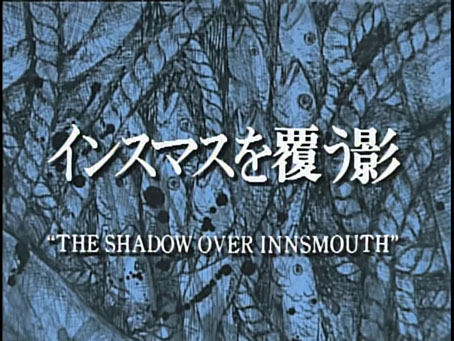
When it comes to film and TV dramas based on the writings of HP Lovecraft I’ve always been very selective, to a degree that I avoid most adaptations unless they receive reviews good enough to provoke my curiosity. I do, however, keep an eye out for unusual (or unusually inventive) adaptations whose shortcomings I’m prepared to forgive if they promise to be more than another wearying trudge through cinematic cliches. Such is the case with this Japanese TV adaptation of The Shadow Over Innsmouth which was written and directed by Chiaki Konaka in 1992.

innsmouth1.jpg

Konaka’s adaptation isn’t immediately attractive, being shot entirely on video, a very unsympathetic format for horror productions when the harshness of the image works against any attempts to create an eerie atmosphere. (Even The Stone Tape suffers in this area.) Konaka presents a sketch of Lovecraft’s story which he updates to the present day and moves to contemporary Japan, with no explanation as to why the Japanese coastline is a home to towns with names like “Innsmouth”, “Arkham” and “Dunwich”. Lovecraft’s detailed history of the blighted backwater and its inhabitants is also ignored. Konaka’s narrative begins with an unnamed photo-journalist (Renji Ishibashi) securing a job at a travel magazine where he convinces the editor that the remote coastal town of “Insumasu” is worthy of a feature. As with the anonymous narrator of Lovecraft’s story, the photographer is drawn to the place as much by ancestral impulses as by his curiosity about a place where a strange fish-human corpse has been washed ashore.

innsmouth2.jpg

Konaka’s direction is more functional than suspenseful, with the photographer’s biographical history telegraphed so much in advance that none of the revelations come as a surprise. The soundtrack is also very uneven, being a collage of music borrowed from other films: there’s a brief snatch of Goblin’s Suspiria score at one point, and I think the repeated flute refrain is borrowed from a Preisner score. This is a well-made adaptation all the same even if the Japanese Innsmouth isn’t as deteriorated as the decayed fishing town that Lovecraft describes. (To be fair, any film depicting Lovecraft’s Innsmouth would require a serious budget to do the place justice.) Fishy details abound, and Konaka uses green light as a recurrent motif that refers to Innsmouth’s secret history, like an inversion of the emerald glow that signifies magic or the supernatural in John Boorman’s Excalibur. I was especially pleased to see borrowings from the George Hay Necronomicon during a cermonial invocation to Dagon that takes place in a cave. Later on we see a copy of the Hay book being perused by the curator of the Innsmouth museum. This makes a change from the tiresome ubiquity of the “Simon” Necronomicon whose sigils are always turning up in Lovecraftian adaptations when people are at a loss to create symbols of their own. The symbology in the Hay book was the work of Robert Turner, an occultist with an aesthetic sensibility more finely attuned to the world of the Cthulhu Mythos.

Chiaki Konaka has been described as bringing a Lovecraftian influence to his other work but when most of this is anime scripts for juvenile fare like the Digimon franchise you can’t expect very much. One of his credits is for something called Cthulhu’s Secret Record but I’ve no idea what this might be. Konaka’s The Shadow Over Innsmouth many be viewed in full here. The translated subtitles are larger than I prefer (and in vivid green) but I’m still pleased that someone went to the trouble of making this curio available to a wider audience.

Elsewhere on { feuilleton }
The Lovecraft archive

The art of Jean-Michel Nicollet

nicollet12.jpg

French artist Jean-Michel Nicollet isn’t really known as a comic artist but one of his strips appeared in the Métal Hurlant Lovecraft special in September, 1978, and was reprinted in the Heavy Metal Lovecraft special a year later. Nicollet’s three-page story, H.P.L., is a slight thing which you can read below but his paintings present more of the atmosphere of Lovecraft’s fictional worlds than many of the other strips in those issues, including the equally slight contribution from Moebius. Prior to this, Métal Hurlant had been using some of Nicollet’s paintings for cover art, as a result of which one of the same illustrations appeared on the cover of the very first issue of Heavy Metal magazine in 1977. The winged Lovecraft from his comic strip turned up again on the cover of a Robert Bloch story collection for French publisher Nouvelles Éditions Oswald (NéO) in 1980.

nicollet09.jpg

Nicollet seems to have retired now from cover work but during the 1970s and 80s he was a very prolific illustrator, especially for NéO. NooSFere has a gallery of his covers which are mostly for reprints of early 20th-century horror, fantasy and adventure tales, also a few detective stories. He seems to have enjoyed illustrating classic detective fiction (photos show him posing with a large Holmesian pipe) so there may well be more covers which aren’t included in the NooSFere list.

nicollet11.jpg

The selections I’ve chosen here match my own preferences for cosmic horror and weird fiction, and represent another attempt to look further afield for this type of illustration. French cover design can be unsympathetic to cover illustration, crowding the paintings with poor type choices and purposeless graphics. The uniform layouts of NéO treat the artwork with more respect.

nicollet13.jpg

nicollet14.jpg

Continue reading “The art of Jean-Michel Nicollet”

Akihiro Yamada’s Lovecraftiana

yamada01.jpg

Akihiro Yamada is a Japanese illustrator and manga artist best known for his work in the sub-genre of historical fantasy, as well as character design for video games and other media. All of this art is very accomplished—he’s great with lengths of billowing fabric—while giving no hint at all of his earlier detours into cosmic horror. I’ve been familiar for some time with a couple of his covers in the “Cthulhu” series (c. 1988–1993) but hadn’t gone looking for the entire run until now. Doing so turned up another series of books published in the early 2000s by Kurodahan Press, Lairs of the Hidden Gods, with a quartet of covers in which the traditional Japanese print-making theme of the four seasons is given a demonic twist. All of these books are reprints of stories by Lovecraft and other writers, past and present, with the Kurodahan series being introduced by Robert M. Price. The artwork, meanwhile, is very different in style to Yamada’s more recent output, to an extent that you wouldn’t connect these covers with his fantasy illustrations without seeing a credit.

yamada02.jpg

I’ve long been curious about Japanese representations of the Cthulhu Mythos. Lovecraft’s fiction has obvious attractions for the Japanese imagination but the art used by Japanese publishers doesn’t always travel overseas unless the artists themselves capture the attention of aficionados in other countries. ISFDB is a very useful resource but it’s still lacking when it comes to the listing of foreign editions. There’s more out there to be discovered.

yamada03.jpg

yamada04.jpg

yamada05.jpg

Continue reading “Akihiro Yamada’s Lovecraftiana”

Lettering Lovecraft

font.jpg

A font design.

I’m still working on the new edition of my Lovecraft book, other projects permitting. The restoration gained a substantial boost last week when I finished re-lettering all the old comics pages, something I was initially reluctant to do given the amount of work involved. To date, there are 71 finished comics pages, 69 of which contain one or more lettered captions. This has never been a book where I’d want to use a typical US-style comics font, and with drawn pages you often want to avoid using book fonts which look too mechanical and precise when set among drawings. The thing to do—if I was going to do it at all—would be to design a font that would be a neater version of my hand-drawn lettering without looking so different that it changed the character of the pages. I’ve made fonts in the past but never taken the time to make one that would have to work this well.

There were two reasons for committing to all the effort. The first was that my lettering on the old pages had never been all that good to begin with. When I started work on The Haunter of the Dark in January 1986 the only comic strips I’d drawn had been jokey four-panel things while still at school. For the Lovecraft adaptations I was inventing my own method of comics adaptation from the ground up, paying little attention to prior examples beyond being vaguely inspired by Bryan Talbot’s first Luther Arkwright book, and the strips I enjoyed in Heavy Metal magazine. The Heavy Metal strips generally gave primacy to the art, with artwork that was more like illustration than production-line comic art. As with underground comics, most of the strips were also lettered by the artists themselves. The captions I drew on the second page of The Haunter of the Dark were pretty much invented on the spot, and since I tended to go along with these decisions once they’d been made, the first few pages established the look of all those that followed.

stone.jpg

The weathered reference page from A Book of Lettering.

The lettering style I ended up with was an awkward amalgam of three different designs: my own lower-case letters, plus two sets of capitals taken from a page in A Book of Lettering (1939) by Reynolds Stone, one of my mother’s books from art school that she gave me when I was about 10 years old. For some reason I thought it would be a good idea to use the Black Letter (or Gothic) capitals at the beginning of each new text box, with the uncials being used for any other capitals in the following sentences. By the time I’d finished the first story I was starting to think that using the Gothic caps was a bad idea, but rather than correct all the pages I stuck with the decision through The Call of Cthulhu and on into The Dunwich Horror. More of a problem for readers was that my lower-case letters were made with the same very thin pen I was using for most of the drawing, so they weren’t always easy to read. Once again, I stuck with the original decision.

All of which leads to the second reason for re-lettering the pages: if I was going to finish The Dunwich Horror then I’d have to letter any new pages in the old manner, hand-drawing boxes that matched the earlier pages. It was this factor that made me decide I’d much rather design a font based on my hand-drawn letters then apply this to all the pages in order to create a more satisfying and unified body of work.

BBOM-font.jpg

The Bumper Book of Magic font.

If you’re used to working with vector shapes—something I do almost every day—dropping shapes you’ve designed into a font-making application is easy enough. The time-consuming part—and the thing that makes me avoid creating more fonts of my own—is applying all the kerning settings to every single character. Kerning is the name for the process that causes all the letters to sit neatly beside each other without any unsightly gaps. When I was working on The Bumper Book of Magic I created a font based on the book’s magical alphabet so I could type out words to use on some of the pages. I didn’t bother tuning the kerning for this design since it was only being used for headings, not passages of text; any uneven spaces were adjusted manually. My Lovecraft font isn’t as finely tuned as those produced by professional font designers but it does function as intended, and is much more readable than its hand-drawn equivalent.

text1.jpg

Hand-drawn lettering from The Call of Cthulhu, 1987.

In digitising the letters I made a number of small adjustments. The upper-case letters are still rather uneven, being for the most part based on the uncial set from the lettering book. The lower-case letters have been tweaked a little so that the “t” isn’t so easily confused with the “e”, while all the loops on “g”, “j”, “p”, “q” and “y” now match each other. I’ve followed the original design by creating two sets of tails for these letters. The looped tails were an affectation that had a tendency to impinge on any letters running underneath which meant I had draw half loops to avoid having a tall letter or a capital collide with the loop above it. I’ve grown used to seeing the looped tails, and I wanted to keep them for the font design, so to evade collisions I made an extra set of letters with half tails which can be used at appropriate instances. In doing this I was pleased to see that some of the loops made ligature-style joins with the ascenders of letters like “h” or “k”. I can imagine typesetters frowning at the occasional overlaps of tails with ascenders but I don’t mind this so long as the readability of the sentence isn’t affected too much.

text2.jpg

The same passage re-lettered (and slightly rewritten), 2025.

The results of all the effort have been hugely beneficial. All the pages are now much neater and more readable yet they don’t look substantially different from the older printed versions. I also weeded out a couple of unforgivable spelling errors which had been sitting uncorrected for far too long. And I was able to get rid of the ruled lines that I used to end the captions where the hand-drawn letters didn’t quite fill out the box. One advantage of lettering a pre-existing story is that you can add extra words to the captions, or even rewrite whole sentences. In a few instances I’ve been able add in more of the adjectives that were omitted to save space, so that some of the pages now have more of Lovecraft’s text than they had before.

This week I’m back at work on The Dunwich Horror which is now proceeding without my having to worry about the lettering. Further updates will follow.

Elsewhere on { feuilleton }
The Lovecraft archive

Weird ekphrasis and the Dunwich horrors

dunwich1.jpg

The Seal of Yog-Sothoth, or Old Whateley’s conception of the same. A detail from the delightful kitchen autopsy scene which you’ll find below.

My thanks to Tentaclii for bringing the following to my attention in the most recent HPLinks post. The Actual Anatomy of the Terrible: Gou Tanabe, Weird Ekphrasis, and the History of Lovecraft in Comics is a lengthy academic essay by Timothy Murphy which I doubt I would have seen otherwise. Since Lovecraftian comics is the subject, a combination of vanity and curiosity made me click the link to see whether any of my own work rated a mention. I was surprised to find much more than this, with Murphy discussing and contextualising my adaptations of The Haunter of the Dark and The Call of Cthulhu. The bulk of his essay concerns the series of doorstop adaptations that Gou Tanabe has been producing for the past decade (most of which I’ve only seen as extracts), but Murphy’s knowledge of both Lovecraft’s fiction and comics history is very thorough. Particular attention is paid to Alberto Breccia’s pioneering adaptations of the 1970s; Breccia’s version of The Dunwich Horror was the story that impressed me the most when it appeared in the Heavy Metal Lovecraft special in October 1979. Seeing someone approach Lovecraft’s fiction in a sober, realistic manner was a welcome riposte to the jokey EC formula, and very much in my mind when I decided to start adapting Lovecraft myself seven years later.

books-big.jpg

Previous hauntings: Caermaen Books (1988), Oneiros (1999), Creation Oneiros (2006).

The biggest surprise in Murphy’s essay (and the reason for my writing all of this) was the end of his appraisal when he says “Lovecraft devotees may regret Coulthart’s abandonment of further adaptations…”, referring to my own version of The Dunwich Horror which stalled in late 1989 when I was asked to start working on the Lord Horror comics series from Savoy Books. A few Dunwich pages and panels were included in my Haunter of the Dark book, most of them in collage form, but the bulk of the story has never been made public. In one of those striking coincidences that often occur when you’ve embarked on a new project, I happened to have resumed work on The Dunwich Horror only a week ago, 36 years after leaving page no. 25 in its pencilled form. A few weeks prior to this I’d been scanning all of my Lovecraft comic art for the new edition of the Haunter of the Dark that I’ve been preparing since January. I’ve already mentioned reworking some of the illustrations from the first edition of the book but this process has scaled up considerably in the past two months. I’d been a little mortified to find that the artwork scans I used for the slightly upgraded edition in 2006 were the same ones I made in 1999 using a desktop scanner that wasn’t as good as those I’ve had since. Sorting through all the artwork again reminded me that my adaptation of The Dunwich Horror had been abandoned very near the end, with only the last two parts of the ten-part story left unfinished. This in turn prompted me to seriously consider finishing the story at last, an idea I’d always dismissed as being difficult if not impossible. My work on the Lord Horror comics in the 1990s led to a change in my penmanship and working methods which meant abandoning the very fine (0.2 mm) Rotring Variant pen that I’d used for drawing all the Lovecraft comics. I still have all my old Rotring pens; what I no longer have is the desire to spend months covering sheets of A3-size paper with lines like those made by an etching needle.

Continue reading “Weird ekphrasis and the Dunwich horrors”