The art of Jacek Malczewski, 1854–1929

malczewski1.jpg

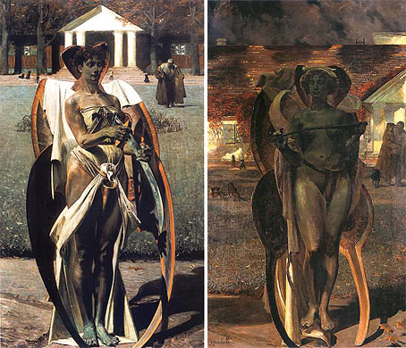
Thanatos I & II (1898).

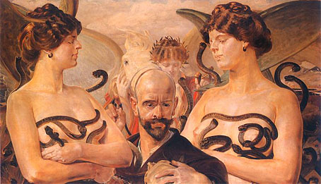
The Symbolist movement in painting found adherents across Europe but the western Europeans have always been the ones who receive the most attention for their work. Jacek Malczewski was a Polish artist who produced a number of paintings which can be classed as Symbolist—the usual complement of angels and chimeras—even though much of his output is more mundane fare. He also had a peculiar Dalínian propensity for putting himself in many of his pictures, as in the example below. The pictures here are from a substantial web collection.

malczewski2.jpg

Finis Poloniae (1906).

Previously on { feuilleton }
Carlos Schwabe’s Fleurs du Mal

Robert Rauschenberg, 1925–2008

rauschenberg.jpg

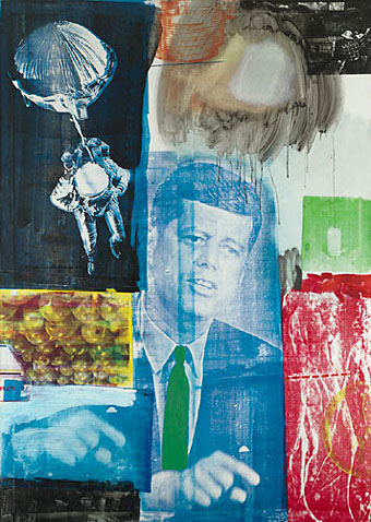
Retroactive I (1964).

My youthful enthusiasm for art acquainted me with the name of Robert Rauschenberg (who died two days ago) earlier than most. Surrealism and Pop Art held an appeal that was immediate, if rather superficially appreciated at the time, and it was seeing works from both those movements which were the most memorable aspect of my first visit to the Tate Gallery when I was 13. Later on when I was reading JG Ballard’s stories and essays in back numbers of New Worlds, Rauschenberg was one of a handful of artists who seemed to depict in visual terms what Ballard was describing in words. In this respect Robert Hughes’s discussion of the “landscape of media” (Ballard’s common phrase would be “media landscape”) below is coincidental but significant. Retroactive I was painted a couple of years before Ballard began the stories that would later become The Atrocity Exhibition and it could easily serve as an illustration for that book.

There are and will be plenty of words written elsewhere about Rauschenberg’s work and influence. I’ll note here his inclusion in the list of gay artists at GLBTQ for his creative and personal partnership with another great Pop artist, Jasper Johns.

One of the artists (television) most affected in the Sixties was Rauschenberg. In 1962, he began to apply printed images to canvas with silkscreen—the found image, not the found object, was incorporated into the work. “I was bombarded with TV sets and magazines,” he recalls, “by the refuse, by the excess of the world … I thought that if I could paint or make an honest work, it should incorporate all of these elements, which were and are a reality. Collage is a way of getting an additional piece of information that’s impersonal. I’ve always tried to work impersonally.” With access to anything printed, Rauschenberg could draw on an unlimited bank of images for his new paintings, and he set them together with a casual narrative style. In heightening the documentary flavour of his work, he strove to give canvas the accumulative flicker of a colour TV set. The bawling pressure of images—rocket, eagle, Kennedy, crowd, street sign, dancer, oranges, box, mosquito—creates an inventory of modern life, the lyrical outpourings of a mind jammed to satiation with the rapid, the quotidian, the real. In its peacock-hued, electron-sweetbox tints, this was an art that Marinetti and the Berlin Dadaists would have recognized at once: an agglomeration of memorable signs, capable of facing the breadth of the street. Their subject was glut.

Rauschenberg’s view of this landscape of media was both affectionate and ironic. He liked excavating whole histories within an image—histories of the media themselves. A perfect example is the red patch at the bottom right corner of Retroactive I. It is a silkscreen enlargement of a photo by Gjon Mili, which he found in Life magazine. Mili’s photograph was a carefully set-up parody, with the aid of a stroboscopic flash, of Duchamp’s Nude Descending a Staircase, 1912. Duchamp’s painting was in turn based on Marey‘s photos of a moving body. So the image goes back through seventy years of technological time, through allusion after allusion; and a further irony is that, in its Rauschenbergian form, it ends up looking precisely like the figures of Adam and Eve expelled from Eden in Masaccio’s fresco for the Carmine in Florence. This in turn converts the image of John Kennedy, who was dead by then and rapidly approaching apotheosis as the centre of a mawkish cult, into a sort of vengeful god with a pointing finger, so fulfilling the prophecy Edmond de Goncourt confided to his journal in 1861:

“The day will come when all the modern nations will adore a sort of American god, about whom much will have been written in the popular press; and images of this god will be set up in the churches, not as the imagination of each individual painter may fancy him, but fixed, once and for all, by photography. On that day civilization will have reached its peak, and there will be steam-propelled gondolas in Venice.”

Robert Hughes, The Shock of the New (1980).

Previously on { feuilleton }
Transfer drawings by Robert Rauschenberg
Jasper Johns
Michael Petry’s flag
JG Ballard book covers

The Feminine Sphinx

colette.jpg

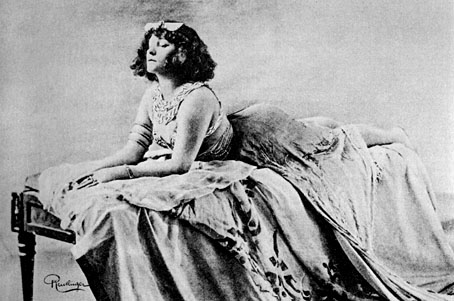
Colette.

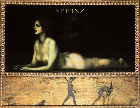
Work this week designing a CD of readings from Colette had me searching books for pictures of the author. Of the few I found this is the most interesting, one of several Colette portraits made by photographer Leopold Reutlinger and one of at least two from 1907 which Colette used to promote her Moulin Rouge pantomime, Rêve d’Égypte. (You can see another one here.) The Egyptian theme explains the sphinx pose and her costume but there’s no indication as to whether the pose was borrowed from Franz Stuck’s famous painting (below) or whether the resemblance is coincidental.

stuck.jpg

The Sphinx by Franz Stuck (1889).

Stuck produced two nearly identical paintings on this theme; the other version is here in a rather muddy copy. I like the frame design for this one which explains in pictures the secret of the famous riddle which the Sphinx asks of Oedipus, “Which creature goes on four feet in the morning, two feet at noon, and three in the evening?” Stuck painted another sphinx picture three years earlier, The Kiss of the Sphinx, which portrays a less feminine and distinctly more rapacious hybrid.

rubenstein.jpg

Ida Rubenstein.

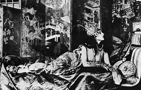
Colette was famously bisexual and so too was dancer Ida Rubenstein. In the same book as the Colette picture, there’s this photo of Ida recumbent in a sphinx-like pose in a very exotic boudoir. Photographs such as these are the material connection between the extravagances of the fin de siècle and the Decadent strain of early cinema in works such as Cabiria (written by Ida Rubenstein’s friend Gabriele D’Annunzio), Intolerance and (of course) Alla Nazimova’s Salomé.

Previously on { feuilleton }
The art of Heidi Taillefer
Dorian Gray revisited
Beardsley’s Salomé
Lussuria, Invidia, Superbia
Alla Nazimova’s Salomé
The art of Giulio Aristide Sartorio, 1860–1932

The art of Mihály Zichy, 1827–1906

zichy1.jpg

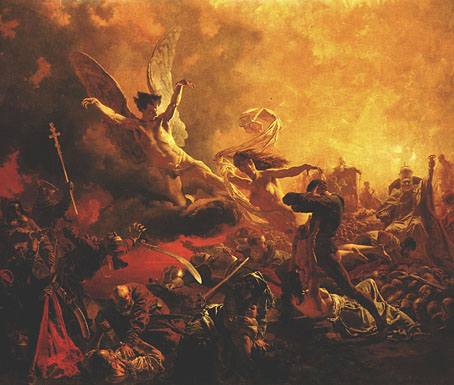
The Triumph of the Genius of Destruction (1878).

A Hungarian artist with a flair for the pandemoniac, as can be seen from this lurid anti-war painting. Zichy is also known today for Love, a series of erotic etchings produced in the 1870s. These may or may not include the masturbating male at the end of this post, attributed to Zichy and included here for curiosity value. Masturbating women are a common sight in drawn or painted porn, men far less so unless the artists were gay. In a similar vein, there’s this picture.

Continue reading “The art of Mihály Zichy, 1827–1906”

Recovering Bond

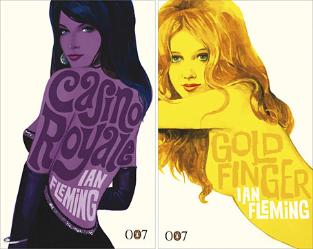
new_bonds.jpg

Penguin is really coming up with the goods these days, living up to their reputation as a house with high standards of cover design, unlike Picador and the shabby way they treated Cormac McCarthy recently.

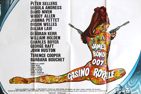
Ian Fleming’s Bond novels are the latest to receive a makeover with some fabulous art from illustrator Michael Gillette. 2008 is Fleming’s centenary so the books have been republished as demi-format hardbacks with these new designs adorning the jackets. Each cover features a different girl matched to the theme of the book (yes, I know they’re women but in Bond’s world women are always girls unless they’re Miss Moneypenny); each cover also features groovy period type which alludes to the hand-drawn elaborations of the Sixties and Seventies. The effect is reminiscent of the poster art for the 1967 film of Casino Royale (below) which used a naked girl as the focal point; all Bond posters before and after this place oo7 himself centre stage. Penguin even dare to push the level of pastiche by making On Her Majesty’s Secret Service look rather like an old romance novel, not such a surprising decision since this is the book where Bond gets married.

casino.jpg

My favourite Bond covers remain the old Pan paperbacks from 1963 but that’s just me; these look great. There’s been a persistent moan recently from authors and publishers worrying about file sharing as they foresee the publishing world going the same way as the music business. The solution is obvious: you can’t stop texts being copied and distributed but you can make the books themselves desirable objects so make them worth buying and owning. Penguin has numbered the spines of the new Bond books as they did with their recent Sherlock Holmes reprints, a smart appeal to book collectors as well as a tip to read them in the order they were written. “Smart” is the key word here; Picador take note.

Update: The Pan covers mentioned above were designed by Raymond Hawkey. Bond site MI6.co.uk has some details about the designer.

Elsewhere on { feuilleton }
The book covers archive

Previously on { feuilleton }
Repackaging Cormac
The World’s Greatest Detective
James Bond postage stamps
Boys Own Books