Digital Grotesque

3d1.jpg

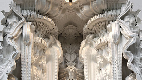
These organic forms are details of an architectural environment produced in sandstone using a 3D printer. The project is a collaboration between Michael Hansmeyer and Benjamin Dillenburger who use a series of algorithms to create the shapes the printer produces:

In the Digital Grotesque project, we use these algorithms to create a form that appears at once synthetic and organic. The design process thus strikes a delicate balance between the expected and the unexpected, between control and relinquishment. The algorithms are deterministic as they do not incorporate randomness, but the results are not necessarily entirely foreseeable. Instead, they have the power to surprise.

The resulting architecture does not lend itself to a visual reductionism. Rather, the processes can devise truly surprising topographies and topologies that go far beyond what one could have traditionally conceived.

3d2.jpg

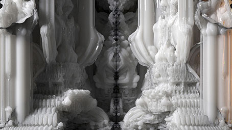
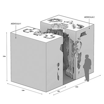
The diagram below shows the scale of the completed structure. Regular readers won’t be surprised to hear that the first thing that came to my mind when looking at these photos was “Lovecraft!” This unpredictable rendering process immediately solves the problem of how to depict or construct a non-human architecture without resort to anything Earth-bound. Those ridged and fluted columns could be R’lyeh or they could equally be the vast and ancient buildings that Dyer and Danforth discover in At the Mountains of Madness. I’ve been waiting for a while for 3D printing to start moving beyond the mere replication of existing objects; this is a very promising development. There’s more detail about the process and construction at the Digital Grotesque site.

3d3.jpg

Previously on { feuilleton }
At the Mountains of Madness

A Trip to the Moon, 1901

expo1.jpg

On the Airship Luna, visiting the Queer City of the Moon, and the wonderful Palace of the Man in the Moon.

An artist’s rendering of Frederic Thompson’s amusement ride created for the Pan-American Exposition of 1901 which is no doubt more impressive than was the earthbound reality. Thompson’s ride pre-dates Georges Méliès’ Le Voyage dans la Lune by a year, and while both lunar excursions owe something to HG Wells, whose The First Men in the Moon was published in 1901, the Wikipedia description of Thompson’s ride sounds very similar to the Méliès film:

The first version of the ride involved a simulated trip for thirty passengers from the fairgrounds to the Moon aboard the airship-ornithopter Luna, with visions displayed of Niagara Falls, the North American continent and the Earth’s disc. The passengers then left the craft to walk around a cavernous papier-mâché lunar surface peopled by costumed characters playing Selenites, and there visiting the palace of the Man in the Moon with its dancing “moon maidens”, before finally leaving the attraction through a Mooncalf’s mouth.

Thompson’s attraction was later relocated to Coney Island where it gave its name to the Luna Park created there, a name subsequently passed on to all the other Luna Parks worldwide. The illustration is from One Hundred Views of the Pan-American Exposition, Buffalo and Niagara Falls (1901) which includes some views of the other attractions and exhibits. This exposition was on a smaller scale than some of those that came before and after, and includes a couple of features that appear plagiarised from earlier shows, notably “Roltair’s House Upside Down” which might have been inspired by the Upside-Down Manor at the Exposition Universelle in Paris the year before. I appear to have exhausted the Paris exposition as a subject but the fascination with these events persists, especially when they turn up oddities such as these. Browse the rest of the book here or download it here.

expo2.jpg

expo3.jpg

expo4.jpg

expo5.jpg

expo6.jpg

Previously on { feuilleton }
Le Voyage dans la Lune
A Trip to Mars
Lunation: Art on the Moon
Somnium by Steve Moore
Mushrooms on the Moon
Filippo Morghen’s Voyage to the Moon

Tokyo details

tokyo01.jpg

Another enormous gigapixel panorama appeared this week, this one being a view from the Tokyo Tower by Jeffrey Martin. Some cities suit this detailed bird’s-eye view more than others. A similar panorama of Prague wasn’t as interesting for me as the view over London which appeared at the beginning of this year. Tokyo from this vantage may be an endless clutter of concrete and tarmac but it still yields some interesting details.

tokyo02.jpg

Tokyo’s Ginza district, and Chuo-dori Avenue, are locatable by these signs.

tokyo03.jpg

Further away there’s this cat-and-kitten sign.

tokyo04.jpg

While elsewhere Colonel Sanders proves inescapable. The Colonel’s Wikipedia entry contains this, er…nugget:

The Japanese Nippon Professional Baseball league has developed an urban legend of the “Curse of the Colonel”. A statue of Colonel Sanders was thrown into a river and lost during a 1985 fan celebration, and (according to the legend) the “curse” has caused Japan’s Hanshin Tigers to perform poorly since the incident.

Continue reading “Tokyo details”

Alas Vegas Tarot cards

alasvegasdevil.jpg

Back in February I bought a Wacom drawing tablet and said I’d show some proper results from its use later. For the past few months I’ve been working on this project using a combination of Wacom drawing and vector graphics. The initial brief from games designer James Wallis was for six Tarot-style card designs for his Alas Vegas role-playing game which has as its theme a fantasy extrapolation from Las Vegas and its gaudy mythology. The Kickstarter funding for the game turned out to be more successful than was anticipated so James asked me to expand the six cards idea into a full set of black-and-white Major Arcana designs.

This has been a fun series to work on although a number of the cards presented problems at first, the antique nature of the Tarot symbolism being a difficult thing to map across a very commercial American city. The symbolism from the Rider-Waite-Smith (RWS) deck was used as a rough guide although we deviated in a few places from the more traditional attributes. Las Vegas has changed over the years so rather than represent a single period of the city’s history there are references to different eras, from the huge casinos of today back to the buildings of the 50s and 60s with their distinctive “Googie” architecture. Notes for the cards follow below. The artwork can be seen at larger size here.

alasvegas00.jpg

The Fool is usually a young man about to step off a cliff edge with a dog barking a warning at his heels, hence the dog on the sign.

alasvegas01.jpg

Several of the cards convert the Tarot characters into cabaret acts. This one was pretty inevitable, and I’m sure it’s not the first time a stage conjuror has appeared on this card.

alasvegas02.jpg

The chair is based on the 1965 “Ball Chair” design by Eero Aarnio (as seen in The Prisoner TV series), adapted here to resemble the Priestess’s crescent moon.

alasvegas03.jpg

The style on this one is more 70s than 60s: patterned wallpaper (the hearts derive from the symbolism of The Empress, and from playing cards, of course), white rug, Kung Fu pyjamas.

Continue reading “Alas Vegas Tarot cards”

Weekend links 171

bossi.jpg

Jeune moine à la Grecque (1771) by Benigno Bossi. Via Monsieur Thombeau.

Victoriana: The Art of Revival is an exhibition which will run throughout the autumn at the Guildhall Art Gallery, London. Some of my steampunk work will be included. Related: Rick Poynor on Soft Machine’s Dysfunctional Mechanism.

• “The egg glows and hovers in the middle of a field of mesmerizing color. The spell is broken when the guard finally says, “Everybody up off the floor.'” Morgan Meis on Aten Reign by the amazing James Turrell.

• Mix of the week: a “heatwave mix” of psychedelic songs compiled by Jaime Williams. Anything that includes Vacuum Cleaner by Tintern Abbey gets my vote.

Because sex is so compartmentalized — it’s often considered separate from the rest of life and hidden away — porn performers, who have sex publicly, are in a unique position to consider and talk about integrating private and public aspects of life.

Writer and porn performer Conner Habib on the issue of nomenclature in the porn business.

• Still Hopscotching: Peter Mendelsund posts some unused cover designs for Julio Cortázar.

A Hymn For Megatron, an hour-long drone work, and a free download, by The Black Dog.

• Vagrancy and drift: Sukhdev Sandhu on the rise of the roaming essay film.

• A Flickr set of Peter “Sleazy” Christopherson’s musical instruments.

mwc.jpg

“Whether flower-pressing in the garden, hallucinating in the summerhouse, fainting inside stifling sites of historical interest, pirouetting along the promenade, or even sea-cruise thalassophobia complications, barely a moment will pass that isn’t made all the sweeter by obsessively listening to Down to the Silver Sea.”

The TM Research Archive: sate yourself on Swiss graphic design.

• A Lecture on Johnson and Boswell by Jorge Luis Borges.

• Words, sounds and robots from Sarah Angliss.

Never Built Los Angeles

Nautilus (2012) by Anna Meredith | Nature Of Light (2012) by Isnaj Dui | Popcorn (Ealing Feeder Mix) (2012) by SpacedogUK (Sarah Angliss)