Just after Christmas I watched the recent French film adaptation of The Count of Monte Cristo, after which I resolved to finally read The Three Musketeers, something I’d been intending to do since reading The Count of Monte Cristo four years ago. I’m currently two thirds of the way through The Three Musketeers and enjoying it very much despite the familiarity of the story. (I’ve watched Richard Lester’s two-part film adaptation many times.) For the most part, the novel avoids the flaws which make Monte Cristo a laborious read (Umberto Eco described the latter as “one of the most exciting novels ever written and on the other hand…one of the most badly written novels of all time and in any literature”), but The Three Musketeers isn’t without flaws of its own. I don’t think too many people would regard the lack of descriptive detail as a flaw per se—this is an adventure story, after all—but I enjoy a well-crafted description, and Dumas’s sketching of costume and place ranges from the scant to the non-existent. We’re told, for example, that d’Artagnan is a member of the King’s Guard, and that the Guards and the Musketeers are identifiable by the differences of their uniforms. But I don’t recall any instance when we’re told how these differences are manifest, or even how any of the principle characters dress from day to day. The same applies to the settings; much of the novel is set in the Paris of the 1620s but Dumas ignores any scenic description in what would have been a darker, muddier and altogether less salubrious city than his own Paris of the 1840s.
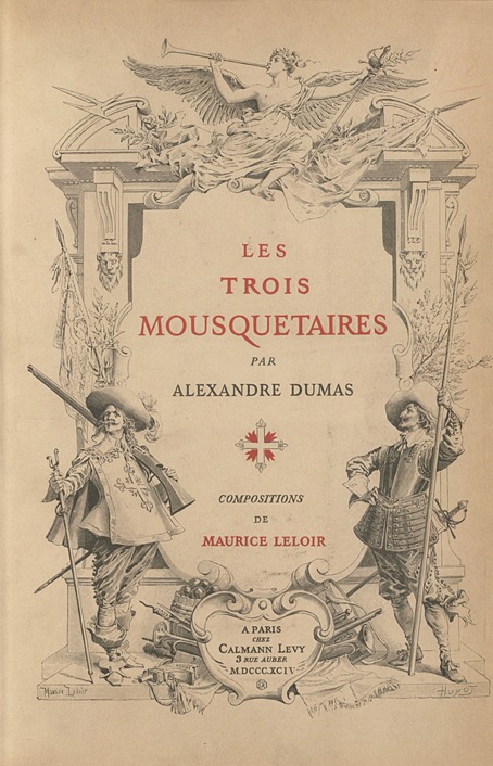
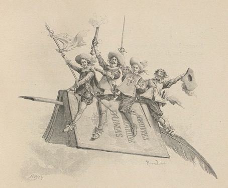
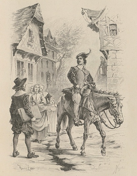
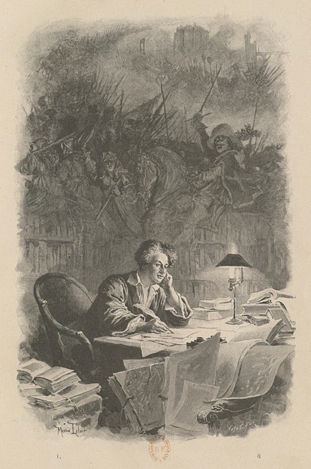
All of which brings us to Monsieur Maurice Leloir (1853–1940) and his illustrations for the novel which were published in a two-volume edition in 1894 (Tome 1 | Tome 2). Leloir was a painter and illustrator with a considerable knowledge of French historical dress; in 1907 he became the founding president of the Société de l’histoire du costume. His illustrations of The Three Musketeers, therefore, may be taken as authoritative when it comes to the costuming of the characters. Leloir was very good with everything else, as it happens; his characterisation is better than those of an earlier edition which makes d’Artagnan and friends barely distinguishable from each other, something not helped by the barbering habits of the day which had every gentleman sporting the same elaborate moustaches.
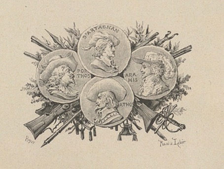
Most of Leloir’s illustrations are placed vignette-style inside the page but a few of the larger ones run across two pages, especially those involving fights or other action scenes. And there are many illustrations, what you see here is a very small sample. A couple of them so closely match scenes in the Richard Lester films that I’m sure the books must have been referred to for details of costuming. Douglas Fairbanks certainly saw them; after playing d’Artagnan in his own film production of The Three Musketeers he invited Maurice Leloir to advise with the costuming of another Dumas adaptation, The Iron Mask, in 1929.