The art of Toshiaki Kato

kato01.jpg

Toshiaki Kato isn’t the first contemporary Japanese artist to work variations on Aubrey Beardley’s style but he’s one I’d not come across before. Kato’s cover illustrations run a gamut of familiar styles, not only Beardsley but Harry Clarke, Gustav Klimt, Tamara Lempicka, Maxfield Parrish and no doubt a few more I haven’t recognised. Beardsley’s influence is something I like to follow so it’s the black-and-white work you see here. It’s particularly fascinating seeing Japanese artists playing with Beardsley motifs when so much of Beardsley’s early style was derived from Japanese prints; a rare example of cultural influence finding its way back home after a century or more.

There’s surprisingly little information about Toshiaki Kato on Anglophone websites but scans of his gorgeous paintings proliferate. This page is a good place to start but there’s plenty more at Pinterest and elsewhere.

kato02.jpg

kato03.jpg

Continue reading “The art of Toshiaki Kato”

Weekend links 228

moss.jpg

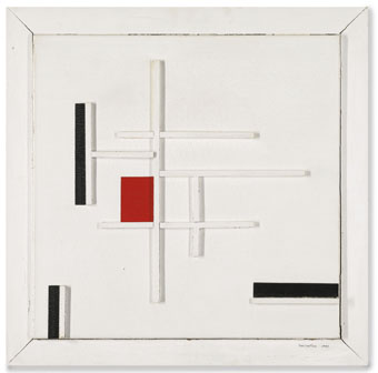
White, Red and Black (1949) by Marlow Moss.

• British television’s greatest director, Alan Clarke, rates on the cult scale here for his work on Penda’s Fen but his career was long, uncompromising and still hasn’t received the full appraisal it deserves. His more violent dramas—Scum, Made in Britain, The Firm, etc—have all appeared on DVD but many of his less notorious films can be hard to find. Paul Duane looks back at the remarkable Contact (1985), an hour-long study of the conflict in Northern Ireland, and a better film about soldiering than any number of big-budget features.

• I’ve wondered for years why one of the Daft Punk helmets seemed so familiar. It’s because they swiped the design from industrial designer and visual futurist, Syd Mead. Mark Wilson talked to Mead about wearable technology; Mr Mead, it seems, isn’t impressed by the French popsters. Related: paintings from Mead’s Sentinel (1979), and Syd Mead designs at Pinterest.

• Remembering that time in 1982 when Alan Moore interviewed Hawkwind. More interviews: Adam Bychawski talks to Jenny Hval about “sonic extremity, the violence of voyeurism and inhabiting bodies”, and Laurent Fintoni talks to (that man again) Bernard Szajner about Visions Of Dune, laser shows, and finding his way back to music.

Our attitudes towards work are extremely schizophrenic: we secretly aspire to sloth, while we loudly praise work. There isn’t an election poster that doesn’t promise more jobs. The call for more work is similar to the Stockholm syndrome, in which the victims of hostage-taking eventually develop a positive relationship with their captors.

Patrick Spaet on the universal employment fetish

• “Marlow Moss was one of Britain’s most important Constructivist artists…a radical lesbian and Drag King,” says Dal Chodha. An exhibition of Moss’s work has just opened at Tate Britain. Related: Marlow Moss: forgotten art maverick.

Yuki Koshimoto plays the Hang, aka the Spacedrum. Via Metafilter where there are more Hang links. The instrument was prominently featured in the score Cliff Martinez wrote for Solaris (2002).

• Broadcast’s Trish Keenan would have been 46 last week. James Cargill posted two demo songs for her birthday.

• At the BFI: Exclusive materials from the making of Powell and Pressburger’s The Tales of Hoffmann.

• Of Tutus and Tortures: Thoughts on the Decadent and the Weird by Christopher Burke.

Faber has launched a Modern Classics imprint with some smart cover designs.

• At Dangerous Minds: Good to see big scans of the Surrealists’ playing cards.

• Mix of the week: Afrofuturist Flowering by Nigel Rampant.

• Writer and editor Russ Kick has a new website.

Infographic: Why Readers Still Prefer Paper.

Superficial Music 1–3 (1981) by Bernard Szajner | Fahrenheit 451 (1982) by Hawkwind | Black Lake (2014) by Jenny Hval & Susanna

October

october03.jpg

October (1877) by James Tissot.

The autumnal month in paintings, and a post that brings this series full circle since the first one was for October last year. I try to be accurate when dating things but some of the dates of these pictures are either vague or missing altogther. The search at the BBC’s Your Paintings site kept failing so there’s fewer British paintings than usual.

october07.jpg

October (The Pumpkins) (1883) by Carl Larsson.

october01.jpg

October Gold (1889) by John Atkinson Grimshaw.

Continue reading “October”

Chocolate devils

chocolat1.jpg

If the Devil has all the best tunes he may as well have the chocolate to go with them. I was hoping there might be more examples of this brand but it seems not. Details about the designs are also scant but Fausta was a product of the Maison Prouvost Motte chocolaterie in Tourcoing, France. This invoice shows they were still using a version of the poster below as a company logo in the 1940s.

chocolat2.jpg

Previously on { feuilleton }
Paul Konewka’s Faust
Magicians

A tabled question

bps1.jpg

Work-related research this week had me wondering who it was that first thought of turning Battersea Power Station into a table. For the past few days I’ve been looking at a lot of the illustration work that George Hardie produced for the Hipgnosis album covers in the 70s and 80s; I’ll explain why in due course but the quest led me to seek out the songbook for Pink Floyd’s Animals album, two pages of which can be seen in the first Hipgnosis book.

Hipgnosis would often extend their album design into promotional areas, producing related posters, stickers, and so on. Pink Floyd’s popularity meant there was demand for songbooks, and the one for Animals is a treat for the use it makes of additional photos from the flying-pig sessions at Battersea Power Station. The idea of using the power station for the cover came from Roger Waters, incidentally; a shame he didn’t apply the same invention to his lyrics. But I digress…

bps2.jpg

From the Animals songbook (1977). By George Hardie?

Between the photos (and, er, the songs) there are several pages of graphics by (I’m guessing) Bush Hollyhead and George Hardie; the former depicts a pig, dog and sheep in various stylised arrangements while Hardie provided a vignette of bacon rashers on a Battersea table. This was 1977 so I’m assuming it’s the earliest example of the power-station-as-table, unless, of course, somebody out there knows better.

bps5.jpg

When the Monster Dies (1990) by Kate Pullinger. Illustration by Willie Ryan.

And sure enough… Thanks to herr doktor bimler for suggesting this one.

table.jpg

Robber Baron Table (2006) by Studio Job.

Artist David Mach took up the table idea in the 1990s to produce a series of collages showing an enormous chimney-legged chair sitting beside the power station. There’s no explanation as to why the table should be upside down but then artists often don’t think things through as well as designers. A better idea is the Battersea-like Robber Baron Table (2006) by Studio Job, part of a series of furniture concepts suitable for oligarchs and those who work in the City of London.

bps3.jpg

And so to the inevitable, one of a number of stylish tables currently being manufactured by the Battersea Table company.

bps4.jpg

Not a table but another clever repurposing of Giles Gilbert Scott’s architecture. Atypyk makes concrete ashtrays for those who still smoke, with the chimneys formed from unsmoked cigarettes. Battersea Power Station when it was in use did much to contribute to London’s polluted air so this seems a fitting by-product. Are there any more examples out there?

Previously on { feuilleton }
Design as virus 16: Prisms
Labels
Storm Thorgerson, 1944–2013
Hipgnosis turkeys
Peter Christopherson, 1955–2010
Storm Thorgerson: Right But Wrong
Battersea Power Station