Salomé: the font

salomefont01.jpg

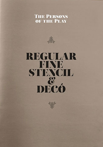
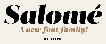
This isn’t the first font that’s been named after Salomé but Salome (without accent) by Rebecca Alaccari and Patrick Griffin was a revival of an earlier design, Cantini, from 1972, whereas Salomé is an original creation by Spanish design studio Atipo. The Atipo design itself owes something to the 1970s being reminiscent of François Boltana’s Stilla (1973), albeit without the eccenticities that make Boltana’s typeface so redolent of the period. Salomé comes in four styles, all of them variations on the extra-bold weights of Didone typefaces.

salomefont02.jpg

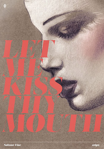
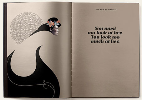
Having a predilection for this look the design appeals to me even without its associations. Atipo add to the attraction by promoting their font family with some gorgeous illustrations juxtaposed against quotes from Oscar Wilde’s play. None of the poster designs or the booklet pages below are credited on the website. The on-screen booklet highlights significant moments from the play with illustrations that manage to be Beardsley-like without going down the pastiche route. This is the way to show off a new font design, it’s just a shame the booklet isn’t available as a pdf. The icing on the cake is that the regular style of Salomé is available for free so long as you help promote it via Twitter or Facebook. The complete family is available for a very reasonable price. Now I have to find something to create that’s worthy of the design.

salomefont03.jpg

salomefont04.jpg

Continue reading “Salomé: the font”

Ulysses versus Maldoror

covers.jpg

Ulysses (1934), designed by Ernst Reichl; Complete Works of Isidore Ducasse (1967), designed by Pierre Faucheux.

On the design front, that is, not the writing one. Ernst Reichl’s design for the 1934 Random House edition of James Joyce’s Ulysses (the first US edition) has a cover which isn’t so different to the many Art Deco-style bindings from around this time. Inside, however, there’s a significant innovation with his title spread, and the dramatic imposition of a huge capital letter. Random House was presenting Ulysses as a major artistic statement, a quality which Reichl’s design reinforces when the page-filling capitals recur at the openings of each of the novel’s three sections.

ulysses1.jpg

I encountered the huge S on the opening page in a book about Joyce shortly after I’d started reading the novel for the first time, and for years was under the impression that this had been a specific instruction of the author’s, a typographic flourish to add to the rest of the formal manipulations. I’d suggest—insist, even—that all editions of Ulysses should adopt Reichl’s design. Martha Scotford at Design Observer looks at the book in more detail.

ulysses2.jpg

maldoror1.jpg

Les chants de Maldoror-Poésies-Lettres (1950) by Lautréamont. Le club français du livre.

Pierre Faucheux went one further with his grandiose opening for Les chants de Maldoror-Poésies-Lettres by filling the opening of the book with Didot capitals which spell out M-A-L-D-O-R-O-R on each page before the title is reached. This is the design equivalent of shouting in the reader’s face when the book is opened; given the nature of the text I can imagine the author approving. I’ve no idea whether the idea was borrowed from Reichl but Faucheux was a very inventive designer who was quite capable of arriving at such a layout on his own. His cover for a 1967 reprint of the book (above) spells out the title by tearing up the earlier Didot capitals. Rick Poynor at Design Observer (again) looked at more of Faucheux’s covers for the Livre de Poche imprint, while at Eye magazine there’s an essay by Richard Hollis about Faucheux’s innovations.

Continue reading “Ulysses versus Maldoror”

Koloman Moser bookplates

moser3.jpg

Ex libris Fritz Waerndorfer (1903).

I could happily post things by the indefatigable Koloman Moser (1868–1918) all the time but he’s not exactly an unknown figure even if his work does get overshadowed by his colleague in the Vienna Secession, Gustav Klimt. This handful of ex libris plates almost all date from the Secession period, and include one for Adele Bloch-Bauer, a woman whose name is familiar these days for her being the subject of a very well-known Klimt portrait.

moser7.jpg

Ex libris Fritz Schwartz (1900).

moser6.jpg

Ex libris Rudolf Steindl (1900).

Continue reading “Koloman Moser bookplates”

Bookmark: Mervyn Peake

peake1.jpg

Another not-so-old TV documentary. It’s good to keep finding these as I have no means at the moment of viewing all the video tapes I’ve kept. Bookmark is (or was) a BBC series about the lives of various writers. This edition concerns author and artist Mervyn Peake, and was broadcast in 1998, shortly before the BBC screened their flawed dramatisation of the Gormenghast books.

Peake’s three children—Sebastian, Fabian and Clare—all recall life with their father, while other contributors, Quentin Crisp among them, discuss his work, his experiences during the Second World War, and life on the island of Sark. The narrator is Julian Glover, and the readings are by Simon Russell Beale. The catastrophic collapse of Peake’s health that occurred when he’d barely reached middle age means a journey through his biography is always a sombre business, but it does make the scale of his achievements seem all the more remarkable. The film is 48-minutes long, and may be viewed here.

peake2.jpg

Previously on { feuilleton }
The Web by Joan Ashworth
Peake’s glassblowers
Mervyn Peake in Coronation Street
The Worlds of Mervyn Peake
A profusion of Peake
Mervyn Peake at Maison d’Ailleurs
Peake’s Pan
Buccaneers #1
Mervyn Peake in Lilliput
The Illustrators of Alice

Dunsany’s highwaymen

pledge.jpg

The Pledge.

As mentioned last week, the BFI’s DVD of Schalcken the Painter includes as extras two short films by other directors. Edward Abraham’s The Pit (1962) is an adaptation of Poe’s The Pit and the Pendulum which is creditable but lacks the sustained malevolence of Jan Svankmajer’s version. The second film is The Pledge (1981), a 21-minute adaptation by Digby Rumsey of The Highwaymen, a short story by Lord Dunsany. This is unusual for being one of the very few film adaptations of Dunsany, Rumsey being responsible for two others: Nature and Time (1976), and In the Twilight (1978). Since this is a low-budget work it’s no surprise that the story is a historical piece rather than one of the florid fantasies so beloved of HP Lovecraft. A trio of highwaymen decide to rescue the hanging body of their former comrade and inter it in a bishop’s tomb. (The bishop’s bones, they decide, can go in the earth.) The story is so slight it’s more of a curio than anything, and would probably be better seen along with with the other Dunsany adaptations. Of note is a typically jaunty score by Michael Nyman, while Nyman’s later collaborator, Peter Greenaway, assisted with the editing. If nothing else, Greenaway would have appreciated the film’s macabre nature.

sime.jpg

Illustration for The Highwaymen by Sidney Sime.

The original story appeared in Dunsany’s 1908 collection The Sword of Welleran and Other Stories. The Internet Archive has a scan of the entire book with illustrations from Sidney Sime’s prime period. The depiction of the scene at the gibbet is a lot more atmospheric than in the film but then that’s the advantage of the illustrator: there’s no need to worry about a budget.

Previously on { feuilleton }
Schalcken the Painter revisited
The Pendulum, the Pit and Hope
Sidney Sime paintings
Haschisch Hallucinations by HE Gowers
Sidney Sime and Lord Dunsany