
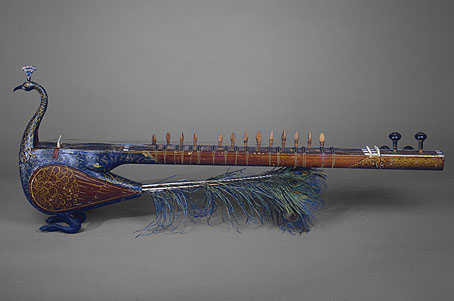
Mayuri means “peacock” and although this splendid instrument doesn’t look like a European lute, a lute it is, albeit styled for Indian court performances. Via Wunderkammer.
Popular at nineteenth-century Indian courts, this bowed lute borrows features of other Indian stringed instruments, such as the body shape of the sarangi and the frets and neck of the sitar. There are four melody strings and fifteen sympathetic strings, which sound when the instrument is played to accompany popular religious song. The peacock is the vehicle of Sarasvati, the goddess of music, and it appears in Indian poetry as a metaphor for courtship. (More.)
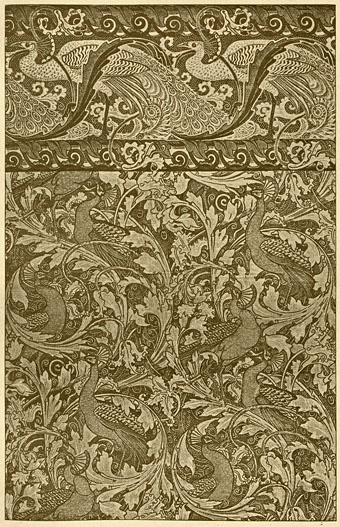
As a complement, here’s something I’m still hoping to find in a good colour reproduction, all one usually sees are details. The Peacock Garden (1889) was one of a number of wallpaper designs created for William Morris by Walter Crane. This copy showing the full pattern is from an 1897 issue of the German arts periodical Pan, part of a section highlighting arts and crafts in England. Walter liked his peacocks, here’s Juno and her birds from The Baby’s Own Aesop (1887).
Previously on { feuilleton }
• Jaipur peacocks
• Maruyama Okyo’s peacocks
• Louis Rhead’s peacocks
• The White Peacock
• Peacocks
• Whistler’s Peacock Room
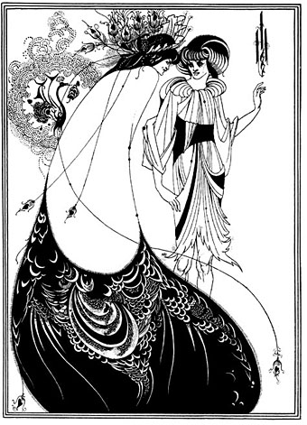
• Beardsley’s Salomé


