Poster Art in Vienna

klinger08.jpg

Margit Schwarcz, 1923.

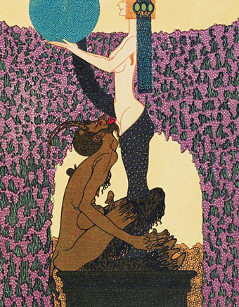
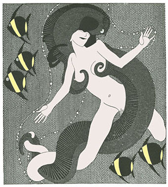
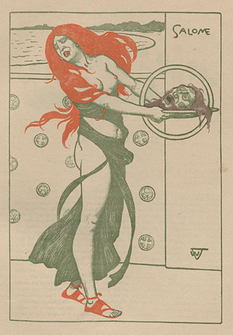
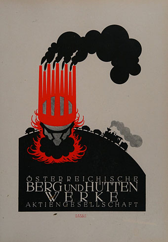
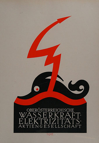
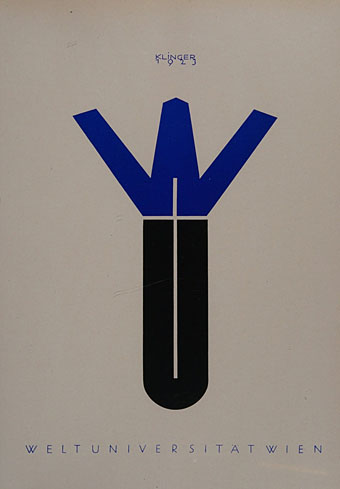
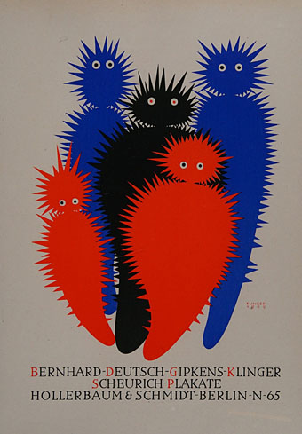
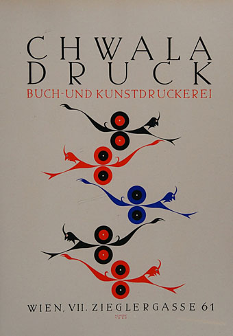
From Art Nouveau (see previous post) to Deco…almost. These posters are more Austrian Moderne, or Plakatstil, most of them being too early for Art Deco which only became an identifiable trend in the mid-1920s. The design above by Margit Schwarcz appeared here last August when I wrote an appreciation of the weird fiction of Stefan Grabinski. Schwarcz’s poster had been reworked as a cover for The Motion Demon, a collection of Grabinski’s rail stories, and I wanted to see the original. The same design appears in Poster Art in Vienna (1923), an introduction to work from the Julius Klinger school of poster art which seems to have been produced to promote the work of the Klinger artists (and Klinger himself) in the USA. The Schwarcz poster is very typical of the Klinger style, with bold shapes, bright inks, spiky serifs and cartoon-like drawings. Klinger’s earlier illustration work was very much in the post-Beardsley style, albeit with a similar cartoon-like approach, so there’s a trace of Beardsley still present in some of the figures.

klinger01.jpg

Julius Klinger, 1922.

This is a great book even if it provokes the melancholy thoughts that tend to arise when looking at something bright and inventive from Austria or Germany in the 1920s. I always find myself wondering how the artists fared during the storm of Nazism and war that would bear down on them in the following decade. Klinger was Jewish, and didn’t manage to escape to his beloved America; he was prevented from working after 1938, and was killed in Belarus in 1942. His name lives on in the Julius Klinger fonts which were based on his type designs. More of Klinger’s poster and illustration work may be seen at Vienna Secession.

klinger02.jpg

Julius Klinger, 1923.

klinger03.jpg

Julius Klinger, 1909.

klinger04.jpg

Julius Klinger, 1923.

Continue reading “Poster Art in Vienna”

Julius Klinger’s Sodom

klinger1.jpg

The more I look at the work of Austrian artist Julius Klinger (1876–1942), the more I like what I see. This Pinterest sample shows his versatility, equally at home with detailed illustration, often with a Beardsley-like quality, as he was with more Modernist design. Sodom (1689) (aka The Farce of Sodom, or The Quintessence of Debauchery) is the notorious Restoration drama attributed to John Wilmot, the second Earl of Rochester, which is here illustrated by Klinger for an edition privately published in Leipzig in 1909. The play is one of the most flagrantly outrageous works in the English language, with a cast of characters that includes Bolloxinion, the King of Sodom, Cuntigratia, his Queen, and so on; you can see parts of it performed in The Libertine (2004) with Johnny Depp playing Rochester, and taking the role of Bolloxinion.

Klinger produced 16 illustrations in all. His picture of Salomé gets linked to this series on a number of websites but I’ve seen other sites that list it as a separate piece. Since Salomé isn’t mentioned anywhere in Sodom I’d also be inclined to keep them separate.

klinger2.jpg

klinger3.jpg

klinger4.jpg

Elsewhere on { feuilleton }
The illustrators archive

Previously on { feuilleton }
Deutsche Kunst und Dekoration #21
Julius Klinger’s Salomé

Virgil Finlay’s Salomé

finlay2.jpg

While chasing down Virgil Finlay’s illustration for Lovecraft’s The Colour Out of Space earlier this week I came across another Finlay drawing I’d not noticed before in a book I’ve owned for years. Makes me wonder what else is lurking on the shelves. Finlay’s depiction of Salomé was an illustration for Waxworks, a story by Robert Bloch published in Weird Tales for January 1939. I’ve never read much of Bloch’s fiction, this story included, so can’t say anything about it, but Finlay’s drawing impresses for the solid black night sky, and the peculiar flaming headdress, the kind of unique detail he often added to his pictures.

Bloch and Finlay had a memorable encounter a couple of years years before when Finlay illustrated The Faceless God, another Weird Tales piece which so impressed HP Lovecraft that it inspired a poem, To Mr. Finlay, Upon His Drawing for Mr. Bloch’s Tale, ‘The Faceless God’. Lovecraft’s handwritten draft can be seen (but not necessarily read) here.

Elsewhere on { feuilleton }
The Salomé archive

Wilhelm Volz’s Salomé

volz.jpg

Wilhelm Volz (1855–1901) was a German artist whose work I might not have paid any attention to at all had this lithograph not been featured in that cult volume Dreamers of Decadence. As a composition it’s a lot more interesting than Volz’s paintings, the circle for a halo being an unusual detail. There’s also more of an atmosphere of horror in this representation than one usually finds with the Salomé theme. The temptress doesn’t seem very enamored of her trophy, and John the Baptist’s head for once bears a suitable expression of horror. Volz’s print was published in Pan magazine in 1896, the entire edition of which may be viewed here.

Elsewhere on { feuilleton }
The Salomé archive

Valenti Angelo’s Salomé

angelo.jpg

And still they come… Valenti Angelo (1897–1982) was an American printmaker, author of several books for children and the illustrator of an estimated 250 classic works of fiction including this 1945 edition of Wilde’s Salomé for Heritage Press. Angelo has an engagingly simple style in this and other works, reminding me of David Sheridan’s Tarot designs. The Internet Archive has a copy of his illustrated The Imitation of Christ with drawings reminscent of Eric Gill’s woodcuts.

Elsewhere on { feuilleton }
The illustrators archive
The Oscar Wilde archive
The Salomé archive