The King in Yellow

king_ace.jpg

Along the shore the cloud waves break,
The twin suns sink beneath the lake,
The shadows lengthen
In Carcosa.

Strange is the night where black stars rise,
And strange moons circle through the skies
But stranger still is
Lost Carcosa.

The King in Yellow, Act i, Scene 2.

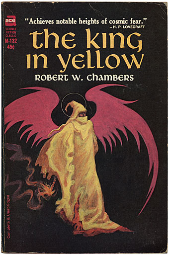
Rearranging the bookshelves this week had me looking again at this old Ace paperback of Robert Chambers’ weird classic, one of that select handful of books which can bear a blurb from HP Lovecraft. Any Lovecraft aficionados yet to read the first four stories in Chambers’ collection (the others pieces are of lesser interest) are missing out. These are as good as anything that Weird Tales published and together they achieve that unique blend of science fiction, fantasy and horror which Lovecraft and others also managed in the days when writers, and readers for that matter, were far less concerned with the definition and boundaries of genre.

king2.jpg

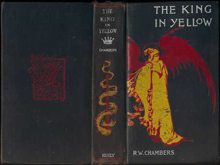
My Ace edition was the first paperback printing from 1965 and the cover painting is by Jack Gaughan, credited inside as being based on Chambers’ own first edition design. I’d often wondered what the original cover looked like and now, of course, it’s easy to find. Whether Chambers himself drew this is unclear but whoever the artist was, the design is rather more finessed than Gaughan’s sketchy painting.
king.jpg

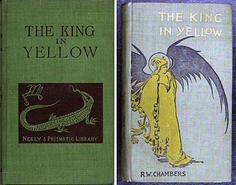
Searching around reveals two further variations, one of which—the green cover—is described on a bookselling site as the actual first edition of the book from 1895. Yours for a mere $1,750. The other cover is probably a later reprint which gives a clearer view of the mysterious King. What’s notable here is the curious sigil on both the Neely editions. I was hoping this might be the dreaded Yellow Sign which is the subject of Chambers’ fourth (and Lovecraft’s favourite) story; it’s certainly more suitable than the squiggle which seems so unaccountably popular among certain quarters of Lovecraft fandom. It isn’t the Yellow Sign, however, it turns out to be the monogram for publisher F. Tennyson Neely. Perhaps this is just as well. “The solution to the mystery is always inferior to the mystery itself,” as Borges said, and some things, like the malevolent play which gives its name to this collection, are best kept out of reach.

The King in Yellow at the Internet Archive

Elsewhere on { feuilleton }
The book covers archive
The Lovecraft archive

Previously on { feuilleton }
Arthur Machen book covers
Clark Ashton Smith book covers

Das Haus zur letzten Latern

sands.jpg

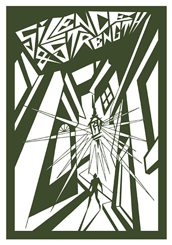
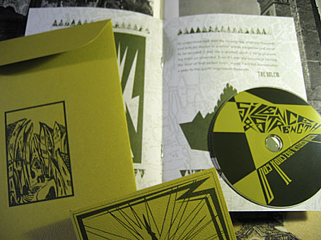
From HP Lovecraft to another writer of weird fiction, Gustav Meyrink. Das Haus zur letzten Latern is a tribute to Meyrink by Silence & Strength and the package I designed late last year for Horus CyclicDaemon has just been released. I’ve mentioned before that Horus make a particular effort with all their CD productions, choosing their materials carefully, and this release is no exception. An envelope of green textured card has two of my designs embossed on either side. Inside this there’s another envelope containing the disc and an 8-page A5 booklet of dark green ink on heavy paper with a grainy texture. The music is suitably dark and atmospheric and would work very well as a soundtrack to Paul Wegener’s Der Golem, wie er in die Welt kam (1920). Seeing as Wegener’s film is the most famous Meyrink adaptation I borrowed the shapes of Prague buildings from one of the original film posters. The rest of the graphics are done in a very spare, quasi-Expressionist drawing style which was a pleasure to do since it’s quite different to my usual work. The background of the booklet pages show an old map of Meyrink’s city, Prague.

sands2.jpg

When people have asked me recently what I think about the proliferation of music downloads I tell them that the best way for record labels (and book publishers for that matter) to continue to attract purchasers is to make beautiful objects which people feel compelled to own. The content is always endlessly reproducible, the packaging isn’t. As far as this argument goes, Horus CyclicDaemon has been ahead of the game for some time.

Previously on { feuilleton }
New things for November II
Hugo Steiner-Prag’s Golem
Nosferatu
Barta’s Golem

Nyarlathotep: the Crawling Chaos

nyarlathotep.jpg

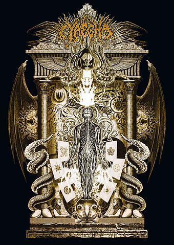
Unveiling another new piece of work, this is a T-shirt design for metal band Cyaegha whose Steps of Descent album I illustrated and designed last year. They asked for something based on HP Lovecraft’s god Nyarlathotep so I thought I’d take the opportunity to rework from scratch the version of this I created in 1999 for the first edition of The Haunter of the Dark. I always felt the earlier piece was going in the right direction but lacked somewhat in execution; this makes up for that. Lovecraft’s Nyarlathotep is one of his most curious creations, in part because the conception of the character changed over many years. In various stories, letters and dream fragments the god/entity is variously described as an Egyptian pharaoh, an itinerant showman with electrical apparatus, the “black man” of European witch cults and the more typically Lovecraftian squamous alien monstrosity. The challenge, then, is to try and represent a little of each of these elements without overly favouring one or the other.

This is one of two illustrations I’ve produced in recent months which use Photoshop to imitate the engraving collage style of Wilfried Sätty, an artist whose work I discussed in an essay for Strange Attractor #2 in 2005. Sätty’s style was derived from Max Ernst’s famous collage “novels” of the 1930s and Photoshop is the ideal tool for this, far better than the old method of scissors, paper and glue. Sätty expanded Ernst’s technique by using reverse printing and the duplication of images; Photoshop extends the technique even further, making it possible to scale images up or down instead of being limited to the size of the original reproduction. The other illustration I’ve done in this style is for a short story and I’ll reveal that closer to publication. In the meantime I should be making a slightly different version of the new Nyarlathotep suitable for the usual range of CafePress products. More about those when they’re done.

Previously on { feuilleton }
The Haunted Palace
The art of Stephen Aldrich

New things for April II

coc.jpg

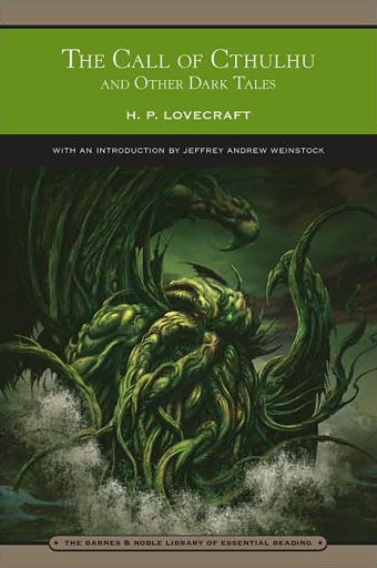
Another work-related update. This HP Lovecraft collection is published by Barnes & Noble next month and features my colour rendering of the rising monstrosity on its cover. Nice to have something decorating an actual Lovecraft book, the second time this has happened (first time was for a French volume). B&N also sell my own book, of course (with, er…the same cover pic).

And another shout-out, for a preview of Arik Roper‘s new book, Mushroom Magick: A Visionary Field Guide, at Abrams. Read an extract from Erik Davis’s introduction here.

Via Further.

Previously on { feuilleton }
The art of Arik Roper

Le Sacre du Printemps

roerich.jpg

Backdrop for the League of Composers’ production, Philadelphia, 1930.

Something for the vernal equinox. The painting is a stage design by artist, writer and theatre designer Nicholas Roerich (1874–1947) for an American production of Stravinsky’s Rite of Spring. Roerich designed the costumes and decor for the riotous Paris performance of 1913 and the Roerich Museum has a selection of designs for this and subsequent performances. Stravinsky’s fiercely primitive ballet has long been a favourite musical work of mine so it’s especially satisfying when one enthusiasm bleeds into another. I’ve noted before HP Lovecraft’s praise for Roerich’s paintings of whom he wrote in 1937:

There is something in his handling of perspective and atmosphere which to me suggests other dimensions and alien orders of being—or at least, the gateways leading to such. Those fantastic carven stones in lonely upland deserts—those ominous, almost sentient, lines of jagged pinnacles—and above all, those curious cubical edifices clinging to precipitous slopes and edging upward to forbidden needle-like peaks!

Roerich is also mentioned in At the Mountains of Madness and some of his designs for the Rite—which are, after all, backdrops for a ritual sacrifice—might easily serve as a scene of Cthulhoid invocation. Writer Mike Jay has a fascinating piece about the artist which proposes that he should perhaps be given more credit for the origin of the Rite of Spring. He’s not the first to note that it was the stage designer who nurtured a lifelong passion for mysticism and esoteric ritual, not the composer.

Finally, some slightly more contemporary music: Can performing Vernal Equinox for the BBC in 1975.

Previously on { feuilleton }
HP Lovecraft’s favourite artists