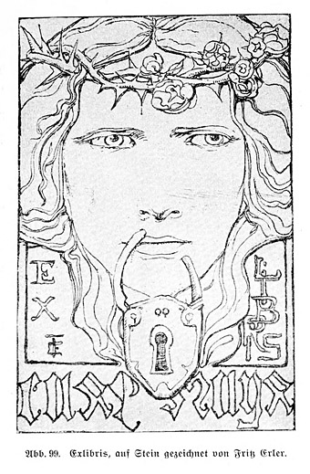
This essay by cult writer Philippe Jullian appeared in an edition of the Observer colour supplement in 1971, shortly after Jullian’s chef d’oeuvre, Dreamers of Decadence, had been published in Britain. Esthètes et Magiciens (1969), as Jullian’s study was titled in France, was instrumental in raising the profile of the many Symbolist artists whose work had been either disparaged or ignored since the First World War. A year after the Observer piece, the Hayward Gallery in London staged a major exhibition of Symbolist art with an emphasis on the paintings of Gustave Moreau; Jullian alludes to the exhibition in his article, and also wrote the foreword to the catalogue. His Observer article is necessarily shorter and less detailed than his introductory essay, emphasising the reader-friendly “Decadence” over the more evasive “Symbolist”. But as a primer to a mysterious and neglected area of art the piece would have served its purpose for a general reader.
Many thanks to Nick for the recommendation, and to Alistair who went to the trouble of providing high-res scans that I could run through the OCR. The translators of the article, Francis King and John Haylock, had previously translated Jullian’s biography of Robert de Montesquiou.
*
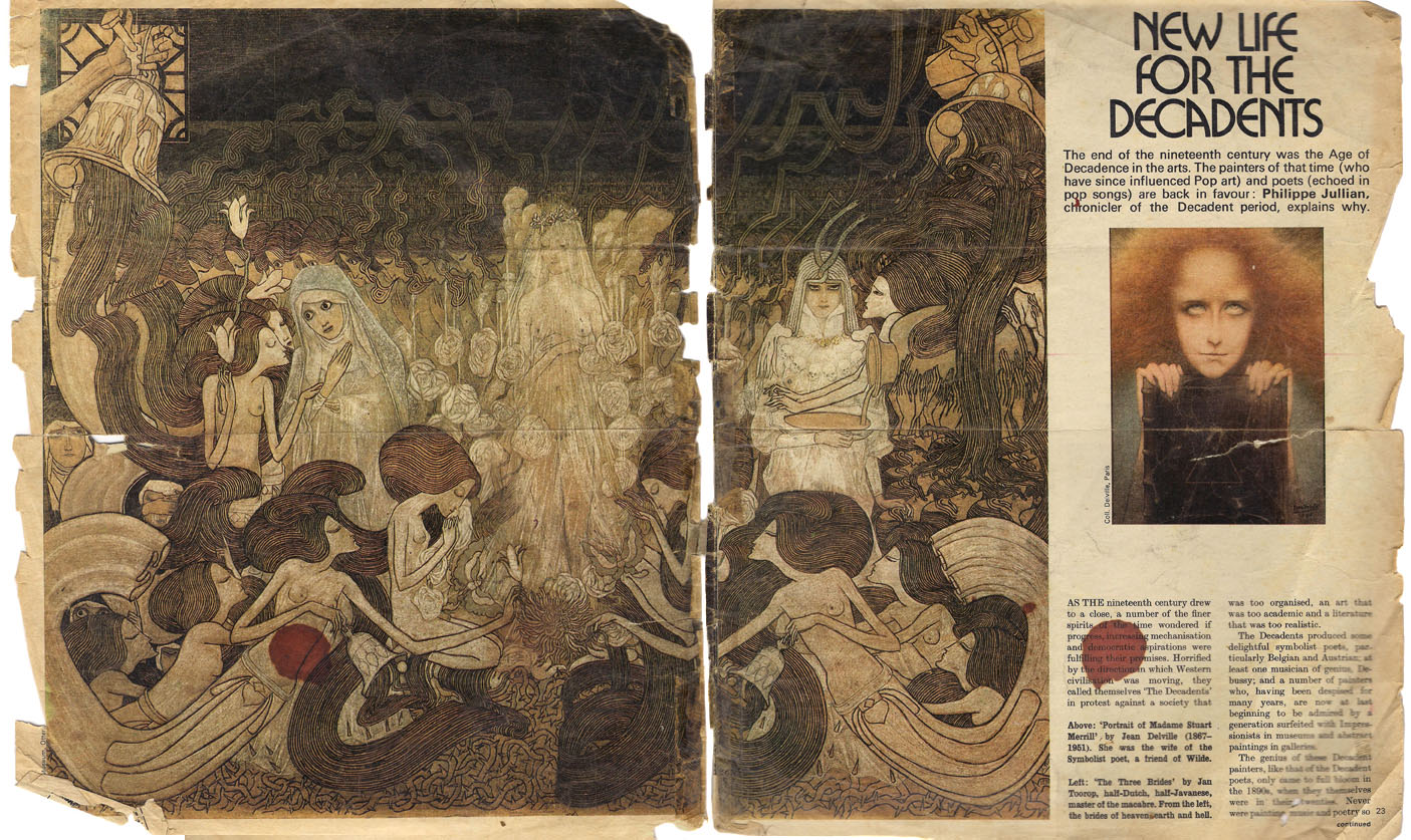
New Life for the Decadents
The end of the nineteenth century was the Age of Decadence in the arts. The painters of that time (who have since influenced Pop art) and poets (echoed in pop songs) are back in favour: Philippe Jullian, chronicler of the Decadent period, explains why.
AS THE nineteenth century drew to a close, a number of the finer spirits of the time wondered if progress, increasing mechanisation and democratic aspirations were fulfilling their promises. Horrified by the direction in which Western civilisation was moving, they called themselves “The Decadents” in protest against a society that was too organised, an art that was too academic and a literature that was too realistic.
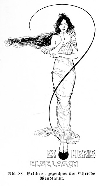
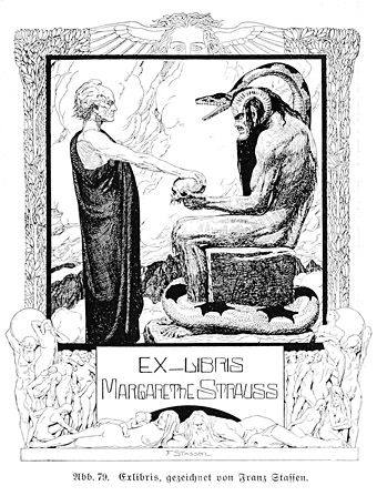
The Decadents produced some delightful symbolist poets, particularly Belgian and Austrian; at least one musician of genius, Debussy; and a number of painters who, having been despised for many years, are now at last beginning to be admired by a generation surfeited with Impressionists in museums and abstract paintings in galleries.
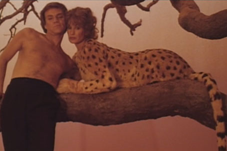
The genius of these Decadent painters, like that of the Decadent poets, only came to full bloom in the 1890s, when they themselves were in their twenties. Never were painting, music and poetry so close to one another. The gods of the Decadents were primarily Wagner and Baudelaire, then Swinburne and Poe. The Decadent movement, so active all over Europe, turned towards two great sources of inspiration: the Pre-Raphaelites, and a French painter whose glory was for a while eclipsed by the Impressionists but who is now once again accorded his place among the great—Gustave Moreau.
The women whom the Decadents loved and of whom they dreamt resembled the women created 30 years previously by Rossetti, Burne-Jones and Moreau.
Nothing could be more naturalistic than the artistic style elaborated by the Pre-Raphaelites in the middle of the nineteenth century. Dante Gabriel Rossetti’s model, inspiration, mistress and finally wife was the sweet and sad Elizabeth Siddal, on whom so many fin-de-siècle ladies had to model themselves on the Continent as did all the aesthetic ladies of England in the 1880s. She posed for Rossetti as Beatrix and as the Belle Dame sans Merci.
She was a rare spirit, about whom everything was nebulous and evanescent: the thick, wild hair; the tunic of a simplicity to challenge the elaboration of the crinolines then in vogue; the frail hands burdened with lilies; the gaze turned towards eternity. She also posed, fully dressed and lying in a bath, her hair outspread around her bloodless face, as Ophelia for another Pre-Raphaelite, Millais. Elizabeth died of pulmonary tuberculosis in 1862.
A macabre episode, which might have been imagined by Poe, was the exhumation of a sheaf of Rossetti’s poems that had been buried in Elizabeth Siddal’s coffin. When this symbol of the New Woman died, the grief-stricken poet had insisted on placing the poems inspired by her under her long hair before the coffin was sealed.
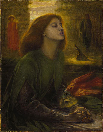
Beata Beatrix (1864–1870) by Dante Gabriel Rossetti.
Continue reading “New Life for the Decadents by Philippe Jullian”