The Savoy magazine

savoy.jpg

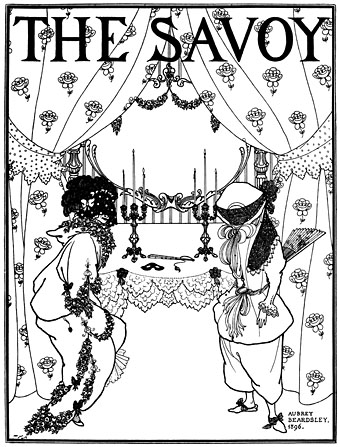
Further retrievals from the depths of the Internet Archive (and thanks to Lord Cornelius Plum for the tip) come in the form of three bound editions of The Savoy magazine, a British art and literary periodical which ran for eight issues from January to December 1896. Aubrey Beardsley was art editor and chief illustrator, Arthur Symons the literary editor and the publisher was the heroic and duplicitous London pornographer Leonard Smithers whose patronage and, it should be noted, exploitation of Beardsley’s work kept the artist solvent during his last two years.

A thesis could be written (and no doubt has been) exploring the curious symbiosis between pornography publishers and the artistic avant garde. Smithers was a proud purveyor of what he called “smut” but he also complained about all the money he lost supporting poets and down-at-heel writers. Posterity can thank him for publishing Teleny, the classic early work of gay fiction attributed to Oscar Wilde, as well as Beardsley’s Lysistrata illustrations and The Savoy, a magazine founded in the fallout of the Wilde scandal when The Yellow Book dropped Beardsley from its staff in order to appease its more conservative contributors. The magazine’s run was short due to poor sales after WH Smith’s refused to stock it, worried again about the controversial nature of Beardsley’s art. (Speculative fiction magazine New Worlds faced similar problems with Smith’s in the late Sixties.) This seems astonishing to us now when looking at the world-class roster of contributors to the first issue, a list which included two future Nobel winners—George Bernard Shaw and WB Yeats—as well as Max Beerbohm, Ernest Dowson, Havelock Ellis, JM Whistler, Charles Shannon, William Rothenstein, and Beardsley writing and illustrating the first part of his erotic caprice, Under the Hill.

Beardsley’s illustrations are very familiar from book reproduction but it’s good to see them in the context in which they first appeared, and to be able to read some of the features. The later issues include pages of adverts which always fascinate for their contemporary detail.

The Savoy: Volume 1 | Volume 2 | Volume 3

Elsewhere on { feuilleton }
The Aubrey Beardsley archive
The illustrators archive

Through the Wonderwall

wonderwall1.jpg

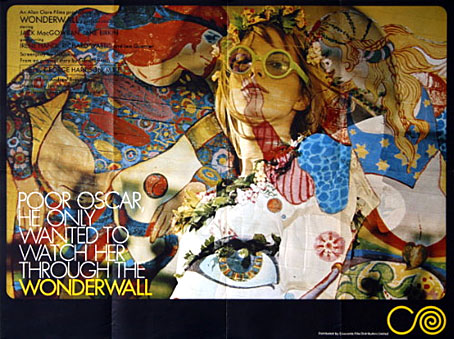
It’s taken me years but the recent obsession with UK psychedelia led me to finally watch Joe Massot’s piece of cinematic fluff from 1968, Wonderwall, a film distinguished primarily for its score by George Harrison (with Ringo Starr and Eric Clapton playing pseudonymously), and its title which was swiped years later by a bunch of Rutles-imitators from Manchester. The story is so slight it would have barely sustained an hour-long TV film: absent-minded scientist (Jack MacGowran) becomes intrigued by his glamorous neighbour (Jane Birkin playing “Penny Lane”; yeah, right…) and knocks holes in the walls of his flat in order to scrutinise her modelling, partying and frequent undressing. Unlike Blow Up (1966, and also featuring Jane Birkin) and the later Performance (1970), both of which attempted to accurately pin down some of the modish aspects of the period, this is a very kitsch piece. That wouldn’t be so bad if it was entertaining kitsch like, say, Smashing Time (1967), but Massott has to resort to scenes of limp comedy and some rather dull dream sequences in order to pad the thing out. Between the handful of actual dialogue scenes there’s a lot of gloating over Ms Birkin’s flesh which no doubt satisfied one half of the audience but by today’s standards is hardly thrilling. Iain Quarrier plays Penny’s duplicitous boyfriend (with a fake Liverpool accent) in his last screen role before he quit acting. Quarrier and MacGowran had appeared together in two of Roman Polanski’s British films, Cul-de-sac (1966) and Dance of the Vampires (1967). In the latter, MacGowran again plays an absent-minded scientist while Quarrier is cinema’s first (?) gay vampire.
wonderwall2.jpg

An interjection from The Fool.

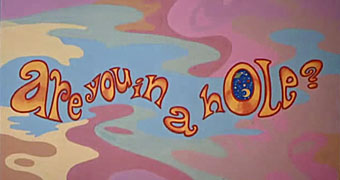
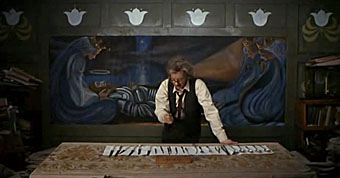
Of chief interest for me in Wonderwall was the decor and title card decorations by Dutch psychedelic collective, The Fool (who also appear in the party scene), famous for their earlier Beatles associations including the inner sleeve for Sgt Pepper and designs for the short-lived Apple Boutique in London’s Baker Street. I was also curious about the distinctive decor of MacGowran’s flat which contrasts with the psychedelia next door, all dark green walls embellished with Victorian murals and a Tennyson poem—very fittingly a piece called The Daydream—which circles the room.
wonderwall4.jpg

The professor prepares to attack the wall.

This was particularly interesting in that it made another connection between the psychedelic era and Victorian arts movements, especially from the Aesthetic/Arts & Crafts end of things, but it wasn’t at all obvious whether the connection was an intentional part of the film’s production design or an accident of location and budgetary convenience. Aside from the old-fashioned appearance of MacGowran’s rooms there seemed no reason why his otherwise cultureless character would have any interest in decorating his living space in this way.
wonderwall3.jpg

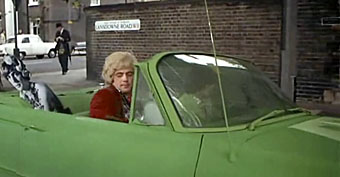
The street corner then…

google1.jpg

…and now.

google2.jpg

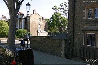
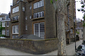
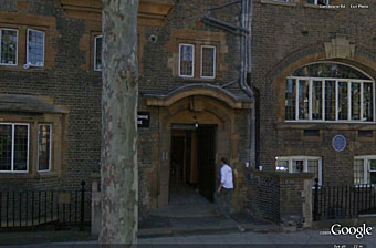
The building itself is equally distinctive and an exterior shot conveniently shows a street sign placing the location in Lansdowne House, a Victorian apartment block on the corner of Lansdowne Road and Ladbroke Road in the Notting Hill/Holland Park area of London.
google3.jpg

Lansdowne House.

What did the building look like today, I wondered? Google Earth proves indispensable at times like this and it was easy to find, in a street which looks more cramped than it does in the film. The presence of a blue plaque on the wall proved intriguing, a sign that the place once had famous residents. Googling for that revealed this photo which was a real surprise: Lansdowne House at one time contained studios for artists who included Charles Ricketts and Charles Shannon, a gay couple and leading lights of London’s fin de siècle art scene (also friends of Oscar Wilde), and another artist, James Pryde, who with William Nicholson worked as The Beggarstaffs. So my suspicion about the Arts & Crafts decor was correct, which means that MacGowran’s flat may have been decorated that way originally and remained untouched since the 1890s. I haven’t seen Rhino’s special edition of Wonderwall which contained additional information about the making of the film, so have no idea whether the history of the building is mentioned there. If anyone does know, please leave a comment. For now I’m quite happy to have stumbled upon another minor link between two of my favourite art decades.

For more visuals, this page has a host of screen grabs from the film as well as some gif animations, all of which manage to make Wonderwall seem more interesting than it is when you’re watching it.

Previously on { feuilleton }
Charles Ricketts’ Hero and Leander
Images by Robert Altman

Charles Ricketts’ Hero and Leander

ricketts1.jpg

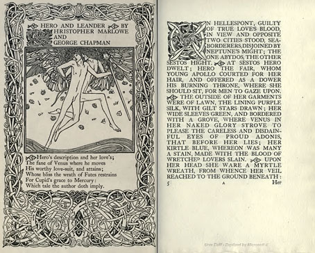
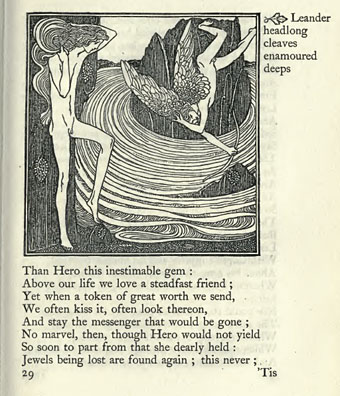
Enthusiasts of Charles Ricketts’ illustrations can find book collections of his drawings and paintings but the artist (with partner Charles Shannon) was also a printer, typographer and book designer who would no doubt have preferred his illustrations to be seen in their intended setting. The Internet Archive has a few choice examples of Rickett’s books, of which the most profusely illustrated is Hero and Leander (1894), Christopher Marlowe’s poem (completed by George Chapman).

ricketts2.jpg

Also of interest is Danaë (1903) by Thomas Sturge Moore with its black and red type, A Bibliography of the Books Issued by Hacon & Ricketts (1904), and A Defence of the Revival of Printing (1899). The latter is of interest to book designers and typographers for its presentation of Ricketts’ aesthetic philosophy. Ricketts’ and Shannon’s books made continual use of a small leaf motif as a pilcrow to mark a fresh paragraph. In A Defence of the Revival of Printing Ricketts discusses his replacement for the ampersand (&), which he disliked, preferring instead a new character combining the letters E and T, ampersands being a contraction of the Latin word “et”. There’s also some discussion of his unique type designs which he charmingly refers to as “founts”, preferring, like contemporary William Morris, the antique terminology.

ricketts3.jpg

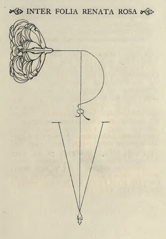
Colophon from Hero and Leander. A rose forms the monogram of Ricketts’ and Shannon’s Vale Press.

Elsewhere on { feuilleton }
The illustrators archive

Previously on { feuilleton }
Art Nouveau illustration
Dorian Gray revisited

Dorian Gray revisited

dg1.jpg

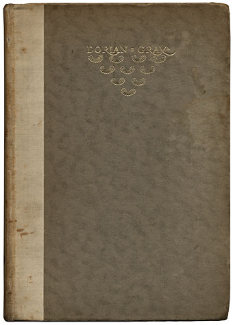
Today’s book purchase was an edition of The Picture of Dorian Gray published in 1945 by the Unicorn Press, London. It’s rather battered and the spine is stained by some unknown brown fluid that may be blood (which would suit a sanguinary tale such as this) but which is most likely something less dramatic.

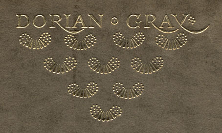
The cover is a cropped version of the design drawn by the wonderful Charles Ricketts (1866–1931) for the original Ward, Lock & Co edition of 1891. More about his work below. Ricketts designed and illustrated a number of Wilde’s books and was far closer to Wilde than Aubrey Beardsley, despite the latter’s permanent association with the writer via Salomé. Ricketts’ title design for Dorian Gray was originally lettered in full and the pattern beneath it extended further down the board. The reversed “y” is a unique touch, something I don’t think I’ve seen anywhere else.

dg2.jpg

Continue reading “Dorian Gray revisited”