Compass Road by Iain Sinclair

sinclair.jpg

I was hoping to get my delayed 2011 calendar launched today but other work needed completing so here’s an interim post.

Think of your journey through mortality as a sequence of valid movies and the pain is ameliorated. Forget the tedious 60-minute division of the lecture hall or dead television (quartered by adverts): arrange just enough markers for the 90-minute slots of Golden Age cinema. And then it’s only a question of nominating the eight guides, culture-figures who will dominate your thoughts (and reveries) for as long as you stay upright. The road is endless, you aren’t. Iain Sinclair

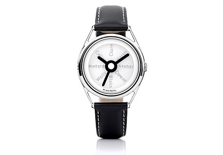
There may be a recession on but people still keep putting out the luxury goods; maybe the bankers are buying all this stuff with their unwarranted bonuses. Compass Road is a limited edition wristwatch from Mr Jones Watches, London, and sports a design commissioned from writer Iain Sinclair, a somewhat surprising choice given that these things are more usually farmed out to those individuals we have to call celebrities. Sinclair is too intelligent and interesting to be a mere celebrity and consequently designs a watch I’d probably buy if I had an excessive income. The watch middle and the hands are based on the British road signs designed by Margaret Calvert and Jock Kinneir while the typeface used for the compass points is Calvert and Kinneir’s Transport (below) which is also used across Britain’s road signs. For the destinations Sinclair has chosen eight writers with London associations: John Clare, Gerald Kersh, Bram Stoker, Joseph Conrad, William Blake, HG Wells, JG Ballard and Louis-Ferdinand Céline. The last seems an odd choice but he did work in London for a while.

transport.jpg

Sinclair’s design is a flexible enough to be applied to other literary cities which raises the question of which names you’d choose for Paris, say, or New York. And which signage systems? Subways or the local roads? Compass Road meanwhile can be yours for £145.

Wilfried Sätty: Artist of the occult

satty1.jpg

After last week’s post about Wilfried Sätty‘s illustrated Poe, I thought I’d follow it up with this 1970 interview from Man, Myth & Magic, a part-work publication which built weekly into a seven-volume “illustrated encyclopedia of the occult”. In the back of each issue there was a two-page feature, Frontiers of Belief, usually featuring more topical material, and issue 36 had Sätty as its subject. The interview captures him just after he’d been building his reputation as one of San Francisco’s psychedelic poster artists and just before the book collections of his collage work started to appear. The description of his working methods inevitably plays up the occult associations but helps to give a little insight into the artist. The first two pictures here are from the published article to which I added a couple of the album covers he produced in the 1970s. There’s also a poster for an exhibition with friend and fellow artist David Singer whose lettering adorned many of Sätty’s posters.

A note about Sätty’s name: he was known as Wilfried Podriech when he came to America but changed his name to Sätty thereafter. This surname is often reproduced without an umlaut over the “a” which I regard as an error. When Jay Babcock, Richard Pleuger and I visited David Singer to discuss Sätty’s work (and see some of Singer’s own) we were informed that Sätty’s adopted name was intended to be reminiscent of the Egyptian Pharaohonic name Seti. The umlaut over the “a” gives the pronunciation setty; without it would be satty.

*   *   *

ARTIST OF THE OCCULT by Robert W. Neubert

Alchemy can be a state of being according to Sätty, a German-born artist who now lives in San Francisco; and he believes that this concept can be extended to art. In his attempts to plumb the depths of the subconscious he makes use of his collection of occult works, including a 17th century alchemical text and a book of healing and magic published in 1648.

Blue and orange flames flicker from an ancient urn and throw dancing shadows about a dimly-lit subterranean chamber in San Francisco, California. Old, dark-hued tapestries hang from the walls and low ceiling, and occult art objects are crammed into every corner. Baroque harpsichord music filters through the incense-scented air.

Descending a wooden ladder into the nearly black chamber is a tall, lanky man with flowing brown hair, a dark blue Western-styled shirt, and grey flared slacks. He carries under his arm a mystical-looking montage he has recently created and run off on a lithograph press.

The montage is in poster form, and it is a haunting collection of Renaissance and medieval themes, incredible in its intensity, colour and creativity.

satty_photo.jpg

Sätty photographed for Man, Myth & Magic (1970).

The artist is Sätty, a German-born montage-maker with a dream—a dream of plumbing the depths of the subconscious by utilizing alchemy and mysticism in his work.

Alchemy is essential to his creativity, he says. But the 31-year-old artist’s definition of alchemy has a broader meaning than the classic textbook definition of transmuting base metals into gold. He is one of the first non-commercial poster makers, and his work far transcends the psychedelic art used to advertise San Francisco rock and roll dances.

“Alchemy can be a state of being,” he says. “There is such a thing as visual or intellectual or artistic alchemy. The undeveloped mind may be considered akin to lead, the fully-realized mind as gold. And the same is true of art. Much of contemporary art is lead.”

Continue reading “Wilfried Sätty: Artist of the occult”

Salome’s Last Dance

salome1.jpg

More Wildeana. It’s taken me over two decades to watch this film, and while I can’t really say it was worth the wait it was more entertaining than I expected. Salome’s Last Dance was directed in 1988 by Ken Russell and is his own typically mannered adaptation of the Wilde play. It appeared around the same time as his adaptation of another Victorian work, Bram Stoker’s The Lair of the White Worm, and it was the latter film which caused me to lose my patience with Russell’s excesses and so ignore this one. In Salome’s Last Dance we have Oscar Wilde and Lord Alfred Douglas visiting Alfred Taylor’s London brothel one night in 1892 where Taylor and company stage a performance of Wilde’s banned play.

salome2.jpg

Aubrey Beardsley’s illustrations appear in the title sequence.

If you’re a Wilde enthusiast there are at least two ways you may take this; you can be appalled by Russell’s “translation” of Wilde’s words (Salomé was written in French then translated for English publication in 1894; there’s no reason to re-translate a version the author approved), a translation which is really more of an adaptation, with much of the poetic monologue removed and the tone lowered for a general audience—Wilde’s “Iokannen” is vulgarised to “John the Baptist” throughout. Or you can try and enjoy what is at least a complete performance of the play, even though it more often resembles Carry On Salomé than anything one might have expected Sarah Bernhardt to perform. Injecting a Symbolist drama with slapstick and grotesquery is probably inevitable given the director (Russell is also co-writer and he plays—badly—the role of the Cappadocian). I found it impossible to decide whether Russell was sending up the play because he found it too pompous or whether he felt that an audience wouldn’t sit still for it otherwise. Whatever his intention, the premise is intriguing enough to inspire speculation as to how it might have been treated by other hands.

Continue reading “Salome’s Last Dance”

Nosferatu

nosferatu.jpg

Poster design by Albin Grau.

Friedrich Murnau’s Nosferatu, A Symphony of Horror (1922) isn’t the first horror film but it’s certainly the first truly effective one which is why it’s been so influential over the years, inspiring a remake by Werner Herzog (1979), the vampire’s appearance in Salem’s Lot (1979), Coppola’s Dracula (1992), and a fictionalised account of its creation in Shadow of the Vampire (2000).

The Internet Archive have a copy available as a free download. If you’ve never seen it then this is your chance since silent films rarely turn up on TV. Many early films exist in multiple versions due to the vagaries of film storage (different cuts, decaying prints, etc). Nosferatu was nearly destroyed altogether after a successful lawsuit by Bram Stoker’s widow, Florence, which means that all the prints are in a less than satisfactory condition. My own favourite is the BFI edition (which DVD now seems to be deleted), taken from the definitive “Bologna” restoration, with scenes tinted throughout (as silent films often were) and with a tremendous new score by Hammer composer James Bernard.

Murnau went on to make better films but Nosferatu retains an uncanny power owing to the rare combination of the director’s technical brilliance and Albin Grau’s fabulous vampire design, worlds away from Stoker’s sinister aristocrat. This is the place where cinema showed it could fully compete with horror fiction by summoning its own archetypes from the recesses of the imagination.