An early illustration by Burne Hogarth from Federal Illustrator, Winter 1931–1932, credited to the artist’s original name, Bernard Spinoza Ginsburg. (Via)
• RIP Simon House, a musician whose death was announced in the same week as news of a remixed edition of Hall Of The Mountain Grill by Hawkwind, the first of the group’s albums to feature House on violin and keyboards. House’s keyboards made a considerable difference to Hawkwind’s sound, expanding the range of their songwriting; the melodramatic scale of Assault And Battery/The Golden Void wouldn’t have been possible without those massed Mellotrons. Post-Hawkwind it was House’s violin that was sought after during his time as a session musician, on songs like Yassassin by David Bowie, and Talking Drum by Japan. He’s also one of the musicians credited on Thomas Dolby’s biggest hit, She Blinded Me With Science (violin again), although his contribution there is easy to mistake for a synthesizer.
• “We did want the name to be weighty and metal-related because it is a kind of a metal band. So what is heavy and what is metal: that was the answer.” Hildur Gudnadóttir talking about Osmium, an experimental quartet comprising Gudnadóttir with James Ginzburg, Rully Shabara and Sam Slater.
• At Criterion: Stephanie Zacharek on Richard Lester’s The Three Musketeers and The Four Musketeers, films from a time “when delighting audiences meant more than catering to the predetermined whims of a dogged fandom”.
• The week in maps: At Public Domain Review, Bernard Sleigh’s Anciente Mappe of Fairyland (ca. 1920 edition); at Nautilus, the first maps of the Earth’s magnetic field.
• The eleventh installment of Smoky Man’s exploration of The Bumper Book of Magic has been posted (in Italian) at (quasi), and in English at Alan Moore World.
• Not on any map: Mark Valentine describes the time he tried to buy a phantom island from the Hudson’s Bay Company.
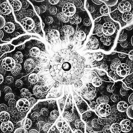
• At Colossal: “In surreal portraits, Rafael Silveira tends to the garden of consciousness“.
• New music: Osmium by Osmium, and Along The Wind Spear by Survey Channel.
• Anne Billson chooses Anjelica Huston’s ten best roles.
• Five Owls (1970) by Canned Heat | Night Owl (1996) by System 7 | Owls And Flowers (2006) by Belbury Poly


_(14782918732).jpg)