
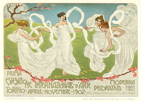
Turin exposition poster by Leonardo Bistolfi.
Part two of a two-part skate through the contents of volume 10 of Deutsche Kunst und Dekoration, the German periodical of art and decoration. In addition to the Heinrich Vogeler feature which was the subject of yesterday’s post, this edition includes articles on the Prima Esposizione Internazionale d’Arte Decorativa Moderna in Turin—another international showcase for the Art Nouveau style—and a feature on the Viennese Secession exhibition of the same year. This latter piece was especially fascinating when seeing such a notable event reported for the first time. There’s more about that below. This volume also includes a piece on the Glasgow Arts and Crafts movement but the photos for that piece are poor quality. As before, anyone wishing to see these samples in greater detail is advised to download the entire volume at the Internet Archive. There’ll be more DK&D next week.
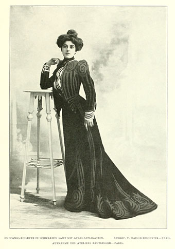
A feature on dress design shows some rare examples of Art Nouveau style being applied to clothing.
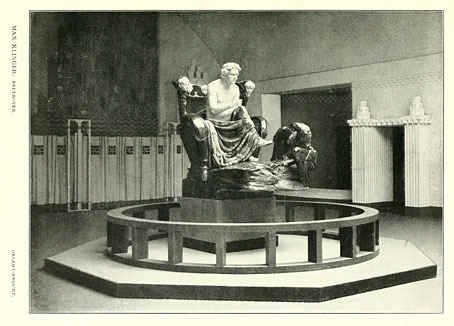
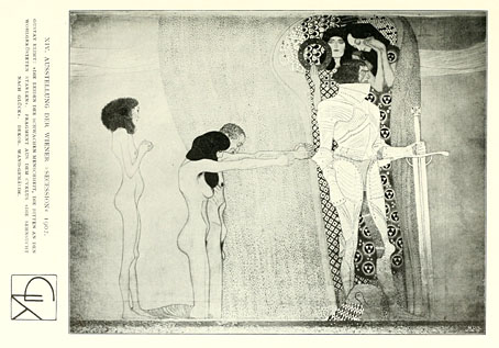
Modernism begins here. I love the Secession artists, and as I said above, it’s fascinating seeing an event like the Beethoven exhibition being reported as news. The exhibition was staged in Joseph Maria Olbrich’s Secession building in Vienna, a radical “temple of art” and the forerunner of all later white cube gallery spaces. This was a themed exhibition—itself a relatively new idea—which took Max Klinger’s Beethoven sculpture as its central work; the contributions of the other artists were all intended to complement this. Most famous of these were the Beethoven-themed paintings by Gustav Klimt which were arranged as a frieze inside the building.
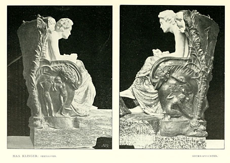
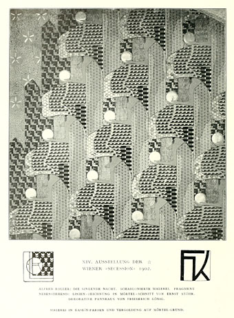
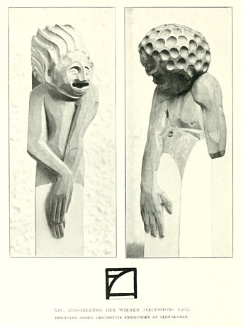
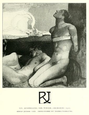
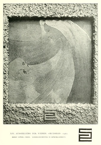
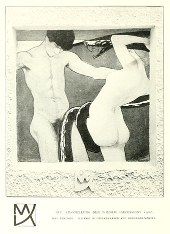
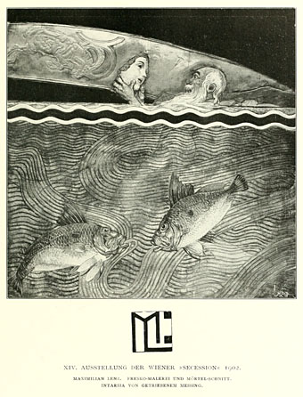
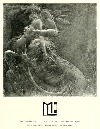
Another great pleasure of this edition of DK&D is the attention they devote to all aspects of the exhibition. Klinger’s sculpture is usually reproduced in books in a single view; here we get to see it in detail from many different views. So to with the minor works by other artists which adorned walls and doors. Many of these pieces are very advanced for 1902, showing once again how the tendency to abstraction in western art was absolutely inevitable from whichever direction it came. The radical qualities of the Secession came through in their painting, architecture and especially in the graphic design which featured in their showcase magazine, Ver Sacrum, and the posters produced by Koloman Moser, Alfred Roller, Otto Wagner and others. Something to note here is how every contributing artist was given a stylised monogram as a means to identify their work. These examples are only a few of those shown in the journal.
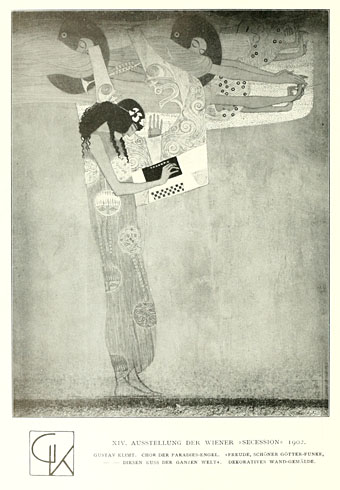
The great Gustav. Klimt’s work has now attained that dubious Impressionist-infested realm of Art-for-people-who-don’t-really-care-much-for-art, a place where once-challenging paintings are reduced to a kind of visual muzak. The ubiquity of his work today obscures its radical qualities, and also his presence at the heart of an art movement with very lofty ideals indeed. The Secessionists wanted to change the world with their art, hence the choice of Beethoven as a venerable predecessor; Klimt himself later admitted that their plans had failed but one has to wonder what he would have thought about his paintings becoming such a fixture of the greetings card market.
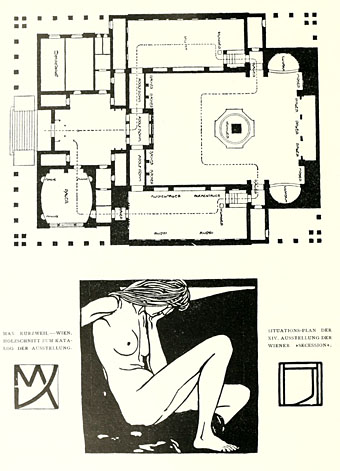
A plan of the Secession building showing the route visitors were supposed to take through the exhibition.
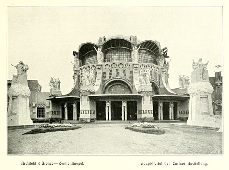
A feature about the Turin exposition begins here and is continued in the next volume. The exposition also had lofty ideals with a pronouncement that “Only original products that show a decisive tendency toward aesthetic renewal of form will be admitted. Neither mere imitations of past styles nor industrial products not inspired by an artistic sense will be accepted.” The entrance above was design by Raimondo D’Aronco.
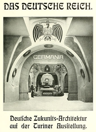
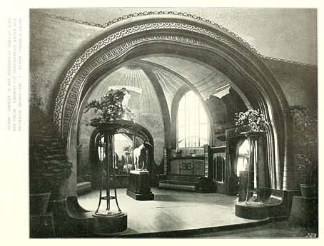
The entrance to the German pavilion, and a typical example of Teutonic bluster. If you overlook the pomposity and sense of foreboding such a gateway inspires (the First World War was only twelve years away), the interior featured some beautiful and original designs, some of which will be seen in the next installment.
Previously on { feuilleton }
• Deutsche Kunst und Dekoration #10: Heinrich Vogeler
• Deutsche Kunst und Dekoration #9
• Deutsche Kunst und Dekoration #8
• Deutsche Kunst und Dekoration #7
• Deutsche Kunst und Dekoration #6
• Deutsche Kunst und Dekoration #5
• Deutsche Kunst und Dekoration #4
• Deutsche Kunst und Dekoration #2
• Deutsche Kunst und Dekoration #1
• Deutsche Kunst und Dekoration
• Jugend Magazine revisited
• Secession posters
I’m unconvinced of the wisdom of attempting to produce art that will ever after seem radical. By all means be daring (free jazz, 12-tone music), but to make work with an eye to challenging all of future history seems merest vanity.
Of course, the art historian will continue to see the daring of the since assimilated artist (e.g. Beethoven), but does the appreciative audience always need the art-historical perspective not to be philistine? For example, if someone hears the turbulence in Beethoven but is ignorant of the history of western art music (and so knows nothing of the un/acceptability at the time of composition of expressing the feelings LvB did), how wrong is their experience of the music?
I don’t mean to run down the art-historical perspective–lacking faith in the eternal appeal of great art and the constancy of human nature, I’d better not–, but someone with less a-h knowledge than I (very hard to imagine, I know) may have a much better eye or ear for what’s important.
I agree that Klimt’s been “chocolate-boxed”–how could I not?–, but is ubiquity the problem, rather than a combination of careful selection of works and complete decontextualisation?
Is it Max Kurzweil who wins the prize for most hilarious use of a snake?
I nearly fell off my chair laughing.
I do hope he meant to amuse.
The colored poster looks like it could have come out of Lost Girls
I don’t know Klimt wanted to be permanently radical, the Secession people were concerned more with breaking away from the constraints of academic art (lifeless historicism and the like), and doing something new. I’m sure they’d be aware that anything new has an in-built shelf-life. The concept of art as being a major, ongoing challenge became far more common in the 20th century, previous gestures were usually for other artists and a few gallery visitors. The Succession’s aim was to involve everyone in art, that’s why they built their own exhibition space. On that level, Klimt’s popular success would have pleased him up to a point, although I can’t see him being pleased with ‘The Kiss’ fridge magnets.
I don’t see it as a case of being wrong, it’s more a general disappointment that people can treat things superficially and not be more curious about the motives behind a given work, the context in which it was created and so on. The audience does itself and the artist a disservice if it treats a work superficially; you can easily appreciate the nice tune that Beethoven created for the fourth movement of his Ninth Symphony but you’ll have a greater appreciation of the work as a whole if you also take time to find out that the words that tune accompanies are a Schiller poem about joy, that the fourth movement recapitulates (then rejects) the themes of the previous three movements, that his making the third movement the slow one was a bold and original step, etc. I’ll always prefer mass attention for Klimt and the Impressionists over the wretched Thomas Kincaid but art usually tries to be more than this even when it approaches mere decoration as so much abstract painting does. In the case of the Impressionists some of them are little more than pretty pictures, plein air sketches of sunny scenes, but Klimt’s work was part of an ongoing debate with the past, and a proposal for how art could work in the future. I doubt any of the members of my family who like Klimt could look at his two pictures of Judith, for example, and tell you who Judith was. Many people will be unaware that the male heads peeping from those beautiful paintings are the decapitated remains of Holofernes. No, you don’t need to know this to “like” the paintings but knowledge of the meaning behind the surface helps you see the aestheticising of an act which Caravaggio (for example) presented in a very different way.
I don’t disagree with a word, John.
One of my most treasured possessions is a postcard of Hannah More’s “Judith and Holofernes”, which was sent to me by the model, Jennifer Nagel, a college friend of mine. Around the frame is written, “Judith is preferable to Salome as a role model for enterprising women everywhere because she was not afraid to get blood on her hands.” Always makes me smile.