
Image-heavy post! Please be patient.
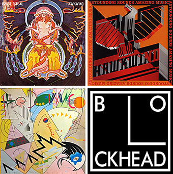
Four designs for three bands, all by the same designer, the versatile and brilliant Barney Bubbles. A recent reference over at Ace Jet 170 to the sleeve for In Search of Space by Hawkwind made me realise that Barney Bubbles receives little posthumous attention outside the histories of his former employers. Since he was a major influence on my career I thought it time to give him at least part of the appraisal he deserves. His work has grown in relevance to my own even though I stopped working for Hawkwind myself in 1985, not least because I’ve made a similar transition away from derivative space art towards pure design. Barney Bubbles was equally adept at design as he was at illustration, unlike contemporaries in the album cover field such as Roger Dean (mainly an illustrator although he did create lettering designs) and Hipgnosis (who were more designers and photographers who drafted in illustrators when required).
Colin Fulcher became Barney Bubbles sometime in the late sixties, probably when he was working either part-time or full-time with the underground magazines such as Oz and later Friends/Frendz. He enjoyed pseudonyms and was still using them in the 1980s; Barney Bubbles must have been one that stuck. The Friends documentary website mentions that he may have worked in San Francisco for a while with Stanley Mouse, something I can easily believe since his early artwork has the same direct, high-impact quality as the best of the American psychedelic posters. Barney brought that sensibility to album cover design. His first work for Hawkwind, In Search of Space, is a classic of inventive packaging.
Update: BB didn’t work with Mouse in SF, I’ve now been told.
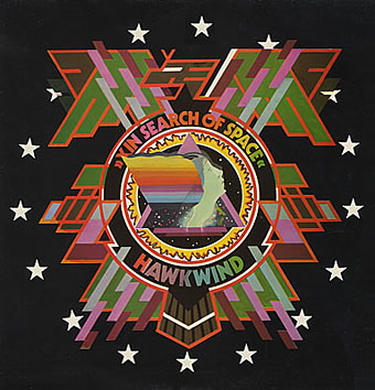
Hawkwind: In Search of Space (1971).
It’s fair to say that Hawkwind were very lucky to find Barney Bubbles, he immediately gave their music—which was often rambling and semi-improvised at the time—a compelling visual dimension that exaggerated their science fiction image while still presenting different aspects of the band’s persona. In Search of Space is an emblematic design that opens out to reveal a poster layout inside. One of the things that distinguishes Barney Bubbles’ designs from other illustrators of this period is a frequent use of hard graphical elements, something that’s here right at the outset of his work for Hawkwind.
This album also included a Bubbles-designed “Hawklog”, a booklet purporting to be the logbook of the crew of the Hawkwind spacecraft. I scanned my copy some time ago and converted it to a PDF; you can download it here.
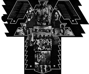
The In Search of Space sleeve unfolded.
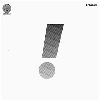
Gracious! by Gracious! (1970).
The shifting identity of Barney Bubbles means that many works such as this are omitted from listings. Gracious! was one of the first releases on the Vertigo label and the design was credited to “Teenburger”. The bold exclamation mark is printed on textured (bubbled?) card while the interior (below) featured a three-dimensional Richard Hamilton-style tableau. This band also connects Barney Bubbles and Roger Dean, another artist whose work was increasingly used by Vertigo. The second Gracious! album featured a Dean cover which kept the exclamation mark design.
Gracious! gatefold interior.
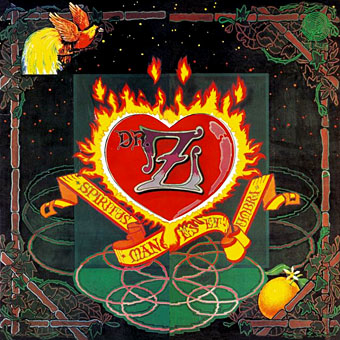
Dr Z: Three Parts to My Soul (1971).
In the 1970s even the most obscure bands could receive lavish cover treatment. This more typical design for the Vertigo label had two flaps that opened out from the centre with a heart-shaped hole cut in the middle.

Hawkwind: Doremi Fasol Latido (1972).
I hadn’t realised until I started assembling these images how much Barney’s work seemed to go through phases of influence. For the third Hawkwind album he must have been looking at the kind of superhero comic art exemplified by Jack Kirby. The Doremi cover is a black and white drawing (printed in silver ink on the original sleeve) done in the style of Kirby’s familiar reflective metal strips. The inner sleeve was even more Kirby-like although less successful, a squadron of barbarians on horseback with a sacked city burning in the distance and flying saucers drifting overhead. The fold-out poster below was free with initial pressings.
Hawkwind: Star Rats—poster with the Doremi album (1972).
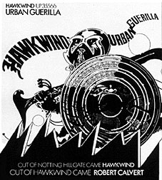
Hawkwind: Urban Guerilla single ad (1973).
This artwork in this ad design was part of a series of black and white posters all created around the time of the Doremi album that still exhibited the bold influence of Jack Kirby. This particular picture, however, is lifted directly from a Lone Sloan strip by French comic artist Philippe Druillet, Les Iles du Vent Sauvage (1970). (You can see part of the drawing on this page.) I later swiped from Druillet myself so I’m not one to criticise. In fairness, the comic strip figure only had the helmet and the shield, Barney adds an elaborate sword and a new background.
Update: thanks to comments from Rebecca and Mike below, I was reminded of the title of the picture above and so was able to find the poster version and its companions. You can see all five posters here.
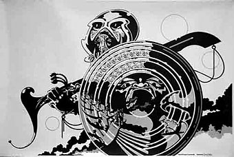
Fanon—Dragon Commando.
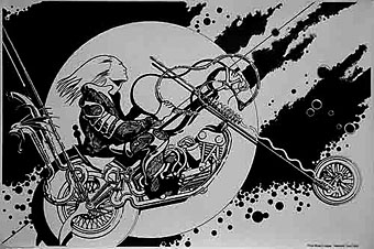
Prince Minksy’s chopper.
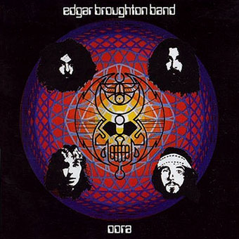
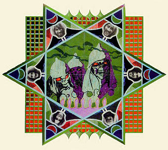
Edgar Broughton Band: Oora (1973).
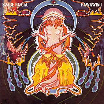
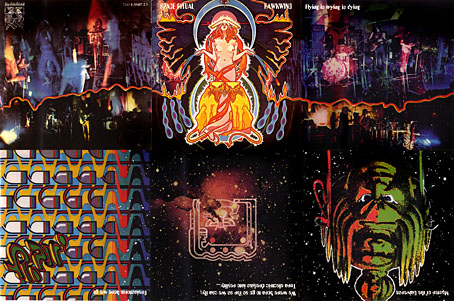
Hawkwind: Space Ritual (1973).
The definitive Hawkwind design and one of my favourite album covers. Barney’s work had now moved away from comic books into a kind of cosmic Art Nouveau with the band’s dancer, Stacia, here presented in the style of Alphonse Mucha. The lion heads were based on a head in Mucha’s L’Emeraude from 1900. Mucha also favoured a combination of illustration with hard graphics so it’s easy to see why Barney would respond to this. Much of the Hawkwind ad art of the time features Mucha-styled borders.
Space Ritual is justly celebrated for its poster sleeve which opens out to six panels. Barney’s graphics for the interior were developments of the work he created for the Hawkwind logbook, a blend of drawn or painted graphics with “significant” photos, in this case Edwardian erotica, atomic structures, a foetus floating among stars, etc. The example below is crudely composited from the CD reissue; it was too much effort to photograph the original sleeve and it doesn’t make much difference at this size anyway.
The Space Ritual tour programme also came as a fold-out poster, featuring a pulpy sf story and pictures of the band among the Mucha flourishes. Once again, I made my copy into a PDF which you can download here.
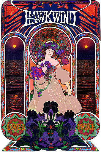
Hawkwind: Love & Peace poster (circa 1973).
The Mucha influence continued in this promotional poster whose figure and design is based on the Champagne White Star artwork for Moet & Chandon (1899).
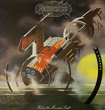
Hawkwind: Hall of the Mountain Grill (1974).
The most illustrational of all his Hawkwind sleeves and a picture that could easily have worked as one of his monochrome designs.
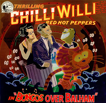
Chilli Willi and the Red Hot Peppers: Bongos Over Balham (1974).
The sleeve for Mike Moorcock’s Deep Fix album below was (according to Moorcock) a real wooden fairground booth that Barney constructed, painted then photographed.
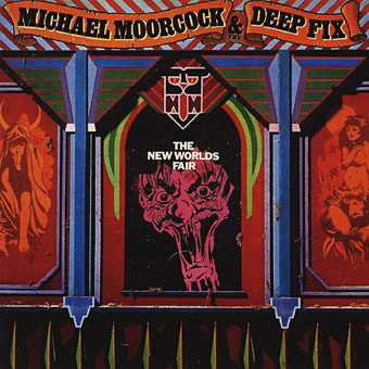
Michael Moorcock & the Deep Fix: New Worlds Fair (1975).
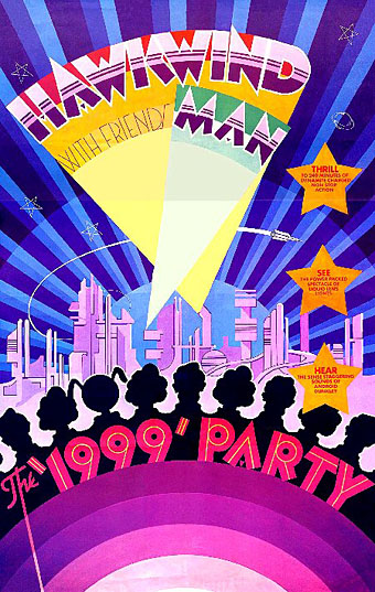
Hawkwind: The 1999 Party—tour poster (1975).
The shift of emphasis in the mid-Seventies was away from Art Nouveau towards Art Deco poster graphics, a style evident in all the 1999 Party tour artwork and the two sleeves that follow.
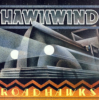
Hawkwind: Roadhawks (1976).
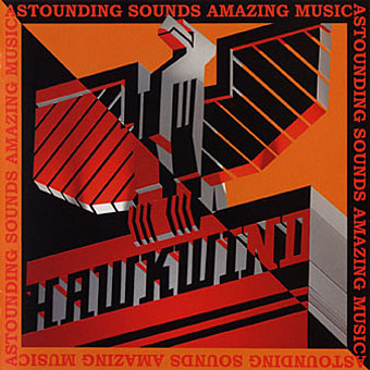
Hawkwind: Astounding Sounds, Amazing Music (1976).
The final Hawkwind design isn’t just Art Deco, it’s almost fascist, looking like a piece of Soviet propaganda art topped by a Nazi eagle. Hawkwind singer Bob Calvert spoke of the band being reorganised after this album along the lines of “a Stalinist purge” so maybe the design is appropriate.
1976 was the year of a Stalinist purge in British music as a whole. With the advent of punk Barney successfully made the transition from hippy designer to punk designer. If anything, punk gave him a new leash of life as his tremendous sleeve for the second Damned album demonstrates. His association with Stiff Records and Radar Records was the second major phase of his career after Hawkwind and gave him the opportunity to explore a range of influences from early 20th century design.
The Damned sleeve is a Kandinsky-esque portrait of the band with the group’s name spelled out using abstract shapes, an approach to album lettering he was to use for other artists as the decade progressed. I was especially taken with this album at the time and referred to it in an exam essay I had to write about album covers.
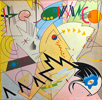
The Damned: Music For Pleasure (1977).
The very wide letter spacing used on the titles of these albums was a common feature of his Stiff designs, one of a number of habitual effects that became prevalent in work from subsequent designers.
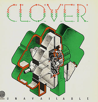
Clover: Unavailable (1977).
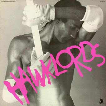
Hawklords: 25 Years On (1978).
Hawkwind became Hawklords for one album and a tour in 1978. Barney was commissioned to help create the stage show and develop the vague science fiction concept of Pan Transcendental Industries around which the album was based. The result was a very up-to-the-minute presentation which the band discarded immediately afterwards. This was Barney’s last work for Hawkwind. I’ve always found this cover distinctly erotic but I doubt you want to know about that here.
Nik Turner’s Sphinx: Xitintoday (1978).
Sax player Nik Turner was thrown out of Hawkwind in the 1976 band purge but he remained friends with Barney Bubbles. When Turner came to record his solo album, Xitintoday, Barney was asked to create the packaging. The album is a concept affair based around the Egyptian Book of the Dead but Barney’s design for the sleeve and accompanying booklet avoids hippy cliches with a use of abstract graphics or arrangements of lettering; the cover design, for example, features stars made up of the word “twinkle”. The pair continued to work together for Turner’s later band, Inner City Unit.
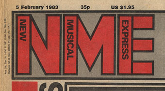
1978 was also the year Barney was asked to help with the redesign of the NME. His new logo remained in use up to the late 80s and forms the basis of the current (degraded) logo design.
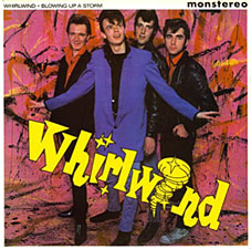
Whirlwind: Blowing Up A Storm (1978).

Ian Dury & the Blockheads: logo design (late 70s).
The association with Stiff Records led to one of Barney’s most famous works, the Blockhead logo. If he’s remembered for anything it should be for this simple, brilliant and witty graphic.
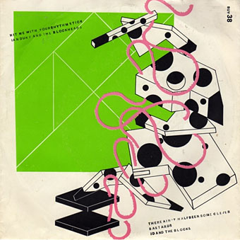
Ian Dury & the Blockheads: Hit Me With Your Rhythm Stick (1978).
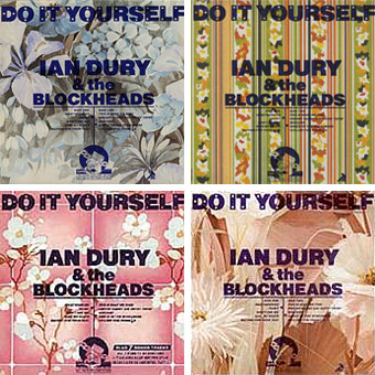
Ian Dury & the Blockheads: Do It Yourself (1979).
His inventiveness came to the fore again with his cover designs for Ian Dury. This sleeve was printed in twelve different versions onto real sheets of wallpaper. The design acts not only as a comment on the home improvement alluded to in the title but also a request for the purchaser to make a choice of their own among the different styles.
Radar Records logo (1978).
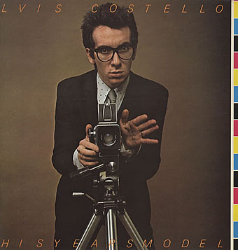
Elvis Costello & the Attractions: This Year’s Model (1978).
Initial pressings were made to look like deliberate misprints, showing CMYK colour bars and cutting off the letters of the artist name and title, a quirk abandoned on subsequent editions.
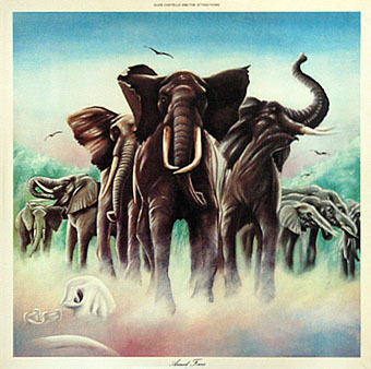
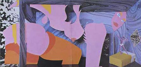
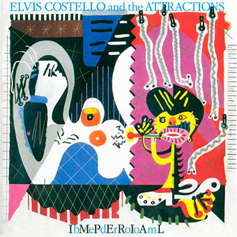
Elvis Costello & the Attractions: Armed Forces (1979).
The David Shepherd-style elephants on this cover do little to hint at the exceptional interior design, probably Barney’s most extravagant work since Space Ritual, and certainly its equal. The sleeve opens out to further extend the interpretation of the title and includes Mondrian and Jackson Pollock stylings among its animal-print abstractions. To save page-loading time there’s a page here where you can see the full effect for yourself. Thanks to LondonLee for the photos.
Update: Tim Niblock in the comments notes that this package was produced in association with Bazooka Graphics, France.
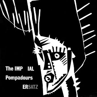
The Imperial Pompadours: Ersatz (1982).
Not many people know Barney Bubbles had a band. The Imperial Pompadours was Barney plus Nik Turner and other members borrowed from Inner City Unit. They recorded this one unhinged rock’n’roll album on a very restricted budget. Read The Seth Man’s review of it here.
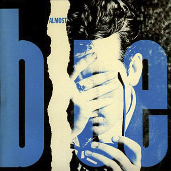
Elvis Costello & the Attractions: Almost Blue (1981).
Work at Radar continued with covers for all the early Elvis Costello albums. Almost Blue prefigures the look of many sleeve designs that came later in the decade while Imperial Bedroom featured a painting of Barney’s pastiching Picasso (“Snakecharmer & Reclining Octopus by Sal Forlenza, 1942”). Despite his increasing success and a growing reputation among younger designers these were to be his last works. Friends say he’d always been something of a depressive and late in 1983 he evidently reached some kind of crisis and took his own life. Roy Carr wrote an obituary for the NME.
Elvis Costello & the Attractions: Imperial Bedroom (1982).
Barney Bubbles’ work is continually featured in histories of album cover design but he was more than just a cover designer. We’re overdue a decent book-length examination of his work and his influence.
Update: The book is on its way. And David Wills’ new blog features his reminiscences about art school life with Barney. Good things come to those who wait.
Update 2: Reasons to be Cheerful: The Life and Work of Barney Bubbles by Paul Gorman was published by Adelita on December 4th, 2008. Paul Gorman writes about it here and I featured an extract here.
Elsewhere on { feuilleton }
• The album covers archive
damn right he needs a book!!!!! a true visionary designer. alwasy loved his noveau/deco stuff. beautiful.
Yes a book please, Bubbles is one of my biggest inspirations. Thanks for posting this, I’ve researched him for years and never found out much.
Hey Arik, good to see you here.
We’d probably have seen a book if he’d stayed with us for a bit longer; will probably happen eventually. I’d try and do something about it myself if I had better contacts in the publishing world.
A great overview of Barney’s work.
Well done!
We’ve researched Barney for years too, and have actually found tons of stuff :-), all sorts: even a concept for a duvet cover(!), through to some nice film work. We collect what we can and tend to focus on the more obscure items. (In 2001 we staged an exhibition of predominantly pre-’75 work in London; maybe you went?)
In our research we speak to a lot of people, and along the way heard that there was talk, in the early ’80s (when Barney was still alive), of a book potentially being done in Japan (if that’s true, unfortunately it never got published). Recently, when talking to someone who was very close to Barney, this Japanese interest in general was corroborated when we were told he was actually offered a VERY good job in Japan.
This is a nice page about Barney. Very interesting to see some of the original references Barney was looking at. Most were known to us, but we had never seen the inspiration for Fanon – Dragon Commando before (the illustration on the Urban Guerilla advert).
The Roadhawks LP you feature has a real curious story to it. In a letter Barney once wrote, he says how he did the original Roadhawks artwork which was solely intended for a HW tour poster. When the Roadhawks LP came out after this (and a subsequent 2nd poster), it wasn’t Barney’s actual artwork that was used for these later items. He says the record company got another illustrator to do a ‘copy’. He says the differences a small, but artistically it makes a BIG differences. One of the more easily noticeable differences is the typography. This is why, if you look at people’s collections closely enough, you can come across 2 different versions of the Roadhawks poster.
Hope people find this interesting.
Thanks.
Rebecca and Mike: Great to hear that other people care so much. I didn’t know there’d been an exhibition in London otherwise I would have tried to get down to see it. And I was fairly sure this sample was only scratching the surface of his career.
I was trying to remember the title of that picture! I used to have all those b&w posters from (reprints?) in the early 80s. I do still have an advert spread from the NME. There was a web page used to have copies of them but I couldn’t find it after some intensive searching. A good job really, this page is image-heavy already.
Aha, I remember thinking there was a difference between the poster art and the album sleeve. I sympathise with Barney on that score, I also had three of my later Hawkwind sleeves (which were pretty terrible to begin with) reworked by another artist for a later release.
Thanks for the info!
John, that’s brilliant! Thanks very much.
I’ve got that Imperial Pompadours album. It’s a blast isn’t it? One track on side one and twenty something on side two, as I remember. Don’t remember knowing Bubbles was actually in it, but it’s been a long time since I looked at it.
Have a few Inner City Unit albums too, I’ll try and get them online soon. They were a fantastic band; amazing live. Can remember Turner going mental with his sax, sporting a moheken, in Peacocks in Birmingham. Wasn’t he always being thrown out of Hawkwind?
You’ll know better than me but isn’t that Astounding Sounds image the back cover? I remember the front cover mimicking the Sci-Fi mag of a similar name, an illustration of a figure sitting by an other-worldly lake or something.
Do you know who designed the PXR5 cover? It’s probably my favourite, perhaps because it’s one of the less “spacey” covers. It feel like Bubbles: Do it yourself meets Clover, kind of thing.
All this Hawktalk makes we want to dust it all off again.
Great post!
Thanks Richard. I’ve heard the Pompadours album but don’t have a copy unfortunately. I saw Inner City Unit live a few times though, crazy, energetic stuff. He was indeed always rejoining then being thrown out of the band again. He was there for a year or two during the period I was working for them.
Barney’s cover was the front (identifiable as such by having the opening on its right), Tony Hyde painted the rear which resembled old magazine art. The album has a dual sleeve, in effect, with the large title on the rear making it look more like the front cover.
I sold my copy (it was the rare unstickered version with the faulty wiring visible) but a bit of checking revealed that it was the work of Philip Tonkyn who also helped with the cover of the later Levitation:
http://homepage.ntlworld.com/philip.tonkyn1/pages_design/HawkwindPXR.htm
I always wanted one of those plug badges!
I’ve never understood why there’s been no book of his work published either. Ridiculous when you consider how famous and well-published Neville Brody and David Carson are in comparison.
You should have show more of his Costello sleeves though- the Hawkwind stuff is a bit hippy for my tastes. Some of the 45 sleeves especially are real small gems of wit and the orignal version of the ‘Armed Forces’ album that folds out opens at the back is brillant.
He gets a passing mention in The Graphic Language of Neville Brody. Brody would have known him since he started out working for Stiff in the late 70s before moving to Fetish Records.
The lack of a book may have something to do with the punk generation being the ones who’ve written the history of that period. Everyone praises Barney’s work at Stiff but I can imagine many would see his hippy past as embarrassing and tasteless in that tedious “us and them” attitude that still prevails when 70s culture is discussed. Barney Bubbles and the Hipgnosis designers were good examples of people who successfully bridged the gap between the heads and the punks but it’s largely the punks who’ve dictated the terms by which their work is discussed. Ironic that the Damned sleeve on this page was for an album produced by Pink Floyd drummer Nick Mason.
I would have shown more Costello stuff if I could have found it?a decent size pic of Imperial Bedroom took some serious searching?although I was worried about the sheer amount of stuff that was going on the page by that point. You’re right that Armed Forces should be there although I don’t own that album and could only find pictures of the front. Would have liked a decent image of Graham Parker’s Parkerilla album as well, a great gatefold spread with more of Barney’s inventive lettering. And maybe a good copy of his witty self-portrait. And, and….
I have that Armed Forces sleeve which I can try to scan (or photographing it might work better). It has a nice inner sleeve too.
I used to have the Parkerilla album, sadly no more. It was a great sleeve, better than the actual album really.
Thanks, I think I this overloaded page could stand a picture of Armed Forces, if you don’t mind. The trouble with these designs if they’re nearly always detailed packages, so a shot of the front rarely communicates the amount of work that went into the thing as a whole.
Fantastic post. Great to see all that work together.
Could people post some of the pseudonyms Barney used in credit lines? For years I’ve looked through my collection (and in shops) wondering Is this Barney too?
He was (possibly?) the “Comte Pierre D’Auvergne” for the Warrior on the Edge of Time album. Then for Astounding Sounds he wanted the credit “Grove Lane”. And as mentioned above, his Imperial Bedroom painting is credited to “Sal Forlenza”. I’m sure there are more.
Great stuff! Illustrators and designers rarely get much press when they pass away.
Wow!
Thanks for this post. One of my favorite belongings (unfortunately misplaced) is a Blockhead watch whose hands complete the logo at 3:00 everyday. I always wondered the provenance of the painting on the cover of “Imperial Bedroom,” glad to have the mystery solved.
For anyone who cares to track it down, we published a well illustrated, 16-page article about Bubbles by Julia Thrift in Eye magazine (no. 6 vol. 2, 1992) — it remains one of the very few pieces published about him.
More recently, I spent two years (as an editor) trying to encourage Rebecca and Mike, above, to share some of their knowledge about Bubbles in a book that a publisher was keen to do. R and M’s London exhibition about his early years as a designer was a real feat of research.
R and M passed on the opportunity. It’s a crying shame that there is no book about such a significant designer. One day perhaps . . .
neville, malcolm garrett and peter saville all hold Bubbles in the highest regard. as do most older designers that are familiar with his work.
i worked with a phorographer who shot a lot of work for him when he was at stiff, and he said barney didn’t like the idea of putting design credits on sleeves, as it was ‘just packaging’, and you didn’t see credits on a can of soup.
he also said that barney had received a summons from the taxman just before he took his life.
this is the best collection of barney’s work i’ve seen gathered together in one place. you are to be applauded for spreading the gospel.
but quit going on about the image heavy page – we want more!
Nice site – glad I found it – Barney’s work has always grabbed me. His other stuff is equally excellent.
I used to spend some time painting.
I hand painted my jean jacket with the Space Ritual cover, did a silk screen for shirts of the Astounding Sounds cover, painted a t-shirt with the In Search of Space cover, along with the eerie “your captain is dead…” quote, and a painted a Hawklords t-shirt, and used to have the Hall of the Mountain Grill poster on my walls.
I do indeed hold Barney in the highest regard – hello Norman! ;-) – and always cite him as the single biggest direct influence on my own work designing sleeves in the late 70s.
I have written (quite briefly it must be said) about his influence in both Graphics International and Dublin’s Hot Press magazine amongst others.
I was particularly influenced by the ‘attitude’ of his work for Hawkwind, not just for the sleeves themselves but for the attention to all aspects of their visual persona. That was certainly something I endeavoured to bring to bear with my Buzzcocks work. At that time I even had the opportunity to work with photographer Chris Gabrin who had worked with Barney a lot during the Stiff days (eg Elvis Costello -This Years Model with the fantastic off register ‘wrongly’ trimmed slleve) – there was a small circle of creative talent that all worked together then, and credit must be given to Head of A&R at UA Records, Andrew Lauder both for signing great bands to that label, and his subsequent labels Radar and then F-Beat (in partnership with Jake Riviera of Stiff fame), and for always giving space to Barney to deliver of his best with all those fold out sleeves, and elaborate extra booklets and posters etc. Credit must also be given to his loyal and dedicated assistant, Pauline (aka. Caramel Crunch) who worked with him at least from 1978 onwards.
I am always on the lookout for Barney’s sleeves in second hand stores, trying to build up my ‘collection’, both before and after Hawkwind sleeves. He was extremely prolific and did lots of low budget jobs for the many friends he’d made in the West London music world. An early one which I’m fond of and that shows his inventive and witty figurative illustration style is for Chilli Willi and the Red Hot Peppers.
I’m not sure if the tax demand reason for his ultimate depression and death is actually anecdotal or not, as he apparently often went off to the West Country on ‘retreat’ to get away from the daily pressures of work. It’s certainly true that on one of those last sleeves (can’t recall which one) his design credit was his VAT number, as a wry comment on those demands.
I was honoured to meet him when I worked briefly at Radar records in 1978, officially as his sort of ‘relief’ designer. Andrew Lauder, who had signed ‘my’ band Buzzcocks to UA and subsequently left to form Radar as noted above, thought it would be good idea to take some pressure of him by having me do much of the design work for lesser signings whilst he concentrated on producing great work for Elvis Costello (eg. Armed Forces) and Nick Lowe.
As well as Rick’s article in Eye magazine, there was also a couple of pages in The Face circa 1983 shortly after his death.
The exhibition that Rebecca and Mike staged at Artomatic Gallery (about six doors down from where I am now writing in fact) was particularly good as it focused to a great extent on all his counter-culture defining work just before Hawkwind ‘took off’. I was happy to see included one of the original Hawkwind painted amplifiers, still with (apparently) a healthy coating of suspicious white powder on the insides where presumably Lemmy’s legendary narcotic requirements were stored and transported when on the road.
Hey, Norman, it seems we should be reconsidering that publication we talked about a year or so ago…
Thanks for the insight Malcolm, and to others for their comments.
Good to hear about the Chilli Willi album; a vinyl-hoarding friend has a copy of that and I remember looking at it and thinking “looks like a Barney Bubbles job”. If I remember correctly, it’s either uncredited or another pseudonymous creation.
Malcolm mentions the article about Bubbles in The Face — it’s in no. 19, November 1981. Not impossible to find in a vintage magazine shop, even now.
It’s by Dave Fudger, runs to four pages, includes a nice abstract self-portrait in colour (BB declined to be photographed), and, as well as the record sleeves, it shows some of the furniture — very postmodern, quite Memphis — that Bubbles designed for Editions Riviera in 1981.
It’s the only interview with Bubbles I’ve seen; the text claims Bubbles had never done an interview before. Here’s a quote about the graphic artist’s role in the record business:
“I find it’s a big racket. I think everybody should own up, first of all they’re doing it for money and the art definitely comes second. All it is is rock and roll and it’s no big shakes. But at the same time I think commercial design is the highest art form . . .”
He has some words about the younger generation, too — about Malcolm, perhaps:
“They’re so creative — the kids that do the sleeves — it makes me feel so staid and boring, and I think: I’ve got to get out, it’s time for me to go.”
Hadn’t he worked at Conran for a while as well?
I long to see a compilation of all the throw away logos he created.
I think he and fellow englishman Mick Haggerty were the first to start mining 50s imagery. It looks wonderful now, but at the time it seemed very brave as within that context it all seemed quite ugly.
Malcolm- that publisher is the guy who forwarded the link to this page to me. his email contained crude language relating to our deadline meeting skills. Save me.
OK, it looks like Rick, Rebecca & Mike, Norman and I should all pool our collective thoughts on this book idea, and help save Norman from an untimely demise at the hands of his publisher.
I’m up for it.
I’m trying to write an essay about 70’s record sleeves, about Barney Bubbles etc. Anyone of you guys who know where I can found information about Barney Bubbles, Peter Saville, Malcolm Garrett and the records sleeve design during this period in general?
I would really appreciate if you could give me some tips on books and/or internet websites.
thanks.
I took some pictures of the ‘Armed Forces’ fold-out sleeve which are at the link below. They’re not perfect but that’s what you get from an impromptu photo studio set up on your kitchen floor.
They don’t make ’em like this anymore…
http://www.londonlee.com/Armed%20Forces/
Wow, fabulous! And that absolutely deserves a page of its own, I think. Gimme a sec and I’ll put the front up above then a link to the rest on a dedicated page. Many thanks for going to the trouble.
Okay here we go:
Armed Forces.
Also linked further up this page.
Naturally if Malcolm and co manage to interest someone in a BB book I’ll be cheering from the sidelines. For what it’s worth, when I was under the employ of Hawkwind myself I’m sure either Dave Brock or someone else in the band told me that Brock has a big collection of BB originals. Might have other stuff besides although I’m not in contact with him these days so I can’t verify anything. Same goes for Nik Turner who was mates with Barney right to the end.
Lovely tribute, thanks. I scanned a few things myself, including the Chilli Willi cover:
http://www.flickr.com/photos/jvk/tags/barneybubbles
Seeing the Chilli Willi sleeve again just reminded me for some reason of another fantastic piece of lettering Barney did as a logo for the rockabilly band Whirlwind. It featured on their album ‘Blowin’ up a Storm’ as I recall. Anyone out there got a picture of that one?
Whirlwind installed up the page, just above Ian Dury; thanks for the tip Malcolm. Looks like some of Barney’s Jackson Pollock business going on in the background there. He gets a mention on a page about the band as well. “Monstereo” was used on the Rockabilly Psychosis collection in the mid-80s but it looks like Whirlwind got there first.
John K: I didn’t realise he’d done more Chilli Willi stuff, Kings of the Robot Rhythm is the only one I’d seen. Amazing. And get this: I was looking at your Flickr book covers just a few days ago. I wrote a brief post about the covers Bob Haberfield did for Moorcock in the 70s and stumbled across the SciFi Books pool.
Revenant volumes: Bob Haberfield, New Worlds and others
I’ve got a few vintage Hawkwind badges including a nice enamel one of the Astounding hawk/eagle design. Also a rare patch of the Doremi cover that a hippie turned punk gave me.
Oh, just noticed you’ve got the same enamel badge in another photo set, John! And immediately to its right is one of my shameful attempts from 1984.
The timing and the proposition of that one wasn’t right Rick, like we ended up realising and saying to you at the time. BUT, the research goes right on to this very day – each week turns up something new: got a BB handmade birthday card winging its way across the Atlantic as we type this…
Nope, that Warrior sleeve wasn’t Barney.
Malcolm, you’ve got our details. We’ll always listen to anything…
—
Hey John Coulthart, the Mike of Rebecca and Mike did the inside gatefold artwork for Hawkwind’s Electric Teepee LP! The landscape painting of Castlerigg stone circle: did it as a teenager – was always aware of your work John.
Lucky are those who have handmade Barney Bubbles things.
Re: the Warrior sleeve, I should have said I meant the inner sleeve graphics. Never known who did the sleeve art but it doesn’t look like BB’s work whereas those Art Nouveau peacocks and that Viking ship do.
Warrior on the Edge of Time
Oddly enough I’ve been doing some work for a Finnish band recently and had cause to refer them to that inner sleeve. They wanted something more robust.
And Mike: I’ve got the CD of that album, always assumed that was a photo inside! I was also a teenager when I was doing a lot of that Hawkart which is my excuse for much of it looking pretty awful.
Hi John. Yes, the inners are Barney’s: infact we’ve got the original artwork for that inner sleeve. We’re also incredibly lucky enough to have the original artwork for the ‘Prince Minsky’s Chopper’ poster (which appears in your pics above). It is interesting because the artwork for it appears at an angle on the artboard. That, together with a few whited-out details really makes it seem that the first intention was for the Chopper to be going along on a horizontal, rather than an angle!
Thanks to Malcolm Garrett for remembering Pauline (aka. Caramel Crunch). I worked for her in1991 and in the same office as her on and off over the years. She does not work in design anymore which is a pity, she was also an excellent typographer. I even took my portofolio to Malcolm in 1986 at The Bank(?) on Curtain Road and very friendly and encouraging he was too – gave me a list of contacts to follow up.
If anybody is interested there is some images of Barney’s work and some stories about him in Will Brich’s ‘No Sleep Till Canvey Island: The Great Pub Rock Revolution’ – http://www.amazon.co.uk/Sleep-Till-Canvey-Island-Revolution/dp/0753504111. Which I enjoyed and is worth a look at.
Thanks Simon. There’s also a feature on him and his work in the Mojo Great Album Sleeves special that’s out at the moment.
I’d like to add my thanks for the information on this page. I have long been a fan of the late, great Barney and have even considered writing a book about him myself.
I’d like to add two things: Firstly, don’t forget the incredible sleeve (and inserts) BB did for the ‘Glastonbury Fayre’ triple LP. It’s a huge fold-out sleeve similar to that of Space Ritual and contains several booklets, posters, pyramid model kits etc. All contained in an outer polythene bag! A superb design and one which sadly has never been reprinted.
Secondly, although the UK first pressing of the ‘Astounding Sounds’ LP had the ‘fascist’ eagle design on the front cover and the sci-fi magazine design to the rear, my understanding is that this was as a result of a printing / assembly error. The record was very rapidly re-issued with the two designs reversed.
PLEASE give serious thought to a book!
Tim: Yes, I know the great Glastonbury Fayre sleeve and would have been happy to include it here if I could have found a good enough reproduction of it.
Thanks for a wonderful set of postings.As someone closely involved in the very early days of Factory (i did the original Factory Films for Ludus, Joy Division and A Certain Ratio) the richness of his comic book (French and US) influenced styles as stayed with me all my professsional life as a TV drama and documentary director.
He must be turning in his grave at the way the music buisnes has become.I only hope his influence is handed down to students so that new bands who must earn the bulk of their earnings from live work collaborate with people like him in presenting their stage shows.
If they do – we all ca nexpect a better experience both sides of the stage! Regards Charlie Salem.
I’d like to add a practical note about how the design of both the ‘Glastonbury Fayre’ and ‘Space Ritual’ sleeves came about. The reason they were that particular shape is that this made maximum use of the size of card that would usually be used to print three separate identical sleeves (side by side), or one gatefold sleeve, with an inner sleeve alongside.
Barney knew well the technical parameters he was working within and maximised the use of this size of board for the ‘Glastonbury Fayre’ album, which as a triple album would require that amount of card in any event, and thus suggested one large folding sleeve with no gluing required.
The practical success of that sleeve, gave him the leeway to utilise the same format for the live Hawkwind album shortly afterwards.
A few years later he used the same kind of thinking when suggesting the folding sleeve for Elvis Costello’s ‘Armed Forces’, only this time he printed ‘postcard’ designs onto the four blank corners that would otherwise have been thrown away, to be included as more elements in the package.
Without this design intelligence which allowed him to make smart use of ‘standard’ size boards, that he realised would have been hard to argue with on an economic standpoint, it is doubtful that such radical designs would have been signed off so readily by cost conscious record executives. That said, Andrew Lauder at Hawkwind’s label UA was a wonderfully sympathetic A&R man who, then as later, not only signed the most radical of bands both in the UK and from Germany (Amon Düül II, Can, Neu!) but also supported Barney’s visionary design thinking, especially whenever record company opposition might have caused problems.
I can’t think of any ‘real’ graphic designers working in the field of record sleeve design in this way before Barney, and few record company men before that time who were quite as musically and visually perceptive, enthusiastic or supportive as the great unsung Andrew Lauder.
Hi, the WC Fonts site’s online. If you can write on Wc Fonts it’s great. Best regards. Christophe
http://www.wcfonts.com
WC FONTS was founded in 2005 by Christophe Féray. WC FONTS are based in Avignon and Nantes (France). WC FONTS is a graphic design actor which specializes in designing and producing typefaces. These are often conventional in terms of legibility – yet functional, having concepts that seek for new visual, typographic and linguistic possibilities. WC FONTS create a large freeware fonts BTA collection. These typefaces in PRO version are published for retail sale or are custom designed.
I actually like the fact he was someone whose work spans the supposed divide between “hippy” and “punk” eras ? the received wisdom is that they were a sort of fasion/music-culture yin & yang, so it is good to see there was still room for an underlying consistency in BB’s work during the 70s through to the early 80s.
Have you thought about getting an article published, as a way of generating interest in a larger project (exhibition, book) sometime? Maybe it’s already been done somewhere, but BB’s work is exactly the kind of subject that would appear in Baseline magazine, for example: prinarily illustrations with a short essay text and extended captions. (www.baselinemagazine.com).
There was an article recently in Mojo magazine’s album cover special which spanned several pages. And Rick Poyner mentions the Eye magazine piece above. I’d love to see a substantial feature that’s more design-oriented (rather than treating him as an adjunct to the music business) but I’m not really the person to write anything so authoritative.
You will find that the screaming black creature with a blue eye on the “Music For Pleasure” album cover is a Barney self portrait.
Have you got a reference for that, Brian? I always thought that head was supposed to be singer Dave Vanian; same slicked black hair and the fangs referring to his vampire persona.
It is just my opinion, although what you say makes sense.
There is also the album cover for the Feelgoods “Fast Women and Slow Horses” which definitely features a Barney self portrait.