The Fool album covers

fool.jpg

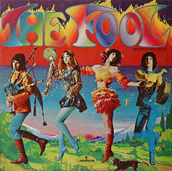
The Fool (1968).

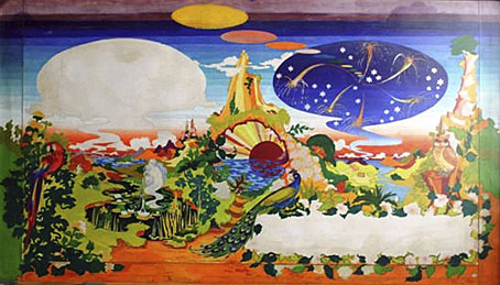
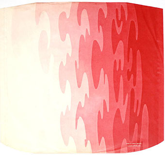
Many people know the work of design collective The Fool even if they couldn’t tell you the name or the names of any of the individuals involved.  The accelerated career trajectory of Dutch artists Marijke Koger and Simon Posthuma took them from a hippie enclave on the isle of Ibiza in 1966, to London and work for The Beatles throughout 1967 thanks to their distinctive brand of rainbow-hued psychedelia. Marijke Koger says the name The Fool was chosen after they met Crowley-obsessed blues singer Graham Bond who introduced them to the Tarot deck. Barry Finch and Josje Leeger later joined Koger and Posthuma. For The Beatles the group created the short-lived mural for the Apple boutique in Baker Street (removed after complaints), the decoration on John Lennon’s piano, and the inner sleeve for the Sgt Pepper album. The gatefold interior of the album was going to incorporate a Fool painting but Robert Fraser apparently persuaded the band to replace this with a group photo. The Fool themselves (and their decor) appear in the Beatles-produced feature film, Wonderwall (1968).

beatles.jpg

Proposed interior for the Sgt Pepper album (1967).

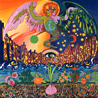
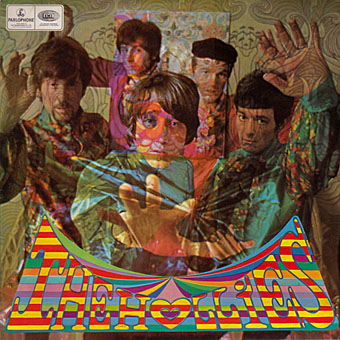
Given all this sudden visibility it’s surprising they weren’t more in demand for album cover designs although they were also busy producing florid outfits for other groups. The Beatles clothes on the All You Need is Love broadcast are Fool creations. Of the album covers, the one for The Incredible String Band is probably the most well-known. This small collection reminds me I still haven’t heard Evolution by The Hollies. The work on that cover led to a collaboration with Graham Nash on an album by The Fool (and session musicians) in 1968. The collective split up in 1969 with Marijke Koger and Simon Posthuma relocating to California.

Marijke Koger-Dunham’s site
Simon Posthuma’s site

beatles2.jpg

Sgt Pepper inner sleeve.

incredible.jpg

The 5000 Spirits Or The Layers Of The Onion (1967) by The Incredible String Band.

hollies.jpg

Evolution (1967) by The Hollies. Clothes and design by The Fool, photo by Karl Ferris.

degroot.jpg

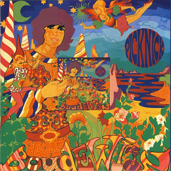
Picknick (1967) by Boudewijn De Groot.

move.jpg

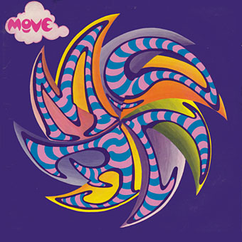
Move (1968) by The Move.

Elsewhere on { feuilleton }
The album covers archive

Previously on { feuilleton }
Through the Wonderwall

The Running Jumping & Standing Still Film

lester1.jpg

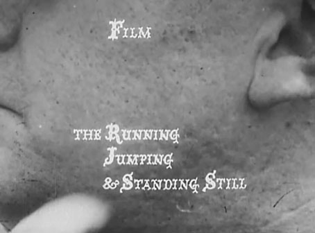
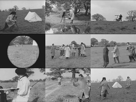
The Beatles’ second feature, Help!, was released on Blu-ray last month. The origin of the film’s visual humour and frenetic style can be found in this short directed by Richard Lester over two weekends in 1959, a collaboration between Lester, Spike Milligan, Peter Sellers and others. It may be nothing more than ten minutes of sight gags but it was enough for The Beatles to seek out Lester as director of their first two features. (Leo McKern, the actor in the opening shot, also appears in Help!) Considering the subsequent influence of those films—from The Monkees’ TV show on into numerous pop videos—this little film is very influential indeed. Watch it here.

lester2.jpg

Previously on { feuilleton }
Petulia film posters

The Sea of Monsters

beatles1.jpg

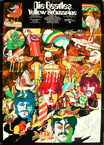
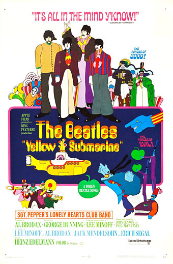
The German definite article has unfortunate implications when applied to a group of Brits, but if we overlook this detail the poster makes an interesting contrast with its US counterpart. Where the American design depicts all the film’s main characters, Heinz Edelmann’s painting concentrates almost solely on the creatures from the Sea of Monsters with no Blue Meanies in sight. As is often the case with film posters, both designs give a slightly different impression whilst being accurate in their selective representations. Yellow Submarine was reissued on DVD and Blu-ray last year. It looks and sounds marvellous.

beatles2.jpg

Previously on { feuilleton }
Tomorrow Never Knows
Yellow Submarine comic books
A splendid time is guaranteed for all
Heinz Edelmann
Please Mr. Postman
All you need is…

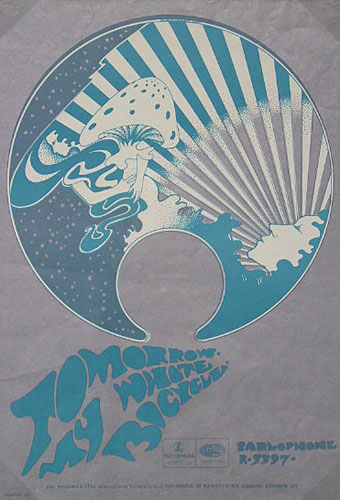
My White Bicycle

tomorrow1.jpg

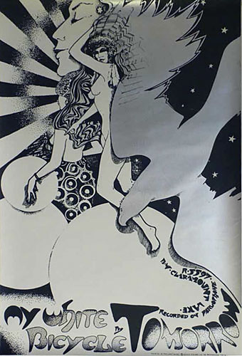
My White Bicycle (1967), poster by Hapshash and the Coloured Coat. Too risqué for EMI.

In what passes here for spare time I’ve been working on a private project that concerns events in London during a single week in 1967. I won’t elaborate for now but the research has been fun, and has led down byways where it’s easy to get lost in a profusion of historic detail. The International Times archive is a great time-sink if you want to see London’s psychedelic culture evolving from one week to the next. Oz magazine covered much of the same ground but in broader strokes; IT being a weekly paper was the closest thing the underground of the time had to a journal of record which means you’ll find things there which weren’t reported anywhere else.

tomorrow3.jpg

International Times, Volume 1, issue 13, 19/05/1967.

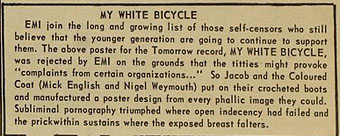
A brief item about a poster for the debut single by Tomorrow caught my eye, the artwork being an early piece by Hapshash and the Coloured Coat (Michael English and Nigel Waymouth) who we here discover were briefly known by another name:

MY WHITE BICYCLE

EMI join the long and growing list of those self-censors who still believe that the younger generation are going to continue to support them. The above poster for the Tomorrow record, MY WHITE BICYCLE, was rejected by EMI on the grounds that the titties might provoke “complaints from certain organizations…” So Jacob and the Coloured Coat (Mick English and Nigel Weymouth [sic]) put on their crocheted boots and manufactured a poster design from every phallic image they could. Subliminal pornography triumphed where open indecency had failed and the prick within sustains where the exposed breast falters.

Tomorrow were one of the first British psychedelic bands. My White Bicycle is their most memorable song but the rest of their self-titled debut album still holds up today. Ace guitarist Steve Howe became a lot more famous in Yes a few years later, while drummer Twink was in a host of bands in the late 60s and early 70s, Hawkwind included. My White Bicycle sounds superficially like a typical piece of psych whimsy à la Pink Floyd’s Bike (both songs were recorded at Abbey Road) but according to Twink there’s an anarchist subtext:

“My White Bicycle” was written out of what was actually going on in Amsterdam. One of the owners of Granny Takes a Trip, Nigel Weymouth [sic], had gone there and come back with a Provos badge which he gave to me. They were kind of like a student anarchist group that believed everything should be free. In fact, they had white bicycles in Amsterdam and they used to leave them around the town. And if you were going somewhere and you needed to use a bike, you’d just take the bike and you’d go somewhere and just leave it. Whoever needed the bikes would take them and leave them when they were done.

What would have been dismissed as pure utopianism now looks like prescience when bike-sharing schemes have become a reality. As to the redrawn poster, there’s a copy here which is described as very rare, hence its absence from other Hapshash galleries. Not really as phallic as the IT report implies; Aubrey Beardsley got away with a lot more priapic subterfuge in the 1890s when the strictures were also more severe.

tomorrow2.jpg

My White Bicycle (1967), the replacement poster by Hapshash and the Coloured Coat.

On the same page of IT there’s a brief announcement that The Beatles will have a new album out in June, something entitled Sgt. Pepper’s Lonely Hearts Club Band. That album also gave EMI a headache with both Lucy In The Sky With Diamonds and A Day In The Life being accused by “certain organisations” of promoting drugs. If the record company could have seen the greater headache that was coming less than ten years later from Malcolm McLaren and his King’s Road scallywags they might not have been so uptight.

Previously on { feuilleton }
Hapshash Takes a Trip
Michael English, 1941–2009
The Look presents Nigel Waymouth
The New Love Poetry

Labels

label01.jpg

A post for Record Store Day, and a slight return to the work of Hipgnosis and the late Storm Thorgerson. One of the many things which impressed about Hipgnosis album designs was the way they gradually came to approach each album as a distinct package for which every component deserved special attention. The very early Hipgnosis designs were little more than photos or photo-collage with some typography applied; a few years down the line and in addition to creating elaborate pictorial sleeves they were also designing logos or special typography for each release, with the design frequently extending to the labels of the vinyl records themselves.

label03.jpg

This last feature has since become so commonplace that it’s surprising now to find albums with a simple generic label. The Beatles Sgt. Pepper album is famous for its own elaborate package which included a special inner sleeve, but the label on the disc was the regular Parlophone design which had been used on all the earlier Beatles releases. Hipgnosis were in the vanguard of designing special labels, and I’m tempted to say they began the practice although it’s likely there were prior examples. The earliest Hipgnosis example seems to be the prism design for The Dark Side of the Moon (1973); prior to this Pink Floyd were using the same label as other artists on Harvest Records. A few more Hipgnosis examples follow below. I especially like the ones for Wings Over America (1976), a triple-live set which extended the passenger plane sleeve design by using artwork based on different aircraft instrument dials.

label04.jpg

label05.jpg

Continue reading “Labels”