The biter bit

cauty.jpg

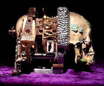
For the Love of Disruptive Strategies and Utopian Visions in Contemporary Art and Culture No.2 by James Cauty.

I usually wouldn’t bother writing about the over-rated and over-valued Damien Hirst—I’ll leave that to heavyweights such as Robert Hughes—but one story this week toasted the cockles of my black and cynical heart. Before we get to that, some context is required.

Hirst unveiled his diamond-coated platinum skull, For the Love of God in June 2007. Later that month, artist John LeKay complained that Hirst swiped the idea from LeKay’s series of crystal skulls made in the early Nineties. Hirst certainly knew LeKay at that time and interviewed him for a gallery catalogue in 1993.

(LeKay) said: “I would like Damien to acknowledge that ‘John really did inspire the skull and influenced my work a lot’. Damien’s very insecure about his originality. He used to say, ‘You’re a better artist than me’.

“He can be affectionate and is fun to be around, but he struggles to come up with ideas. It takes years of work to develop something. My stuff with crystals took a lot of research. You don’t just get there. He’s impatient. He’s a lazy artist.”

This wasn’t the first time Hirst was accused of laziness or even plagiarism. In 2000 he was sued for breach of copyright by Norman Emms after he made Hymn, an over-sized copy of Emms’ model for the Young Scientist Anatomy Set. That dispute was settled out of court only to be followed in 2006 with an accusation of theft by computer artist Robert Dixon who claimed that his geometric model of a flower, True Daisy, had been copied by Hirst for a piece entitled Valium. Judge the similarity for yourself.

Fast forward to December 2008 when a teenage graffiti artist who calls himself Cartrain created a collage which includes a photo of Hirst’s skull. The £200 that sales of this netted him also drew the attention of the Design and Artists Copyright Society and Hirst himself who demanded both the money and the artwork. Cartrain said:

I handed over the artworks to Dacs on the advice of my gallery. I met Christian Zimmermann [from Dacs] who told me Hirst personally ordered action on the matter.

I think this is the point where one has to start using the word hypocrite, don’t you? Others think so too, among them Jimmy Cauty (ex-KLF) and Sex Pistols sleeve designer Jamie Reid whose website Red Rag To A Bull describes itself as “a radical institution dedicated to the pursuit of “FREEDOM, TRUTH and JUSTICE in the art world and BEYOND”. And also overblown statements.” Inspired by Cartrain’s treatment, Cauty and co have been producing their own riffs on Hirst’s skull as a deliberate act of provocation. Cauty says, “Unlike Cartrain and his gallery, we are not intimidated by lawyers and if an injunction is issued, we will simply ignore it on the grounds of freedom of speech.” Reid calls Hirst a “hypocritical and greedy art bully”. There’s some funny stuff on their site, all of which is for sale as limited edition prints.

All of the works below are for sale and once TWENTY MILLION POUNDS has been raised ALL the proceeds will go to make an exact copy of a sculpture known as “For the Love of God”. This will then be sold for FIFTY MILLION POUNDS and the THIRTY MILLION POUND profit will then be used to repay the Street Urchin his 200 quid, help other Street Urchins and also feed starving children in Africa and Sussex.

Hirst will no doubt be grudgingly amused by the attention even if it is for behaving more like a grasping corporation than an artist. He’s also become the subject of another artwork by Eugenio Merino, For the Love of Gold, which depicts the corporate entity inside one of his vitrine tanks shooting himself in the head. All of which is silly and juvenile but then the only response much contemporary art deserves is a silly and juvenile one. People are naturally tempted to wave a red rag in the face of the pompous or the hypocritical. More power to them.

Update: Damien Hirst in vicious feud with teenage artist over a box of pencils

Lux Interior, 1946–2009

lux.jpg

Lux on stage in Glasgow, 1990.

Lux Interior, co-founder of the Cramps and the group’s singer, lyricist, cultural archaeologist and a superb stage performer. Also one of the few people who could successfully enthuse about the delights of female sexuality while wearing nothing more than a pair of high heels and a black G-string.

That exhilarating manifestation of deviant intent and skull-denting impact remains Lux and Ivy’s exclusive domain. Where punk rock was a barrage of refutation that fomented rabid exultation, the Cramps reclaimed the hillbilly power long since flushed down the Mersey. Through a self-stated “disdain for the myth of musical progress,” they melded their mutant propensities to emerge as a guiding voice in the wilderness, a commanding force that redefined the rock & roll spectrum while outgunning almost everyfuckingbody in the game. Jonny Whiteside, LA Weekly.

The Cramps’ Lux Interior: A life in pictures
• The Cramps on The Tube, 1987: part 1 | part 2 | part 3

Skull cameras

camera1.jpg

Third Eye Camera.

Two camera artworks by Wayne Martin Belger, aka Boy of Blue.

Yama is made from Aluminium, Titanium, Copper, Brass, Bronze Steel, Silver, Gold, Mercury with 4 Sapphires, 3 Rubies (The one at Yama’s third eye was $5000.00), Asian and American Turquoise, Sand, Blood, and 9 Opals inlayed in the Skull. The film loading system is pneumatic. A 300psi air tank in the middle of the camera powers 2 pneumatic pistons to move the film holder forward and lock it into place. The switch to open and close the film chamber is located under the jaw.

camera2.jpg

Yama (Tibetan Skull Camera).

Previously on { feuilleton }
The skull beneath the skin
Darwin Day
Vanitas paintings
Giant Skeleton and the Chocolate Jesus
Very Hungry God
History of the skull as symbol

Jim Cawthorn, 1929–2008

cawthorn1.jpg

“Jim Cawthorn and I have been inseparable for over twenty-five years, sometimes to the point where I can’t remember which came first—the drawing or the story. It is his drawings of my characters which remain for me the most accurate, both in detail and in atmosphere. His interpretations in strip form will always be, for me, the best.” Michael Moorcock.

Jim Cawthorn—illustrator, comic artist and fantasy historian—died this week. Cawthorn was the first illustrator employed by Savoy Books and one of the key factors in drawing me to their doors in the early 1980s. His illustrations made their books special and his comics adaptation of Moorcock’s The Jewel in the Skull was a big influence on my early black and white work.

Mike Moorcock, Dave Britton and I seem to be in a minority in regarding Cawthorn as one of the finest fantasy illustrators of his generation. His carefully stipled drawings of the late Fifties and early Sixties are all miniature masterpieces and I don’t care how many artists attempt lavish paintings of Moorcock’s Elric character, for me the definitive representation remains the drawing used on the cover of the first edition of Stormbringer in 1965. Cawthorn was Moorcock’s illustrator of choice for many years and was involved with the Moorcock-edited run of New Worlds right from the start with his cover illustrating Ballard’s Equinox story. He also provided reviews for New Worlds, and his critical faculties were demonstrated to the full in 1987 with Fantasy: The 100 Best Books, an overview of the genre credited to Cawthorn and Moorcock for which Cawthorn himself wrote most of the entries.

I wrote in more detail about Cawthorn’s work for the Savoy site several years ago. For an overview of his career and influences, there’s Dave Britton’s interview from 1979.

Update: some extra pictures added.

cawthorn2.jpg

Jagreen Lern and Elric (1963).

Continue reading “Jim Cawthorn, 1929–2008”

Dark horses

equus1.jpg

A juxtaposition of old and new theatre posters in the New York Times caught my eye this week, part of a feature about the current Broadway run of Peter Shaffer’s play. The news there, of course, has been Daniel Radcliffe’s on-stage nudity; understandable, perhaps, but celebrity trivia has overshadowed appraisal of Shaffer’s work as a piece of art.

What struck me seeing these was the two very different approaches to the same design problem. Given the subject matter, using an image of a horse is somewhat unavoidable as well as being immediately attractive since horses nearly always look good. The freight of historical and cultural association they carry is also one of the themes of the play. I really like the spare treatment of Gilbert Lesser’s 1976 poster for the National Theatre (left) and much prefer it to the new version used for the London and New York shows. The Lesser poster has the quality of a puzzle, matching the psychological piecing together of the story and Alan Strang’s accusation that Dysart the psychiatrist is always “playing games”. It also has a sinister quality lacking in the contemporary version; Shaffer’s Equus is an unforgiving god and the black eyes could refer to the blinded horses. The Photoshop horse looks altogether too mundane and is it my imagination or is the horse head misshapen slightly in order to fit the torso?

Continue reading “Dark horses”