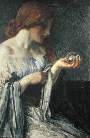
The Crystal Ball (c. 1900) by Robert Anning Bell.
Crystal balls in art, film and the pulp magazines.
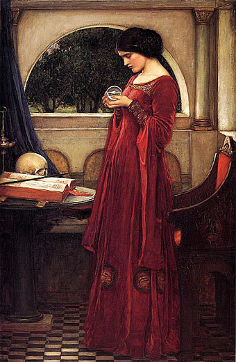
The Crystal Ball (1902) by John William Waterhouse.
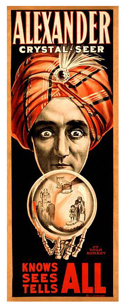
Alexander, Crystal Seer (1910).
A journal by artist and designer John Coulthart.

The Crystal Ball (c. 1900) by Robert Anning Bell.
Crystal balls in art, film and the pulp magazines.
The Crystal Ball (1902) by John William Waterhouse.
Alexander, Crystal Seer (1910).
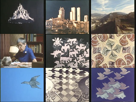
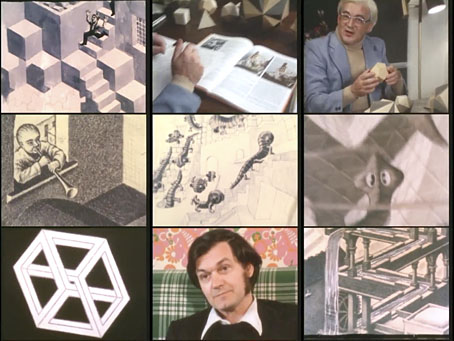
An Italian documentary about the Dutch artist made in 1980 and directed by Michele Emmer. I don’t recall ever seeing a British TV documentary about Escher (although I’d be surprised if there were none) but this resembles the type of thing the BBC used to do so well. Shots of the Italian towns where Escher lived for many years show the influence of the vernacular architecture on Escher’s prints. Elsewhere, animated sequences bring to life his tessellations, while various mathematicians examine some of the structural principles at work in these very familiar images. Of greatest interest for me is mathematician and physicist Roger Penrose discussing his first encounter with Escher’s work, and the development with his father of the Penrose Triangle, an impossible object similar to those that appear in some of Escher’s prints. (I used a Penrose Triangle in my cover art for Zones by Hawkwind.) The Fantastic World of MC Escher runs for 50 minutes, and may be watched here.
Previously on { feuilleton }
• MC Escher album covers
• Escher and Schrofer
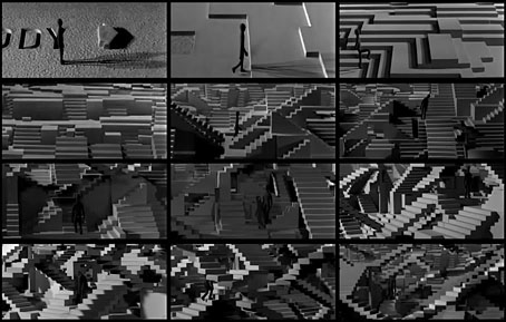
YouTube in recent years has become an increasingly worthwhile repository for short animations or experimental films, many of which you might otherwise never get to see. Stairs (1969) is another great piece of Polish animation, a brief scenario concerning a Plasticine figure who wanders into a terrain of random steps which soon turns mountainous. The obvious precursor is MC Escher’s stairways, but Escher’s worlds are always very formal despite their paradoxes. Schabenbeck’s film, like many Eastern European animations, can be read as allegory although this only becomes apparent at the very end. Watch it here.
Previously on { feuilleton }
• Walls, a film by Piotr Dumala
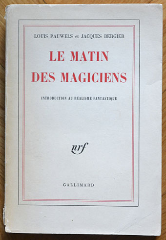
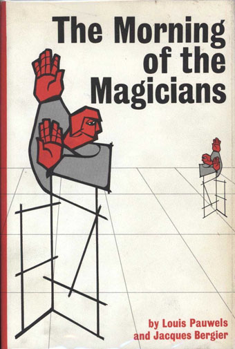
Éditions Gallimard, France, 1960.
Yesterday’s post proved popular so it seemed worthwhile taking another look at the book that birthed Planète magazine. The main problem The Morning of the Magicians presents for an art director is how to encapsulate such wildly diverse contents in a cover design. To judge from the examples here, most people seem to have either given up or gone for vaguely symbolic designs which at the most correspond to the contents in a minor way. The biggest surprise for me was seeing the cover of the first edition above, one of those typically sober French titles which gives away nothing of the intellectual fireworks within. Few of these designs have any credits, and this is nothing like a complete list (more editions may be seen at Goodreads). More recent editions have been avoided altogether since they’re pretty terrible.
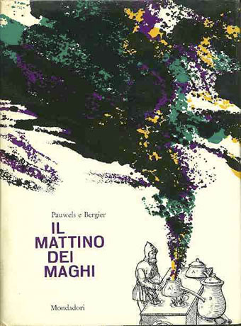
Arnoldo Mondadori Editore, Italy, 1963. This edition, which runs to 476 pages, includes three translated stories inserted into the text: The Nine Billions Name of God by Arthur C. Clarke, A Canticle for Leibowitz by Walter M. Miller Jr, and The White People by Arthur Machen.
A hardback edition showing an alchemist at work.
Stein and Day, USA, 1964.
You know a cover is failing when it could easily be applied to any number of other titles.
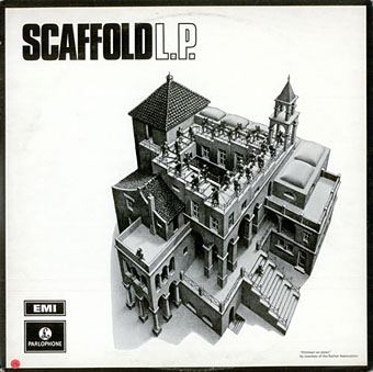
L The P (1969) by Scaffold. Art: Ascending and Descending (1960).
A follow-up to yesterday’s post. MC Escher lived long enough to see his work move from curiosities appealing to a small circle of print collectors, through enthusiasm among scientists and mathematicians, to mass acceptance in the late 1960s thanks, in part, to the general vogue for any art that looked weird or far out. New Worlds magazine used Relativity on a cover in 1967, while Thomas Albright writing for Rolling Stone in 1970 introduced a generation of American heads to Escher’s work. A year earlier, another Rolling Stone, Mick Jagger, had tried to persuade Escher to create something for the cover of Let It Bleed; the artist declined but that didn’t stop others using his prints for cover art.
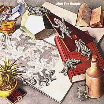
Mott The Hoople (1969) by Mott The Hoople. Art: Reptiles (1943).
Escher’s work is so well-suited to a vinyl sleeve that I’m surprised his lithographs and woodcuts haven’t seen more use. Liverpool group Scaffold beat Mott the Hoople to the first usage by a few months in 1969 (unless there’s an earlier example I don’t know about); L The P is a play on the Scaffold’s big hit, Lily The Pink. As is often the case with these music design histories, things start off well with sympathetic treatments of the artwork then degrade when hamfisted amateur designers take over. I can’t imagine Escher being flattered by some of the later examples. If you know of any others, good or bad, then please leave a comment.
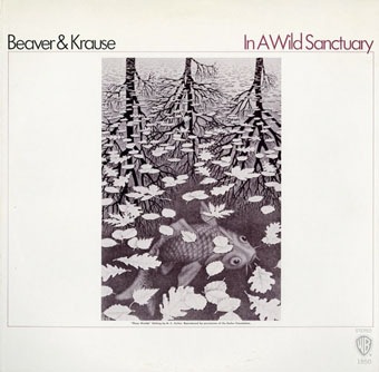
In A Wild Sanctuary (1970) by Beaver and Krause. Art: Three Worlds (1955).
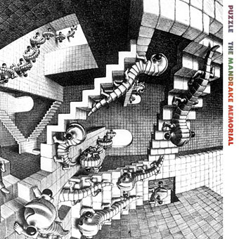
Puzzle (1970) by The Mandrake Memorial. A gatefold sleeve which opened out to reveal the whole of Escher’s House of Stairs I (1951). Inside the gatefold was Curl-up (1951). Design by Milton Glaser who also designed the group’s second album, Medium.