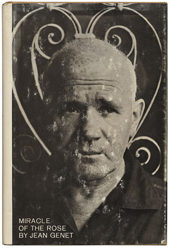
Miracle of the Rose (1965). Photo by Jerry Bauer, design by Kuhlman Associates.
[William Burroughs is] without a doubt…the greatest American writer since WWII. There are very, very few writers in his class; I think Genet is about the only one whom I’d put in the same category. All the British and American writers so heavily touted—the Styrons and the Mailers and their English equivalents—it’s just not necessary to read anybody except William Burroughs and Genet.
JG Ballard, RE/Search interview, 1984.
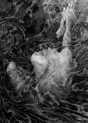
Jean Genet (the “Saint” was a gift from Jean-Paul Sartre) was born on December 19th, 1910 so consider this a late centenary post. Some of Ballard’s debt to William Burroughs can be found in writings such as The Atrocity Exhibition (1970) and his early text experiments. Genet’s influence, if we have to look for such a thing, I usually see in the use of metaphor to transform an uncompromising reality. Like the moment at the beginning of Crash (1973) when the crushed bodies of package tourists are compared to “a haemorrhage of the sun”. Genet’s writings effected similar transformations from squalid prison environments, turning the sexual assignations and passions of the inmates into ceremonial acts which assume the lineaments of a new religion. He used to claim in later life to have forgotten all his works but we haven’t forgotten him. A small selection of Genet links follows.
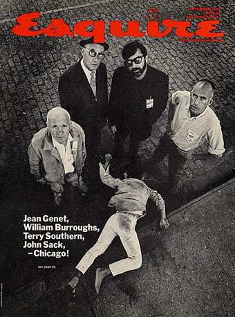
Esquire, November 1968.
RealityStudio:
Burroughs’ most famous and most widely read piece for Esquire remains his coverage of the 1968 Democratic National Convention, “The Coming of the Purple Better One,” which was included in Exterminator! Burroughs was hired to cover the convention along with Terry Southern, who was a pioneer in New Journalism with his “Twirling at Ole Miss” (which appeared in Esquire in February 1963), John Sack, who wrote on the experiences of Company M in Vietnam for Esquire (with the legendary cover “Oh my God — We hit a little girl”), and Jean Genet, an authority on oppression who turned increasingly politically active after the events in Europe in May 1968. (Continues here.)
Ubuweb:
• Un Chant d’Amour (1950): Genet’s short homoerotic drama which he later disowned. The film’s masturbating prisoners and naked male flesh made it notorious and, for later generations of filmmakers, a pioneering and influential work.
• Le condamné à mort (1952): A reading of Genet’s poem (in French) with electroacoustic accompaniment.
• Ecce Homo (1989): A short film by Jerry Tartaglia which cuts scenes from Un Chant d’Amour with gay porn.
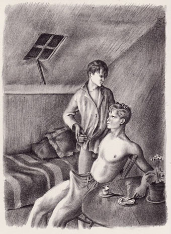
Bibliothèque Gay:
Vingt lithographies pour un livre que j’ai lu, Jean Genet, Roland Caillaux, 1945. A sequence of twenty pornographic drawings.
YouTube:
• The Maids (1975): Glenda Jackson and Susannah York in a film by Christopher Miles based on Genet’s play. There’s also Fassbinder’s Querelle (1982) but YouTube’s limitations don’t do it any favours.
• Jean Genet (1985): an extract from the BBC interview where the writer makes a fool of interviewer Nigel Williams. This captured Genet a few months before his death and he remains the stubborn outsider to the last, questioning the conventions of the television interview which he compares to a police interrogation. A transcript of the whole fascinating event can be found here.
Previously on { feuilleton }
• Emil Cadoo
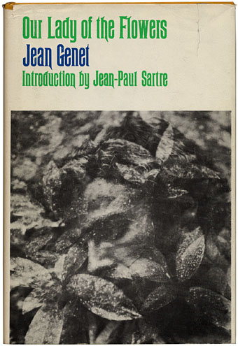
• Penguin Labyrinths and the Thief’s Journal
• Un Chant d’Amour by Jean Genet