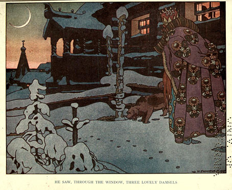
Ivan Tsarevich Catching the Firebird’s Feather (1899) by Ivan Bilibin.
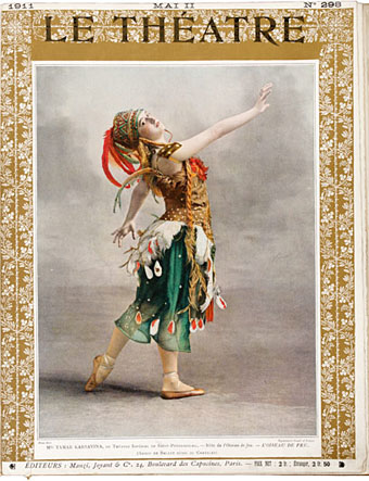
The firebirds are those that you find on the covers of recordings of Stravinsky’s Firebird ballet score, or on its popular distillation, The Firebird Suite. The latter has long been one of my favourite pieces of classical music, in fact it was one of the first I owned, via a cheap vinyl pairing with The Rite Of Spring that was mainly of interest for being conducted by Stravinsky himself. The cover photo showed a ballerina as the Firebird in a ballet performance, a common choice for the covers of Firebird recordings.

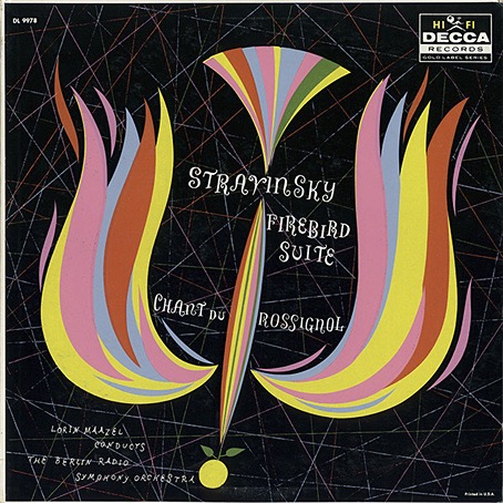
No artist/designer credited, 1955.
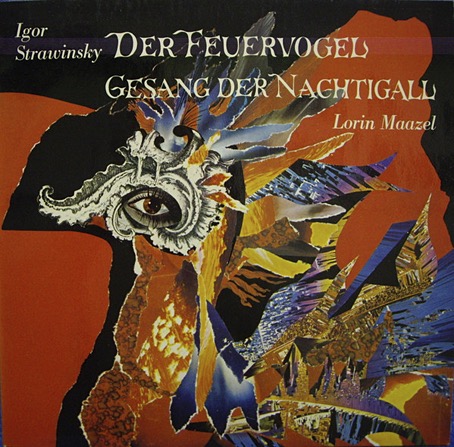
Much better was the cover of Tomita’s Firebird album (see below) which I bought around the same time, an uncredited tapestry design which is also a better album cover than the painting used on the earlier Japanese release. Depicting the Firebird itself is the other obvious choice when designing Stravinsky albums, and the dazzling, magical bird has helped this particular opus fare better in the world of classical album design than many other recordings.
No artist/designer credited, 1958.
It’s easy to cast aspersions at the designers or art directors of classical records when you see an uninspired cover design, but the format presents a number of difficulties. There’s no such thing as a fixed design for a classical album because classical albums have no fixed form. With the exception of albums devoted to a single long composition most classical albums are compilations, pairing longer works with shorter ones, often by two or more composers. This confusion of identity creates problems for the designer, as does the huge quantity of classical releases. Then there’s the problems posed by the music itself which is so often abstract; you can’t “illustrate” The Goldberg Variations. The default choice is to use a painting or a drawing or a photograph of the composer as a cover image, or a photo of the conductor or performer. The easiest assigments, as these Firebird covers demonstrate, are albums based around a composition with a well-defined theme that can be depicted visually. Nobody has ever had a problem designing a cover for recordings of Debussy’s La Mer, for example, the only difficulty is deciding what picture of the sea you want to use.

No artist/designer credited, 1960.
I’ve never had the impression that classical devotees care very much about these issues, it’s the music and the performance they’re interested in. Record labels (or their marketing departments) do seem to pay attention to visual matters now and then, and you’ll find occasional attempts to create a new line of themed covers. (The Orphic Egg series was one of the more bizarre examples from the 1970s.) Deutsche Grammophon have a history of decent cover design but even they resort to using photos of the artist or conductor far too often. I’ve never been asked to design a classical release, and I’m not sure I’d relish the task, but the problems raised by the form fascinate me. This is a subject I’ll no doubt keep returning to.
Irma Seidat, no date.


.jpg)