The Return of the Crawling Chaos

nyarlathotep.jpg

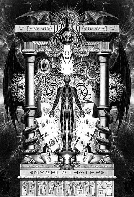
Behold Nyarlathotep, v. 3.0, this being yet another revision of an old illustration. Some readers may recognise the imagery from version 2.0 (2009) or even the original that appeared in my Haunter of the Dark book in 1999. Earlier this month the work I’ve been doing for the new edition of the book reached the end of another stage with the completion of all the necessary redrawing of The Dunwich Horror. I’ve also just finished drawing page 24 of the story, the page I’d left half-done when the strip was abandoned in 1989. Everything I do from now on will be new material.

Having got this far I decided to pay a little more attention to the upgrading of the book’s fourth section, The Great Old Ones, by finishing Nyarlathotep, something I began this time last year then set aside when I got involved in rescanning all the old comics pages. As I’ve mentioned before, several of the pieces for this section of the book were some of my earliest digital illustrations, created a few months after I’d bought a secondhand and very underpowered Macintosh computer. Nyarlathotep was an attempt to depict the hybrid nature of a Mythos entity which combines elements of an Egyptian pharaoh, the diabolic “Black Man” of European witch cults, a sinister stage magician or scientist, and the winged abomination that Robert Blake finds lurking in the steeple of the Starry Wisdom church. Version 1 was one of my very first digital collages which suffered as a result of my inexperience with the new medium, hence my eagerness to rework the design in 2009 when Cyaegha, a metal band I’d been working with, requested a Nyarlathotep-themed T-shirt. The first version had been aimed more at the theatrical/scientific aspect of the character, with a poster in the background from John Nevil Maskelyne’s Egyptian Hall in London. For version 2 I added a number of organic elements to bolster the “Haunter of the Dark” side of the character. Version 3 keeps all the details from version 2 while replacing some of the collaged elements with similar ones taken from better sources. The new design is also slightly taller to account for the enlarged page size of the new book.

sephiroth.jpg

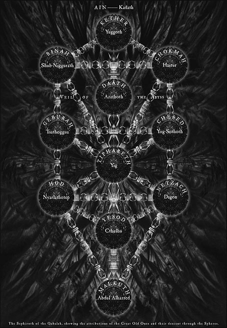
The Sephiroth chart from the second edition of the book, 2006.

The most notable additions to the new piece are the names of the character in Latin letters and Egyptian hieroglyphs (𓋔𓇋𓄿𓂋𓈌𓊵), the latter being a suggestion from this Reddit post. The Egyptian spelling is conjectural but I have a guidebook to the hieroglyphic language which confirms that most of the letters are the ones they should be. The words aren’t included solely as decoration. The Great Old Ones was a collaboration with Alan Moore in which Alan wrote eleven texts or invocations which position each god or entity on one of the spheres of the Kabbalistic Tree of Life. Alan was heavily involved with the Kabbalah at this time, being also engaged with the first few issues of Promethea, a story which involves a physical (or metaphysical) journey from Malkuth to Kether. The Great Old Ones takes the same journey in reverse, and from a much darker perspective, like a Lovecraftian equivalent of the Qliphoth, the “nightside” of the Kabbalistic spheres. In Alan’s scheme, Nyarlathotep is positioned at sphere 8, Hod (or “Splendour”), a sphere associated with gods of magic and language like Thoth, Hermes and Mercury. I imagine most Mythos-acquainted occultists would agree with adding Nyarlathotep to this pantheon. In addition to being gods of magic and language, Thoth, Hermes and Mercury also serve as celestial messengers, a function which Lovecraft assigns to Nyarlathotep in The Whisperer in Darkness when one of the Mi-Go declares “To Nyarlathotep, Mighty Messenger, must all things be told.”

As for the rest of The Great Old Ones, I have four more of them still to be reworked, one of which, Abdul Alhazred (or Lovecraft himself) is almost finished. Further progress will be posted here.

Elsewhere on { feuilleton }
• The Lovecraft archive

Previously on { feuilleton }
• Lettering Lovecraft
• Weird ekphrasis and the Dunwich Horrors
• Kadath and Yog-Sothoth
• Another view over Yuggoth
• Nyarlathotep: the Crawling Chaos

Innsmouth, Japanese-style

innsmouth3.jpg

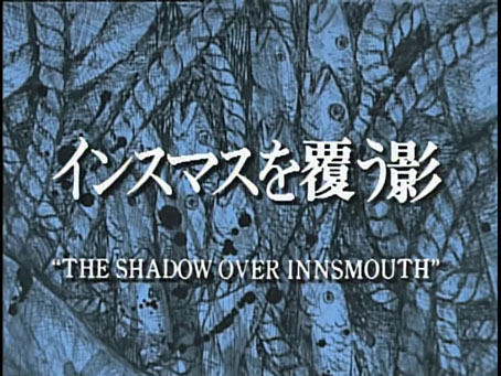
When it comes to film and TV dramas based on the writings of HP Lovecraft I’ve always been very selective, to a degree that I avoid most adaptations unless they receive reviews good enough to provoke my curiosity. I do, however, keep an eye out for unusual (or unusually inventive) adaptations whose shortcomings I’m prepared to forgive if they promise to be more than another wearying trudge through cinematic cliches. Such is the case with this Japanese TV adaptation of The Shadow Over Innsmouth which was written and directed by Chiaki Konaka in 1992.

innsmouth1.jpg

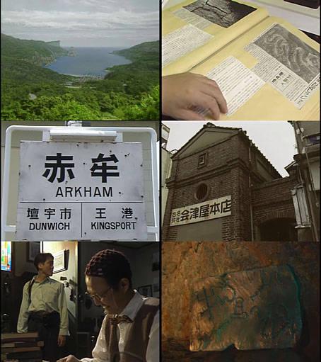
Konaka’s adaptation isn’t immediately attractive, being shot entirely on video, a very unsympathetic format for horror productions when the harshness of the image works against any attempts to create an eerie atmosphere. (Even The Stone Tape suffers in this area.) Konaka presents a sketch of Lovecraft’s story which he updates to the present day and moves to contemporary Japan, with no explanation as to why the Japanese coastline is a home to towns with names like “Innsmouth”, “Arkham” and “Dunwich”. Lovecraft’s detailed history of the blighted backwater and its inhabitants is also ignored. Konaka’s narrative begins with an unnamed photo-journalist (Renji Ishibashi) securing a job at a travel magazine where he convinces the editor that the remote coastal town of “Insumasu” is worthy of a feature. As with the anonymous narrator of Lovecraft’s story, the photographer is drawn to the place as much by ancestral impulses as by his curiosity about a place where a strange fish-human corpse has been washed ashore.

innsmouth2.jpg

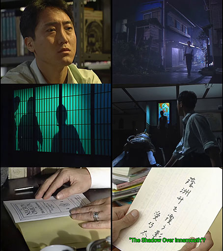
Konaka’s direction is more functional than suspenseful, with the photographer’s biographical history telegraphed so much in advance that none of the revelations come as a surprise. The soundtrack is also very uneven, being a collage of music borrowed from other films: there’s a brief snatch of Goblin’s Suspiria score at one point, and I think the repeated flute refrain is borrowed from a Preisner score. This is a well-made adaptation all the same even if the Japanese Innsmouth isn’t as deteriorated as the decayed fishing town that Lovecraft describes. (To be fair, any film depicting Lovecraft’s Innsmouth would require a serious budget to do the place justice.) Fishy details abound, and Konaka uses green light as a recurrent motif that refers to Innsmouth’s secret history, like an inversion of the emerald glow that signifies magic or the supernatural in John Boorman’s Excalibur. I was especially pleased to see borrowings from the George Hay Necronomicon during a cermonial invocation to Dagon that takes place in a cave. Later on we see a copy of the Hay book being perused by the curator of the Innsmouth museum. This makes a change from the tiresome ubiquity of the “Simon” Necronomicon whose sigils are always turning up in Lovecraftian adaptations when people are at a loss to create symbols of their own. The symbology in the Hay book was the work of Robert Turner, an occultist with an aesthetic sensibility more finely attuned to the world of the Cthulhu Mythos.

Chiaki Konaka has been described as bringing a Lovecraftian influence to his other work but when most of this is anime scripts for juvenile fare like the Digimon franchise you can’t expect very much. One of his credits is for something called Cthulhu’s Secret Record but I’ve no idea what this might be. Konaka’s The Shadow Over Innsmouth many be viewed in full here. The translated subtitles are larger than I prefer (and in vivid green) but I’m still pleased that someone went to the trouble of making this curio available to a wider audience.

Elsewhere on { feuilleton }
• The Lovecraft archive

Two new covers

rockhill.jpg

My latest cover designs have arrived in time for Spook Month, although the first of these suits the season more by association than its appearance. Jim Rockhill’s A Mind Turned in Upon Itself is a study of the work of J. Sheridan Le Fanu, Ireland’s leading writer of ghost stories and Gothic fiction. This is another design for Swan River Press which adheres to the publisher’s preferred format of a dustjacket that wraps a small hardback with textured and illustrated boards. The brief was fairly straightforward, to present a rare photograph of Le Fanu in a suitably attractive manner. My initial idea was to create a frame that would reflect to some degree various aspects of Le Fanu’s fiction, but it quickly became apparent that the portrait photo was too tall and narrow to sit easily inside a frame that matched the ratio of the book. A better option was to look for a frame which could fit the shape of the book while also filling in the space around the photo.

dore.jpg

A page from The Workshop: a Monthly Journal Devoted to Progress of the Useful Arts.

When Le Fanu was writing in the mid-19th century book design had become very lavish, with a proliferation of presentation volumes gold-blocked and embossed on their covers and spines. The Heztel editions of Jules Verne are prime examples, as are the many editions of Gustave Doré’s books. My cover is an adaptation of a German edition of Doré’s Bible which had an unusual panel in the centre that happened to be a good size and shape to accommodate the Le Fanu photo, although I still had to extend the design a little. My version also includes a pair of small Le Fanu monograms embedded in the frame.

outline.jpg

For the board illustration I followed the form of an earlier Swan River book with an Irish theme, The Far Tower, whose boards I covered with an engraving collage. The end result, which looks like a single illustration, is a composite of two smaller illustrations from a book of views of Ireland, together with a quantity of foliage which frames the design and joins the pictures together.

ppc.jpg

The second cover is for a book I’m working on at the moment, Lovecraft’s Brood, a sequel to Tachyon’s well-received Lovecraft’s Monsters. I was very pleased to be asked to work on this one, the earlier book is a favourite of mine from among the books I’ve done for Tachyon, and Ellen Datlow is an expert at compiling well-chosen story collections. There’s not much I can say about the cover which follows the form of the previous book. As with Lovecraft’s Monsters, the framed face will also appear as one of the interior illustrations. You’ll have to wait a while to see the results of this, however. Watch this space.

brood-cover.jpg

Meanwhile, I’ve neglected to mention another Tachyon book whose interiors I’ve designed which is available now. The Essential Horror of Joe R. Lansdale is a great introduction to the work of a master of horror fiction whose stories manage to be grim and witty in equal measure. Very grim at times; visceral horror is Lansdale’s forte. The collection includes his best-known story, Bubba Ho-Tep, and features cover art by another Swan River Press cover artist, Dave McKean.

Previously on { feuilleton }
• Lovecraft’s Monsters

Elliott Dold’s Night

dold01.jpg

Looking for artwork by Elliott Dold turned up this remarkable set of illustrations for an unremarkable collection of poetry, Night, by a friend of the artist, Harold Hersey. Elliott Dold (1889–1957) was an American illustrator during the early days of the pulp magazines, best known today for drawings of huge machines which are a match for those by his more prolific contemporary, Frank R. Paul. The pulp magazines are so often filled with mediocre illustration that it’s a pleasure to find another talent lurking in their pages. But Dold was more than an illustrator of big science, as these illustrations for Hersey’s dubious poetry demonstrate.

dold02.jpg

Night is a collection of vaguely erotic poems, all of which Hersey labels “Nocturnes”. The collection was published in 1923 in a privately-printed subscriber-only edition, and every description I’ve read of it agrees that the illustrations are the best thing about it. The drawings are also radically different to Dold’s science-fiction art, to a degree that they could easily be taken for the work of a different illustrator. “What a pity the artist has to waste his time grinding out art for the pulps,” said HP Lovecraft, in a letter to Clark Ashton Smith. A pity, indeed. Dold’s illustrations are on a par with those that Wallace Smith was producing in the same year, and are close enough to Smith’s style that’s it’s tempting to accuse him of imitation. Smith’s style wasn’t unique, however; Ray Frederick Coyle was another American artist at work in the 1920s who favoured the same combination of strict black-and-white, careful linework and stylised figures. It’s curious that three books with somewhat controversial contents should have been published in the USA in 1922/23, all of them illustrated in a very similar manner: Ben Hecht’s Fantazius Malare (illustrated by Wallace Smith), James Branch Cabell’s new edition of Jurgen (illustrated by Ray Frederick Coyle), and Hersey’s Night. Rather than look for spurious influence I’d guess that this was a combination of coincidence and American literature acquiring a belated taste for Decadence which required suitably Beardsleyesque illustration. Similar trends were evident in cinema, especially in Alla Nazimova’s 1923 film adaptation of Oscar Wilde’s Salomé, where the costumes and settings were all based on Beardsley’s illustrations.

dold03.jpg

The images here are from a copy of the book at HathiTrust that’s another poor Google scan. The Hathi website isn’t as convenient for reading as the Internet Archive so I’ve downloaded all of the illustrations and, when necessary, cleaned the grey tone left by the scanner’s camera.

dold04.jpg

dold05.jpg

Continue reading “Elliott Dold’s Night”

Weird ekphrasis and the Dunwich horrors

dunwich1.jpg

The Seal of Yog-Sothoth, or Old Whateley’s conception of the same. A detail from the delightful kitchen autopsy scene which you’ll find below.

My thanks to Tentaclii for bringing the following to my attention in the most recent HPLinks post. The Actual Anatomy of the Terrible: Gou Tanabe, Weird Ekphrasis, and the History of Lovecraft in Comics is a lengthy academic essay by Timothy Murphy which I doubt I would have seen otherwise. Since Lovecraftian comics is the subject, a combination of vanity and curiosity made me click the link to see whether any of my own work rated a mention. I was surprised to find much more than this, with Murphy discussing and contextualising my adaptations of The Haunter of the Dark and The Call of Cthulhu. The bulk of his essay concerns the series of doorstop adaptations that Gou Tanabe has been producing for the past decade (most of which I’ve only seen as extracts), but Murphy’s knowledge of both Lovecraft’s fiction and comics history is very thorough. Particular attention is paid to Alberto Breccia’s pioneering adaptations of the 1970s; Breccia’s version of The Dunwich Horror was the story that impressed me the most when it appeared in the Heavy Metal Lovecraft special in October 1979. Seeing someone approach Lovecraft’s fiction in a sober, realistic manner was a welcome riposte to the jokey EC formula, and very much in my mind when I decided to start adapting Lovecraft myself seven years later.

books-big.jpg

Previous hauntings: Caermaen Books (1988), Oneiros (1999), Creation Oneiros (2006).

The biggest surprise in Murphy’s essay (and the reason for my writing all of this) was the end of his appraisal when he says “Lovecraft devotees may regret Coulthart’s abandonment of further adaptations…”, referring to my own version of The Dunwich Horror which stalled in late 1989 when I was asked to start working on the Lord Horror comics series from Savoy Books. A few Dunwich pages and panels were included in my Haunter of the Dark book, most of them in collage form, but the bulk of the story has never been made public. In one of those striking coincidences that often occur when you’ve embarked on a new project, I happened to have resumed work on The Dunwich Horror only a week ago, 36 years after leaving page no. 25 in its pencilled form. A few weeks prior to this I’d been scanning all of my Lovecraft comic art for the new edition of the Haunter of the Dark that I’ve been preparing since January. I’ve already mentioned reworking some of the illustrations from the first edition of the book but this process has scaled up considerably in the past two months. I’d been a little mortified to find that the artwork scans I used for the slightly upgraded edition in 2006 were the same ones I made in 1999 using a desktop scanner that wasn’t as good as those I’ve had since. Sorting through all the artwork again reminded me that my adaptation of The Dunwich Horror had been abandoned very near the end, with only the last two parts of the ten-part story left unfinished. This in turn prompted me to seriously consider finishing the story at last, an idea I’d always dismissed as being difficult if not impossible. My work on the Lord Horror comics in the 1990s led to a change in my penmanship and working methods which meant abandoning the very fine (0.2 mm) Rotring Variant pen that I’d used for drawing all the Lovecraft comics. I still have all my old Rotring pens; what I no longer have is the desire to spend months covering sheets of A3-size paper with lines like those made by an etching needle.

Continue reading “Weird ekphrasis and the Dunwich horrors”