Elliott Dold’s Night

dold01.jpg

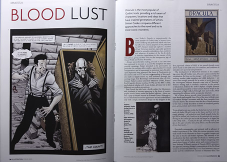
Looking for artwork by Elliott Dold turned up this remarkable set of illustrations for an unremarkable collection of poetry, Night, by a friend of the artist, Harold Hersey. Elliott Dold (1889–1957) was an American illustrator during the early days of the pulp magazines, best known today for drawings of huge machines which are a match for those by his more prolific contemporary, Frank R. Paul. The pulp magazines are so often filled with mediocre illustration that it’s a pleasure to find another talent lurking in their pages. But Dold was more than an illustrator of big science, as these illustrations for Hersey’s dubious poetry demonstrate.

dold02.jpg

Night is a collection of vaguely erotic poems, all of which Hersey labels “Nocturnes”. The collection was published in 1923 in a privately-printed subscriber-only edition, and every description I’ve read of it agrees that the illustrations are the best thing about it. The drawings are also radically different to Dold’s science-fiction art, to a degree that they could easily be taken for the work of a different illustrator. “What a pity the artist has to waste his time grinding out art for the pulps,” said HP Lovecraft, in a letter to Clark Ashton Smith. A pity, indeed. Dold’s illustrations are on a par with those that Wallace Smith was producing in the same year, and are close enough to Smith’s style that’s it’s tempting to accuse him of imitation. Smith’s style wasn’t unique, however; Ray Frederick Coyle was another American artist at work in the 1920s who favoured the same combination of strict black-and-white, careful linework and stylised figures. It’s curious that three books with somewhat controversial contents should have been published in the USA in 1922/23, all of them illustrated in a very similar manner: Ben Hecht’s Fantazius Malare (illustrated by Wallace Smith), James Branch Cabell’s new edition of Jurgen (illustrated by Ray Frederick Coyle), and Hersey’s Night. Rather than look for spurious influence I’d guess that this was a combination of coincidence and American literature acquiring a belated taste for Decadence which required suitably Beardsleyesque illustration. Similar trends were evident in cinema, especially in Alla Nazimova’s 1923 film adaptation of Oscar Wilde’s Salomé, where the costumes and settings were all based on Beardsley’s illustrations.

dold03.jpg

The images here are from a copy of the book at HathiTrust that’s another poor Google scan. The Hathi website isn’t as convenient for reading as the Internet Archive so I’ve downloaded all of the illustrations and, when necessary, cleaned the grey tone left by the scanner’s camera.

dold04.jpg

dold05.jpg

Continue reading “Elliott Dold’s Night”

Notes from the Underground

hawkwind1.jpg

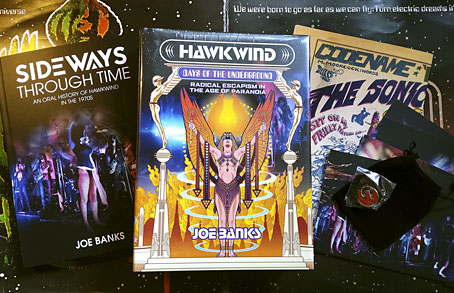
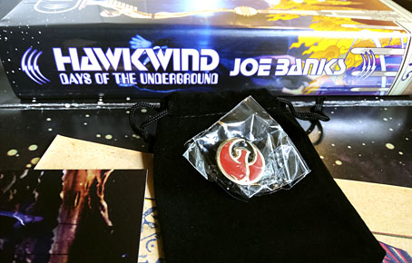
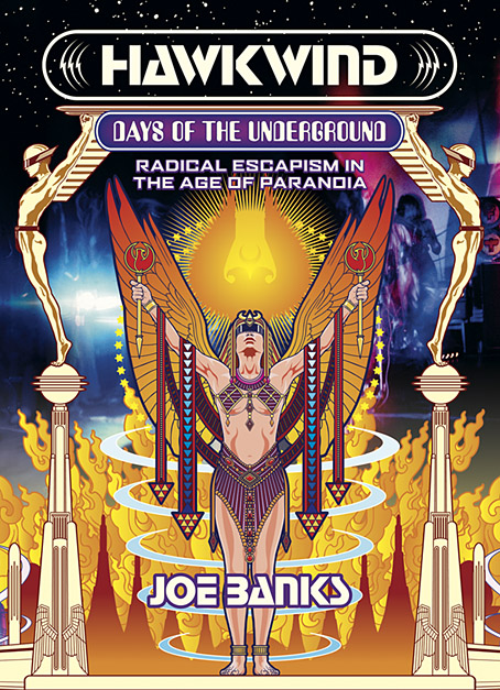
This time last year I was about to start working on the cover of Joe Banks’ Hawkwind book, and here it is at last, after a considerable delay. The special edition has been worth the wait since it comes with an additional 200-page volume, Sideways Through Time, containing the interviews that Joe used for his research. There’s also a set of cards with photos by Laurie Lewis from the session used for the cover of Space Ritual (we used some of the same photos on the book cover), and a print of the Moorcock/Cawthorn Hawklords comic strip from Frendz which further developed the group’s self-mythologising begun by the In Search Of Space “Hawklog”. And for people who pre-ordered the book last year then had to wait for months, there’s a bonus enamel pin based on the hawk design I supplied for the front board. I like badges, and I designed a few for Hawkwind in the past, but this is a better design and a nicer object than any of those I did in the 1980s.

hawkwind2.jpg

It’s a big book.

Now that the book is out I can show off the full cover wrap. As mentioned earlier, I followed Barney Bubbles’ preference for retro futurism by creating a cityscape based on the Deco-styled architecture that Frank R. Paul liked to use in his pulp illustrations. Some of the details refer obliquely to Hawkwind’s cover art or songs of the 1970s, so the speeding car can be taken as a reference to both Kerb Crawler and Death Trap, as well as the speeding Art Deco vehicle on the cover of Roadhawks. The flying saucers are a nod to those by Barney Bubbles on the inner sleeve of the Doremi album (and on one of his black-and-white posters from the same period), while the Philippe Druillet rocket refers to Barney’s own appropriation of a Druillet figure in his Hawk graphics. The combination of vehicles fleeing a burning city gives us the recurring theme in the group’s lyrics about the need to escape from a self-destructing society/planet. Welcome to the future.

Hawkwind: Days of the Underground is available now from Strange Attractor.

Previously on { feuilleton }
Hawkwind: Days of the Underground
The Chronicle of the Cursed Sleeve
Rock shirts
The Cosmic Grill
Void City
Hawk things
The Sonic Assassins
New things for July
Barney Bubbles: artist and designer

Interview with the vampire illustrator

illustration1.jpg

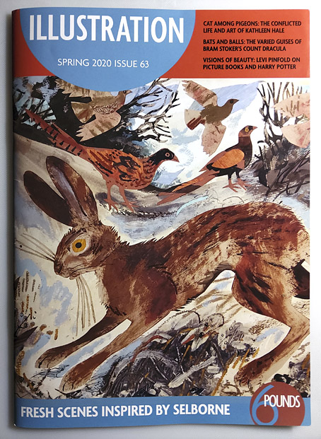
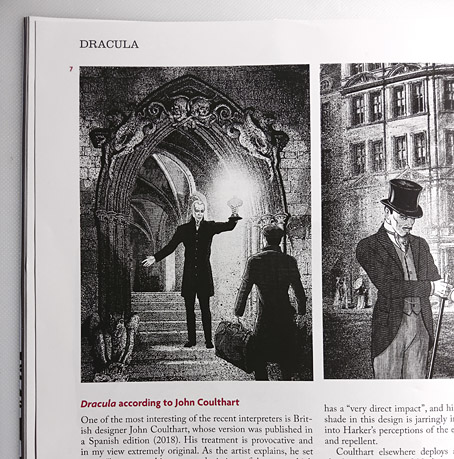
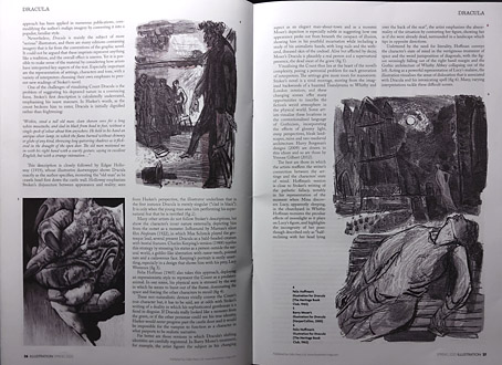
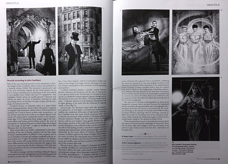
Some of the many illustrators of Bram Stoker’s Dracula are the subject of a six-page feature in the latest issue of Illustration magazine. The writer of the piece, Simon Cooke, asked me a few questions about the edition I worked on for Editorial Alma in 2018 (previously), and he devotes two pages to analysing my illustrations. I was a little unnerved by this since Alma asked me to produce 27 full-page pictures—one for each chapter—in five weeks, which isn’t the kind of deadline I prefer for work that requires so much historical research. Consequently, I still feel the book is compromised but people evidently like the end results so I should stop complaining. Illustration magazine is available from Cello Press.

illustration2.jpg

As for my work of the moment, the Joe Banks Hawkwind book will be published by Strange Attractor in the next few weeks, so everyone will finally get to see my Frank R. Paul-derived wraparound cover. And there’s more science fiction on the way with a new cover design featuring a robot as its centrepiece. Watch this space.

illustration3.jpg

illustration4.jpg

illustration5.jpg

Previously on { feuilleton }
Hawkwind: Days of the Underground
Illustrating Dracula

Hawkwind: Days of the Underground

hawkwind.jpg

As mentioned at the weekend, Joe Banks’ account of the first ten years of Hawkwind will be published by Strange Attractor Press later this year with a wraparound cover of my design. I never expected to be doing anything else for Hawkwind after moving on to other things in 1985, but it was the group’s first decade of music that fuelled the drawings which brought me to their attention, so this cover design brings everything full circle. The earliest of my Hawkwind drawings dates to 1979 which means this cover is also an anniversary piece.

The design combines Barney Bubbles’ Space Ritual template with elements of the art he created before and afterwards, notably the inner and outer sleeve of Doremi Fasol Latido, and the futuristic Art Deco of his tour poster for The “1999” Party. All the Bubbles Hawk-art up to and including Space Ritual is a blend of the ancient (Egypt, tribal motifs, characters that resemble pirates or barbarians), the previous century (Art Nouveau in particular), and the far future as depicted in comics and pulp magazines. I wanted to reflect this blend without being too imitative of the details, so the cover works a variation on Space Ritual, with a similar hieratic woman as the focus, and a margin of stylised flames separating the foreground from Laurie Lewis’s photos of the band (the latter are unused shots from the same session used for Space Ritual).

haberfield.jpg

Art by Bob Haberfield, 1970.

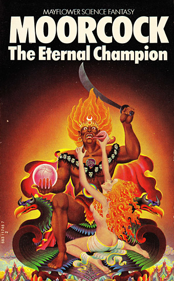
All the background elements run across the wrap but this hasn’t been revealed yet so you’ll have to wait a while to see the full design. The flames are based on Tibetan designs in a nod to the ancient side of the equation, as well as Bob Haberfield’s covers for the Moorcock novels published by Mayflower in the early 70s, many of which featured art derived from Tibetan Buddhism. (And one of the Mayflower Moorcocks, The Black Corridor, is the origin of the monologue of the same name on Space Ritual.) The full wrap shows a futuristic city whose Frank R. Paul-derived architecture is either on fire or menaced by a wall of encroaching flames. Many of Hawkwind’s songs of the period concern flight from cities or from the Earth itself—Born To Go, Time We Left (This World Today)—so the back cover also has a number of vehicles fleeing the scene: the radical escapism of the book’s subtitle in literal form. “Sign my release from this planet’s erosion,” as Nik Turner sings in Brainstorm.

Continue reading “Hawkwind: Days of the Underground”

Portraits of futures past

ttc1.jpg

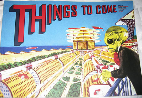
Since blogging here has become sporadic I find myself continually playing catch-up. Recent arrivals in the book department have included two art-related items that feature work of mine. The first is the catalogue for the Things To Come exhibition which ended last month at the Petach Tikva Museum of Art, Israel. When I posted photos of the exhibition back in May I was wondering about the identity of the curious iridescent structure occupying the gallery floor. This turns out to be a piece from 2015 by Netaly Aylon entitled Armour (Disappearing Methods). The same artist is also responsible for the cover of the catalogue, an homage to SF illustrator Frank R. Paul. I’ve always admired the wild inventiveness of Paul’s work so approve of the choice. There’s more Paul (and many other artists, past and present) inside the catalogue.

ttc2.jpg

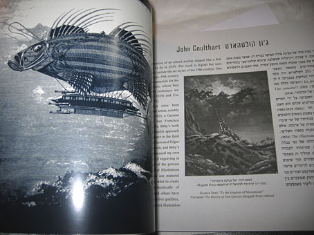
The booklet design by Yon Shavit cleverly solves the need to present bi-lingual information by having the English text run from the front while the Hebrew equivalent runs from the back. The artist pages feature both languages.

dg0.jpg

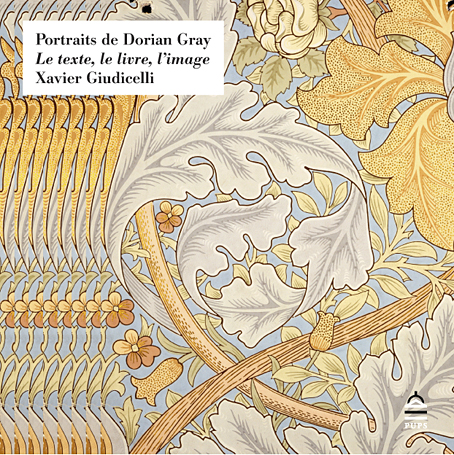
Book design by Emmanuel Dubois.

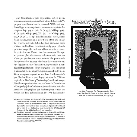
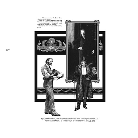
The other arrival was Portraits de Dorian Gray: Le texte, le livre, l’image by Xavier Giudicelli, a lavish, 404-page study from the Presses de l’université Paris-Sorbonne examining representations of Dorian Gray across various media. Xavier had already written about my illustrations based of Oscar Wilde’s novel for a French academic journal, Imaginaires. The book reprises that piece in the wider context of the many other adaptations of the novel. The text is French so much of the discussion is beyond me but the pictorial content is profuse, and includes many illustrations I’ve never seen before. Xavier says he’s already had an enquiry about a possible English edition so I’m hoping this goes ahead.

dg1.jpg

dg2.jpg

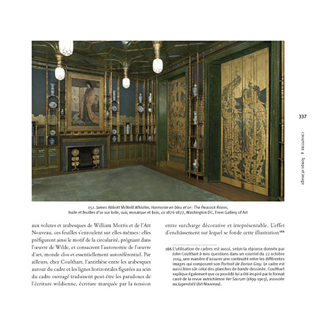
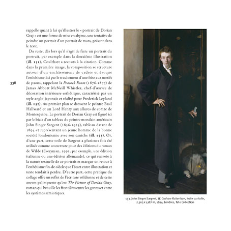
In addition to reproducing two of my pages from the Graphic Canon adaptation, Xavier illustrates my comments with photos of Whistler’s Peacock Room and Sargent’s portrait of W. Graham Robertson, a painting I used as the model for Basil Hallward’s portrait.

dg3.jpg

dg4.jpg

Previously on { feuilleton }
More Things to Come
Things to Come
Foreign appearances
Picturing Dorian Gray