The ceramic art of Eduard Stellmacher

stellmacher01.jpg

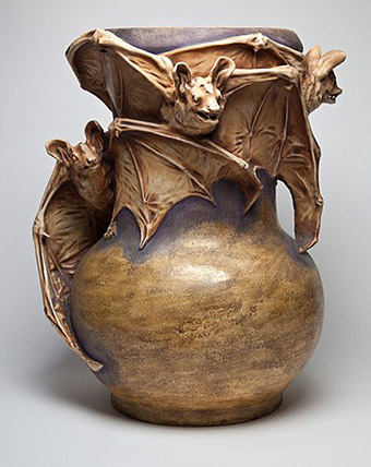
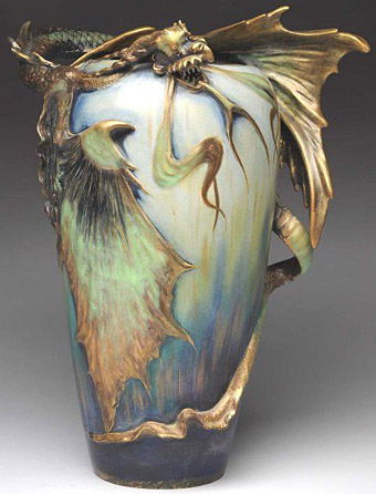
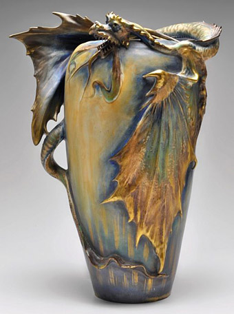
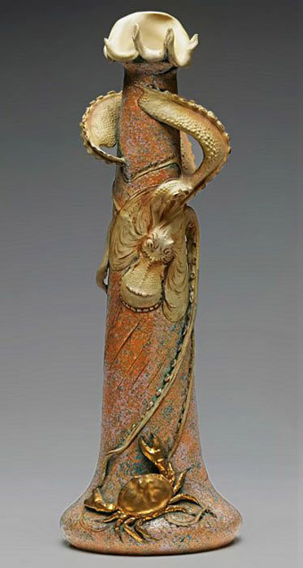
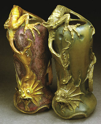
The Art Nouveau style is seldom more grotesque than in these vases and amphorae designed around the turn of the century by Eduard Stellmacher (1868–1945) for his father’s company, Amphora, in the Tur-Teplitz region of Bohemia. Art Nouveau (or Jugendstil as it was in Germany and Austria) emerged in Europe in the 1890s, and though its development ran parallel to the Decadence of the fin de siècle it wasn’t really a Decadent form in the literary sense of a dwelling on the perverse, the morbid or the blasphemous. The sinuous curves of Art Nouveau are too suggestive of vigorous life and energy to appear corrupt; Alphonse Mucha’s femmes are too healthy to be fatale, they’re nothing like the dissolute, hollow-eyed sirens seen in the drawings of Félicien Rops, an artist who wasn’t Nouveau (he died in 1898) but who was thoroughly Decadent.
stellmacher02.jpg

Stellmacher and co. created their share of delightful ceramic figures with Mucha-like tresses and flowing garments but Eduard’s designs around this time were preoccupied with ferocious creatures: bats, fish, lizards, octopuses, and a profusion of fire-breathing dragons. Even the plant forms have a diseased, unhealthy aspect. The designs may not have been intended as Decadent but they embody the quality more than anything used as vase decoration before or after this period. Art Deco also favoured predatory animals (snakes and leopards especially) but only in forms that were suitably sleek and abstracted.
stellmacher03.jpg

stellmacher04.jpg

stellmacher05.jpg

Continue reading “The ceramic art of Eduard Stellmacher”

The Last Ritual

sidor.jpg

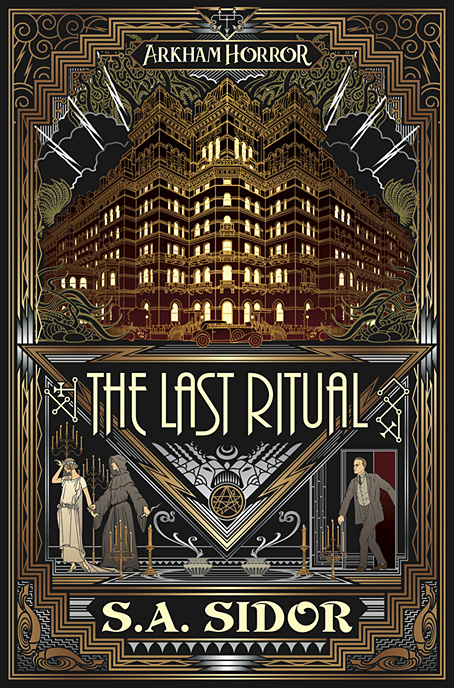
Starting the new year with a new cover, and another from the plethora I was working on last year. Art Deco occultism is the theme this time, a satisfying combination since the rectilinear Deco style is a good match for the sigils and thaumaturgic diagrams you find in grimoires. The publisher is Aconyte Books, a new imprint launched a year ago to produce novels that complement the games created by parent company, Asmodee UK. Arkham Horror is an Asmodee game with a Lovecraftian theme, and S.A. Sidor’s novel is set in the game’s world:

Aspiring painter Alden Oakes is invited to join a mysterious art commune in Arkham: the New Colony. When celebrated Spanish surrealist Juan Hugo Balthazarr visits the colony, Alden and the other artists quickly fall under his charismatic spell. Balthazarr throws a string of decadent parties for Arkham’s social elite, conjuring arcane illusions which blur the boundaries between nightmare and reality. Only slowly does Alden come to suspect that Balthazarr’s mock rituals are intended to break through those walls and free what lies beyond. Alden must act, but it might already be too late to save himself, let alone Arkham (more).

The design of the cover combines the look of much Art Deco metalwork, especially bronze door and grille designs, with the kind of inlay you see on Deco furniture and the more lavish leatherbound books of the period. Part of the brief was to show a magic ritual taking place but I thought it wouldn’t do to make the figures look too realistic, hence the stylised poses; George Barbier rather than Weird Tales. Another request in the brief was to incorporate the Yog-Sothoth sigil from the Simon Necronomicon (the bronze circle under the title). I think I’ve said before that the symbols in the Simon Necronomicon tend to be used a lot today as though they’re the only ones available, even though the book is only one of several unofficial attempts to imagine the contents of Lovecraft’s notorious grimoire. I’ve always favoured the George Hay-edited Necronomicon so the symbol at the top of the cover is the Yog-Sothoth sigil from the Hay volume.

The Last Ritual will be published in August 2020.

Elsewhere on { feuilleton }
The Lovecraft archive

Hawkwind: Days of the Underground

hawkwind.jpg

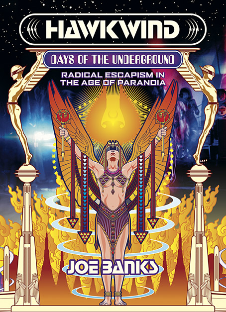
As mentioned at the weekend, Joe Banks’ account of the first ten years of Hawkwind will be published by Strange Attractor Press later this year with a wraparound cover of my design. I never expected to be doing anything else for Hawkwind after moving on to other things in 1985, but it was the group’s first decade of music that fuelled the drawings which brought me to their attention, so this cover design brings everything full circle. The earliest of my Hawkwind drawings dates to 1979 which means this cover is also an anniversary piece.

The design combines Barney Bubbles’ Space Ritual template with elements of the art he created before and afterwards, notably the inner and outer sleeve of Doremi Fasol Latido, and the futuristic Art Deco of his tour poster for The “1999” Party. All the Bubbles Hawk-art up to and including Space Ritual is a blend of the ancient (Egypt, tribal motifs, characters that resemble pirates or barbarians), the previous century (Art Nouveau in particular), and the far future as depicted in comics and pulp magazines. I wanted to reflect this blend without being too imitative of the details, so the cover works a variation on Space Ritual, with a similar hieratic woman as the focus, and a margin of stylised flames separating the foreground from Laurie Lewis’s photos of the band (the latter are unused shots from the same session used for Space Ritual).

haberfield.jpg

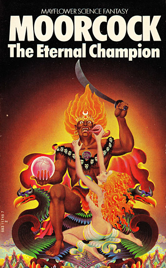
Art by Bob Haberfield, 1970.

All the background elements run across the wrap but this hasn’t been revealed yet so you’ll have to wait a while to see the full design. The flames are based on Tibetan designs in a nod to the ancient side of the equation, as well as Bob Haberfield’s covers for the Moorcock novels published by Mayflower in the early 70s, many of which featured art derived from Tibetan Buddhism. (And one of the Mayflower Moorcocks, The Black Corridor, is the origin of the monologue of the same name on Space Ritual.) The full wrap shows a futuristic city whose Frank R. Paul-derived architecture is either on fire or menaced by a wall of encroaching flames. Many of Hawkwind’s songs of the period concern flight from cities or from the Earth itself—Born To Go, Time We Left (This World Today)—so the back cover also has a number of vehicles fleeing the scene: the radical escapism of the book’s subtitle in literal form. “Sign my release from this planet’s erosion,” as Nik Turner sings in Brainstorm.

Continue reading “Hawkwind: Days of the Underground”

Daughters of Forgotten Light by Sean Grigsby

grigsby.jpg

I’ve spent most of the year so far working on more black-and-white illustrations for Editorial Alma—47 full-page pieces to date—so this cover design made a welcome break, especially since all the black-and-white art has a late-Victorian setting. More about that later. Sean Grigsby’s second novel for Angry Robot Books is previewed at the Barnes & Noble SF blog as follows:

A floating prison is home to Earth’s unwanted people, where they are forgotten…but not yet dead, in this wild science fiction adventure.

Deep space penal colony Oubliette, population: scum. Lena “Horror” Horowitz leads the Daughters of Forgotten Light, one of three vicious gangs fighting for survival on Oubliette. Their fragile truce is shaken when a new shipment arrives from Earth carrying a fresh batch of prisoners and supplies to squabble over. But the delivery includes two new surprises: a drone, and a baby. Earth Senator Linda Dolfuse wants evidence of the bloodthirsty gangs to justify the government finally eradicating the wasters dumped on Oubliette. There’s only one problem: the baby in the drone’s video may be hers.

The gangs are biker gangs, riding machines with wheels of light, so the brief was for a design as much reminiscent of a rock poster as a science-fiction cover. I don’t stray very often into the SF world so this again made a refreshing break from the 19th century and its heavy furnishings. There’s a touch of Syd Mead in the background, a reference suggested by the Tron-style bikes, but he’s long been a favourite visual futurist of mine even before Blade Runner (as I noted recently). The side panels and parts of the halo are adapted from Art Deco designs, the panels being based on embellishments for a New York skyscraper. It doesn’t take much to push the aerodynamic qualities of Deco style into the Space Age (the Soviet Monument to the Conquerors of Space could have been designed in 1930), a suggestion that William Gibson explored from a different angle in The Gernsback Continuum.

The Barnes & Noble post linked above also has an extract from the beginning of the novel. The book itself will be out on 4th September, 2018.

Leo Visser calendar, 1903

visser01.jpg

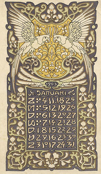
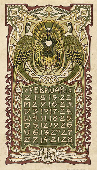
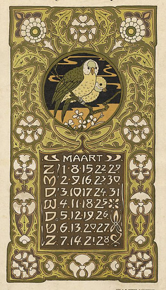
Leo Visser (1880–1950) was a Dutch artist who created a number of calendars in addition to other decorative designs featuring plants and animals. This example is one of the earliest, combining both flora and the fauna in a series of attractive Art Nouveau plates. You don’t see monkeys very often in Art Nouveau designs, for some reason they were more popular during the Art Deco period.

visser02.jpg

visser03.jpg

Continue reading “Leo Visser calendar, 1903”