Lorca was censored to hide his sexuality, biographer reveals
Fata Morgana: The New Female Fantasists
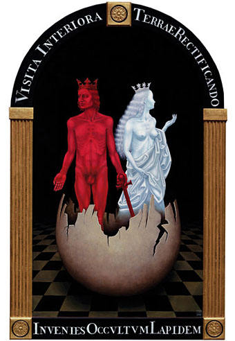
The Chemical Wedding by Madeline Von Foerster (2008).
Art lovers in the NYC area are advised to get down to the Saturday opening of this exhibition at the Dabora Gallery in Greenpoint, Brooklyn, for some great paintings and a free glass of absinthe. Fata Morgana: The New Female Fantasists is curated by Pam Grossman who runs one of my favourite art sites, Phantasmaphile. Further details can be found at the gallery pages which include links to the artists’ websites.
Dabora Gallery and Phantasmaphile’s Pam Grossman are proud to usher in the spring season with the group show “Fata Morgana: The New Female Fantasists,” on view from March 14th through April 12th, 2009. It features fourteen of the most vital and visionary women artists working in the US today.
In literal terms, a fata morgana is a mirage or illusion, a waking reverie, a shimmering of the mind. Named for the enchantress Morgan le Fay, these tricks of perception conjure up a sense of glimpsing into another world, whether it be the expanses of an ethereal terrain, or the twilit depths of the psyche. The artists of “Fata Morgana: The New Female Fantasists” deftly utilize the semiotics of mysticism, fantasy, and the subconscious in their work, thereby guiding the viewer through heretofore uncharted realms – alternately shadowy or luminous, but always inventive.
Yoko Ono recently said, “I think all women are witches, in the sense that a witch is a magical being.” Each artist in this show is a sorceress in her own right. Endowed with fecund imaginations and masterful craftsmanship, their work transforms the viewer: we become spellbound, bearing witness to their attempts to reconcile the desire for a diurnal beauty with the lure of a lush and riotous inner wilderness. The fantastical is counterpoint to the ferocious, the monstrous to the marvelous. Allusions to myth and metamorphosis abound, as these works channel their own heroine spirits and tell their own secret tales. Here, frame is magic threshold, bidding us to take a breath, and cross over.
Elsewhere on { feuilleton }
• The fantastic art archive
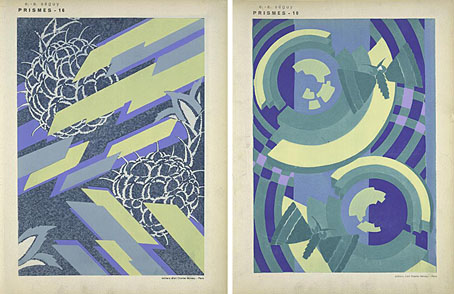
Prismes
Sample designs from Prismes : 40 planches de dessins et coloris nouveaux (1931) by EA Séguy. Another great print set at NYPL Digital Gallery.
Previously on { feuilleton }
• The art of Thayaht, 1893–1959
• The Mentor
• The art of Cassandre, 1901–1968
• The Decorative Age
• The World in 2030
Soviet posters
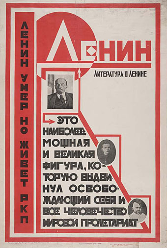
“Lenin is dead but the Russian Communist Party lives on” (no date).
More typography and yet more Soviet poster art which seems perennially popular with graphic designers. Bold Constructivist designs like this example are part of the reason why: over 80 years old yet still striking. Type foundry P22 have a set of Constructivist fonts similar to the typeface used here. Poster tip via Coudal.
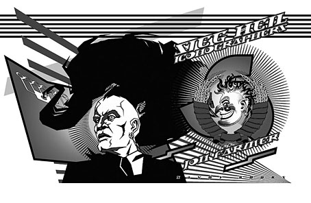
Sieg Heil Iconographers, title spread (2006).
I plundered the Soviet style in 2006 for the design of Jon Farmer’s Sieg Heil Iconographers for Savoy Books. The typeface this time was Jonathan Barnbrook’s contemporary design, Newspeak. Does the assertive bad taste of the book’s title undermine the Communist propaganda or do the Agitprop graphics ironically counterpoint the discussion of fascist history within? That’s left for the reader to decide.
Previously on { feuilleton }
• Lenin Rising
• Dead Monuments
• Soviet ceramics of the 1920s
• Enormous structures II: Tatlin’s Tower
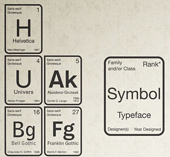
Periodic Table of Typefaces
Marvellous. Typefaces sorted by popularity according to surveys. Interesting for this Bodoni fan finding Bodoni as the first serif at no. 3. Some surprises too—is Univers really that popular?
Created by Squidspot. See the whole thing here. Via Metafilter.

