The art of Gustav Adolf Mossa, 1883–1971

mossa1.jpg

Self-portrait.

A French artist and another late Symbolist painter whose idiosyncracies point to Surrealism but whose obsession with femmes fatales looks back to the preoccupations of the fin de siècle. If you don’t mind the implicit misogyny there’s a lot more to be seen here and here.

mossa2.jpg

Elle (1906).

mossa3.jpg

Le baiser d’Hélène (1905).

mossa4.jpg

Bruges-la-morte (1911).

Previously on { feuilleton }
Le Sphinx Mystérieux
La belle sans nom
The Feminine Sphinx
Le Monstre
Carlos Schwabe’s Fleurs du Mal
Empusa
Bruges-la-Morte

Historic Design in Printing

historic1.jpg

16th century binding designs.

If anyone was wondering why I keep trawling through the scanned books at the Internet Archive, let this volume stand as one of many reasons why. Historic Design in Printing was published in 1923 by the Graphic Arts Company, Boston (USA), and is edited by one Henry Lewis Johnson. The book’s subtitle, “Reproductions of book covers, borders, initials, decorations, printers’ marks and devices comprising reference material for the designer, printer, advertiser and publisher” gives an idea of the content. Many of the motifs are familiar to me from books in Dover Publications’ Pictorial Archive series while a number of the sets of initials I have as bad reproductions in a book by a French publisher. This would suggest that Historic Design in Printing has served as a resource for later collections, and a very fine resource it is too. Download it in a variety of formats here.

historic2.jpg

Title-page border, 1567.

historic3.jpg

historic4.jpg

Initial designed by Georg Heinrich Paritus, 1710.

Previously on { feuilleton }
Combinaisons Ornementales
Charles J Strong’s Book of Designs

The psychedelic art of Howard Bernstein

bernstein1.jpg

Lord of Light by Roger Zelazny (1967).

I made a post a while back about the work of Bob Pepper, an artist whose illustrations from the 1960s can also be described as psychedelic and who was equally visible in the music and book publishing worlds. Howard Bernstein (not to be confused with musician Howie B) wasn’t as prolific as Pepper but this post was prompted by the appearance at Sci-Fi-O-Rama of the swirling abstractions of his Roger Zelazny cover. Like Pepper, Bernstein produced album cover art as well as book covers although it’s possible the Zelazny piece may have been a one-off. This was the jacket of the first edition and a rather flagrant attempt by Doubleday to co-opt the trendiness of the psychedelic style for a science fiction readership. They tried something similar with the cover for Harlan Ellison’s landmark anthology Dangerous Visions in the same year, the art in that case being the work of Leo & Diane Dillon. The Zelazny cover caught my attention for another reason, the typography is a variation on the 19th century Kismet typeface by John F Cumming which I used for my two Alice in Wonderland calendars and which turns up regularly in psychedelic design. And while we’re considering conjunctions of music and science fiction, I ought to note that the Hawkwind song Lord of Light lifts its title from Zelazny’s novel.

bernstein4.jpg

The Heliocentric Worlds Of Sun Ra, Vol. I (1965).

As for Bernstein’s music work, most of this appears to have been for Bernard Stollman’s eccentric ESP Disk label where the roster of artists included many free-jazz greats along with The Fugs, William Burroughs, Timothy Leary and fringe psychedelic groups such as Pearls Before Swine, Cromagnon, The Godz and others. Bernstein’s Cromagnon cover (below) exists in both monochrome and coloured versions but the monochrome one seems to be the original. In fact much of his art looks like it was drawn in black-and-white with the colours being created by separations at the print stage. His poster for The Godz is especially striking, so much so I’m surprised to find there isn’t more of his work around. Wolfgang’s Vault has a blacklight poster and there are some other blacklight works here. If anyone knows of other posters, please leave a comment although I suspect if there was much more then Wolfgang’s Vault would have the goods.

Continue reading “The psychedelic art of Howard Bernstein”

Deutsche Kunst und Dekoration #4

dkd04-01.jpg

Continuing the delve into back numbers of Deutsche Kunst und Dekoration, the German periodical of art and decoration. There isn’t a volume 3 in the Internet Archive collection, hence the jump in the series to volume 4 which covers the period from April–September 1899. This edition features a few more familiar names beginning with artist and illustrator Heinrich Vogeler whose illustrated edition of Oscar Wilde stories was featured here last year. Vogeler’s work isn’t always to my taste although I liked his Wilde drawings; the Tod und Alte piece above is an exception to his usual work of this period rather than the rule. Elsewhere there’s a feature on the graphic designs of Paul Bürck, a profile of Dutch Symbolist Jan Toorop and a report on the Dresden art exhibition of 1899 which includes an array of beautiful Art Nouveau interiors. As with all such idealised exhibition displays, they point the way to a future that was never to be.

More DK&D next week.

dkd04-02.jpg

dkd04-03.jpg

Continue reading “Deutsche Kunst und Dekoration #4”

Passage 14

passage14.jpg

It’s that time of year again when my good friend Ed Jansen unveils the latest edition of Passage, his Dutch-language webzine:

The 14th issue of Passage contains articles about language, the dreamachine of Brion Gysin, the collaboration of Gysin with William Burroughs and Ian Sommerville (The Third Mind), a recently discovered photograph of Arthur Rimbaud’s presence in Aden, lots of photos of exhibitions and performances of artists in and around The Hague, about the experiences of Louis-Ferdinand Céline in the First World War and the latest novel of Michel Houellebecq. The purpose behind everything we write and make is to give the reader a sense of direction towards the unknown, towards the North-West Passage that leads to a new world.

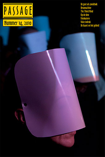
The cover picture is a photo of the audience at a Dreamachine-inspired presentation by Matthijs Munnik about which we’re told:

In my performance I also make use of the flicker effect, but I have more control over it. In my performance, the audience wears white plastic masks, this way they look into a ganzfeld, a totally white field during the performance. In my set up, I use beamers, projecting light on the audience’s masks, completely immersing them in the light and colors of the projection.

I play an 8 minute live composition, based on the varying effects of different frequencies of flicker, colour, binaural beats and sound. During the performance every spectator will see something different, varying patterns and colours, created within their own brains.

And speaking of the Dreamachine, Nick Hydra left a comment in an earlier post with the news that visitors to the Wellcome Collection’s High Society exhibition in London have the opportunity to trip out with one of Brion Gysin’s flicker machines until the end of February.

Previously on { feuilleton }
Brion Gysin let the mice in
Passage 13
Passage 12
Passage 11
Passage 10