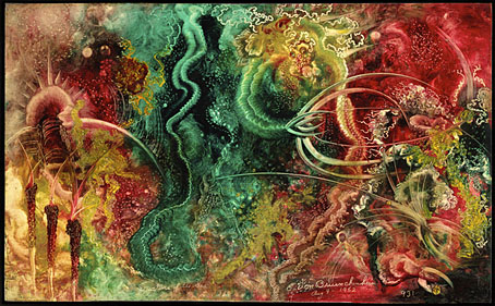
Weekend links 774

jakuchu.jpg

Fish and Octopus (Colourful Realm of Living Beings) (circa 1765) by Ito Jakuchu.

• At Aeon: “Could extraterrestrial technology be lurking in our backyard—on the Moon, Mars or in the asteroid belt? We think it’s worth a look.” Ravi Kopparapu and Jacob Haqq Misra explain.

• At Smithsonian magazine: The first confirmed footage of the Colossal Squid. Only a baby one, however, so not very colossal.

• The eighth installment of Smoky Man’s exploration of The Bumper Book of Magic has been posted (in Italian) at (quasi).

Less than six months later, Lindsay signed an executive order that effectively turned the city into a movie set. The new Mayor’s Office of Film, Theatre, and Broadcasting was designed to cut through existing red tape and facilitate location filming. Script approval was centralized in a single agency. A production now needed but a single permit to shoot on the streets; a specific police unit would remain with the filmmakers as they moved from location to location. Thus, Lindsay created the necessary conditions for the tough cop films, bleak social comedies, and gritty urban fables that captured the feel of New York in the late sixties and early seventies—the cinema of Fun City.

J. Hoberman explores New York City’s popularity as a film location

• Mixes of the week: A mix for The Wire by John King; and DreamScenes – April 2025 at Ambientblog.

• At Colossal: Water droplets cling to fluorescent plant spines in Tom Leighton’s alluring photos.

• At the BFI: Alex Barrett on Carl Theodor Dreyer’s unmade film about Jesus.

• Anne Billson ranks 20 films starring Julie Christie.

Voyage To The Bottom Of The Sea (1964) by Paul Sawtell | Das Boot (1981) by Klaus Doldinger | Ambient Block (Sequenchill/Mission Control #2/Lost In The Sea) (1993) by Sequential

Playhouse: Aubrey

aubrey3.jpg

Aubrey was a TV play for BBC 2’s Playhouse strand, an eighty-minute drama enacting events from the last three years of Aubrey Beardsley’s life. It was broadcast on 22nd January, 1982, and never repeated. After I digitised my own VHS copy in 2008 I wrote a somewhat taunting post about it, showing stills from the scenes that matched Beardsley’s drawings while refusing to make the video itself more widely available. I was subsequently surprised when the writer of the play, John Selwyn Gilbert, turned up in the comments to justifiably bemoan the BBC’s refusal to make so much of its vast archive publically available, an iniquity always compounded by the British public having paid for all those broadcasts in the first place.

aubrey1.jpg

Fast-forward seventeen years and here at last is a copy of Aubrey at YouTube, albeit in compromised form (see below). Since I wrote my original post I’ve become more acquainted with the TV productions of director Philip Hammond so it’s worth giving Hammond a little more credit for the success of the production than I did originally. Hammond’s directing career ran from the 1960s through to the 1990s, with significant contributions to Granada TV’s landmark adaptations of the Sherlock Holmes stories, and a very creditable three-part adaptation of Sheridan Le Fanu’s Uncle Silas which the BBC broadcast as The Dark Angel in 1989. Television has never encouraged the kinds of stylistic flair you find in cinema but Hammond’s later productions stand apart in their mise-en-scene and frequent use of artistic detail. Many of his later productions achieve unusual effects by shooting scenes through reflections in sheets of glass. Elsewhere you’ll often find characters framed in mirrors (as happens in the opening scene of Aubrey) or lit by saturated light from a stained-glass panel.

aubrey2.jpg

Hammond takes a different approach with Aubrey which was shot on video in studio sets. The production design is almost exclusively black and white; many of the sets and compositions frequently mimic Beardsley’s drawings, with decorative motifs framing the scenes. The general appearance is stagily artificial but the details of the script are nevertheless accurate. John Selwyn Gilbert was also the writer, producer and narrator of Beardsley and His Work, a documentary which had been broadcast on BBC 2 three days before Aubrey. Gilbert’s drama follows Beardsley from his dismissal as art editor of The Yellow Book in 1895, through the foundation of The Savoy magazine with Arthur Symons and Leonard Smithers, to his untimely demise in Menton on the French Riviera. Rula Lenska plays Aubrey’s sister, Mabel, with Sandor Elès as André Raffalovich, Simon Shepherd as John Gray, Ronald Lacey as Leonard Smithers, Christopher Strauli as Arthur Symons, Mark Tandy as WB Yeats, and Alex Norton as Max Beerbohm. John Dicks was evidently chosen for his facial resemblance to Beardsley but he’s a decade too old for the role, and looks too healthy for an artist enduring the final stages of a tubercular illness that would eventually kill him. But this is a minor complaint.

More of a problem is the way the play has been uploaded to YouTube in the wrong screen ratio. All TV broadcasts prior to the 1990s are 4:3 but this one has been horizontally compressed to something closer to a square. It is possible to rectify this if you download the video (I currently use 4K Video Downloader) then use Handbrake to write a new copy of the file with the picture size set to a 4:3 ratio. Or maybe you’d rather watch the squashed version…

And while I’m on the subject of Beardsley on screen, Chris James has made available a new copy of his short animated film, After Beardsley, which is now complete, and not chopped into three parts as it was before.

Elsewhere on { feuilleton }
The Aubrey Beardsley archive

Baurenfeind’s capitals

capitals.jpg

Six of the enigmatic capitals.

After writing about my occasional and not very diligent search for the origin of an unidentified set of calligraphic capitals, Jacob Filipp resolved the whole matter for me very quickly. The mystery dates back to 1997 when I bought a Pepin Press book, Ornamental Type, a substantial overview of historic lettering which contains many quality reproductions but no information at all as to the origin of the alphabets. One set of calligraphic capitals were immediately attractive even though many of them had their flourishes cropped by their containing frames. I’ve since used these letters a number of times in print designs, and also used them as page backgrounds for the very first version of my website. In 2002 there was still a tendency in web design for things to look streamlined, cybernetic or futuristic, qualities I was happy to ignore. After ten years or so of using and reusing the letters the question of their origin began to nag at me, hence my recent attempts to resolve the mystery.

capitals2.jpg

From Baurenfeind’s Schreib-Kunst at the Letterform Archive.

It turns out that the capitals were the work of Michael Baurenfeind (1680–1753), a German calligrapher whose exceptional work appeared on these pages just over a year ago. Had I been more observant I would have noticed that one of the pages in the 1716 edition of Baurenfeind’s Schreib-Kunst is the alphabet in question (I even posted the page here!) but the copy of the book at the Internet Archive is missing the page that shows the first half of the alphabet. Every time I’d gone searching for the capitals I’d been using the letter A as a guide, looking for the reflected flourishes at the foot of the letter in other alphabets. The obvious thing to do would have been to look for more of the letters using image searches, which is what Jacob did, eventually locating a capital D on a deleted post at Design Observer.

I’m pleased to have Michael Baurenfeind revealed as the creator of the capitals, his work stands out even among his equally talented contemporaries. The cropped flourishes mean they aren’t ideal for print purposes—in the past I’ve used them in backgrounds where the cropping goes unnoticed—but I’ve thought a few times of making a new set with the cropped sections restored. Now that I know Baurenfeind is the designer this would be easier to do. Any hesitation about how to properly complete a flourish or fill in a missing area could be resolved by consulting Baurenfeind’s other lettering designs. My thanks again to Jacob for resolving the mystery!

Previously on { feuilleton }
Mira Calligraphiae Monumenta
Liber Artificiosus Alphabeti Maioris
Michael Baurenfeind’s extravagant calligraphy
Bergling’s Art Alphabets
Grand capitals
Costume capitals
Paulini’s mythological alphabet
Joseph Balthazar Silvestre’s Alphabet-album
Johann Theodor de Bry’s Neiw Kunstliches Alphabet
The Book of Ornamental Alphabets
Paul Franck’s calligraphy
Gramato-graphices
John Bickham’s Fables and other short poems
Letters and Lettering
Studies in Pen Art
Flourishes

Weekend links 773

kircher.jpg

The Tower of Babel from Turris Babel (1679) by Athanasius Kircher, showing how wide the Tower would have to be at its base to reach the Moon.

• The week’s literary resurrection: Penguin announced Shadow Ticket, a new novel by Thomas Pynchon. “Hicks McTaggart, a one-time strikebreaker turned private eye, thinks he’s found job security until he gets sent out on what should be a routine case, locating and bringing back the heiress of a Wisconsin cheese fortune who’s taken a mind to go wandering…”

• The week’s musical resurrection: Stereolab announced Instant Holograms On Metal Film, their first new album since Not Music in 2010. Aerial Troubles is the new single with a video which has prompted complaints in the comments about the use of AI treatments for the visuals.

• At Public Domain Review: Modern Babylon: Ziggurat Skyscrapers and Hugh Ferriss’ Retrofuturism, a long read by Eva Miller. Previously: The Metropolis of Tomorrow by Hugh Ferriss.

• This week in the Bumper Book of Magic: Ben Wickey is selling some of the original art from his Lives of the Great Enchanters pages.

• At Wormwoodiana: The Golden Age of Second-Hand Bookshops is now. Mark Valentine explains.

• “Alvin Lucier is still making music four years after his death – thanks to an artificial brain.”

• At Colossal: Hundreds of fantastic creatures inhabit a sprawling universe by Vorja Sánchez.

• Coming soon from Radiance Films: A blu-ray disc of Essential Polish Animation.

• Pattern design and illustration by Gail Myerscough.

• Steven Heller’s font of the month is Homage Script.

• New music: Sabi by Odalie.

• RIP Max Romeo.

Babylon (1968) by Dr John | War In A Babylon It Sipple Out Deh (1976) by Max Romeo | Babylonian Tower (1982) by Minimal Compact

Four short films by Lejf Marcussen

marcussen1.jpg

There’s more Surrealism inside this 34-minute collection of films by Lejf Marcussen (1936–2013), a Danish film-maker and animator whose filmography has never been easy to explore on the internet. Marcussen made an impression on a number of Britons in the late 1980s when The Public Voice was shown on TV, one of many such films broadcast during a time when British television channels still dared to screen unusual animations. I’ve written about The Public Voice before so there’s no need to repeat myself, it was a search for a better copy that led me to this compilation of four Marcussen films—The Conductor (1978), Tone Traces (1983), The Public Voice (1988), and Angeli (2002)—all of which differ so much from each other they could easily be taken for the works of four different directors.

marcussen2.jpg

The Conductor is the one closest to traditional animation, being a comic portrait of an orchestral conductor’s wildy exaggerated actions and facial reactions during the performance of a piece of music. It’s music that turns out to be the dominant theme in this collection, and the sole consistent element.

marcussen3.jpg

Where The Conductor is overtly comedic and grotesque, Tone Traces is completely abstract, an illustration of Carl Nielsen’s Symphony No. 5 whose unfolding is depicted by coloured lines on a black background. Marcussen’s approach differs from earlier musical illustrators like Oskar Fischinger in restricting his shapes to lines that follow the instrumentation and composition in great detail.

marcussen4.jpg

This version of The Public Voice is another one taped from a TV broadcast, it’s not necessarily better than any of the others but it does at least keep Marcussen’s remarkable film circulating. The music this time is a chaotic amalgam of pieces by Luciano Berio, Henry Cow and Gustav Mahler.

marcussen5.jpg

Angeli was Marcussen’s final film, another remarkable piece of work although it’s not one I like very much. Watching computerised shapes jump around in a jaunty manner isn’t how I prefer to spend my time, and the score for this one is chaos of a different kind, a collision of digital keyboard pieces with the superior music of Handel, Dvorak and Beethoven. Watch the second and third films in this set if you do nothing else.

Previously on { feuilleton }
A Picture, a film by Lejf Marcussen
The Public Voice by Lejf Marcussen