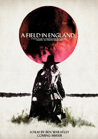
Poster by Luke Insect & Kenn Goodall.
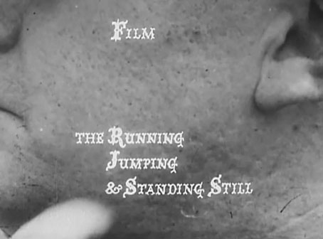
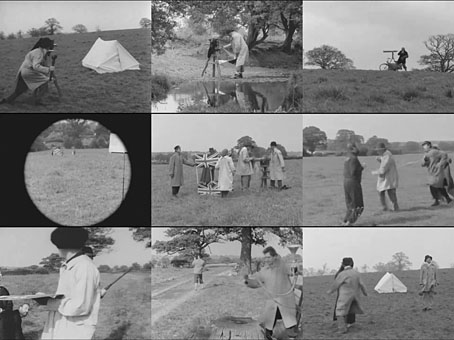
In recent years I’ve had little patience for British cinema: too much dour “realism” with little of Alan Clarke’s vitality, too many comedies that aren’t funny, too many Hollywood calling cards, too much Colin Firth… So it’s been a pleasure to see Peter Strickland’s Berberian Sound Studio followed this month by Ben Wheatley’s A Field In England, a pair of films that stand out by daring to be different in a medium which seems to grow more creatively conservative with each passing year. A Field In England adds to the micro-genre of weird British films set around the time of the English Civil War. In place of witchfinders and devil worshippers we have magic, murder, madness, and a field of hallucinogenic mushrooms. Wheatley, like Strickland, takes risks that wouldn’t be allowed with a bigger budget which makes me excited to see what they’ll be doing next. A Field In England is already out on DVD & Blu-ray. The trailer is here. The director talked to Mat Colegate about the genesis of the film (spoiler alert). There’s more big hats and cloaks in this list of ten 17th century films.
• “I like to look at men…the way they look at women,” photographer Ingrid Berthon-Moine says about her pictures of sculpted testicles.
• Roger Dean has finally sued James Cameron over the designs for Avatar. Will be interesting to see how this one turns out.
• Google has taken its Street View cameras to Battleship Island, “the most desolate city on earth“.
• The strange fantasy novels of Edward Whittemore are available again in digital editions.
• Julia Holter talks about her forthcoming Gigi-inspired album Loud City Song.
• At Pinterest: Maneki-neko, the beckoning cat of good fortune.
• Beautiful Books: Decorative Publishers’ Cloth Bindings.
• The abstract paintings of Hilma af Klint (1862–1944).
• Lee Brown Coye illustrates August Derleth in 1945.
• Bill Laswell’s discography intimidates the collector.
• Mix of the week: Kit Mix #23 by Joseph Burnett.
• The Soundcarriers: Last Broadcast (2010) | Signals (2010) | This Is Normal (2012)