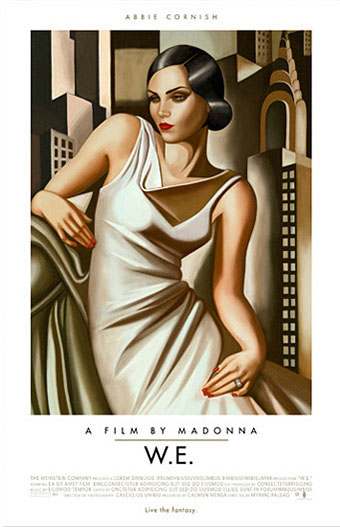
The poster art of Akiko Stehrenberger

stehrenberger1.jpg

W.E. (2011).

Being someone who enjoys adopting and pastiching different art and design styles for different projects I naturally like to see other people doing the same. American illustrator and designer Akiko Stehrenberger is very adept at using this approach for her film posters. Without knowing the identity of the person responsible you wouldn’t guess that they were all the work of the same person.

The Madonna and Polanski posters are the two most overt pastiches, being based respectively on the paintings of Tamara de Lempicka, and the posters by Jan Lenica for Polanski’s Repulsion and Cul-de-Sac. Good as the poster for W.E. is, it seems the studio preferred a more cliched “romantic” treatment for their international sales. Stehrenberger’s Mac desktop design for Burn After Reading was dropped in favour of yet another Saul Bass pastiche. (As a sidenote I’d suggest a moratorium on imitating Saul Bass for the time being; it’s getting boring.) The Lost Highway design isn’t a poster but I added it here since it’s a surprising take on David Lynch’s noir piece. I like the way the dotted line can be taken either as road markings or a line signifying the division in the film between the separate storylines and the separated characters.

Akiko Stehrenberger talked to Adrian Curry earlier this year about her favourite film posters.

stehrenberger2.jpg

Burn After Reading (2008).

stehrenberger3.jpg

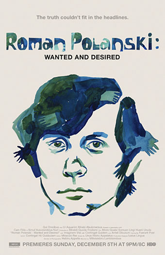
Roman Polanski: Wanted and Desired (2008).

stehrenberger4.jpg

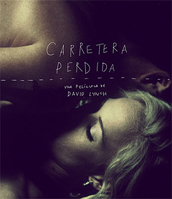
Lost Highway (Spanish Blu-ray cover).

Previously on { feuilleton }
La Belle et la Bête posters
Dr Mabuse posters
The poster art of Frank McCarthy
Repulsion posters
The poster art of Vic Fair
Petulia film posters
Lucifer Rising posters
Wild Salomés
Druillet’s vampires
Bob Peak revisited
Alice in Acidland
Salomé posters
Polish posters: Freedom on the Fence
Kaleidoscope: the switched-on thriller
The Robing of The Birds
Franciszek Starowieyski, 1930–2009
Dallamano’s Dorian Gray
Czech film posters
The poster art of Richard Amsel
Bollywood posters
Lussuria, Invidia, Superbia
The poster art of Bob Peak
A premonition of Premonition
Metropolis posters
Film noir posters

Ignacio Goitia interviewed

goitia.jpg

Acrílico sobre tela (My Other Self, 2009).

Back in 2010 I wrote the following about Ignacio Goitia:

Ignacio Goitia is a Spanish artist whose depictions of opulent aristocracy manage to be subversively homoerotic thanks to the addition of figures we can interpret as boyfriends, sex slaves or wish-fulfilling phantasms; Ludwig II would no doubt approve of the sentiment even if he disagreed with some of the decor.

Earlier this year John Wisniewski sent me a short interview he’d done with Mr Goitia which I’m ashamed to say it’s taken me this long to post. My apologies to John and Ignacio. (I’d have been tempted to ask what’s with all the giraffes?)

*

John Wisniewski: When did you begin drawing and painting?

Ignacio Goitia: I have always, since I can recall, loved drawing and painting. When I was a child, I would spend endless hours with my colour paints, and as soon as I was able, I enrolled myself to different art schools and academies.

Later on I got accepted in the Superior Beaux Art faculty at the University of the Basque Country in Bilbao. Since I finished those five years of University, this is all I have been doing, paint.

JW: When was your first art exhibition? What was the reaction to your work?

IG: Since my first exhibition, the public reaction to my work, has been in general, very positive, although, there is always the sceptics, that relate modernity with abstraction and minimalism, conceptualism… Despite this, with the passing of the years, my work has gained many followers in those circles. In all my exhibits the amount of people that has made an effort to visit them, its been quite large.

JW: What inspires you to paint or draw? How do you choose a subject?

IG: My first source of inspiration are my travels. I find it photographing the buildings, monuments, streets and people that catch my attention. I am passionate about architecture, and love discovering in it, the evolution of human thought.

Once in my studio, I select the sceneries that better adapt to the concept that I wish to express. After that, I start introducing the people and subjects, distributing them in the different spaces, until I get the adequate composition that better express my thought. This work of preparation and distribution, is a process that takes several days.

JW: Do you hope to exhibit your work in the USA at sometime? What do you think the reception will be for your work in the USA?

IG: I have exhibited during Art Basel Week in the HACS gallery in Miami in the Year 2007 and 2008. The reception was very good.

I am also participating with a good chance in the Creatives Rising project with See Me and will be featured in the digital projections over facades in NYC next October. We are in the process for an exhibit in Miami and NYC in the near future. Most of the people that I have been dealing in the USA are having a very positive and enthusiastic response.

JW: How is your painting uniquely Spanish and how is it universal?

IG: I think being born in Spain and specifically in the Basque Country has influenced in some of my work, but is something that is not in the back of my mind, and it is not a source of thought when I paint. The scenarios that I create are inspired in many places around the world, and the subjects could belong to different nationalities.

It’s also true, that I have also use as backdrop, cities like Bilbao or Madrid, and there are blinks of folklore and culture belonging to the Basque country or Spain, and I introduce them in some of my work, but not often. I consider my paintings something less related to a particular culture, or universal, there are something more personal and an individual thought on how I see the world, as a result of my own interests and ideas. •

Elsewhere on { feuilleton }
The gay artists archive

We Have Always Lived in the Castle by Shirley Jackson

whalitc7.jpg

Penguin, 2009. Photo by Lisa Johansson.

Having recently re-read Shirley Jackson’s The Haunting of Hill House (1959) I thought it was about time I read her final novel, We Have Always Lived in the Castle (1962), and I’m very pleased that I did. I was less pleased, however, with the cover of the current edition from Penguin which, like many of the recent Penguin Classics, aspires to a kind of evasive blandness. There are recurrent problems in designing covers for books of exceptional quality: the more the writing opens itself to interpretation, and refuses to be easily categorised, the greater the challenge of finding a single design or image which might represent the book. It’s this that leads literary novels, classics especially, down the road of the text-only cover.

We Have Always Lived in the Castle may be of exceptional quality but it’s also very strange, dark and disturbing, something which the Penguin cover does little to communicate. The opening paragraph doesn’t match the justly celebrated opening of The Haunting of Hill House but it still sets out its stall in no uncertain terms:

My name is Mary Katherine Blackwood. I am eighteen years old, and I live with my sister Constance. I have often thought that with any luck at all I could have been born a werewolf, because the two middle fingers on both my hands are the same length, but I have had to be content with what I had. I dislike washing myself, and dogs, and noise. I like my sister Constance, and Richard Plantagenet, and Amanita phalloides, the death-cup mushroom. Everyone else in my family is dead.

Merricat (as her sister calls her) neglects to mention that they live with one other member of the family, Uncle Julian, a wheelchair-bound survivor of an unresolved poisoning that killed the rest of the family six years earlier. Julian devotes himself to obsessively writing an account of that fatal day while Constance works equally obsessively in the kitchen of the house they share. Mary does little except run errands to the nearby village (whose populace she hates and fears), and play outdoors with her cat, Jonas. Mary is the focus of the novel, a character as painfully introverted as Eleanor in Hill House but with more self-possession and some dangerous obsessions of her own. Joyce Carol Oates in the afterword to the current Penguin edition calls her a witch, which she is in a very diffuse sense. She protects the house with objects that she turns into charms, buries other significant objects, and selects words at random which she believes will protect her. Unlike Hill House there’s nothing at all supernatural in We Have Always Lived in the Castle but Merricat successfully predicts that change is going to disrupt the happily insular household which it does with the arrival of boorish cousin Charles.

whalitc1.jpg

First edition, Viking Press, 1962.

What’s notable for me when looking at earlier cover designs is seeing how much more successful the original covers are compared to later editions. The drawing of Jonas on the jacket of the first edition is suitably wary and even baleful, as Merricat is where strangers are concerned. The lurching, uneven script reflects the skewed lives of the novel’s characters. The cover could have been the work of Merricat herself.

whalitc4.jpg

Popular Library, 1963. Illustration by William Teason.

And it’s Merricat who appears on the first paperback edition. I tend to disapprove of the depiction of central characters on book covers but this addresses the challenge brilliantly: the wild hair, the suspicious eye, the charred wood (there is a fire in the second half of the book), and the spikes which give her cat-like ears.

Continue reading “We Have Always Lived in the Castle by Shirley Jackson”

Weekend links 184

lefler.jpg

Gevatter Tod (Godfather Death, 1905) by Heinrich Lefler. Via Beautiful Century.

An inevitable hangover from Halloween this week. At 50 Watts: A Modern Dance of Death (c. 1894) by Joseph Sattler, Harry Clarke Revisited, and more Ex Libris Mr Reaper | At Design Observer: Keith Eggener on When Buildings Kill: Sentient Houses in Fiction and Film | At Dangerous Minds: An interview with horror soundtrack composer Fabio Frizzi | Clive Hicks-Jenkins on illustrating the ghost stories of MR James.

Punk 45: The Singles Cover Art of Punk 1976–80, a book by Jon Savage & Stuart Baker with an accompanying compilation album on Soul Jazz Records. Savage & Baker selected a handful of favourite covers here.

De humani corporis fabrica by Vesalius is back in print as a beautiful two-volume hardback edition. See sample pages here.

…the business of the writer is to find something out for yourself and to stick by it. To forge a new mythology out of materials pertinent to the moment. Otherwise you’re at the mercy of their mythology, which is a destruction of language, above everything else. This non-language, this bureaucratic-speak of the global corporate entities, is a horror in the world. So that strange language we started with – that piece of Kerouac – I think is more valuable than ever.

Iain Sinclair (yes, him again) talking to James Campbell about his new book, American Smoke.

Bob Mizer & Tom of Finland, an exhibition at the Museum of Contemporary Art, Los Angeles.

• From 2010: The Bridget Riley Look, The Bridget Riley Sound, Bridget Riley’s Rolling Papers.

The Strange and Mysterious History of the Ouija Board. Related: Ouija Boards at Pinterest.

Highway 62 posted some close-ups of my adaptation of The Call of Cthulhu.

• “This is not a coincidence”: Max Dax talks to Andrey A. Tarkovsky.

Anthony Lane‘s Foreword to The Big New Yorker Book of Cats.

• At AnOther: Nicolas Roeg on Mirrors and Memory.

Toys and Techniques: a blog.

Death And The Lady (1970) by Shirley & Dolly Collins | Clang Of The Yankee Reaper (1975) Van Dyke Parks | All And Everyone (2011) by PJ Harvey

Weather vanes

vanes01.jpg

New illustration work has had me searching again through the Internet Archive’s scanned books so there may be a surfeit of these postings for a while. One of the more fascinating areas of that site for my purposes is the Winterthur Museum Library which has a large quantity of manufacturers’ and retailers’ catalogues. This is the kind of ephemera that Walter Benjamin enjoyed, the documents that you give you a more initimate and direct sense of the past than the broader examinations of social historians. (The same applies to magazine and newspaper adverts.)

This weather vane catalogue for the Fiske Iron Works, New York, dates from 1921. Have weather vanes in recent times been more popular in America than in Britain? It often feels that way, possibly as a result of the preponderance in the US of new (or newish) houses in remote locations. The variety of designs in the Fiske catalogue implies a demand, in any case, with some surprising offerings such as a fish and an automobile. The rest of the designs can be seen here.

vanes02.jpg

vanes03.jpg

Continue reading “Weather vanes”