The art of Sidney Hunt, 1896–1940

hunt01.jpg

Ganymede Before Zeus (1921).

Another of those artists about whom detail remains tantalisingly remote if the web is your primary research tool. Hunt was a British Modernist who also edited an avant-garde magazine, Ray, from 1926–27. Most of the works here are bookplates from around 1923, many of them distinctly homoerotic which adds to their interest. The note at Wikipedia is unsourced but tells us that his output included “experimental prose-poem fantasies of 18-year-old hermaphrodites”. Maybe these, and more of his work, will turn up eventually.

hunt02.jpg

hunt03.jpg

hunt04.jpg

Continue reading “The art of Sidney Hunt, 1896–1940”

The Royal Picture Alphabet

royal1.jpg

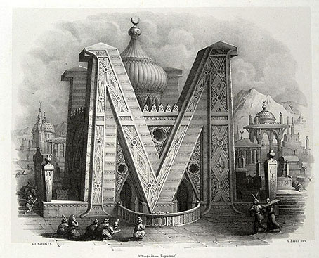
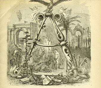
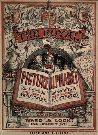
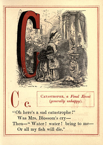
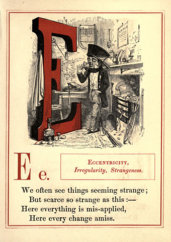
Another pictorial alphabet but no architecture this time. “Royal” is used here in the more general sense of “grand” or “first-rate”, and this isn’t the only example of an instruction book for children that calls its alphabet a royal one. John Leighton’s Royal Picture Alphabet is a finer example than others to be found at the Internet Archive, however, where the results are either very simple or, in the case of Walter Crane’s Absurd ABC, might have benefitted from additional pages. It’s surprising that Leighton’s book is a more substantial piece of work than Crane’s when Crane wrote a history of book design. Leighton’s alphabet is also surprisingly polysyllabic; you can’t imagine anyone today choosing “Eccentricity” to represent the letter E.

Books such as this always have trouble with the letters at the end of the alphabet, especially that tricky X. The Royal Picture Alphabet chooses “Xantippe”, the wife of Socrates, while its earlier counterpart has “Xanthus”, a horse from Greek mythology. (That old stand-by, the xylophone, didn’t become established until later in the 19th century.) Both books, and Crane’s volume, offer “Zany” for the letter Z.

royal2.jpg

royal3.jpg

royal4.jpg

Continue reading “The Royal Picture Alphabet”

Giovanni Battista Pian’s Pictorial Alphabet

muller1.jpg

Another recommendation from Paul Rumsey (thanks, Paul!), these are from a series of lithographs dated 1842–43 by Leopold Müller based upon paintings (?) by Giovanni Battista Pian, or Giovanni Battista de Pian (1813–1857). Shades again of (Giovanni Battista) Piranesi in the name, although the pictures are a lot less Piranesian than Antonio Basoli’s; the only time Piranesi bothered with wooden materials was as a support for building stone arches, and in the spars and torture engines of his Prisons. See more of the series here.

muller2.jpg

muller3.jpg

Continue reading “Giovanni Battista Pian’s Pictorial Alphabet”

Antonio Basoli’s Pictorial Alphabet

basoli1.jpg

My thanks to Paul Rumsey for reminding me of the Alfabeto pittorico (1839) by Antonio Basoli (1774–1848). This is the same idea as yesterday’s pictorial alphabet but with an architectural theme. Basoli’s series of prints depicts each letter in an architectural style which matches the initial: A is for Arabia but also for aranciera (orangery). The attention to detail and the rendering of light and shade is very Piranesian, and it so happens that Piranesi had earlier designed a small number of capitals for use in books, the letterforms being created by architectural scenes. It’s tempting to see Basoli’s series as an elaboration of this idea done in the manner of Piranesi’s Prima parte di Architettura e Prospettive.

Given how much I enjoy this kind of thing I would have posted something about them by now, but seeing as they’d already been covered by the late-lamented Giornale Nuovo I stayed my hand. Mister Aitch’s post on the subject is still worth a look for the detail he supplies regarding the prints and their creator. For scans of the entire volume, go here.

basoli2.jpg

basoli3.jpg

basoli4.jpg

Continue reading “Antonio Basoli’s Pictorial Alphabet”

Grand capitals

larousse1.jpg

It’s no doubt true to say that they don’t make them like this any more, but it’s also likely that they didn’t make many of them like this in 1866 when the first volume of Pierre Larousse’s Grand dictionnaire universel du XIXe siècle was published. Despite the title this is a 15-volume encyclopedia, each volume of which opens with a spread showing the initial letters of the section that follows. The illustrations fill most of each page, the left-hand side displaying the section initial in letterforms or typefaces from different ages, while the right-hand side embellishes a huge decorated letter with objects or scenes sharing the same initial. These are all in French, of course, so a pig (cochon) sits under the letter C. Illustrated alphabets are an old idea, and still a very common one since they make good teaching aids. Seeing these elaborate examples makes me wonder how far back the idea can be traced.

These pictures are from an incomplete set of the books at the Internet Archive. A more complete set can be found via this Wikipedia page but the scans linked to there are all bitmap images which have lost much of their detail.

larousse2.jpg

larousse3.jpg

Continue reading “Grand capitals”