Rhino Head

rhino1.jpg

A new book arrived in the post this week. Rhino Head is a collection of words (in both German and English) by Carlos Atanes and drawings by Jan van Rijn which describes itself thus:

This illustrated fantastical narrative consists of 21 chapters and features short, self-contained stories told from shifting narrative and temporal perspectives. It is a collaboration between author/director Carlos Atanes and illustrator Jan van Rijn, and explores the realms of eroticism and magical realism.

What lies behind a simple fable about wolves and rabbits? An actress fleeing in terror from an underground film shoot on the slopes of Mount Fuji? A New Mexico scrap dealer serving coffee to two visitors from outer space? A fashion designer who believes she is being dreamed by a mythical figure? An antiques forger who discovers an old tale has come true? A female cult disrupting the cosmic order with terrifying rituals?

This interwoven web of stories includes a summons to a fictitious event, sunflowers acting as orgasmic energy batteries, rhino heads at the farthest reaches of the world, pornographic films projected inside the viewer’s mind, dolls transformed into women and women transformed into dolls – a constellation of strange intertwined incidents creating a hyperfable, moving beyond its individual characters because the meaning of the whole can only be revealed to each individual reader.

rhino2.jpg

Having known Jan for some time—I contributed to the Genet-themed collection he put together in 2021—I was happy to write a foreword for his new publication. In books like this you tend to find the pictures acting solely as illustration but here there’s more of a dialogue going on between the different media. The drawings show you things the texts don’t provide, and vice versa.

Rhino Head doesn’t appear to be on sale just yet but anyone wanting further information should contact Kraut and Rubies.

Huszti Horvath’s Three Dragons

horvath01.jpg

Book of the Three Dragons is an unusual illustrated volume, being an American edition of a retelling of Welsh myths by a Welsh writer, Kenneth Morris, with illustrations by a Hungarian artist, Ferdinand Huszti Horvath (1891–1973). Morris was, among other things, a Theosophist who was living in California when he wrote Book of the Three Dragons which no doubt explains the American publication. There doesn’t appear to be any Theosophy in this book at least. Dragons are an important symbol for the Welsh, with a red dragon being a prominent emblem on the flag of Wales. Morris’s book opens with a guide to the pronunciation of the Welsh names and words that appear in the text.

horvath02.jpg

Ferdinand Horvath, meanwhile, moved to the USA in the 1920s where he eventually found employment as an illustrator before working (without credit) for Disney. It’s at Disney-related websites that you’ll find most of the information about his life and work, where the discussion inevitably concerns his designs for animated films. A list of his other book productions would be welcome. There’s a very nice edition of The Raven that was published in the same year as Book of the Three Dragons but with art in much more of an Expressionist style.

I often wonder what Disney’s animations might have been like if the studio had given artists like Horvath and Kay Nielsen a freer rein. Disney only began to change its style in the late 1950s as a result of competition from other animation studios, and even then the results were compromised. Sleeping Beauty used the designs of Eyvind Earle to distinguish the film from the studio’s previous fairy tales but Earle was dissatisfied with the treatment his work received and he left the project before it was finished; the art direction for One Hundred and One Dalmatians was based on the cartoons of Ronald Searle but Walt Disney hated the results and refused to try anything similar again.

horvath03.jpg

horvath04.jpg

horvath05.jpg

Continue reading “Huszti Horvath’s Three Dragons”

Weekend links 832

corridor.jpg

Dark Corridor (1990s) by Unknown Artist.

• “I greatly enjoyed this rich, allusive and strange text, which has affinities to the literary form and style of TS Eliot, David Jones and Iain Sinclair, uniting high modernism with demotic and pulp elements, as well as to the occult thrillers of Charles Williams, Mary Butts and others.” Mark Valentine reviews B-Movie: Serial of Seven Stars by Andrew Duncan.

• New music: Electronic Meditation For Inner Space Travel by Studio Kosmische; Fathom Tides by Werner Dafeldecker & Lawrence English; rust/wave by Tewksbury.

• At Public Domain Review: Animal, Vegetable, Lamb: Thom Sliwowski on the history of the mysterious Vegetable Lamb of Tartary.

• At Door of Perception: Wistman’s Wood, Dartmoor, as photographed by Neil Burnell.

Anne Billson selects 20 of the best corridors in film.

• More corridors: Scificorridorarchive.

Ukrainian animation.

• RIP Sonny Rollins.

Current Rothko

The Black Corridor (1973) by Hawkwind | Corridor (2018) by Steve Jansen | Spectral Corridor Part 4 (2021) by The House In The Woods

Steal Me

stealme.jpg

Coming soon from Absinthe Books, the novella imprint of PS Publishing, is Steal Me by Helen Grant, a book for which I created the wraparound cover art:

Rowan Byrne hasn’t stolen anything for ages—not since she started to straighten her life out after a personal tragedy. But the volume she’s just picked up in the new bookshop in town seems to want her to steal it. The text is very persuasive. There’s a book for everyone in Legends—a book that will encourage their worst impulses. Steal. Fear. Burn. Kill. It’s not long before Rowan’s small town, isolated from the outside world, is descending into mayhem. Assailed by her own demons, Rowan could try to cut and run. Or she could make a stand, and try to save the community she loves…

stealme2.jpg

This was a good book to work on. I’d not worked for PS for a while, and very much enjoyed Helen’s collection of stories for Swan River Press, Atmospheric Disturbances, whose cover and boards I also designed. “Legends”, the mysterious shop with the darkened windows, is staffed by a pair of elderly women who seem vaguely unreal—pleasant and helpful but not quite human, and with an undefined aura of menace. By coincidence, the previous book I worked on for PS Publishing was a fully illustrated edition of Needful Things by Stephen King, a much longer novel about a mysterious shop in a small town whose sinister/unreal proprietor and wares cause mayhem among the populace. Helen says she wasn’t imitating the King novel, and the similarities are superficial in any case. I feel she did more with the concept, and with greater economy, than the world’s most popular horror novelist (and I say this after the world’s most popular horror novelist sent his compliments for my work on his book); but then I’ve never been keen on the tendency favoured by King and others to fill out hundreds of pages with background detail and character biographies at the expense of the horror. In the past I’ve thrown the occasional barb at Mies van der Rohe’s overused quote, but sometimes less really does mean more.

Steal Me will be published in June. Don’t steal it.

Previously on { feuilleton }
Atmospheric Disturbances
The Needful Thing
All the Things
Needful Things

The Black Goat

blackgoat.jpg

I found time recently to finish another picture for the revised edition of my Lovecraft book, a picture which I almost completed several months ago then had to set aside. Last year’s steady progress on the book’s production was brought to a halt in December as a result of a substantial and time-consuming illustration commission. I can’t complain—the new work was welcome after a rather fallow year—but it left me with none of the spare time I usually try and allot to personal projects.

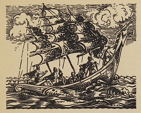
The latest piece is yet another addition to the Great Old Ones section, a collaboration with Alan Moore for which Alan wrote a series of short text pieces that mapped Lovecraftian gods and locations across the spheres of the Kabbalah. If you’ve heard of Shub-Niggurath then you’ll doubtless know the additional title given to the entity: “The Black Goat of the Woods with a Thousand Young”. For the Kabbalistic scheme Alan identified Shub-Niggurath with Binah, the third sphere on the Tree of Life which represents the point at which the descent of energies from the higher spheres to the lower are infused with female qualities. In Kabbalistic terms the assignation works well, Binah being a sphere where gravid entities are preparing to give birth. For the artist, Shub-Niggurath is another Lovecraftian god that’s little more than a suggestive name; the “Black Goat” is never described in Lovecraft’s own writings, and we never learn what the “Thousand Young” may be. This gives considerable latitude to an illustrator, although most of the depictions tend to incorporate goatish features of some kind. I remain undecided about this. On the one hand the creation of a goat god is a rare example of Lovecraft carrying over attributes from pagan iconography into the unearthly realm of the Great Old Ones; Pan is the obvious forerunner here even though Pan was a male deity. On the other hand there’s the question of the degree to which we should acknowledge any physical goatishness when—as with Tsathoggua and Cthulhu—the resemblance to a terrestrial organism may be a result of a mind at the end of its tether straining for a visual description: “It looked like a…goat/toad/squid-faced dragon…!”

sephiroth.jpg

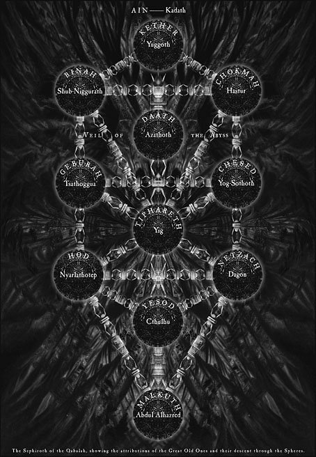
The Sephiroth chart from the second edition of the book, 2006.

As I say, I’m undecided but for this piece I opted for a compromise, a goat-like head supported by a monstrous body presiding over an even more monstrous progeny. My earlier depiction was another Photoshop melange, something that looked novel in 1999 but wouldn’t pass muster today. The new version is a further evolution of a form of digital drawing I’ve been developing, a process in which you draw a portion of the picture then copy and paste it to a new layer, distort it slightly using one of Photoshop’s Distort filters, then draw over and around the new section until it blends seamlessly with the rest. This has the effect of creating unpredictable forms that underly the work as a whole, rather like the Surrealist techniques of frottage, grattage, decalcomania and so on. The Surrealist processes were all the product of physical materials but the impulse is the same whatever technique you may use: the introduction of a random element that might evade the conscious input of the artist and the habitual strokes made by the drawing hand.

This leaves me now with one last god-form to be reworked, Yig the serpent deity. I’ve no idea at the moment what to do for this but something will emerge once I start playing around. I’ll also be chipping away at the new pages for The Dunwich Horror. Progress on this has been slower than I hoped but I’m still determined to finish the story. Stay tuned for further updates.

Elsewhere on { feuilleton }
The Lovecraft archive

Previously on { feuilleton }
Tsathoggua rising
H.P.L.
The return of the Crawling Chaos
Lettering Lovecraft
Weird ekphrasis and the Dunwich Horrors
Kadath and Yog-Sothoth
Another view over Yuggoth
Nyarlathotep: the Crawling Chaos