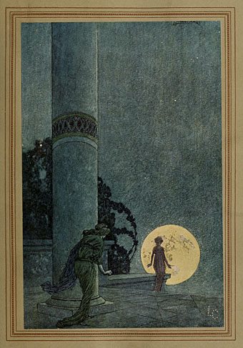
A detail from Tom Phillips’ cover design for Starless And Bible Black (1974) by King Crimson.
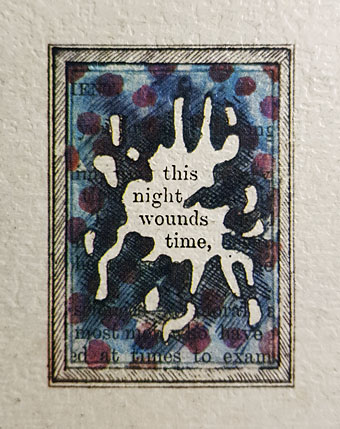
• RIP Tom Phillips. The term “polymath” is often used by monomaths to describe people who are proficient in two areas instead of just one. Tom Phillips was a model polymath, an artist whose work ranged wherever his curiosity took him, from conventionally realist portraiture to abstract painting and computer art, from collage, sculpture and stage design to 20 Sites n Years, a long-term photographic work. When Phillips decided to illustrate Dante’s Inferno he first translated the book himself; the Dante project subsequently evolved into a TV/film production made in collaboration with Peter Greenaway and Raúl Ruiz. As for A Humument, this is the artist’s book by which all others should be judged, a unique reworking of a Victorian novel which now exists in multiple editions and sub-works. Humument extracts became a kind of Phillips signature (you can see one at the top of this post), a series of often cryptic fragments and pronouncements that appeared in prints and paintings while also supplying the libretto for Phillips’ first opera, Irma, one of his many musical compositions. Some years ago I posted a quote by Brian Eno about his former art teacher; those words (from A Year With Swollen Appendices) are worth repeating:
It’s a sign of the awfulness of the English art world that he isn’t better known. Tom has committed the worst of all crimes in England. He’s risen above his station. You can sell chemical weapons to doubtful regimes and still get a knighthood, but don’t be too clever, don’t go rising above your station.
The smart thing in the art world is to have one good idea and never have another. It’s the same in pop—once you’ve got your brand identity, carry on doing that for the rest of your days and you’ll make a lot of money. Because Tom’s lifetime project ranges over books, music and painting, it looks diffuse, but he is a most coherent artist. I like his work more and more.
• “The most radical thing about Ever So Lonely is the instrumental when it breaks down and for eight glorious bars you’re dancing to a classical raga and loving it, whoever you are.” Sheila Chandra again on the fleeting pop career of Monsoon.
• Something to look forward to for next summer: Worlds Beyond Time: Sci-Fi Art of the 1970s, a book by Adam Rowe, curator of 70s Sci-fi Art at Tumblr.
• Mix of the week: Groove Orient: South Asian Elements in Psychedelic Jazz at Aquarium Drunkard.
• “Physicists create a wormhole using a quantum computer.” Natalie Wolchover explains.
• Pattern Collider is a tool for generating and exploring quasiperiodic tiling patterns.
• “Infernal Affairs is still Hong Kong’s greatest crime saga,” says James Balmont.
• Secret Satan, 2022, the essential end-of-year book list from Strange Flowers.
• Also no longer with us as of this week, comic artist Aline Kominsky–Crumb.
• New music: Violet Echoes by Subtle Energy.
• Il Trio Infernale (1974) by Ennio Morricone | Firebird Suite: Infernal Dance Of King Kastchei (Stravinsky) (1975) by Tomita | Infernal Devices (2011) by Moon Wiring Club