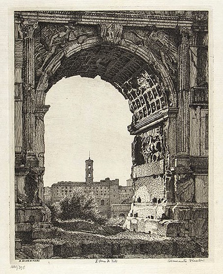
L’arco di Tito (1918).
Benvenuto Disertori was an Italian artist with a parallel career as a musicologist. I forget how his prints came to my attention but they’re just the kind of thing I like to see: meticulous monochrome views with an emphasis on architecture and eroded mineral surfaces. Some printmakers tend to concentrate on a single medium—wood engraving, for example—but Disertori embraced a wide range of etching and engraving techniques. Once again, the influence of Piranesi is discernible in some of these views (another point in their favour), especially those that depict Roman ruins or older Italian buildings like the medieval towers in San Gimignano.
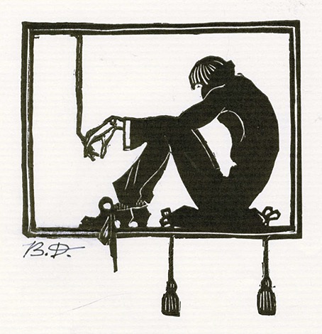
Il Pensatore (1909).
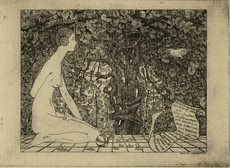
L’edera (1911–13).
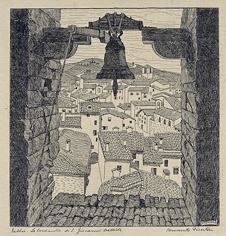
Gubbio. La Campanella di S. Giovanni Battista (1912-13).
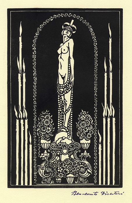
La Nicchia (1913).
Continue reading “The art of Benvenuto Disertori (1887–1969)”