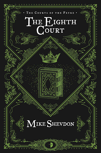
Mid-January and here’s the first book cover design of the year, and another title for Angry Robot. This is the fourth book in Mike Shevdon‘s Courts of the Feyre series; since I’d already provided the three earlier books with a uniform design it didn’t take long to create this one. I’ve been very pleased with the reception of these covers, the positive response shows that it’s possible to design something for a fantasy series that isn’t the customary generic illustration plus florid typography. I wrote about the problems of designing fantasy covers last year with a lengthy examination of M. John Harrison’s Viriconium books.
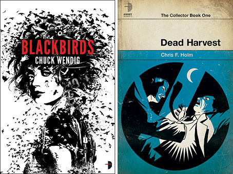
Two recent Angry Robot covers: Joey HiFi‘s cover for Chuck Wendig and Amazing15‘s Pelican-styled design for Chris F. Holm.
Credit should be given to Angry Robot’s Marc Gascoigne for encouraging this direction, the company has been producing a range of very smart covers which don’t pander to the clichés of the marketplace. There’s more of an incentive for smaller publishers to do this when small press imprints and self-publishers often have terrible cover designs (sad but true) while the multinationals play safe for fear of losing readers. If you want to stand out from the crowd then it helps to look good.
Elsewhere on { feuilleton }
• The book covers archive
Previously on { feuilleton }
• The Courts of the Feyre