Weekend links 198

boty.jpg

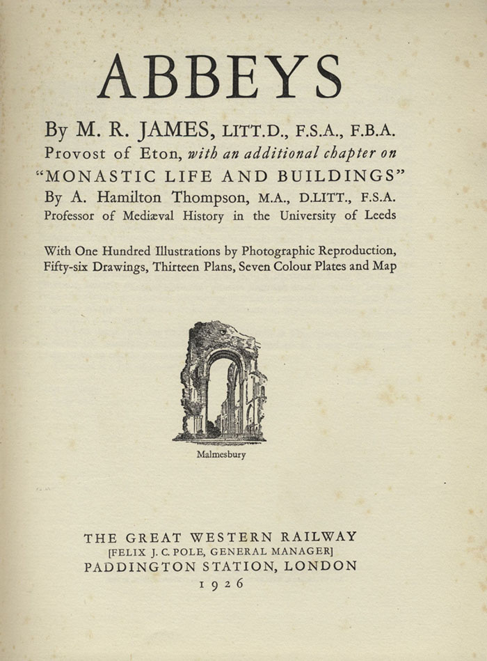
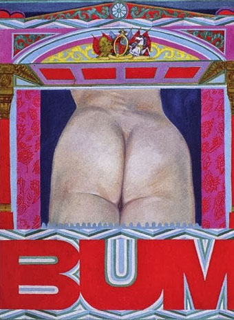
Bum (1966) by Pauline Boty.

Eleanor Birne on Pauline Boty, “the only prominent female Pop artist among a generation of famous men”. Ken Russell’s Pop Art documentary, Pop Goes the Easel (1962), which features Boty, may be seen here. Two years later Boty was back with Ken Russell playing the part of the prostitute from The Miraculous Mandarin in a film about Béla Bartók. That’s something I’d love to see. There’s more about her painting, and the work of other female Pop artists, here.

• Why Are We Sleeping? Mark Pilkington on the music world’s recurrent interest in the philosophy of GI Gurdjieff. Pilkington’s most recent Raagnagrok release with Zali Krishna, Man Woman Birth Death Infinity, was reviewed by Peter Bebergal.

• Cinematic details: Frames-within-frames in The Ipcress File (1966), and the typography of 2001: A Space Odyssey (1968).

highrise.jpg

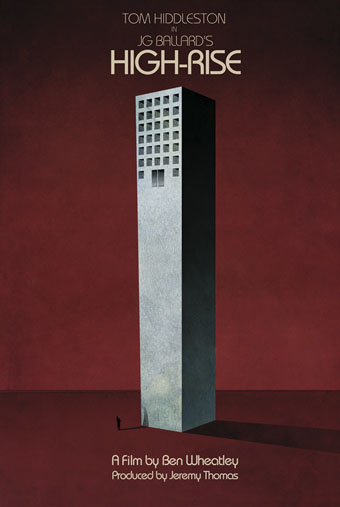
A Jay Shaw poster for Ben Wheatley’s forthcoming film of High-Rise.

• “…a large cavity must be dug in the bird’s shoulder and filled with ball bearings.” Christine Baumgarthuber on the dubious delights of The Futurist Cookbook.

• Why Tatlin Can Never Go Home Again: Rick Poynor on the difficulties of finding a definitive representation of an artwork online.

Jay Parini reviews Inside a Pearl: My Years in Paris by Edmund White. At AnOther Donatien Grau talks to White about fashion.

• At Bajo el Signo de Libra (in Spanish): the homoerotic and occasionally Surrealist art of Pavel Tchelitchew.

• At 50 Watts: Kling Klang Gloria: Vintage Children’s Books from Austria.

• The motorbike girl gangs of Morocco photographed by Hassan Hajjaj.

Geoff Manaugh on how LED streetlights will change cinema.

Stylus “is an experiment in sound, music and listening”.

• Mix of the week: Secret Thirteen mix 106 by Senking.

• At Pinterest: JG Ballard

This Is Pop? (1978) by XTC | Pop Muzik (1979) by M | Pop Quiz (1995) by Stereolab

Antonio Basoli’s Pictorial Alphabet

basoli1.jpg

My thanks to Paul Rumsey for reminding me of the Alfabeto pittorico (1839) by Antonio Basoli (1774–1848). This is the same idea as yesterday’s pictorial alphabet but with an architectural theme. Basoli’s series of prints depicts each letter in an architectural style which matches the initial: A is for Arabia but also for aranciera (orangery). The attention to detail and the rendering of light and shade is very Piranesian, and it so happens that Piranesi had earlier designed a small number of capitals for use in books, the letterforms being created by architectural scenes. It’s tempting to see Basoli’s series as an elaboration of this idea done in the manner of Piranesi’s Prima parte di Architettura e Prospettive.

Given how much I enjoy this kind of thing I would have posted something about them by now, but seeing as they’d already been covered by the late-lamented Giornale Nuovo I stayed my hand. Mister Aitch’s post on the subject is still worth a look for the detail he supplies regarding the prints and their creator. For scans of the entire volume, go here.

basoli2.jpg

basoli3.jpg

basoli4.jpg

Continue reading “Antonio Basoli’s Pictorial Alphabet”

Grand capitals

larousse1.jpg

It’s no doubt true to say that they don’t make them like this any more, but it’s also likely that they didn’t make many of them like this in 1866 when the first volume of Pierre Larousse’s Grand dictionnaire universel du XIXe siècle was published. Despite the title this is a 15-volume encyclopedia, each volume of which opens with a spread showing the initial letters of the section that follows. The illustrations fill most of each page, the left-hand side displaying the section initial in letterforms or typefaces from different ages, while the right-hand side embellishes a huge decorated letter with objects or scenes sharing the same initial. These are all in French, of course, so a pig (cochon) sits under the letter C. Illustrated alphabets are an old idea, and still a very common one since they make good teaching aids. Seeing these elaborate examples makes me wonder how far back the idea can be traced.

These pictures are from an incomplete set of the books at the Internet Archive. A more complete set can be found via this Wikipedia page but the scans linked to there are all bitmap images which have lost much of their detail.

larousse2.jpg

larousse3.jpg

Continue reading “Grand capitals”

Abbeys by MR James

abbeys01.jpg

MR James is remembered today for his ghost stories but the four collections published during his lifetime represent a small percentage of his written work. His scholarly studies inform his stories, of course, but they also contribute to a pair of popular non-fiction books which have peripheral associations with the ghost collections: Suffolk and Norfolk: A Perambulation of the Two Counties with Notices of Their History and Their Ancient Buildings (1930) is a guide to the low-lying eastern counties where a number of the stories are set; Abbeys (1925) is a guide to the monastic ruins of the south-western counties and central England, locations which the author and his characters would enjoy visiting. This is a favourite book of mine, and one I often recommend to James enthusiasts.

abbeys03.jpg

Abbeys is one of a three-volume set of illustrated guides published by the Great Western Railway company in 1925, (my copy is a second edition from 1926) the other titles being Cathedrals (1924), with no author credited, and Castles (1926) by Charles Oman. The books detail the ancient attractions a traveller in Britain might wish to explore using the services of Great Western Railway. Many of the more celebrated buildings in England and Wales are covered but the lines only travel as far north as Manchester and as far east as London. In addition to photo plates and illustrations, each book contains a removable map of the rail network folded into a pocket inside the back of the book. The coloured boards (red for Abbeys, blue for Cathedrals and brown for Castles) are sturdy enough to withstand the rigours of travel.

abbeys02.jpg

Another of those poignant inscriptions.

abbeys04.jpg

abbeys05.jpg

Although Abbeys lacks any credits for its photos and illustrations, Cathedrals states that the photos are the work of the railway’s staff photographers while the pen-and-ink illustrations are by William M. Hendy. There’s also a credit for the typographer, William Gordon Tucker, who not only provides many fine illuminated capitals but also uses ligatures for “ct” and “st”. Abbeys has an additional feature in the form of several fold-out plans of the larger buildings.

Continue reading “Abbeys by MR James”

Specimens of Chromatic Wood Type

chromatic01.jpg

You don’t see many type specimen books in colour; offhand I can’t think of seeing any before this one. Specimens of Chromatic Wood Type, Borders, Etc. Manufactured by Wm. H. Page & Co dates from 1874, and features 100 examples of the very bold typefaces and border designs you find on 19th-century billboards and posters. Very useful if you’re ever called upon to imitate this style. Browse it here or download it here.

chromatic02.jpg

chromatic03.jpg

chromatic04.jpg

Continue reading “Specimens of Chromatic Wood Type”