Herbie Hancock live!

hh.jpg

Whenever my music listening gets on the jazz train, as it has been for the past week or so, I find myself gravitating to the Kozmigroov Konnection to see what albums I may still be missing. “Kozmigroov” is one of those descriptive terms that sounds awkward but is nevertheless useful for framing an idiom that would otherwise go undefined: “a transgressive improvisational music which combines elements of psychedelia, spirituality, jazz, rock, soul, funk, and African, Latin, Brazilian, Indian and Asian influences culminating [in] an all encompassing cosmic groove. At its most accomplished, Kozmigroov is both expansive and highly rhythmic, and simultaneously finds connections with the mind, soul and body.” (more)

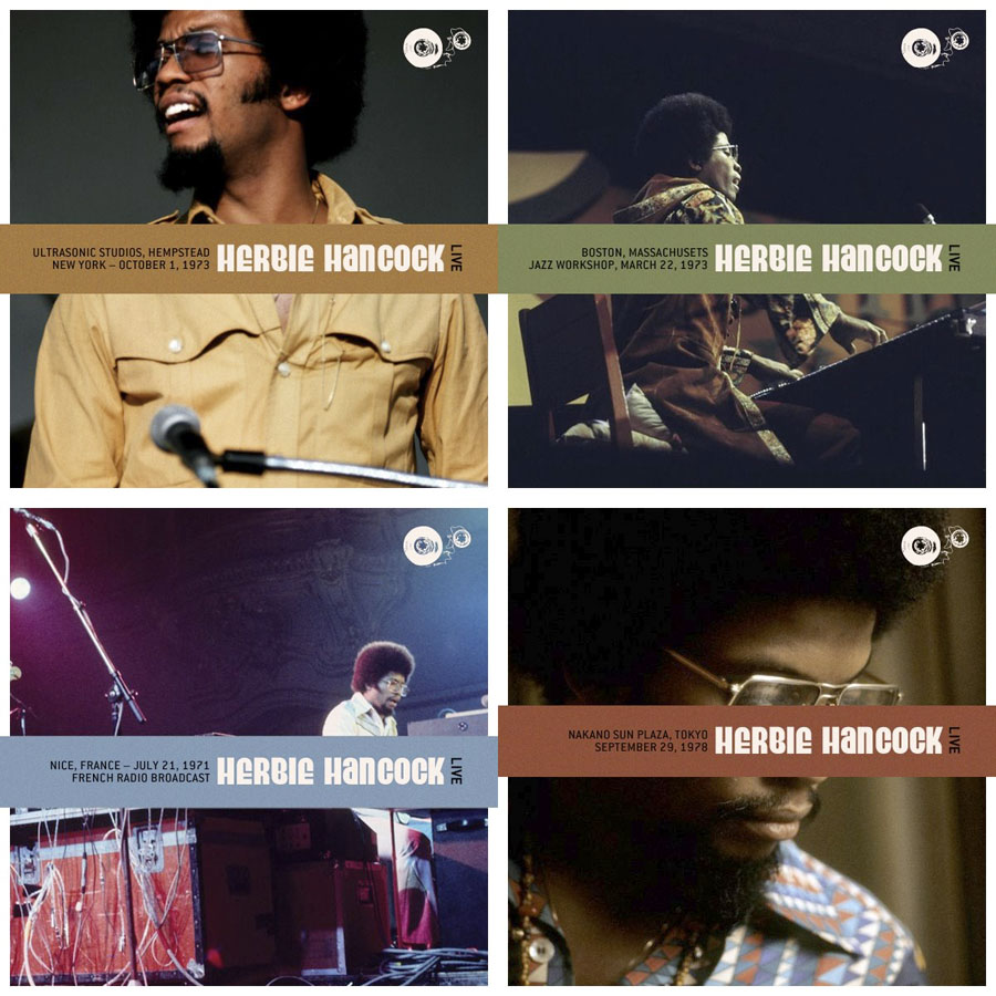
If you like this kind of thing then the Kozmigroov Konnection is an essential guide, especially when you’re faced with discographies by artists you know only from their contributions to releases by bigger names. Herbie Hancock isn’t exactly an unknown quantity but I hadn’t noticed before that his Kozmigroov listing features a number of live recordings that I was sure I hadn’t heard. Could they be found anywhere? The answer is obviously yes, thanks to the trove of live recordings archived at Never Enough Rhodes. The post there is an old one but the links for all the Herbie Hancock recordings were updated a few years ago, and all the ones from the essential years up to 1979 are still active. Not only are they active but there are far more concerts from the Mwandishi/Head Hunters era than I ever expected to find in one place. And many of these are from FM radio broadcasts so they don’t suffer from the cassette-recorder-under-the-seat syndrome that spoils so many rock bootlegs from the 1970s and 80s. Amazing.

flood.jpg

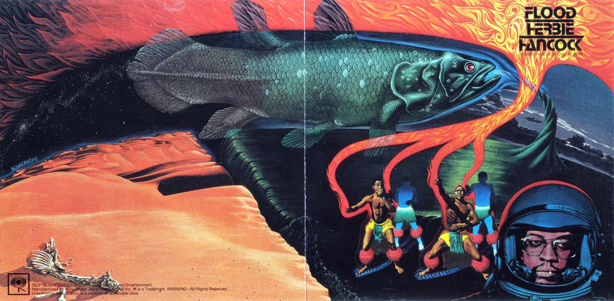
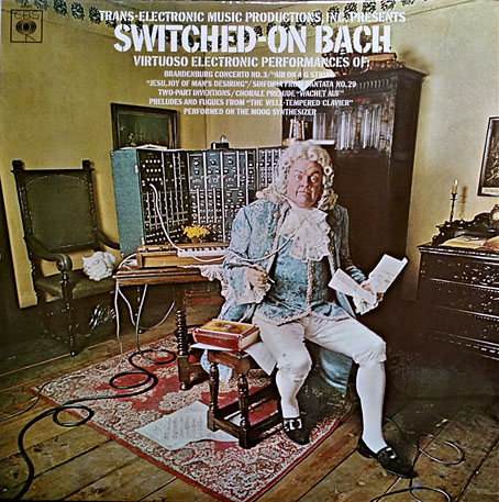
Sleeve art by Nobuyuki Nakanishi for one of the few official live albums from Hancock’s Head Hunters period (but only in Japan until it was reissued a few years ago). I love everything about this cover: the Cosmic Coelacanth, Mr. Hancock’s NASA helmet, the Stop typeface, the waterspout nod to Mati Klarwein’s cover for Bitches Brew… Earth, air, fire and water.

The performances range from extended extrapolations of album compositions—a 43-minute version of Hornets (Boston Jazz Workshop, 1973) featuring a lot of synth freakery from Patrick Gleeson; a 57-minute performance of Sleeping Giant (Baker’s Keyboard Lounge, Detroit, 1972)—to later concerts that capture the post Head Hunters group playing to wildly enthusiastic audiences. The thumping version of Palm Grease that opens the Kansas City show makes the studio version sound very restrained. The only disappointment is a rather noisy recording of the FM session from the Ultra-Sonic Recording Studio, a Long Island venue that in the early 1970s hosted many studio appearances by rock, blues and jazz artists. An Ultra-Sonic session by Dr John from 1973 has circulated for years in exceptional quality so I was hoping the Hancock set might sound as good. This is a minor quibble, however, the recording is still decent enough, and the performances are fantastic.
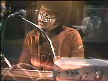
hh2.jpg

Musikladen, 1974.

The only concert on the list that I had heard before is an audio rip from a 1974 appearance by the Hancock ensemble on Musikladen, a German TV series. I linked to a copy of this in one of the weekend posts years ago but nothing lasts on YouTube so the link is now defunct. There is another copy here, however. For the time being… The person who was running Never Enough Rhodes complained about having to keep reposting concerts when file hosting services were shut down. Always download things of interest, you never know how long they may be available.

Previously on { feuilleton }
Miles and Miles

The art of John Alcorn, 1935–1992

alcorn16.jpg

Ad art for Seventeen magazine, August 1970.

Another member of the Groovy Set, John Alcorn was a very prolific illustrator and designer whose career included a period at Milton Glaser and Seymour Chwast’s Push Pin Studios. Alcorn’s art predates the groovy look, and also extends beyond it, but since I have a taste for this quasi-psychedelic style all the examples here are from the late 1960s/early 1970s. An overview of Alcorn’s career may be found in John Alcorn: Evolution by Design, a book edited by Stephen Alcorn and Marta Sironi which was featured at 50 Watts. And since I keep referring back to it, I’ve added some updates to the original groovy post.

alcorn12.jpg

The Astrology Album, 1967.

From an astrological album to astrological covers for Sydney Omarr’s books, 12 of which were published by Signet in 1969.

alcorn04.jpg

alcorn05.jpg

alcorn06.jpg

Continue reading “The art of John Alcorn, 1935–1992”

Weekend links 572

poumeyrol.jpg

L’Insolite (1980) by Jean-Marie Poumeyrol.

• “As we move down the ladder of prestige into the world of unvetted tweets, we observe an increasing difficulty, among people with very strong opinions, in exercising that basic critical competence of distinguishing between the authorial creation of a character, and the author’s affirmation of that character’s every moral trait and political view.” Justin EH Smith on the HR managers of the human soul.

• “When is a Didone not a Didone? How far must an exemplar Didone, like a Didot or a Bodoni, be altered before it loses its ‘Didoneness’?” John Boardley on the vexed question of font classification, and the need for an alternative to the present system.

• “Birds with Human Faces and Birds with Human Souls share shelf space with The Book of Owls and Expert Obedience Training for Dogs…” Joanna Moorhead visits the Casa Estudio Leonora Carrington in Mexico City.

“Indolent” is a funny way to characterize her natural state, which seems more like “incisive” to me, but I also have the unshakable sense—for myself—that writing can’t or shouldn’t look like staring into space or feel like not wanting to move from the couch. “A fraud is being perpetrated: writing is not work, it’s doing nothing,” she states in that first essay, from 1992. But she immediately counters with, “It’s not a fraud: doing nothing is what I have to do to live.” Listing a few more pertinent existential options, Diski ends with, “Or: writing is what I have to do to be my melancholy self.” The protoplasmic, chattering, melancholic “I” of these essays is, of course, the collection’s constant, its true subject. I can commiserate with her on every page even if emulation is out of reach.

Johanna Fateman on the incisive long-form criticism of Jenny Diski

• At Spine: Vyki Hendy identifies sunburst as a new trend in book cover design. I often think I overuse these things in my own cover designs which means I may be inadvertently (and fleetingly) trendy.

• At the Magnum Gallery, London: Metamorphoses, photographic studies by Herbert List of male bodies and Greek statuary.

• At Spoon & Tamago: A butterfly sipping moisture from puddles, sculpted entirely in wood by Toru Fukuda.

• At Dangerous Minds: Joseph Lanza on the easy listening side of psychedelic pop.

• At CounterPunch: Louis Proyect on thinking like an octopus.

• Mix of the week: Fact Mix 510 by Britton Powell.

Bye Bye Butterfly (1965) by Pauline Oliveros | Butterfly Mornings (2001) by Hope Sandoval & The Warm Inventions | Butterfly Caught (2003) by Massive Attack

Switched-On… hits and misses

so01.jpg

The first pressing of Switched-On Bach with a cover showing a Bach-alike confounded/dismayed by the sounds issuing from the machine behind him. The cover was soon swapped for the one below.

After mentioning the proliferation of Switched-On… synthesizer albums in the previous post, curiosity impelled me to see how many of these things were out there. A lot more than I expected is the answer, almost enough to make this cul-de-sac of novelty exploitation into a sub-genre of its own. As mentioned earlier, it was the huge success of Switched-On Bach (1968) by Wendy Carlos that began the trend. The album had a rare crossover appeal so that it could be sold to classical listeners as well as to a younger audience interested in electronic sounds, those for whom the words “switched on” echoed the druggy/erotic intersection of “turned on”. Carlos had an advantage over other musicians thanks to a long association with Robert Moog which meant she had a head start in exploring the recording potential of the new Moog synthesizer and innovations like Moog’s touch-sensitive keyboard. In 1968 few people could afford a Moog system; those who could usually needed to hire technicians like Paul Beaver and Bernie Krause to help them operate the thing. For a brief while it was enough to simply use the instrument to make strange noises, hence Mick Jagger’s droning score for Kenneth Anger’s Invocation of my Demon Brother (1969), and George Harrison’s preposterous Electronic Sound (1969), 44 minutes of very amateurish Moog-doodling. Switched-On Bach sounds a little primitive today—it sounds primitive next to its follow-up albums, The Well-Tempered Synthesizer (1969) and Switched-On Bach II (1973)—but Carlos and collaborators Rachel Elkind and Benjamin Folkman spent much more time refining their recording techniques than the knob-twiddling horde who rushed to capitalise on their success.

so02.jpg

The rules of the Switched-On… idiom are as follows: a title that begins with the words “Switched-On”, obviously, although there’s a subset of the form in which an album may have a different title while a subtitle mentions something about “switched-on recordings”; the music must be cover versions of familiar songs or compositions, originality here is surplus to requirements; and it’s not essential but the cover art often alludes in some way to synthesizer technology and/or “the future”, with the latter represented by Space Age typefaces such as Amelia, Computer, Countdown or Data 70. I’ve not heard many of these albums, and I’m fairly certain that I don’t want to hear most of them, but I’ve heard enough Carlos cash-ins to know that the cover designs are often the best thing about them. The remastered CDs that Wendy Carlos released in the 1990s feature additional tracks that give some idea of the amount of work involved in the creation of each album. The early cash-ins, by contrast, tend to avoid time-consuming multi-track composition in favour of using a synthesizer as though it’s merely an expensive keyboard. The success of these albums musically may be gauged by the lack of reissues. They may be of interest to the so-bad-it’s-good “Incredibly Strange Music” crowd but I prefer to spend my time listening to other things. Beware.

so03.jpg

Switched-On Rock (1969) by The Moog Machine.

so04.jpg

Switched-On Bacharach (1969) by Christopher Scott.

so05.jpg

Switched-Off Bach (1969) by Various Artists.

CBS exploits the success of the electronic album by packaging a collection of earlier non-electronic recordings.

Continue reading “Switched-On… hits and misses”

More Swans and Robots

robotartists01.jpg

Real Italian fantascienza is an authentic expression of Italian culture, which is brainy, nerdy, gutsy and pulp, it’s far-out but down-home, and raw but civilized. I would not proclaim that it’s the best fantasy writing ever created in the world, but it encourages and motivates me.

Bruce Sterling talking to Paul Semel about his collection of fantascienza stories, Robot Artists and Black Swans. My cover design was posted here last September; the book itself is published this week by Tachyon so I can at finally reveal the interior illustrations. Sterling’s collection presents seven stories written by his Italian alter-ego, Bruno Argento, with several of them appearing in English for the first time. The Italian theme informs the design as well as the content, although the associations aren’t always as obvious as they are in my illustrations for Sterling’s earlier fantascienza book for Tachyon, Pirate Utopia, the art and design for which adapted graphics by the Italian Futurists.

robotartists08.jpg

As I mentioned in the earlier post, while searching for more recent Italian graphics I came across the work of Franco Grignani (1908–1999), a designer whose most famous work was the Woolmark logo, one of those international symbols that most people will have seen even if few know who was responsible for its creation. The Woolmark’s black-and-white stripes are typical of Grignani’s designs, many of which work variations on the eye-jangling Op Art style pioneered by Bridget Riley. Grignani’s work seemed at first as though it might offer a suitable model for the cover design but it quickly became apparent that his style wasn’t suitable for this title so I went in another direction. Grignani’s influence is present inside the book, however, in the more abstracted illustrations, and in the parallel lines that provide a connecting thread between the stories and their illustrations. The Eurostile fonts used throughout the book also have an Italian flavour. They’re a little clichéd for science fiction but I liked the way they combined SF associations with more Italian design, being the work of Alessandro Butti and Aldo Novarese.

robotartists15.jpg

The other design influence, and a more identifiable source, is MC Escher, a choice prompted by the black swans in the title. Escher’s tessellated patterns feature a variety of animals, swans included, so I adapted two of the artist’s swan patterns to prevent the illustration from being robot-heavy. Escher also has an Italian side, as it happens; he enjoyed holidaying in Italy, and the vernacular architecture of the country’s small coastal towns may be found in many of his lithographs. The Escher swans led in turn to a self-indulgent illustration that fills two pages at the front of the book, something that came about after I was playing with Penrose triangles in Illustrator. I’d made a group of these impossible shapes into a construction which a little tweaking turned into a piece of equally impossible architecture, rather like those in the Escher-influenced mobile game, Monument Valley. All that was required to flesh things out was to cover the walls in a brick pattern then add a few swans and robots.

Continue reading “More Swans and Robots”