Bookplates from The Studio

studio01.jpg

Cyril Goldie.

Selections from Modern Book-plates and their Designers, an overview of British, American and European designs published by The Studio magazine in 1898. These small Studio books are always good to see, not least for the period ads in the opening and closing pages. A couple of the designs are familiar from later reprints, notably Cyril Goldie’s remarkable accumulation of thorns and skulls. Many others are in the swirling and tendrilled style of Art Nouveau which The Studio did much to promote in Britain. Also of interest are a few entries from well-known fine artists who are seldom associated with this kind of design. Among these is Belgian Symbolist Fernand Khnopff who contributes a design of his own and an article about Flemish bookplate design.

studio02.jpg

Charles Robinson.

studio03.jpg

PJ Billinghurst.

Continue reading “Bookplates from The Studio”

Deutsche Kunst und Dekoration #24

dkd24-01.jpg

Continuing the delve into back numbers of Deutsche Kunst und Dekoration, the German periodical of art and decoration. Volume 24 covers the period from April 1909 to September 1909, and this is the penultimate edition that I’ll be posting samples from. The checkerboard designs of the Wiener Werkstätte are still being featured in this number but the focus here is on pictorial works rather than interior design. As before, anyone wishing to see these samples in greater detail is advised to download the entire number at the Internet Archive. There’ll be a final volume of DK&D next week.

dkd24-02.jpg

dkd24-03.jpg

Continue reading “Deutsche Kunst und Dekoration #24”

Ver Sacrum, 1898

vs-1898-01.jpg

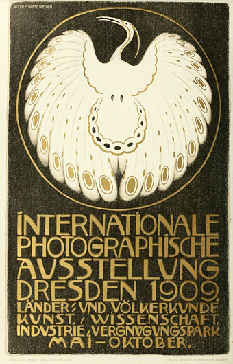
There are art magazines, and then there’s Ver Sacrum. I’m tempted to say there are magazines, and then there’s Ver Sacrum but that’s going a little far. Suffice to say that among the many fine art magazines of the period 1890 to 1910, a number of which have been featured here already, Ver Sacrum stands apart for its design and the consistent quality of its contents. Having seen back numbers of Jugend and Pan made available at the University of Heidelberg I’d been hoping the archivists there would eventually turn their attention to the art journal of the Viennese Secession, and they finally have, with the first bound number digitised here.

vs-1898-01.jpg

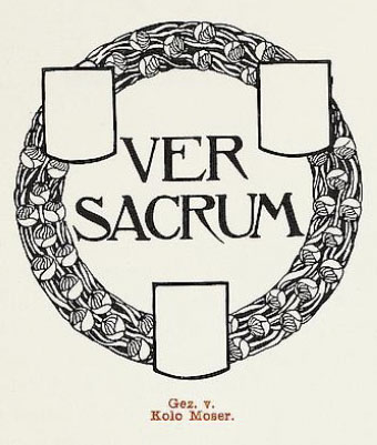
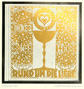
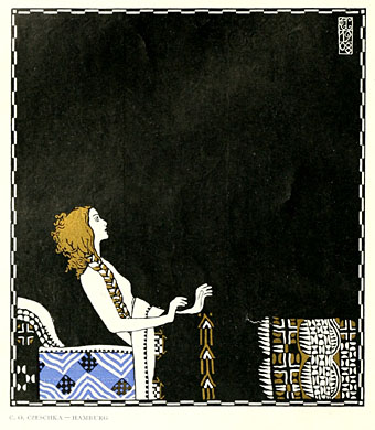
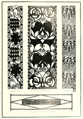
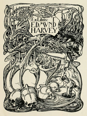
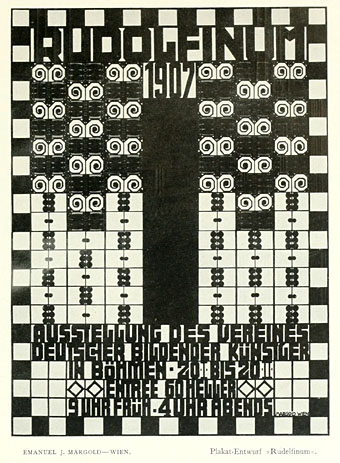
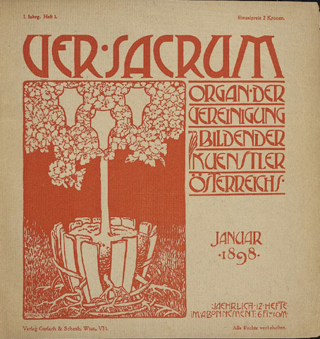
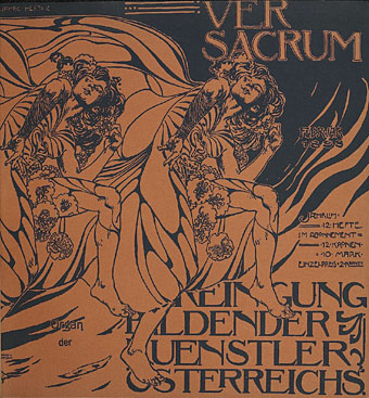
The volume for 1898 collects the first year of the journal cum manifesto of the Union of Austrian Artists, as the Secession group called themselves. That union is represented by the triple shield symbol which recurs in different forms across all the media produced by the group, the shields representing painting, sculpture and architecture. (On the cover of the first issue, the shields are shown growing from a tree whose roots have burst the confines of their container.) Ver Sacrum was a team effort with design contributions by Koloman Moser, Alfred Roller, Josef Hoffmann and Gustav Klimt, and what really sets it apart for me is its striking square format and the wide margins which provided a very flexible template for presenting a variety of graphic content. Other magazines of the period such as Pan shared some of the content but their presentation didn’t greatly differ from the more staid magazines of the era. Ver Sacrum was a break with the style of 19th century journals, and its graphic design points the way to much of the magazine and book design which would follow. It’s also a superb showcase for the Austrian development of the Art Nouveau style, and the overlap between Art Nouveau and the final flourishes of the Symbolist movement.

vs-1898-01.jpg

There’s far too much in this first volume to easily select, all I can do is advise that anyone interested has a browse through the entire book. As with Deutsche Kunst und Dekoration some of the art is the typically conservative fare of the period but the presentation makes up for that, and there’s enough of interest elsewhere to prevent things from getting dull. Here’s hoping the other volumes are made available very soon.

Update: Paul in the comments draws my attention to additional scans of Ver Sacrum at the Österreichische Nationalbibliothek. Heidelberg does a better job of making the issues browsable but it’s still great to have more than one source for this material.

Continue reading “Ver Sacrum, 1898”

Deutsche Kunst und Dekoration #20

dkd20-01.jpg

More sculptual work by Franz Metzner for a building whose interiors are in that ponderous Teutonic style which resembles designs for a fantasy film.

Continuing the delve into back numbers of Deutsche Kunst und Dekoration, the German periodical of art and decoration. Volume 20 covers the period from April 1907 to September 1907, and this is where this fascinating publication starts to run out of steam. A few more editions are worth looking at but after volume 25 the content collapses into the same welter of excessively dull genre painting and academic work that was plaguing Jugend magazine at this time. More about that later.

As usual, anyone wishing to see these samples in greater detail is advised to download the entire number at the Internet Archive. There’ll be more DK&D next week.

dkd20-02.jpg

dkd20-03.jpg

Continue reading “Deutsche Kunst und Dekoration #20”

Deutsche Kunst und Dekoration #15

dkd15-01.jpg

Continuing the delve into back numbers of Deutsche Kunst und Dekoration, the German periodical of art and decoration. This week there’s another jump in the running order, from volume 12 to 15, and it’s impossible to avoid feeling frustrated by this when some of the previous editions have been so good. Volume 15 covers the period from October 1904 to March 1905, and includes work by the Wiener Werkstätte whose rectilinear designs mark the transition from Art Nouveau to what would eventually be called Art Deco. There’s also another feature on the Glasgow Arts and Crafts movement based around Charles Rennie Mackintosh with a look at the designs for Hill House in Helensburgh, Scotland. As usual, anyone wishing to see these samples in greater detail is advised to download the entire volume at the Internet Archive. There’ll be more DK&D next week.

dkd15-02.jpg

dkd15-03.jpg

The peculiar Symbolist paintings of gay artist Sascha Schneider are featured once again, and typically for this artist there’s a profusion of male flesh on display.

Continue reading “Deutsche Kunst und Dekoration #15”