Dalí in New York

dali.jpg

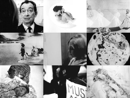
Another Dalínean gem surfaces at Ubuweb. Dalí in New York is a fascinating 50-minute account of the artist’s antics in New York City at the end of 1965. Unlike the reverential documentaries of the 1970s this film isn’t out to flatter its subject: scenes of the usual Dalí happenings are intercut with some combative verbal sparring from the equally remarkable Jane Arden who does her best to try and make sense of the painter’s pronouncements. The director was Arden’s collaborator, Jack Bond, most of whose work was for television although he’s also notable for having directed the Pet Shop Boys’ It Couldn’t Happen Here (1988), a film with some not entirely successful “surrealist” moments of its own.

Previously on { feuilleton }
• The Secret Life of Edward James
• René Magritte by David Wheatley
• Soft Self-Portrait of Salvador Dalí
• Mongolian impressions
• Hello Dali!
• Dirty Dalí
• Impressions de la Haute Mongolie revisited

The Fourth Dimension

fourthdimension.jpg

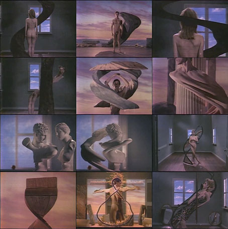
This post ought to have followed the one about Tango since it concerns another experimental film by Zbigniew Rybczynski. The Fourth Dimension was made in 1988 and like many of the director’s films uses a single effect to create striking results. In this case the effect involves photographing people and objects one narrow line at a time. When the lines are combined then shifted slightly the objects seem to bend and twist like melting plastic. This is the kind of semi-analogue technique which has now been made redundant by computer animation but Rybczynski gives his compositions a quasi-Surrealist quality, reinforced by the Magritte-like windows in some of the rooms.

Previously on { feuilleton }
• Tango

Recovering Viriconium

viriconium01.jpg

Detail from Assassination in the Night (c. 1600?) by Monsù Desiderio.

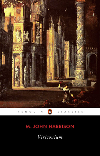
Yesterday’s post looked at some of the past cover designs for M. John Harrison’s Viriconium books. This post makes a few suggestions for how they might be presented in the future. Since these are mostly covers that I’d like to see they’re not necessarily ideal for the audience a publisher might be aiming at, cover design is usually a three-way process involving designer, author and publisher. In the end I’ve resisted the temptation to draft a range of original cover proposals—writing these posts has taken long enough—so almost everything here uses pre-existing art. If I was designing covers for all four Viriconium books, however, and the brief was to orient them towards a fantasy readership, the first thing I’d try would be a series of four imaginary Tarot designs. A peculiar pack of Tarot cards is a recurrent feature of the books so I’d create four emblematic cards that featured significant elements and characters from each. The characters wouldn’t be too well defined, they’d be stylised, maybe even silhouettes. Each card would feature a dominant presence: offhand these would be one of the geteit chemosit for The Pastel City, a locust for A Storm of Wings, the Barley Brothers for In Viriconium and a Mari Lwyd horse skull for Viriconium Nights. These presences together with the human characters would loom over a silhouette city at the foot of each card whose outlines would change appearance from book to book, evolving gradually from a fantastic outline of domes and towers to something that resembles a contemporary city. The colours and treatments would show a similar evolution from the bright and bold styles of the Pamela Colman Smith Tarot deck to something more photographic, collaged from elements closer to our world. Maybe.

That’s an idea for the four individual books. All the examples here use the convenience of the omnibus edition so a single image (or pair of images) has to somehow represent the entire series. To save time and effort I’ve taken the liberty of hijacking a couple of Penguin Books layouts. I hope Penguin doesn’t mind, and I should also apologise to Harrison’s UK publishers, Gollancz, for making one of their authors jump ship. The Viriconium omnibus is certainly good enough to be considered a modern classic. Penguin’s recent template for its Modern Classics series happens to be very easy to apply to a wide range of artwork.
viriconium04.jpg

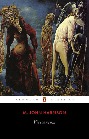
The Anti-Pope (1942) by Max Ernst.

Penguin has a long tradition of using pre-existing art on its covers, especially on those in its Penguin Classics series. You can almost make this into a parlour game: match your favourite novel with the best choice of painting. The tradition was extended to its science fiction titles in the early 1960s when the art of Max Ernst was featured several times along with the work of other Surrealists. Max Ernst is a favourite artist of mine so this is one I can’t resist. Many of Ernst’s decalcomania paintings of the 1940s would suit Viriconium but The Anti-Pope with its horse heads seems especially suitable.

Also on the Penguin sf covers was a picture by the mysterious “Monsù Desiderio” one of whose works can be seen at the top of this post. Desiderio was a 17th-century painter with a vague enough presence—works have been attributed to both François de Nomé and Didier Barra—and a line in gloomy architectural fantasias to make him an ideal Viriconium artist.

Continue reading “Recovering Viriconium”

Max Klinger’s New Salomé

klinger.jpg

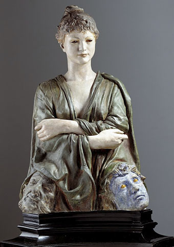
The New Salomé (1887–1888) by Max Klinger.

The German Symbolist Max Klinger (1857–1920) is celebrated today for the etchings which comprise his Ein Handschuh (A Glove) series, ten prints that in their curious details and dream-like quality prefigure Surrealism and Giorgio de Chirico’s “metaphysical” paintings. During his life Klinger was highly regarded for his sculpture as well as his etchings: his Beethoven was a centrepiece of the Secession building in Vienna in 1902. His New Salomé is one of the handful of Klinger works at the Google Art Project where I still feel we ought to be able to view sculpture in the round. I’ve seen many photos of this piece before but hadn’t realised until now that the eyes were…what? Rubies? Amber? Whatever they are, their fiery cast ensures that his imperious female sits unequivocally with the Evil Women that proliferated in the late 19th century.

pla.jpg

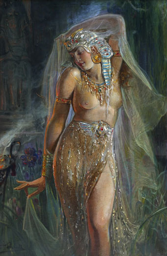
Salomé (c.1910) by Julio Borrell Pla.

Klinger’s sculpture may have been fashionably misogynist but it was at least a serious piece of art. Twenty years later the Salomé theme had devolved to little more than titillating exotica, as with this vaporous painting by Julio Borrell Pla which I hadn’t come across before. The last gasp of this exhausted trend is William Dieterle’s 1953 film in which Rita Hayworth plays Herod’s daughter as all titillation and little else.

Elsewhere on { feuilleton }
• The Salomé archive

The art of Juan de Valdés Leal, 1622–1690

leal1.jpg

In ictu oculi (1672).

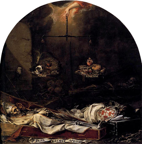
Having castigated Somerset Maugham yesterday for a novel that even he professed to dislike, thanks can be offered for the passage in The Magician which draws attention to a painter I hadn’t come across before. With a scythe-wielding skeleton snuffing a candle flame, and a bishop rotting in his casket, these are a very Spanish take on the vanitas genre. Some of the subsequent works of Salvador Dalí and Luis Buñuel are less surprising when you see art that’s this grotesque.

leal2.jpg

Finis gloria mundi (1672).

Previously on { feuilleton }
• Alfred Rethel’s Totentanz
• The art of Jacopo Ligozzi, 1547–1627
• Massachusetts memento mori
• Skull cameras
• Walmor Corrêa’s Memento Mori
• The skull beneath the skin
• Vanitas paintings
• Very Hungry God
• History of the skull as symbol