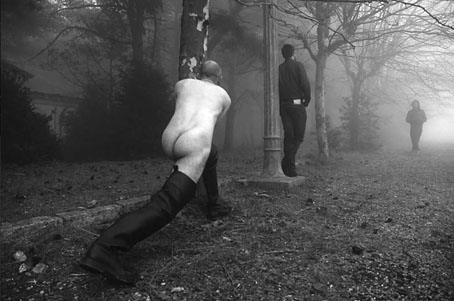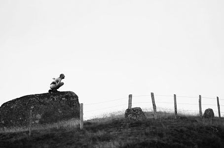
Ruins 3 by Rachel Thomas and Dan Tobin Smith.
“Dan wanted to do something on a really large scale and was looking at a lot of Piranesi and started talking to me about ruins. I then started looking at modern interpretations of this idea, I was obsessed with the post modern architecture of SITE, Disney fantasy settings, Busby Berkeley, Sotsass ceramics, Art Deco motifs in general, Giorgio de Chirico’s paintings, Arabic temples and on and on…” Rachel Thomas talks to Daisy Woodward about Imaginary View, an exhibition currently showing at Somerset House, London.
• A brief description of The Yokel’s Preceptor (1855), a guide to Victorian London’s gay underworld by William Dugdale. When do we get to see a facsimile of this document? The slang is a treat.
• Mix of the week: Secret Thirteen Mix 054, a great selection by Biosphere of doomy ambience from the Post Punk/early Industrial era, 1979–1981.
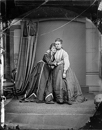
Stella (Ernest Boulton) with Fanny (Frederick Park) (c. 1860–1870).
While Stella and Fanny might be the most terrible show-offs, not to mention industrious sex workers, even they drew the line at coupling in public places. Over the course of the subsequent trial, and despite bribing witnesses, the prosecution failed to prove that sodomy had ever occurred, either between the two young men themselves, or within their circle of genteel “sisters”, or even in a dark corner behind the Haymarket with a passing guardsman. Eventually, and only after a second trial a year later, the young men were found not guilty and allowed to slip back into their lives of pro-am theatricals, touring together and separately in such limp pieces as A Comical Countess and A Morning Call.
Kathryn Hughes reviews Fanny and Stella: The Young Men Who Shocked Victorian England by Neil McKenna. Related: photographs of the pair.
• The Twilight Language of Nigel Kneale, a book of essays and a cassette tape dedicated to the television dramatist.
• Sheltered and Safe from Sorrow: “Victorian mourning rituals, tombstones, epitaphs, and other creepy things”.
• Crate digging and the resurgence of vinyl. Related: Men & Vinyl, a Tumblr devoted to men and their discs.
• Designer Shirley Tucker talks about her cover for the first edition of The Bell Jar by Sylvia Plath.
• More Will Bradley at The Golden Age (formerly Golden Age Comic Book Stories).
• The Mirror Reflecting (Part 2), a new track by The Haxan Cloak.
• Psychedelic Press UK | Related: Catnip: Egress to Oblivion?
• Twilight (1983) by Pete Shelley | Twilight (2000) by Antony and the Johnsons | Twilight (2005) by Robin Guthrie & Harold Budd