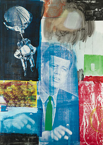
Retroactive I (1964).
My youthful enthusiasm for art acquainted me with the name of Robert Rauschenberg (who died two days ago) earlier than most. Surrealism and Pop Art held an appeal that was immediate, if rather superficially appreciated at the time, and it was seeing works from both those movements which were the most memorable aspect of my first visit to the Tate Gallery when I was 13. Later on when I was reading JG Ballard’s stories and essays in back numbers of New Worlds, Rauschenberg was one of a handful of artists who seemed to depict in visual terms what Ballard was describing in words. In this respect Robert Hughes’s discussion of the “landscape of media” (Ballard’s common phrase would be “media landscape”) below is coincidental but significant. Retroactive I was painted a couple of years before Ballard began the stories that would later become The Atrocity Exhibition and it could easily serve as an illustration for that book.
There are and will be plenty of words written elsewhere about Rauschenberg’s work and influence. I’ll note here his inclusion in the list of gay artists at GLBTQ for his creative and personal partnership with another great Pop artist, Jasper Johns.
One of the artists (television) most affected in the Sixties was Rauschenberg. In 1962, he began to apply printed images to canvas with silkscreen—the found image, not the found object, was incorporated into the work. “I was bombarded with TV sets and magazines,” he recalls, “by the refuse, by the excess of the world … I thought that if I could paint or make an honest work, it should incorporate all of these elements, which were and are a reality. Collage is a way of getting an additional piece of information that’s impersonal. I’ve always tried to work impersonally.” With access to anything printed, Rauschenberg could draw on an unlimited bank of images for his new paintings, and he set them together with a casual narrative style. In heightening the documentary flavour of his work, he strove to give canvas the accumulative flicker of a colour TV set. The bawling pressure of images—rocket, eagle, Kennedy, crowd, street sign, dancer, oranges, box, mosquito—creates an inventory of modern life, the lyrical outpourings of a mind jammed to satiation with the rapid, the quotidian, the real. In its peacock-hued, electron-sweetbox tints, this was an art that Marinetti and the Berlin Dadaists would have recognized at once: an agglomeration of memorable signs, capable of facing the breadth of the street. Their subject was glut.
Rauschenberg’s view of this landscape of media was both affectionate and ironic. He liked excavating whole histories within an image—histories of the media themselves. A perfect example is the red patch at the bottom right corner of Retroactive I. It is a silkscreen enlargement of a photo by Gjon Mili, which he found in Life magazine. Mili’s photograph was a carefully set-up parody, with the aid of a stroboscopic flash, of Duchamp’s Nude Descending a Staircase, 1912. Duchamp’s painting was in turn based on Marey‘s photos of a moving body. So the image goes back through seventy years of technological time, through allusion after allusion; and a further irony is that, in its Rauschenbergian form, it ends up looking precisely like the figures of Adam and Eve expelled from Eden in Masaccio’s fresco for the Carmine in Florence. This in turn converts the image of John Kennedy, who was dead by then and rapidly approaching apotheosis as the centre of a mawkish cult, into a sort of vengeful god with a pointing finger, so fulfilling the prophecy Edmond de Goncourt confided to his journal in 1861:
“The day will come when all the modern nations will adore a sort of American god, about whom much will have been written in the popular press; and images of this god will be set up in the churches, not as the imagination of each individual painter may fancy him, but fixed, once and for all, by photography. On that day civilization will have reached its peak, and there will be steam-propelled gondolas in Venice.”
Robert Hughes, The Shock of the New (1980).
Previously on { feuilleton }
• Transfer drawings by Robert Rauschenberg
• Jasper Johns
• Michael Petry’s flag
• JG Ballard book covers