Outer Alliance Pride Day

outer.jpgToday is Outer Alliance Pride Day so let’s begin with a statement:

As a member of the Outer Alliance, I advocate for queer speculative fiction and those who create, publish and support it, whatever their sexual orientation and gender identity. I make sure this is reflected in my actions and my work.

Various members of the Outer Alliance are either posting fiction, or reviewing something or otherwise attempting to fill that declaration of intent. For my part I decided today to do a sketch based on my favourite chapter of The Ticket that Exploded by William Burroughs, the sequence entitled the black fruit which Burroughs wrote with Michael Portman. Ticket was the first Burroughs book I read at the age of 16 or so, having discovered a copy in a local library, and it really felt like something exploding in the head. For a start, the text is some of his least accommodating for an average reader, although I was already familiar enough with literary experiment to cope with that. Far more electrifying was seeing familiar scenarios from science fiction and fantasy infused with a raw and relentless gay sexuality of endless erections and spurting cocks. The black fruit begins with a science fiction scene of lost astronauts encountering alien fishboys intent on having sex; it then progresses through a series of descriptions which read like a pornographic rewriting of similar scenes from HP Lovecraft or Clark Ashton Smith. In the opening pages of Ticket, Burroughs describes his book as “science fiction” but this was like no sf I’d read; I started to wish there was more like it. There are flashes of similar stuff in The Soft Machine (including an idea borrowed from Henry Kuttner) and elsewhere, and Cities of the Red Night is pretty much a full-on fantasy in its second half, but I’d still like to read more about the fishboys…

fishboy

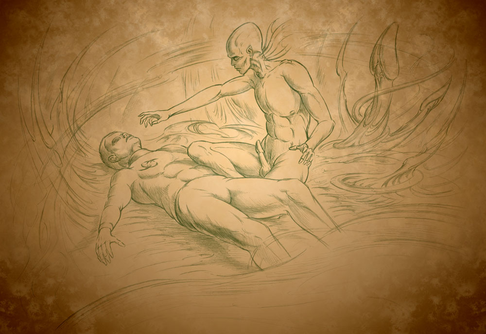
Fishboy and Astronaut (detail).

So here’s an explicitly erotic sketch based on the black fruit (click the picture for the full thing). This should have been a lot better but I’m out of practice drawing at the moment and I didn’t give myself enough time. The scene doesn’t really match the book either, and the astronaut figure is pretty crappy. Feeble excuses aside, Burroughs’ rotting swamp gardens with their marble statues of copulating boys deserve better. And where his fiction leads, I’m still hoping that more writers will follow, not by copying his obsessions but by being as fearless and honest in mining their own.

Previously on { feuilleton }
William S Burroughs: A Man Within
The art of NoBeast

The art of Warwick Goble, 1862–1943

goble1.jpg

Moon Maiden (1910).

Goble’s Moon Maiden, an illustration from Green Willow and Other Japanese Fairy Tales, is proof that a peacock train needn’t be the sole preserve of masculine birds, but then Ruth St Denis had already shown us that. Art Passions has a decent selection of Goble’s fairy pictures although if you want to see the full complement of drawings made for these books you need to consult the Internet Archive. As usual with illustrators of this period, I find I prefer many of the black-and-white works over the paintings; Art Passions doesn’t have any of those, unfortunately, while the book scans are too low-res to do them justice. Once again, Bud Plant provides an overview of the artist’s career.

goble2.jpg

Sea-Nymphs – Ding-Dong, Bell (1920).

Elsewhere on { feuilleton }
The illustrators archive

Previously on { feuilleton }
Ruth St Denis

More book design

hotel.jpg

Yes, it’s been a busy year. These are books three and four respectively of the titles I’ve been designing for Tachyon Publications, and there are more on the way.

Kage Baker’s The Hotel Under the Sand is a charming fantasy for children concerning the hotel of the title and its curious inhabitants, which include a ghost bellboy and a pirate captain. The illustrations were by Stephanie Pui-Mun Law and I tried to complement these with the lettering design and graphic elements. I always enjoy working on illustrated books.

fandsf.jpg

The Very Best of Fantasy & Science Fiction is a very different beast, a big (480 pages) selection by Gordon Van Gelder of some of the many first-class stories from the sixty-year history of the fiction magazine. F&SF has published so many classic stories over the years the book could easily have been twice as big. As it is there are pieces by Alfred Bester, Ray Bradbury, Shirley Jackson, Philip K Dick, Harlan Ellison, Stephen King and Neil Gaiman, among others. The design in this case came from studying a copy of the magazine from 1967; I was already thinking of using Bodoni for the story titles and that choice was confirmed when I saw it used for the same purpose in the magazine. The calligraphic titles were also scanned from there, their design going back to the very first issue.

Both these books are on sale now, and Keith Brooke gave a glowing appraisal to the latter in The Guardian at the weekend.

Previously on { feuilleton }
Medicine Road by Charles De Lint
The Best of Michael Moorcock

March of the Penguins

aco_penguin.jpg

top left: David Pelham’s classic design (1972); top right: photography
by Lionel F Williams (Eye) and SOA / Photonica (Cogs) (1996).
bottom left and right: photography by Véronique Rolland (2000 & 2008).

In April this year I wrote about James Pardey’s excellent site devoted to book covers from the Penguin science fiction range. I’m often pointing to various book cover galleries on Flickr and elsewhere but James’s site goes far beyond these, with credits and annotations for every cover on display. He emailed this week to let me know that his site has been considerably expanded, from 160 covers to 250 (!), bringing the timeline closer to the present. In addition the site has improved page layouts which enable you to study the evolution of each title. All design sites should be this good.

And coincidentally, Anne S mentioned in the comments yesterday that she’s been adding some Penguin Classics covers to her Eye Candy for Bibliophiles site. Lots of other worthwhile viewing there, including some of the old Puffin covers for Alan Garner.

Elsewhere on { feuilleton }
The book covers archive

Previously on { feuilleton }
Penguin science fiction
A Clockwork Orange: The Complete Original Score
Penguin Labyrinths and the Thief’s Journal
Penguin Surrealism
Juice from A Clockwork Orange
Penguin book covers
Clockwork Orange bubblegum cards
Alex in the Chelsea Drug Store

David Trautimas

trautimas.jpg

The Fishing Complex (2008).

Canadian artist David Trautimas re-purposes household and other objects into fantasy buildings by exaggerating their scale then montaging them into landscapes. This example is from his Habitat Machines series; there’s also an Industrial Parkland series. Many of the former group are pleasantly convincing, and their weathered appearance adds to the impression of having discovered the works of a lost Modernist architect. Some of these are like digital equivalents of paintings by Arnau Alemy.

Via Things Magazine.

Previously on { feuilleton }
The art of Arnau Alemany